


Reading Nook: Create Autumn's Coziest Corner
A practical guide to building a reading nook for autumn's dark evenings — the right chair, warm 2700K light, calm green art hung at seated eye height, and layout patterns for tight corner walls.
There is a week at the end of September when the evenings tip over: one Sunday you finish dinner in daylight, and by the next you are reaching for the lamp switch at six. That is the moment a reading nook stops being a nice idea and starts earning its keep. No spare room required — just one deliberately arranged corner with a comfortable chair, a pool of warm light, and something calm on the wall at the right height. For the dark half of the year, that corner becomes the place the rest of the home quietly revolves around.
The encouraging part: a proper reading corner is mostly a matter of arranging things you already own. The chair matters, the lamp matters more than most people think, and the art — hung for someone sitting down, not standing up — is what turns a chair in a corner into a destination. This guide walks through the anatomy of the nook piece by piece, with calm green tones as the anchor palette, concrete measurements in centimeters, and honest advice for small walls.
Why the Reading Nook Belongs to Autumn
In Scandinavia, where the light drains fast once September ends, the reading corner is seasonal infrastructure rather than a decorating whim. When it is dark by dinnertime, a home is experienced less as rooms and more as pools of light: the kitchen counter, the dining table, the lamp beside a chair. A reading nook is the decision to make one of those pools deliberately yours — a place to go that is not the sofa facing the television.
It is also the honest meaning behind the much-exported hygge corner: not candles, but a small zone of warmth and enclosure you return to on repeat — and autumn is the time to build it, because you will use it daily for the next six months.
The Anatomy of a Reading Nook
Strip away the styling, and nearly every reading corner that gets used has the same five components:
- A chair with real support. You will sit for an hour, not perch for five minutes: look for a seat depth around 55-60 cm, armrests to prop a book on, and a back high enough to lean your head against. A footstool changes everything for longer sessions.
- Warm light at about 2700K. That Kelvin number is classic warm white — the color of old incandescent light — relaxing yet bright enough on the page. Place a floor lamp just behind and beside your shoulder so light falls over it onto the book.
- A side table within arm's reach. Tea goes somewhere; the book goes somewhere when tea takes over. Roughly level with the armrest — usually 45-60 cm high — is right; anything grander steals floor space the corner does not have.
- Art hung at seated eye height. The most-skipped detail of all, covered below: in a nook, pictures should center around 120 cm from the floor, noticeably lower than elsewhere.
- Texture in layers. A wool throw over the armrest, a rug under the chair to define the zone, a lined curtain if the nook sits by a window. In the dark months, texture reads as warmth before you touch it.
Notice what is not on the list: square meters. A nook can be 1 x 1.5 meters — enclosure is exactly what makes a corner feel sheltering rather than cramped.
The 120 cm Rule: Hang Art at Seated Eye Height
Here is the detail almost no hanging guide covers. The standard advice — center art about 145 cm from the floor — is calibrated for people standing up. A nook is the one spot in your home you experience almost exclusively seated, and in a chair your eye level drops to roughly 110-120 cm. Art hung at gallery height floats strangely above the scene, disconnected from the chair and lamp below it.
The fix: hang art so its center sits around 120 cm from the floor. From the chair, the image meets your gaze instead of hovering overhead; from across the room, the lower placement ties frame, chair, and side table into one composed group. For a 30x40 cm print, a 120 cm center puts the top edge at about 140 cm and the bottom at 100 cm — often just 20-30 cm above the chair back, precisely the relationship you see in rooms that look put together.
Two practical notes: measure to the center of the picture, not the hook — mark 120 cm, then add the distance from the frame's top edge to the taut hanging wire before drilling. And if the wall also serves standing viewers, split the difference at 125-130 cm; in a seated zone, the seated view wins.
A Calm Green Palette for Dark Evenings
Every nook needs a palette anchor, and for autumn evenings it is hard to beat calm green tones. Green reads as restful rather than stimulating — no accident that libraries have leaned on deep greens for a century — and it improves under warm light: at 2700K, sage drifts toward soft olive and forest green turns velvety instead of cold, exactly when you will use the corner most.
Four pairings that work, from lightest to moodiest:
- Sage green + cream + light oak. The most Scandinavian of the four — airy in daylight, gently warm at night, and it keeps a small corner feeling open.
- Eucalyptus + warm gray + rattan. Muted and modern; the gray keeps the green from turning sweet, while rattan or cane supplies the texture layer.
- Olive + rust + camel. The most overtly autumnal mix — one rust cushion and a camel throw against olive-toned art give you the season without a single pumpkin.
- Forest green + walnut + brass. The classic library mood: deep green art, a dark wood side table, a brass lamp. Made for long, dark evenings.
You do not have to repaint anything: two or three prints, a throw, and a cushion carry the palette convincingly. Browse a dedicated collection of green wall art and you will find the whole tonal range, from pale sage botanicals to near-black forest scenes.
Choosing the Art: Misty Landscapes and Muted Botanicals
The nook wall wants calm: whatever hangs there sits at the edge of your vision for hundreds of hours, so skip high-contrast graphics and anything that shouts. Two motif families do the job best.
Misty landscapes. Fog over a lake, a forest dissolving into haze, hills in soft gradations of green and gray. Mist does visually what the nook does spatially — softens edges, slows things down — and carries so little saturated color that it never fights the lamp-lit atmosphere.
Muted green botanicals. Not bright tropical leaves, but the quieter end of the genre — vintage-style plant studies, dried grasses, eucalyptus sprigs, line-drawn foliage on off-white — echoing the palette and keeping a touch of the natural world indoors just as the real one goes bare.
For the tight walls most corners offer, 30x40 cm is the workhorse format — large enough to look deliberate, small enough for a narrow strip between window and corner, easy to combine in pairs and trios. Go up to 40x50 cm only on a genuinely open wall; go down to 21x30 cm for stacking. Quality shows at nook distance, too: Posterlefi prints on premium 200 gsm and 230 gsm poster paper, with matching wooden frames in 14 colors and 13 sizes — walnut or black for the library mood, oak or white for a lighter Nordic look.
One Literary Quote Print as the Finishing Touch
Once the calm motifs are in place, a single literary quote print is the finishing touch — emphasis on single. A short line of text on a reading-corner wall is a quiet joke the room tells: this is what happens here. Among landscapes and botanicals, one black-and-white typographic print adds just the right graphic contrast.
Choose something short enough to read from the doorway and keep the typography simple — black text on off-white in a thin frame is the safest choice next to tonal green art. Resist adding a second or third; two quotes on one wall start to feel like a café menu. There is a full range of quote posters to hunt through when you want words to be the final note.
Layout Patterns for Tight Corner Walls
Corners rarely offer generous walls — usually a strip beside a window, the corner's narrow return, or the space above a low bookcase. Each has a pattern; all heights refer to the center of the arrangement, which should land near the 120 cm seated-eye line:
- The single anchor. One 30x40 cm print centered over the side table or just off the chair's centerline — the minimalist default, and strongest on any wall narrower than 60 cm.
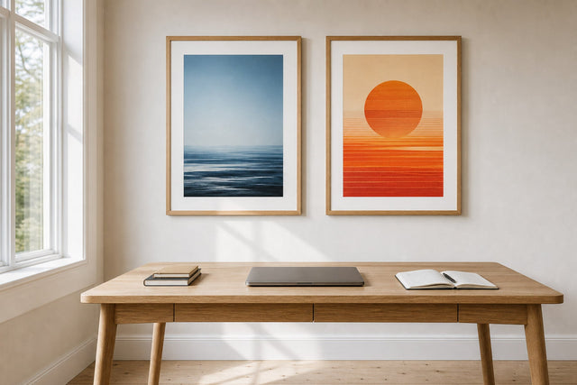
- The stacked pair. Two 30x40 cm prints hung one above the other, 5-7 cm apart, sharing a center at 120 cm. Perfect for the tall, narrow strip beside a window.
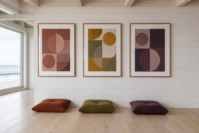
- The seated trio. Three 30x40 cm prints in a row above a low bookcase, 5-7 cm apart — one calm horizontal band rather than three separate pictures.
- The corner L. One 40x50 cm print on the main wall and a 21x30 cm on the return wall, wrapping the corner around the chair so the nook feels enclosed on two sides.
- The picture ledge. A ledge at 105-110 cm with two or three prints leaning in slight overlap — the answer for renters, and for anyone who reshuffles with the seasons.
Plan the Wall Before You Pick Up a Hammer
Every pattern above is easy to get almost right and annoying to get exactly right — a good argument for planning digitally before making holes. Posterlefi's free Gallery Wall Builder lets you arrange real prints in real sizes on a virtual wall: test whether the stacked pair beats a single 40x50 cm on your strip, and compare frame colors before committing. Five minutes of dragging rectangles saves an afternoon of filling nail holes.
And if a print feels different in the room than on screen, the experiment carries little risk: Posterlefi offers 100-day returns — enough dark evenings to know whether the corner truly works.
The evenings only get longer from here, which is the best reason to build your corner now rather than in January. Start with the chair you already have, buy the right bulb, hang the art at 120 cm — and anchor the wall in the palette that suits the season best. Begin with calm green wall art, chosen for the corner where you will spend your autumn.
Reading Nook FAQ
What height should I hang art in a reading nook?
Center it around 120 cm from the floor — noticeably lower than the standard 145 cm, which assumes a standing viewer. Seated eye level is roughly 110-120 cm. For a 30x40 cm print, that puts the top edge near 140 cm, typically 20-30 cm above the chair back.
What size poster is best for a small reading corner?
30x40 cm is the most versatile format for tight corner walls: substantial enough to look intentional, small enough for the strip beside a window, and easy to combine in stacked pairs or trios. Save 40x50 cm for open walls, and use 21x30 cm for stacking or the corner's return wall.
What kind of light is best for reading in the evening?
A warm white bulb around 2700K, placed behind and beside your shoulder so light falls onto the page. It is relaxing without being too dim for print; cool daylight bulbs of 4000K and up feel harsh after dark. Keep the shade's lower edge near seated eye height so the bulb never glares.
How do I make a hygge corner in a small apartment?
Claim about 1 x 1.5 meters — a bedroom corner or the dead spot beside a window is enough. Angle a chair away from the room, add a 2700K floor lamp, a small side table, and a rug, then hang one or two 30x40 cm prints centered at 120 cm. Smallness is an asset: the enclosure is what makes it feel cozy.
Suunnittele seinä virtuaalisesti ennen ostamista
Kokeile kokoja ja asettelua virtuaaliseinällä — ilmaiseksi.

Aloita näistä
Katso koko kokoelma →


Aiheeseen liittyvää inspiraatiota

100 päivän palautusoikeus