


Dorm Room Posters: One Room, Three Zones
How to zone a single dorm room into sleep, study and social areas with posters — deposit-safe hanging methods, concrete sizes and colour palettes that fit a small space.
A dorm room is the hardest-working room you will ever live in. It has to be a bedroom at midnight, an office at nine in the morning, and a living room when three friends show up with snacks — all inside a space that rarely stretches past twenty square meters, and all without putting a single hole in the wall, because the deposit contract says so. The fastest, most forgiving way to make one room behave like three is dorm room posters: art chosen and placed so deliberately that each corner of the room quietly announces what happens there.
Interior designers call this zoning, and they use it constantly in studio apartments and open-plan lofts. The good news is that you do not need furniture walls, folding screens, or a renovation budget to pull it off. You need three small clusters of art with three distinct moods, hung with methods your housing office will never notice. This guide walks through exactly what to hang where, which sizes actually work in a small room, and how to keep every bit of it deposit-safe from move-in day to move-out inspection.
Why zoning beats decorating in a one-room life
Most people decorate a dorm the way they would fill a suitcase: spread everything evenly and hope it fits. The result is a room where nothing has a job. Zoning takes the opposite approach — you group your visual choices with intent, so the bed corner looks and feels different from the desk corner, which looks different again from the spot where people sit and talk.
This is not just an aesthetic trick. Your brain reads visual boundaries as functional boundaries. When the wall above your desk is crisp and graphic while the wall beside your bed is soft and muted, switching between work mode and rest mode gets genuinely easier — which matters a great deal when your commute between the two is a single step. Three zones is the practical maximum for a typical student room: sleep, study, and social. Each zone gets its own art personality, and a shared thread ties them together so the room still reads as one coherent space rather than three arguments.
The sleep zone: calm art where you wind down
The wall beside or above your bed should be the visual equivalent of a slow exhale. Reach for low-contrast, muted motifs: a hazy landscape, soft botanical line art, a pale abstract in dusty tones, or a quiet black and white photograph with plenty of negative space. What you want to avoid here is anything loud, busy, or heavily saturated — bold red graphics above a pillow work against everything a sleep corner is for.
Scale-wise, a pair of 30x40 cm prints hung side by side reads balanced over a standard single bed, and a single 40x50 cm print works if your bed sits against a narrower stretch of wall. Colours that consistently earn their keep in a sleep zone are dusty sage, warm sand, powder blue, and soft greige — all of them forgiving against the flat white paint that nearly every dorm ships with. If you frame these prints, a light oak or white frame keeps the corner airy; a black frame sharpens it more than a rest area needs.
The study zone: sharp graphics over the desk
The desk wall wants the opposite energy. Here, higher contrast and cleaner lines help signal alertness: architectural line drawings, bold graphic shapes, black and white photography with strong geometry, or a well-set typographic print. A short, sharply designed quote print earns its place above a workspace in a way it rarely does anywhere else in a home — browse quote posters for something that reads as a design object first and a message second.
Restraint is the whole game in this zone. One 40x50 cm print centered above the desk, or two 21x30 cm prints stacked or side by side, is plenty. A crowded wall above a workspace becomes visual noise exactly where you can least afford it, and every extra item is one more thing to look at instead of the reading in front of you. Hang the print high enough that the bottom edge sits above your monitor or laptop line, so it frames the workspace rather than competing with the screen.
The social zone: one statement, not twelve small ones
Every dorm room has one wall that guests actually see — usually the one facing the door, or the wall behind whatever passes for seating. This is where you spend your single biggest visual gesture: one 50x70 cm statement print. In a small room, one confident large piece beats a scatter of small ones every time, because it gives the eye a clear destination and makes the wall feel intentional rather than accumulated.
Good candidates for the statement spot are bold abstracts, vintage exhibition-style prints, and city or map prints — a map of your hometown or the city you dream of moving to after graduation is a reliable conversation starter. If you want slightly more presence, flank the 50x70 with two small 21x30 prints in the same palette, keeping about 5 cm of breathing room between frames. With more than 8,000 posters and art prints to choose from, spanning Scandinavian, abstract, botanical, vintage, and city styles, the statement piece is the fun part of the whole project.
Hanging without holes: the deposit-safe toolkit
Now for the constraint that defines dorm decorating: no holes. The reassuring truth is that lightweight wall art is the one category of décor that barely needs them. Posters printed on sturdy stock — Posterlefi prints on premium 200 gsm and 230 gsm poster paper — hold their shape well enough to hang unframed without curling into a sad tube by October.
- Adhesive strips handle unframed prints and lightweight framed pieces. Stick to the weight rating on the packet, press firmly, and remove them at year's end by pulling the tab slowly straight down along the wall — never outward.
- Washi tape is the gentlest option for unframed posters: it holds 200 gsm paper reliably and peels off both the poster and the paint without a trace. Use four corner pieces or make the tape a visible design element.
- Leaning frames need no wall contact at all. A framed 50x70 leaning on a desk hutch, a shelf, or even the floor against the wall looks deliberately relaxed and is completely inspection-proof.
- Existing hooks and nails are free real estate. Many dorm rooms come with a picture rail or a couple of leftover nails from previous tenants — claim them for your heaviest framed piece.
- Shelf styling lets you layer: stand a larger framed print at the back of a bookshelf and overlap a smaller unframed one in front of it.
If you go the framed route, matching wooden frames come in 14 colours and 13 sizes, so you can frame the leaning pieces properly and keep the taped pieces light. Save the heavier framed prints for leaning positions and let the strips and tape carry only paper.
Colour and cohesion: three zones that still feel like one room
The risk with zoning is ending up with three unrelated corners. The fix is a shared thread: one accent colour that appears at least once in every zone, and a frame discipline of no more than two frame colours across the whole room. Both rules cost nothing and do most of the work of making a room look considered.
- Sage, sand and off-white — a calm Scandinavian base that pairs naturally with oak frames and whatever pale furniture the dorm provides.
- Navy, rust and cream — warmer and moodier; let navy dominate the study zone and rust appear as small accents in the other two.
- Black and white plus one accent — the most foolproof scheme for a student room. Monochrome prints everywhere, then a single accent colour (mustard, coral, or forest green) in exactly one print per zone.
- Tonal blues — powder blue by the bed, mid-blue over the desk, deep ink blue in the statement piece. One colour, three intensities, automatic cohesion.
Whichever palette you choose, repeat it in the soft things you already own — bedding, a throw, a desk organizer — and the room snaps together in a way that looks far more expensive than it was.
Sizes and layouts that actually fit a dorm
Small rooms punish vague sizing decisions, so here are layout patterns with real numbers you can measure against your own walls before ordering anything.
- Over the bed: two 30x40 cm prints side by side with a 5 cm gap, centered on the bed's width, bottom edges roughly 25 cm above the mattress line.
- Over the desk: one 40x50 cm print, or a vertical pair of 21x30 cm prints, with the lowest edge clearing your screen height.
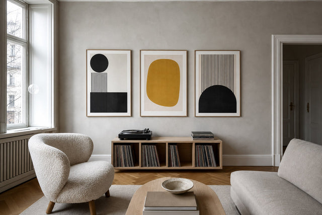
- Statement wall: one 50x70 cm print at eye level, or a symmetrical trio of 50x70 flanked by two 21x30s.
- Awkward slivers: the narrow strip between wardrobe and window takes a vertical stack of three 21x30 cm prints with 5 cm gaps beautifully.
- Shelf or ledge rows: three to four leaning prints in mixed sizes (say 30x40, 21x30, 13x18), edges slightly overlapping, largest at the back.
Measure twice here: a print that is 10 cm too small for its wall reads as a mistake, while one 10 cm too large simply reads as confident.
Plan the zones before you tape a single corner
Because rehanging means re-taping, it pays to get the arrangement right on the first attempt. The free Gallery Wall Builder lets you arrange actual prints on a virtual wall — test the two-over-the-bed layout against the statement wall, swap sizes, and see the palette working together before anything is printed. It turns the classic dorm mistake of ordering blind into a ten-minute planning session.
And here is the quiet advantage posters have over every other way of personalizing a rental: they move out with you. Paint has to be rolled back to white, adhesive hooks get surrendered to the wall, but a poster collection packs flat and re-zones your next room, and the one after that. A three-poster starter set — one calm print for the bed, one sharp print for the desk, one statement for the social wall — typically clears the free-shipping threshold in Denmark (orders over 399 kr) and in the EU (orders over 49 EUR), and a 100-day return window means a print that looks wrong in your actual light can simply go back.
Dorm room posters: your questions answered
How do I hang posters in a dorm without damaging the walls?
Use adhesive strips rated for the weight of the print, washi tape for unframed posters, or skip the wall entirely and lean framed prints on shelves and desks. Remove strips by pulling the tab slowly downward along the wall, and peel tape back on itself at a low angle. Done carefully, none of these leaves a mark at inspection.
What size posters are best for a small dorm room?
Work in three tiers: 21x30 cm for narrow gaps and supporting pieces, 30x40 or 40x50 cm for the bed and desk zones, and a single 50x70 cm as the room's statement. One large print almost always looks better in a small room than many tiny ones, because it gives the eye one clear anchor.
How many posters is too many for one room?
For a typical dorm, five to seven prints across all three zones is the sweet spot. Beyond that, the zones blur into one continuous collage and the calming effect of the sleep corner disappears. If you love collecting, rotate prints seasonally instead of hanging everything at once.
What should I hang above my dorm desk?
Choose one or two high-contrast, low-clutter pieces: an architectural line drawing, a bold graphic print, or a short typographic quote. Avoid busy collages and anything with lots of small detail, which pull attention exactly where you need focus. Keep the bottom edge above your screen line.
Do posters really make a rented room feel bigger?
Placed well, yes. Vertical formats draw the eye upward and exaggerate ceiling height, light muted palettes keep walls feeling open, and one large anchor print reads calmer — and therefore more spacious — than a scatter of small frames. Zoning adds to the effect by making one room feel like several distinct places.
One room, three zones, zero holes — that is the whole formula. If you are ready to build your starter trio, the bestselling posters are a well-tested place to begin: the prints other small-space decorators keep coming back to, in every size a dorm wall can hold.
Suunnittele seinä virtuaalisesti ennen ostamista
Kokeile kokoja ja asettelua virtuaaliseinällä — ilmaiseksi.

Aloita näistä
Katso koko kokoelma →


Aiheeseen liittyvää inspiraatiota


100 päivän palautusoikeus