


Zodiac Posters: Your Personal Sky on the Wall
A practical guide to zodiac posters as personal wall art — line-drawn constellations, gilded celestial illustration and minimalist symbol prints, with concrete advice on sizes, frames and placement.
Some art is chosen because it suits the sofa. A zodiac poster is chosen because it suits you. Your star sign is one of the very few decorative motifs that is genuinely personal without a name or a date printed across it — a symbol you have carried since the day you were born, drawn from a visual tradition of star charts and celestial illustration that stretches back centuries. That mix of private meaning and public beauty is why star sign wall art has quietly become one of the most rewarding corners of home decor.
It is also a corner where quality varies enormously. For every elegant constellation drawing there is a stack of novelty prints that treat the zodiac as a punchline. This guide takes the motif seriously. We will walk through the three directions zodiac art does best — line-drawn constellations, gilded celestial illustration and minimalist symbol prints — and then get practical about sizes in centimetres, frame colours, pairings for couples and where in the home a personal motif actually belongs, so your sign ends up looking like a considered piece of art rather than a horoscope clipping.
Personal decor, not personalised print
There is a real difference between decor that is personal and decor that is personalised. Personalised print-on-demand — names in swirling script, birth coordinates, wedding dates — announces itself the moment anyone walks in, and it rarely ages well, because the design exists only to carry the data. A zodiac poster works the other way around. The motif comes first: a constellation chart, a celestial illustration, a clean astrological glyph, each belonging to a graphic tradition that would hold up on the wall even if it were not your sign. The personal meaning sits inside the choice rather than being printed on top of it. Guests simply see a beautiful print; you see yourself.
This is why star sign art can hold its own in a considered interior where a name poster cannot. It behaves like art first and biography second. And like all art, the job is matching the right visual direction to your room — which brings us to the three styles worth knowing.
Line-drawn constellations: the quiet classic
The most restrained way to hang your sign is the constellation chart: the actual arrangement of stars that forms Aries, Leo or Pisces in the night sky, rendered as small points joined by thin, precise lines. On a deep navy or charcoal ground it reads as a fragment of a star atlas. On an off-white ground with fine black lines it becomes almost architectural — closer to a technical drawing than an illustration.
This is the direction to choose if your home leans minimalist or Scandinavian. A constellation poster carries almost no colour, so it slips into an existing palette without negotiation, and its fine linework rewards a second look the way good line art always does. It is also the most understated of the three styles: nobody mistakes a star chart for a horoscope page. If you are drawn to zodiac art but wary of it feeling whimsical, start here.
Gilded celestial illustration: warmth and old-world drama
At the other end of the spectrum sits the gilded celestial print: crescent moons, radiant suns, scattered stars and zodiac figures drawn in the spirit of antique astronomy plates, warmed with gold tones against deep blue, black or burgundy grounds. Where the constellation chart whispers, this style glows.
Gilded celestial art suits rooms that already have some depth — dark painted walls, wood furniture, brass lamps, heavy textiles. A single large piece above a bed or a reading chair can anchor the whole room, and gold detail does something flat colour never will: it catches lamplight in the evening and shifts as you move past it. If your interior leans warm and layered rather than pale and crisp, browse the gold-toned prints and look for celestial motifs built around your sign. This is the romantic reading of the zodiac, and it earns its drama.
Minimalist symbol prints: the graphic route
The third direction strips the zodiac to its glyph — the ram's horns of Aries, the scales of Libra, the twin fish of Pisces — treated as a bold graphic mark, often set with clean typography naming the sign and its dates. No stars, no illustration, just a confident symbol on a calm ground.
Symbol prints thrive in graphic company: a home office with black and white photography, a hallway with typographic prints, a modern living room where everything else is already pared back. Black on white is the sharpest version; a glyph on muted terracotta, sage or sand softens the effect considerably. Because the composition is so simple, crisp edges and even ink coverage are the whole point — these prints benefit from heavier 230 gsm paper and a proper frame.
The right size in the right place
Because a zodiac motif is personal, placement matters more than it does for a landscape or an abstract. Your sign belongs in the spots that are genuinely yours — the desk, the bedside, the corner where you actually sit — rather than competing for the main wall of a shared room. A few combinations that consistently work:
- 30x40 cm above the desk. Large enough to read as intentional, small enough to stay personal. Hang it so the lower edge sits 20-30 cm above the desktop, roughly at eye level when you look up from the screen.
- 50x70 cm beside or above the bed. The classic bedroom format. Above a nightstand it makes a quietly personal vignette; centred over a single bed it becomes the room's focal point.
- 21x30 cm on a shelf or entry ledge. A leaned, frame-and-go format that lets you live with the motif before committing to nails.
- 40x50 cm in a reading corner. Pairs beautifully with a floor lamp and an armchair — especially in the gilded style, where evening light works in the print's favour.
- 70x100 cm as a statement. Reserved for detailed gilded celestial pieces, which have enough going on to justify the scale. Give it a full wall section of its own.
Whatever the format, hang the centre of the print at 145-150 cm from the floor — standard gallery height — unless it sits above furniture, in which case the furniture sets the line.
Two signs, one wall: zodiac art for couples
The most charming use of star sign art is the pair: two signs, one wall, hung as equals. The rule that makes it work is discipline — same style, same size, same frame. A Taurus constellation in a black frame next to a gilded Scorpio in oak reads as clutter; two matching constellation charts in identical black frames read as a deliberate, slightly private gesture that guests notice on the second visit rather than the first.
Hang the pair with 5-7 cm between frames, tops aligned, centred as a single unit over whatever sits below — a console, a dresser, or the head of the bed with one sign per side. For families there is a natural extension: a horizontal row of three or four smaller prints, 21x30 cm each, one sign per person, evenly spaced in identical frames. Keep everything in one style. That unity is what turns a set of individual signs into a portrait of a household.
Frames and colour pairings that let the sky carry
A personal motif carries best when everything around it stays calm. That applies to the wall — a quiet, low-contrast wall colour lets even a modest 30x40 print hold attention it would lose in the middle of a busy arrangement — and equally to the frame. With wooden frames available in 14 colours and 13 sizes at Posterlefi, these pairings are reliable starting points:
- Black frame + navy constellation chart. The frame reads as part of the night sky, and the whole piece becomes one dark, elegant object.
- Oak frame + off-white line drawing. The lightest, most Scandinavian combination — warm wood, pale paper, thin black lines.
- Gold-toned frame + gilded celestial print. Match the metal to the motif and the print behaves like an antique plate. Best over dark or muted walls.
- White frame + minimalist symbol print. Maximum crispness for the graphic route; the glyph floats.
- Walnut frame + burgundy or black celestial art. The moody library version — beautiful beside leather and brass.
Paper weight matters more than most people expect, too. A 200 gsm poster paper is a solid standard; stepping up to 230 gsm gives the print a stiffer, more substantial feel in the frame — worth it for large formats and for symbol prints, where flatness and clean edges do the talking.
Growing one sign into a celestial wall
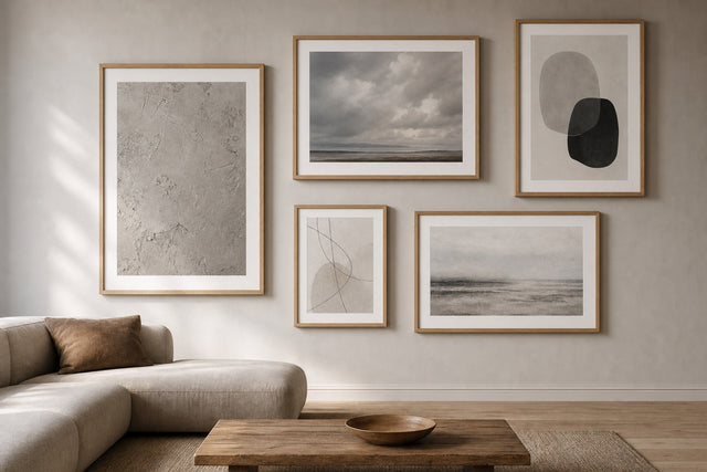
A single zodiac print can also be the seed of something larger. Celestial art is one of the easiest themes to build a gallery wall around because the palette stays naturally coherent: navy, black, cream, gold. Start with your sign as the anchor, then add a moon-phase print, a sun illustration, a small abstract in matching tones, perhaps a vintage-style star map. Keep one element constant — frame colour is the easiest — and vary the sizes.
The honest difficulty with gallery walls is not choosing prints but committing to a layout, and this is where planning digitally first saves both plaster and patience. The free Gallery Wall Builder lets you arrange your chosen prints on a virtual wall, test spacings and swap sizes before you put a single nail in. For a celestial wall, try an anchor-and-orbit layout: your sign at 50x70 cm slightly off-centre, with three or four smaller pieces stepping away from it — appropriately enough, like moons.
Frequently asked questions about zodiac posters
What size should a zodiac poster be?
For a personal spot — above a desk, beside the bed — 30x40 cm is the most reliable format: clearly intentional without dominating. Go up to 50x70 cm if the print will anchor a wall on its own, and reserve 70x100 cm for detailed gilded celestial pieces that can fill the scale.
Do zodiac posters work in a minimalist interior?
Yes, if you choose the right direction. A line-drawn constellation chart or a single glyph print in black and white is as restrained as any abstract, and arguably quieter. Skip the ornate gilded style, keep the frame simple — black, white or oak — and give the print room to breathe.
How do I hang two star sign posters together?
Treat them as one unit: identical sizes and frames, 5-7 cm apart, tops aligned, centred over the furniture below. Matching styles is essential — two constellation charts or two symbol prints, never one of each.
What is the difference between a constellation poster and a zodiac poster?
A constellation poster shows the literal star pattern — points and connecting lines as they appear in the sky. A zodiac poster is the broader category: it can be a constellation chart, but also an illustrated figure, a symbolic glyph or a full celestial scene built around the sign. Every zodiac constellation print is both at once.
What frame colour suits celestial art best?
Match the frame to the print's background rather than to the room: black frames for navy and charcoal prints, gold-toned frames for gilded illustration, oak or white for pale line-drawn pieces. When in doubt, black is the safest choice for anything with a night-sky ground.
However you read your horoscope — devoutly, ironically or not at all — there is something quietly satisfying about a piece of the sky that has been yours since birth hanging in the room where you live. Explore the illustration art collection to find your sign in all three directions, from fine-lined constellations to gilded celestial scenes, and take your time deciding: with 100-day returns, the sky is allowed a trial period on your wall.
Build your wall virtually before you spend a penny
Arrange sizes and layout on a virtual wall — free, before you buy.

Start with these
See the whole collection →


Related inspiration

100-day returns