


Deer on the Wall: Autumn's Most Beautiful Animal Motif
October belongs to the stag. This guide compares photographic, line-art and vintage deer wall art, the colours and sizes that flatter each style, and how to build a simple three-print forest wall.
Every October, something shifts in Nordic homes. The light drops early, the forests turn copper and rust, and the walls indoors start asking for something warmer. Few motifs answer that call like deer wall art. The stag has been an autumn symbol for centuries — October is rutting season across the Nordic woods, when red deer bellow through misty clearings at dawn — and a well-chosen deer print carries that whole atmosphere into a living room, hallway or bedroom without a single antler trophy in sight.
But a deer on the wall can mean very different things. A moody photograph of a stag in fog says one thing; a single-line ink drawing says another; a vintage field-guide illustration says a third. This guide walks through the three main interpretations of the motif, the colours and frames that flatter each one, and how to build a small forest-themed wall around your favourite. By the end, you should know exactly which deer belongs in your home — and precisely where to hang it.
Why the Deer Owns October
Most animal motifs are seasonless — a zebra print looks the same in January as in July. The deer is different: it is tied to a specific moment in the natural calendar. From late September through October, stags gather in forest clearings for the rut, and anyone who has walked a Nordic forest then knows the mood — low fog, wet leaves, and that amber light that only lasts a few weeks.
That is why the stag sits at the centre of woodland wall art every autumn. Among forest animal prints — foxes, owls, hares — the deer is the one that compresses the whole season into a single image. Hung in a hallway, it greets you like a walk in the woods; above a sofa, it anchors the room in what stylists call the forest-lodge look: warm textiles, dark wood, candlelight. You do not need a cabin to pull it off — one well-placed deer poster and two supporting prints do most of the work.
The Photographic Deer: Quiet, Moody Realism
Photography is the most atmospheric interpretation of the motif, and the one to choose if you want your wall to feel like a window. The strongest deer photographs share a few traits: fog or soft morning light, a muted colour range from grey-green to warm brown, and a stag that holds eye contact or stands in calm profile — never mid-leap, never theatrical.
A photographic stag print works hardest in rooms that already lean calm: bedrooms, reading corners, home offices. Because the image contains real depth — trees receding into mist, layered light — it visually opens up a wall in a way flat graphics cannot. Browse with the landscape in mind, not just the animal: a deer standing small in a vast misty frame often feels more powerful than a tight portrait. You will find this mood throughout the nature photography collection, where forest scenes and animal portraits sit side by side.
One practical note: moody photography tends to be dark. Give it a wall that receives decent daylight or a warm lamp nearby, otherwise the detail you fell for will disappear after sunset.
Line Art Stags: The Minimalist Route
At the opposite end of the spectrum sits line art — the deer reduced to a few confident strokes on an off-white or paper-toned background. This is the interpretation for homes already committed to Scandinavian minimalism: pale oak floors, white walls, restrained palettes. A photographic stag might feel too heavy there; a line-drawn one slips right in.
The antlers are the reason line art suits this animal so well. Few natural forms are as graphically interesting, and a good artist can suggest an entire stag with the antler silhouette and two or three body lines. Look for prints where the line has visible character — slight wobbles, varying thickness — rather than perfectly uniform strokes, which can read as clip art.
Line art also plays well in multiples. A pair of stag drawings hung side by side, in identical frames with generous white borders, gives you the seasonal reference without darkening the room by a single lumen.
Vintage Illustration: The Field-Guide Look
The third interpretation borrows from nineteenth-century natural history: detailed, slightly formal illustrations of the kind once printed in zoological encyclopedias and hunting almanacs. Warm paper tones, fine crosshatching, sometimes a Latin species name lettered underneath. Where photography gives you mood and line art gives you restraint, vintage illustration gives you character.
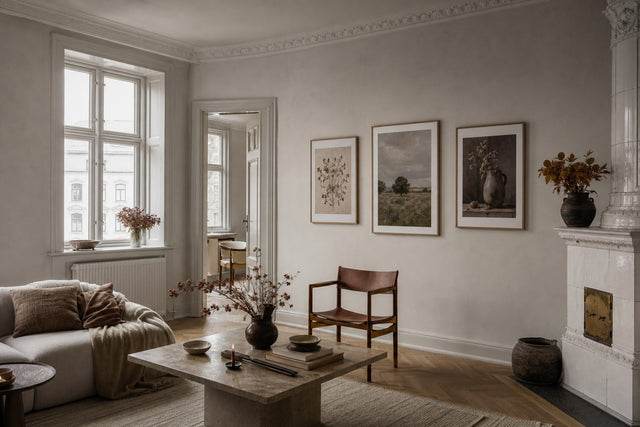
This style has a particular advantage: it bridges old and new interiors. In a period apartment with mouldings and herringbone floors, a vintage stag looks like it has always been there. In a modern flat, it becomes the deliberate contrast piece — one aged, warm-toned print against clean surfaces. Frame it in dark brown or black wood and the field-guide effect is complete.
Vintage deer illustrations also pair naturally with botanicals from the same tradition — an engraved stag next to an engraved oak branch looks curated, as if both came from the same old book.
Colours That Belong With a Deer Motif
Whatever interpretation you choose, the palette around it decides whether the wall feels intentional or accidental. The deer's own colours — russet, taupe, grey-brown — are the starting point; the forest supplies the rest. These pairings are reliable:
- Forest green + warm brown: the classic. A deep green wall, or green textiles nearby, behind a brown-toned deer print instantly reads as autumn. Explore green art prints if you want the palette echoed elsewhere on the wall.
- Rust + cream: warmer and more contemporary. Especially good with photographic deer, where rust picks up the animal's coat.
- Black + off-white: the minimalist pairing for line-art stags. Add one natural-wood frame so the scheme does not turn cold.
- Olive + camel + charcoal: a three-colour scheme that suits vintage illustration and lets you layer leather and wool textures below the wall.
- Misty grey + sage: the softest option — ideal in bedrooms, where a fog-toned photographic print should soothe rather than dominate.
One rule of thumb: let the print be the most saturated thing on the wall — if frame, paint and print all compete at full strength, the deer disappears into the noise.
Getting the Size and Placement Right
Deer motifs are forgiving about style but strict about scale. A stag shrunk onto a tiny print loses the presence that makes the animal worth hanging. Some concrete guidance:
- Above a sofa: 50×70 cm at minimum; 70×100 cm if the sofa is 220 cm or wider. Hang the print so its lower edge sits 20–30 cm above the backrest.
- In a hallway: 30×40 cm or 40×50 cm works, because viewing distance is short. A vertical stag portrait suits the narrow wall format.
- Above a bed: one calm 61×91 cm print, or a pair of 40×50 cm prints hung with 6–8 cm between frames.
- Above a sideboard or console: 50×70 cm, with the lower frame edge 15–25 cm above the surface — close enough to feel connected to the furniture.
- Everywhere else: aim for the centre of the print at about 145–150 cm from the floor, the gallery standard.
Orientation matters too: photographic forest scenes usually want landscape format, mirroring how we see a treeline, while a lone stag almost always sits best in portrait — the vertical frame echoes the lift of the antlers.
Build a Three-Print Forest Wall
A single deer print is a statement; three related prints are a scene. The most dependable forest trio pairs one animal, one landscape and one botanical detail — a subject, a wide shot and a close-up, like three frames from the same walk in the woods.
- The anchor — the deer: your largest print, ideally 50×70 cm, in whichever of the three styles fits your room.
- The atmosphere — a misty landscape: a fog-laced treeline or forest path in 40×50 cm. It gives the deer somewhere to live.
- The detail — a botanical: an oak leaf, fern or pine branch in 30×40 cm. The close-up rounds out the trio and adds a note of green.
Two layout patterns work almost every time. The first is the off-centre row: the 50×70 cm anchor flanked by the two smaller prints, 6–8 cm apart, all centres aligned at eye height. The second is the staircase: anchor at lower left, landscape at upper right, botanical tucked between — more relaxed, and better suited to walls beside doors or along stairs.
Before you commit hammer to wall, test the arrangement in the free Gallery Wall Builder: drag the three prints around a virtual wall, try both patterns and check the spacing before ordering.
Frames, Paper and the Finishing Touches
Paper choice is simple. Posterlefi prints on premium poster paper in two weights — 200 gsm and 230 gsm — and both render deep forest browns and greens with real depth; the heavier 230 gsm has a touch more body on larger formats. For oversized photographic scenes, canvas adds a soft, gallery-like texture.
Frames should follow the style of the print. Matching wooden frames come in 14 colours and 13 sizes, and three combinations cover nearly every deer wall: natural oak for line art (light, quiet, Scandinavian), dark brown for vintage illustration (the full field-guide effect), and black for photography (it deepens shadows and sharpens the mist). Whatever you choose, keep every frame on the wall the same colour — that consistency makes three prints read as one composition.
And if you change your mind once it is up, Posterlefi's 100-day returns let you live with a motif for most of a season before calling it final.
Deer Wall Art: Frequently Asked Questions
What size deer poster should I hang above a sofa?
For a standard two- or three-seat sofa, 50×70 cm is the reliable minimum; sofas wider than about 220 cm can carry 70×100 cm. Hang it 20–30 cm above the backrest, and keep the print narrower than the sofa so the furniture still frames the art.
Which deer print style suits a Scandinavian interior best?
Line art is the safest match for pale, minimalist rooms — a few ink strokes on off-white paper in a natural oak frame. If your interior leans warmer, with wood and wool textures, a muted photographic stag in a black frame works just as well.
What colours go with deer wall art?
Forest green, warm brown, rust, cream and charcoal form the core palette, because they mirror the animal's coat and its habitat. Pick one deep tone for contrast and one soft neutral for calm, and let the print carry the strongest colour on the wall.
Can I mix a photographic deer with illustrated prints on the same wall?
Yes, as long as one style clearly leads. Let the photograph be the large anchor and keep the illustrations smaller and quieter, with a shared palette and identical frames.
Is a deer print only for autumn?
No. Line-art stags are effectively season-proof, and even photographic forest scenes read as calm nature imagery year-round. For maximum flexibility, keep the deer up all year and swap the smaller companion prints seasonally — botanicals in spring, misty woodland in October.
Ready to bring the season indoors? Explore the full range of deer, stag and woodland motifs in the animal art prints collection — and let October last a little longer on your wall.
Build your wall virtually before you spend a penny
Arrange sizes and layout on a virtual wall — free, before you buy.

Start with these
See the whole collection →


Related inspiration

100-day returns