


Grey Posters: 10 Calm Prints for Autumn Walls
Ten grey wall art picks organised by mood, from soft greige for bedrooms to concrete textures and storm-sky photography, with warm styling pairings and an all-grey trio recipe so grey never reads cold.
Every October, the colour conversation in interiors splits in two. One camp leans into the season's darkness with black frames, charcoal walls and inky, moody prints. The other holds on to Scandinavian lightness, all pale oak and white space, as a quiet defence against the shrinking daylight. Grey wall art is the diplomatic answer to both. It carries the depth and seriousness of the dark palette without swallowing what little light the month offers, and it keeps the calm of a Nordic room without pretending autumn has not arrived.
The catch is that grey has a reputation to outrun. Handled carelessly, it reads flat, corporate, even cold. Handled well, with warm undertones, genuine texture and the right company on the wall and in the room, it is one of the most sophisticated colours you can hang. Below you will find ten grey-toned print ideas organised by mood, from soft greige for the bedroom to concrete textures for a modern living room to storm-sky photography for pure drama, plus the styling moves that keep every one of them feeling warm rather than wintry.
Why grey earns its place in October
Grey is a mid-tone, and that is precisely its power. In a month when afternoon light turns weak and blue, very dark art can disappear into shadow by four o'clock, while very pale art can look washed out. Grey sits in the range your eye reads most comfortably in low light, which is why a grey print often looks better on a November afternoon than it did in the summer.
It also helps to know that grey is never just grey. Greige carries a beige base, so it leans warm and gentle. Concrete and stone greys are close to true neutral, which makes them the easiest to combine with other colours. Storm greys carry a drop of blue, which is where the drama lives. Once you can tell the three apart, choosing between them stops being guesswork and starts being a mood decision.
Soft greige: three calm picks for the bedroom
Greige is the gateway grey, and the bedroom is where it does its best work. The first pick is a tonal abstract: soft, cloud-like shapes in mushroom, oat and warm grey that blur into one another with no hard edges. Hung above a headboard as a single 70x100 cm print, it settles a room the way a heavy duvet does.
The second is a minimalist line drawing, a single-stroke figure or botanical sketched over a warm-grey ground. Because the composition is mostly empty space, it keeps a small bedroom from feeling crowded; a pair of 30x40 cm prints on either side of a mirror works beautifully. The third pick is a soft geometric, think arches and half-circles in greige, sand and off-white, which adds just enough structure to balance all that softness. You will find plenty of candidates for all three among our minimalist art prints, where quiet compositions in muted tones are the whole point.
Keep the bedding in ivory, oat or undyed linen and the greige will glow. Put it against bright white walls and cool white bedding, and it can tip grubby, so warm the textiles first.
Concrete and stone: texture for the modern living room
If greige whispers, concrete speaks in a low, confident voice. This mood suits modern living rooms with leather, dark wood or matte black fixtures, and it rewards scale, so think 50x70 cm at minimum and 70x100 cm where the wall allows.
Pick four is a close-up concrete texture print, where the pour lines, pocks and shuttering marks become the composition itself. Pick five is brutalist architecture photography: a raw facade shot straight-on, all repeating windows and grey midtones, which reads as graphic art from across the room. Pick six softens the story with a stone or marble detail, where pale veining adds movement without adding colour. Pick seven is a bold abstract in charcoal and cement tones, large confident shapes rather than delicate marks, which anchors a seating area the way a fireplace would.
The trick with this group is contrast of surface, not colour. Concrete-look art above a smooth leather sofa, next to a chunky wool throw, against a lime-washed wall: every material makes the print's texture more convincing.
Storm-sky photography: grey with drama
The third mood is for anyone who thinks calm is overrated. Storm-sky photography brings the blue-leaning greys, and with them a sense of weather and movement no abstract can quite match.
Pick eight is the classic: a storm front rolling over a flat coastal horizon, the kind of sky the North Sea produces on demand every October. Pick nine trades the coast for a fog-wrapped forest, ranks of dark pines dissolving into pale mist, which reads as almost monochrome from a distance. Pick ten is a black and white seascape, a single wave or a long-exposure shoreline where the water turns to smoke. Browse our photography prints with a strict rule, greys and near-blacks only, and these three will surface quickly.
Storm imagery earns its keep in hallways, dining rooms and home offices, places where you pass through or sit briefly and a bit of drama energises rather than exhausts. In a 70x100 cm format with a slim black frame, one of these can carry an entire wall alone.
How to keep grey from going cold
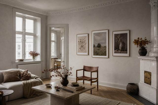
Here is the single most important styling point in this article: grey art needs warm company. Grey does not fail because of the print; it fails because everything around it is also cool. Surround it with warmth and even the stormiest sky feels inviting.
- Frame in oak, not silver. A natural oak or walnut-toned wooden frame instantly warms a grey print. Save black frames for the storm-sky mood, where crispness is the goal.
- Add wool within arm's reach. A chunky wool throw or a looped-pile cushion in oat, rust or mustard placed near the print gives the eye a warm texture to bounce between.
- Bring in brass or aged gold. One brass candlestick, lamp base or picture light near grey art shifts the whole wall from office to home.
- Warm the light itself. Bulbs around 2700K flatter grey enormously; cool daylight bulbs are what make grey rooms feel like waiting rooms.
- Let one earthy accent in. Terracotta, ochre or blush, in a vase or a second small print, keeps an all-grey scheme from becoming airless.
Notice that none of these moves touches the art. The print stays serenely grey; the room does the warming.
The all-grey trio: a recipe you can copy
If you want a ready-made arrangement rather than a single statement, here is a trio that works on almost any wall of two metres or more: two 30x40 cm prints plus one 50x70 cm print, all in grey tones but one from each mood.
Choose a greige abstract and a line drawing in the two 30x40 cm frames, and a storm-sky or concrete photograph for the 50x70 cm anchor. Hang the large print first, with its centre about 145 to 150 cm from the floor. Place the two smaller prints to one side, stacked with 7 to 8 cm between them, and keep the same 7 to 8 cm gap between the stack and the anchor. Aligning the outer edges into a clean rectangle keeps the asymmetry deliberate rather than accidental.
Because the three prints share a colour family but not a mood, the group reads as collected rather than bought in one click, which is exactly the effect you want. If you would rather test the arrangement before making holes in the wall, the free Gallery Wall Builder lets you drag the exact sizes around a virtual wall until the spacing looks right.
Sizes, frames and placement that flatter grey
Grey is forgiving of colour mistakes but unforgiving of scale mistakes. A too-small grey print does not read as subtle; it reads as unfinished. A few concrete rules of thumb:
- Above a sofa: one 70x100 cm print, or the trio recipe above, aiming for a total width of roughly two-thirds of the sofa.
- Above a bed: a single 70x100 cm centred over the headboard, or two 50x70 cm prints hung 8 cm apart.
- Above a console or sideboard: 50x70 cm is the sweet spot, hung so the frame's lower edge sits 20 to 25 cm above the surface.
- Narrow hallway walls: a vertical 30x40 cm or 40x50 cm storm-sky photo turns a dead corner into a view.
- Frame colours: with 14 frame colours to choose from, the shortlist for grey art is short: oak for warmth, black for drama, white when the wall itself is a colour.
On paper: both of our poster weights, 200 gsm and 230 gsm, render soft grey gradients smoothly, and the heavier 230 gsm stock has a satisfying stiffness that suits large-format storm skies. For a frameless, softer look, especially with concrete textures, a canvas print plays the texture card twice.
FAQ: grey wall art
Does grey wall art make a room look cold? Only if the rest of the room is also cool. Choose greys with warm undertones, frame them in oak, and pair them with wool, linen and brass accents, and grey art reads as calm rather than cold. Lighting matters too: warm bulbs around 2700K flatter grey far more than cool daylight bulbs.
What colours go with grey wall art? Nearly everything, which is why designers lean on it. The most flattering partners are warm: rust, ochre, blush, camel and natural wood tones. For a quieter scheme, layer greys with oat, ivory and greige textiles so the palette shifts tone-on-tone instead of jumping.
What size grey print should I hang above a sofa? Go larger than instinct suggests. A 70x100 cm print suits most three-seat sofas, or use a grouping, for example two 30x40 cm prints plus one 50x70 cm, that spans about two-thirds of the sofa's width with its centre around 145 to 150 cm from the floor.
Is greige warm or cool? Warm. Greige is grey with a beige base, which is why it works so well in bedrooms and Scandinavian-style rooms that would find a blue-grey too stark. If a grey looks slightly brown or mushroomy next to pure white paper, you are looking at a greige.
Can I mix grey prints with black and white art? Yes, and it usually looks intentional, since grey and black and white belong to the same monochrome family. Keep the frames consistent, one or at most two frame colours across the group, and vary the subject matter so the wall feels curated rather than repetitive.
Grey is not the absence of a colour choice; it is one of the most deliberate choices you can make in October, the month that rewards mid-tones more than any other. When you are ready to find your greige, your concrete or your storm sky, explore the full range of grey wall art at Posterlefi and give the quietest colour of the season a wall of its own.
Build your wall virtually before you spend a penny
Arrange sizes and layout on a virtual wall — free, before you buy.

Start with these
See the whole collection →


Related inspiration


100-day returns