


Green Posters: Bring Late-Summer Calm Indoors
Green is the bridge colour from summer into autumn. Three practical strategies — sage-and-beige bedrooms, forest-green dining statements, and green art on white rental walls — with sizes, frames and layouts to copy.
There is a point in late summer when the evenings draw in and the house quietly asks for a change. You are not ready for the rust and amber of full autumn, but plain summer whites are starting to feel thin. This is exactly where green posters earn their keep: green belongs equally to both seasons, reading fresh and leafy in August, then calm and grounded in October, without you changing a single thing on the wall.
This guide treats green as a bridge colour and works through three practical strategies: soft sage with warm beige for bedrooms — arguably the calmest pairing of 2026 — deep forest green as a dining-room statement, and, for renters with a no-paint clause, letting green wall art carry the colour work alone. Along the way: concrete sizes in centimetres, frame pairings and layouts you can copy.
Why Green Bridges Summer and Autumn
Most colours commit to a season. Pale blue belongs to summer; terracotta announces autumn the moment it goes up. Green does neither: it borrows its mood from the light around it. In bright July sun a sage print looks airy and botanical; under a low October sky the very same print reads as mossy, muted and warm. You get two seasons from one wall.
Green is also the colour your eye associates with rest — shade, foliage, the view you seek when a room feels stuffy. As art, it concentrates that effect into a framed moment you actually look at; one well-chosen green print often changes a room more than a repainted wall.
Strategy One: Sage and Beige in the Bedroom
If 2026 has one signature calm pairing, it is sage green with warm beige. Sage is green with the volume turned down — a grey-softened, dusty shade that never fights a bedroom's low light. Beige, oat and greige give it a warm base, and together they land in that rare zone where a room is clearly decorated yet completely restful.
The simplest way in: keep bedding and curtains in the beige family, then let sage green prints supply the colour above the headboard. Two mid-size prints beat one small one — a pair of 30x40 cm over a 140 cm bed, or 50x70 cm over a wider bed, gives the wall rhythm without dominating it. Hang them 5–8 cm apart with the lower edge 20–25 cm above the headboard, so the group reads as connected to the bed.
- The pairing recipe: sage artwork, oat or sand bedding, and one darker accent — an olive cushion or walnut lamp — to stop the scheme going flat.
- Motifs that suit sleep: single-stem botanicals, soft abstracts, misty landscapes — slow lines rather than busy detail.
- Frame choice: light oak keeps the mood natural; white frames melt into pale walls and soften the green further.
- Sizes to trust: 2 x 30x40 cm above a 140 cm bed, 2 x 50x70 cm above a 180 cm bed, or a single 70x100 cm as one quiet statement.
- What to avoid: high-contrast black frames around dark motifs — in a sage-and-beige room they pull the eye like a full stop in the wrong place.
One caveat: in a north-facing room sage can drift cool and grey — warm it up with brass, rattan or a caramel throw.
Strategy Two: Forest Green as a Dining-Room Statement
Where sage whispers, forest green speaks in a full voice. Deep bottle and pine greens carry a candlelit, gathered-around-the-table quality, which makes the dining room their natural home. Skip the cluster of small pieces here: one large, dark, confident print anchors the whole eating area.
Scale is the entire trick. Above a sideboard, a 70x100 cm print in a deep green motif — a dark forest photograph, moody oversized leaves — instantly gives the room a centre of gravity. On a longer wall, hang a pair of 50x70 cm prints aligned with the table's centre line rather than the wall's. Dark art on a pale wall creates the drama; the green keeps it from feeling stark.
Pair forest green with materials that already live in most dining rooms: oak or walnut furniture, linen napkins, stoneware. A black frame sharpens a dark green print into something graphic; oak softens it toward the rustic. If your chairs or rug already carry colour, keep the print to green plus one neutral.
Strategy Three: Green Doing the Colour Work on Rental Walls
If you rent, the white wall is your fixed condition — and a better starting point than it gets credit for. White walls make green look its most vivid, the way foliage pops against an overcast sky. Treat white as a gallery backdrop and let two or three green pieces carry every drop of colour in the room.
The key is distribution. One green print in a white room can look like an accident; green repeated at two or three points reads as a deliberate scheme. Hang your largest piece — say a 50x70 cm botanical — at the natural focal point, then echo it with a 30x40 cm print on an adjacent wall and a plant or cushion at seat height. The eye connects the three points, and the room feels designed without a paintbrush in sight.
Because everything hangs rather than paints, the whole scheme moves out when you do. To plan the arrangement before committing to nail holes, the free Gallery Wall Builder lets you arrange sizes and spacing on screen first, so you drill once and get it right.
Know Your Greens: Sage, Olive, Forest and Emerald
"Green" covers an enormous family, and the undertone decides the mood. Sage leans grey and quiet; olive leans yellow and earthy; forest leans blue-black and formal; emerald is saturated and celebratory. When a green scheme feels wrong, it is almost always an undertone clash.
A simple rule keeps you safe: match the green's temperature to the room's warmth. Oak, rattan and brass suit olive and warm sage; grey floors, chrome and cool white suit forest and the cooler sages. Emerald behaves like an accent and is best used in a single piece. For the bridge into autumn, olive and forest are your strongest allies — both carry the depth that suits shorter days.
Motifs That Carry the Season
The motif decides whether green feels like summer holding on or autumn arriving. Leafy, light-filled subjects — ferns, eucalyptus, meadows — keep summer alive well into September; darker subjects — dense forests, moss, pine — welcome autumn in. A clever trick is to hang one of each in the same room: as the season turns, your attention naturally shifts from one to the other.
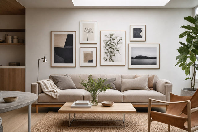
Browse botanical posters for the leafy end of the spectrum, and nature prints for forests, mountains and mistier scenes. Abstract green art is the third and most flexible path: soft shapes and colour-field prints give you the tone without a literal subject, suiting minimalist rooms where a fern might feel too sweet. Black and white photography with a single green piece among it also looks sharp and very Scandinavian.
Frames and Textiles: The Finishing Layer
Green art rewards natural materials. Oak is the default frame for a reason: its warm, visible grain quietly does what the green does loudly — it brings the outdoors in. Around the art, linen is green's best textile partner; its irregular weave in oat or white adds texture in the same relaxed register.
- Sage prints + oak frames + oat linen: the full 2026 bedroom recipe in one line.
- Forest green print + black frame + white wall: maximum contrast, graphic and modern — ideal for dining rooms and hallways.
- Olive prints + walnut frame + caramel leather: the warmest version of green, made for autumn evenings.
- Mixed green gallery + identical oak frames: when the artworks vary, matching frames hold the group together.
- One emerald accent + brass details: a single saturated print plus metallic warmth for glamour without repainting.
A note on paper: greens with subtle tonal shifts keep their depth beautifully on premium 200 gsm or 230 gsm poster paper, with the heavier weight suiting large statement formats. Matching wooden frames come in fourteen colours, covering the oak, black and walnut looks above.
Sizes and Layouts You Can Copy
Five layouts cover almost every wall-and-furniture situation:
- The bedroom pair: 2 x 30x40 cm or 2 x 50x70 cm above the bed, 5–8 cm apart, centred on the headboard.
- The dining statement: one 70x100 cm dark green print above a sideboard, its centre roughly 145–150 cm from the floor.
- The rental triangle: 50x70 cm at the focal point, 30x40 cm on an adjacent wall, plus one green object at seat height.
- The triptych: three 30x40 cm botanicals in a row above a sofa — identical spacing, motifs from the same family.
- The mixed gallery: five to seven pieces from 21x30 cm up to 50x70 cm, greens mixed with black and white, arranged around a centre line at eye height.
For the gallery option in particular, plan before you hammer: mixed sizes are easy to get wrong on a wall and easy to get right on screen.
Frequently Asked Questions About Green Posters
What colours go best with green posters?
Warm neutrals are the safest partners: beige, oat, sand and warm white let any green breathe. For more depth, pair sage with soft terracotta, forest green with black and brass, or olive with caramel and walnut. Match temperature — warm greens with warm neutrals, cooler greens with grey-based schemes.
Is green a good colour for bedroom wall art?
Yes — green is widely considered one of the most restful colours to look at, making it a natural bedroom fit. Choose muted shades such as sage rather than saturated emerald, and pair them with soft, low-contrast motifs. A pair of sage prints above the headboard with beige bedding is one of the calmest schemes you can build in 2026.
What size green poster should I hang above a bed or sofa?
Aim for art roughly half to two-thirds the width of the furniture beneath it. Above a 180 cm bed that means a pair of 50x70 cm prints or one 70x100 cm; above a standard sofa, a 70x100 cm statement or a row of three 30x40 cm prints. Hang the lower edge 20–25 cm above the headboard or sofa back so the pieces read as connected.
Do green posters work in autumn, or are they just a summer colour?
Green genuinely works year-round, which is exactly why it makes such a good bridge from summer into autumn. Lighter sages and leafy botanicals hold on to the summer feeling, while olive and forest greens deepen naturally as the light gets lower. Many people keep the same green art up all year and let the changing daylight do the restyling.
How do I add green to a rental apartment without painting?
Let wall art do the colour work: hang your largest green print at the focal point, then repeat the colour in one or two smaller spots — a second print, a plant, a cushion. White rental walls flatter green, giving it a crisp gallery backdrop, and the whole scheme moves with you.
Ready to bring the bridge colour home? Explore the full range of green posters and prints — soft sage to deep forest — and find the pieces that will carry your rooms gently into autumn.
Build your wall virtually before you spend a penny
Arrange sizes and layout on a virtual wall — free, before you buy.

Start with these
See the whole collection →


Related inspiration

100-day returns