


Passe-Partout Mats: What They Are and When to Use One
A passepartout is the mat between print and frame - and it can make or break a poster. Learn when matting lifts artwork, when it steals impact, and which frame sizes pair with which prints.
A passepartout — also called a picture mount or mat — is the flat board that sits between a print and its frame, surrounding the artwork with a clean border of empty space. The frame holds everything together; the passepartout is the window inside it, and its opening decides how much of the image you see. Beyond the mechanics, it does one important visual job: it creates a breathing zone around the art, separating the image from the frame moulding so your eye settles on the picture instead of the hardware around it.
It is also one of the most misunderstood tools in framing. Used well, a mat can turn a modest 30x40 cm print into something that looks borrowed from a gallery. Used badly, it can shrink a bold statement poster into a timid rectangle floating in cardboard. This guide covers what a passepartout actually is, when matting posters pays off, when it steals impact, and the frame-size pairings that make the whole presentation look deliberate.
What a passepartout actually is
The name comes from the French passe-partout, literally “passes everywhere” — the same word once used for a master key. The etymology fits: a mat is the adapter that lets one artwork fit many frames, or one frame flatter many artworks. Physically, it is a sheet of thick, rigid board, usually 1.4 to 2 mm, with a window cut into it. That window is almost always cut at a 45-degree bevel, so a thin sloping edge of the board’s core shows around the image — that small diagonal line of white is one of the quiet signals that a picture was framed with care.
A good mat is more than decoration. It lifts the print away from the glass, which matters because paper pressed directly against glazing can stick to it over time or ripple with changes in humidity. That air gap is why professional framers mat nearly everything valuable. With posters printed on sturdy stock — Posterlefi prints on premium 200 gsm and 230 gsm paper — the risk is smaller, but the gap still keeps the surface pristine.
What a mat does to your eye
Hang two identical prints side by side, one matted and one not, and the difference is immediate. The matted version reads as more intentional. Part of that is convention: galleries and museums have matted works on paper for over a century, so we associate the look with art someone decided was worth protecting. Part of it is optics: the empty border isolates the image from the wall colour and the frame, giving it a neutral stage where nothing competes.
A mat also adds literal depth. Because the print sits a couple of millimetres behind the mat surface, the framed piece becomes a layered object rather than a flat one, and the bevelled window edge catches light differently through the day. Finally, there is scale: a mat makes the framed object considerably larger than the image itself, which lets a small print hold its own on a wall that would otherwise swallow it.
When a passepartout lifts a poster
The general rule: the smaller, quieter and more detailed the motif, the more a mat gives back. A generous border pulls you in close and rewards inspection. These categories benefit most:
- Line art and one-line drawings — thin black strokes can look sparse in a bare frame; a wide mat presents the emptiness as a feature.
- Photography — especially black and white. A bright white mat inside a slim black frame is the classic photo-gallery formula for a reason.
- Botanical studies and vintage illustrations — a warm off-white mat echoes old paper and makes modern prints feel like collected specimens.
- Text and typography prints — words need silence around them, and a mat provides it.
- Small formats — anything 21x30 or 30x40 cm gains presence from matting, because the total framed size grows while the image stays intimate.
On a wall of mixed sizes, matting also lets modest prints keep up with larger neighbours without you buying everything in 50x70 cm.
When a mat steals impact
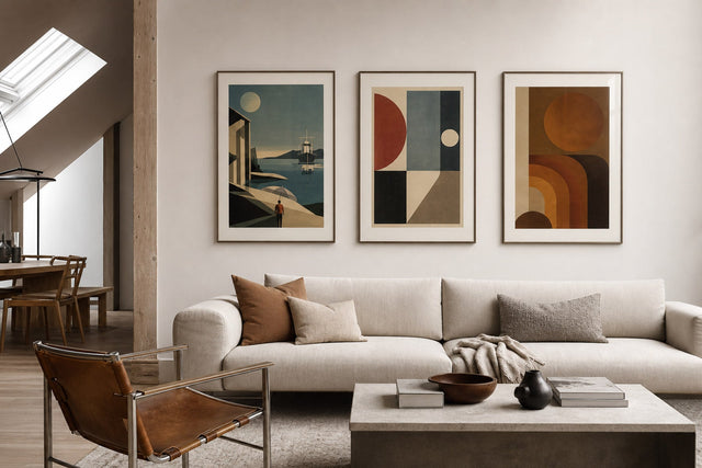
Now the advice nobody prints on the packaging: a passepartout is not always an upgrade. Large statement posters — 50x70 cm and 70x100 cm — work because of their scale. They are designed to be read from across the room. Put a 10 cm border around one and you have paid for a huge frame while shrinking the image that was doing all the work. The result often looks hesitant, as if the poster were apologising for itself.
The same goes for art composed to reach the edges. Full-bleed photography, saturated colour-field abstracts and dense maximalist patterns are designed to fill their rectangle; a mat interrupts the composition rather than framing it. On a tightly packed gallery wall, mats on every piece can fragment the arrangement into small floating islands instead of one confident whole. And if the artwork already has a printed white border — as many Scandinavian-style prints do — adding a mat doubles the whitespace to the point of dilution.
The frame-size trick that makes prints look expensive
Here is the most useful practical move in matting: buy a frame one or two standard sizes larger than the print, and let the mat bridge the gap. A 30x40 cm print inside a 50x70 cm frame with a wide mat reads as considered and expensive — you have added drama with board rather than with a bigger artwork. Some shops sell the combination ready-made as a passepartout frame, meaning a frame delivered with a pre-cut mat. Because standard poster sizes step up in regular intervals, the pairings are easy to remember:
- 21x30 cm print in a 30x40 cm frame — roughly a 4.5 to 5 cm border; tidy and classic for hallways and shelves.
- 30x40 cm print in a 40x50 cm frame — a 5 cm border all round; the safest all-purpose pairing.
- 30x40 cm print in a 50x70 cm frame — around 10 cm of border; the full gallery-drama option.
- 40x50 cm print in a 50x70 cm frame — note the border will be wider top and bottom (10 cm) than at the sides (5 cm); framers often raise the window slightly so it reads as balanced.
- 50x70 cm print in a 70x100 cm frame — museum-scale presentation for high ceilings and large, calm walls.
Two rules keep these pairings looking right. First, a mat border should be at least 5 cm wide; a skinny 2 cm strip looks like a measuring error rather than a decision. Second, when the border cannot be equal on all sides, keep left and right symmetrical and put the extra width at the bottom — a slightly bottom-weighted mat looks centred to the human eye, while a top-heavy one makes the print appear to sink.
Choosing mat colour and frame pairings
White is the default for good reason, but white is not one colour. A bright, cool white suits black and white photography and crisp graphic prints, especially in a black or white frame. A warm off-white or cream flatters botanicals, vintage motifs and anything on a toned background, and pairs beautifully with oak and walnut frames. The mistake to avoid is a mat that is whiter than the paper of the print itself, which makes the artwork look yellowed by comparison. When in doubt, match the mat to the unprinted margin of the poster, or go slightly warmer — never cooler.
Darker mats are a styling statement rather than a neutral choice. A black mat around a moody photograph in a black frame creates a dense, dramatic object that suits home offices and dim hallways. Coloured mats can charm in a child’s room, but they date faster than neutrals. If you want colour in the presentation, it is usually safer to put it in the frame — Posterlefi’s wooden frames come in 14 colours and 13 sizes, which leaves plenty of room to be brave.
Passepartouts on a gallery wall
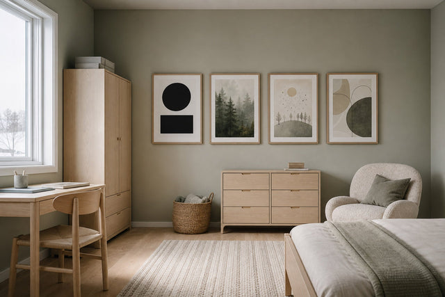
Mats earn their keep on gallery walls, where they solve rhythm problems no frame can. Mixing matted and unmatted pieces creates two visual registers: large unmatted posters carry the colour and scale, while matted smaller pieces add points of calm and detail between them. Keep the mat colour consistent across the wall — one white, not three — even if the frames vary; the repeated border is what ties unrelated motifs together.
Because matting changes the outer dimensions of every piece, plan before you hammer. The free Gallery Wall Builder lets you arrange frames and sizes on a virtual wall first, so you can test whether that 50x70 cm frame holding a matted 30x40 cm print balances the layout — and move it in seconds instead of patching plaster. A reliable starting pattern: one large unmatted anchor (50x70 or 70x100 cm), two or three matted mid-sizes in 40x50 or 50x70 cm frames, and a few small unmatted fillers, all hung with a consistent 5 to 7 cm gap.
Frequently asked questions about passepartouts
What is a passepartout in framing?
A passepartout is the thick paper board mounted between a print and the frame, with a window cut out so the artwork shows through. It creates a visual border around the image and lifts the paper away from the glass. In English it is also called a picture mount or a mat — all three names refer to the same thing.
Should I use a passepartout on every poster?
No. Mats flatter small, detailed and quiet motifs such as photography, line art, botanicals and typography, but they reduce the impact of large statement posters and full-bleed designs that rely on scale. As a rule of thumb, mat prints of 40x50 cm and under, and hang 50x70 cm and larger without one.
What size frame do I need for a 30x40 cm print with a mat?
A 40x50 cm frame gives a classic 5 cm border, while a 50x70 cm frame gives a wide, gallery-style border of around 10 cm. Both are standard sizes, so ready-made frames and pre-cut mats are easy to find. The wider option makes a small print feel like a far larger piece.
Is a passepartout the same as a picture mount?
Yes. Passepartout is the term used across continental Europe and Scandinavia, picture mount is standard in British English, and mat or matboard is the American term. When buying, simply check two measurements: the outer size, which must match the frame, and the window, which should be slightly smaller than the print so the edges stay hidden.
Does a passepartout protect the print?
Yes, in two ways. It holds the paper a couple of millimetres off the glass, preventing the print from sticking or rippling with humidity, and an acid-free mat shields the edges of the sheet from handling. Heavyweight posters on 200 or 230 gsm stock are naturally more robust, but the air gap never hurts.
The best way to learn what a mat can do is to frame one pairing and live with it for a week. For a starting point, browse Posterlefi’s bestselling posters — small formats among them take beautifully to a wide white border — or explore the full range of 8,000+ posters and art prints to find the piece your frame has been waiting for. With 100-day returns, there is room to change your mind about the mat, the frame and everything in between.
Build your wall virtually before you spend a penny
Arrange sizes and layout on a virtual wall — free, before you buy.

Start with these
See the whole collection →


Related inspiration

100-day returns