


Gallery Wall Above the Sofa: Exact Heights and Layouts
A numbers-first guide to the gallery wall above the sofa: the exact heights, widths and spacing that make art above the couch look intentional, plus three ready layouts for a standard three-seater.
The wall above the sofa is the most attempted, most botched wall in the home. Prints hung so high they seem to float away from the furniture, a lonely 30x40 cm frame adrift on three metres of plaster, clusters that lean to one side because the hanging started at the wrong end. If you are planning a gallery wall above the sofa, here is the reassuring truth: almost every one of those mistakes comes down to numbers, and the numbers are known.
This is a numbers-first guide to art above the couch: the exact heights, widths and sofa-to-frame distances that make a wall look intentional, plus three ready-made layouts for a standard three-seater. You will need a tape measure and a pencil more than you will need an eye for design. And because rehanging is far less fun than planning, we will also show you how to test every layout on screen before you make a single hole.
The three numbers that fix the sofa wall
Walk through any well-styled living room and measure what you see. The sofa walls that look right obey the same few measurements, whether they hold one large print or eleven small ones.
- Total width: the art should span roughly two thirds of the sofa's width. For a 220 cm three-seater, that means a composition between 145 and 165 cm wide, gaps included.
- Bottom edge: the lowest frame edge sits 20-25 cm above the backrest. Any closer and heads bump frames; much higher and the art disconnects from the furniture.
- Visual centre: the centre of the whole composition lands at 145-150 cm above the floor, which is standing eye height for most adults.
- Gaps: leave 5-8 cm between frames, and keep that gap identical across the entire wall.
When two rules collide, the backrest rule wins. If your sofa has an unusually tall back, keeping the bottom edge 20-25 cm above it may push the composition's centre past 150 cm; accept it. The sofa and the art are read together as one unit, so their relationship matters more than the abstract eye-height ideal.
How high to hang art above a couch
Galleries hang work so its centre sits at roughly 145-152 cm, and on an empty wall that rule serves you well. A sofa changes the maths. A typical three-seater backrest stands 80-90 cm from the floor; add the 20-25 cm gap and your bottom frame edge lands between 100 and 115 cm, noticeably lower than most people's instinct.
Hanging too high is the single most common mistake on this wall. If your first reaction when you hold the frame at the measured height is that it looks too low, you are almost certainly in exactly the right place.
Leave breathing room at the top as well. Aim for at least 30 cm of bare wall between the top frame edge and the ceiling, so the composition reads as anchored to the sofa rather than stretched to fill every centimetre of plaster.
Layout one: a single 70x100 statement print
The simplest solution is one large print, and large means large. A 70x100 cm poster hung in landscape orientation gives you a full metre of width, and a wooden frame adds another few centimetres. That comfortably passes the two-thirds test on sofas up to about 160 cm and holds its own up to roughly 200 cm if the motif is bold.
Hang it so the bottom frame edge sits 20-25 cm above the backrest and its centre lines up with the centre of the sofa, not the centre of the wall. Printed on heavyweight 230 gsm paper in a solid wooden frame, a single oversized motif — a muted abstract, a large-scale botanical, a black and white photograph — carries more presence than a scatter of small prints ever will.
On a wider sofa, one print can still work if you treat restraint as the point: a lone 70x100 centred over a 240 cm sofa reads as deliberately minimalist, especially in a pale Scandinavian room.
Layout two: a row of three 50x70 prints
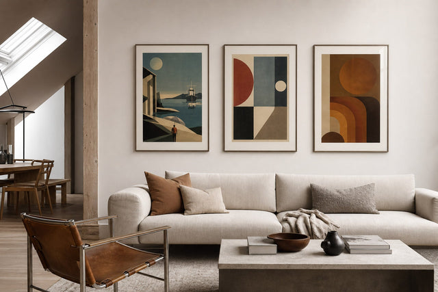
The classic sofa wall. Three 50x70 cm prints hung in portrait orientation with 7 cm gaps span 164 cm, which is almost exactly two thirds of a 240 cm sofa and a generous, correct proportion above a 220 cm one.
Three habits keep a row looking sharp. Hang all three at exactly the same height, so the bottom edges form one clean line 20-25 cm above the backrest. Keep the gaps identical; 6-8 cm reads as one composition, while anything past 10 cm lets the prints fall apart into three separate objects. And unify the framing with a single frame colour across all three, even when the motifs differ.
As for what goes in the frames, the trio format is forgiving: three botanical studies, three line-art figures, three city maps in one palette, or a single wide landscape split across three sheets. Variety works as long as one element — colour, subject or frame — stays constant.
Layout three: an anchor with satellites
The cluster wall is the most flexible layout and the easiest to get wrong. The fix is to stop thinking of it as many pictures and start thinking of it as one shape with a boss. Choose an anchor — a 50x70 or a 70x100 — and place it just off-centre, with its midpoint near the 145-150 cm line. Then build outward with satellites: a 30x40, a pair of 21x30s, perhaps a small 13x18.
Keep every gap in the cluster at the same 5-8 cm, and keep the outer silhouette roughly rectangular — about 150-165 cm wide for a standard three-seater and 60-80 cm tall. The lowest frame still respects the 20-25 cm rule. Mixing portrait and landscape orientations creates rhythm, but it is the consistent spacing that makes nine frames read as one gallery wall instead of a pinboard.
Because clusters involve the most holes, they benefit most from planning. Lay the arrangement out on the floor inside a taped-off rectangle and photograph it before you transfer it to the wall — or skip the floor entirely and plan it digitally.
Colours and pairings that hold the wall together
A layout can be measured; a palette has to be chosen. The reliable method is to pick two or three colours, let one of them echo something already in the room — the sofa itself, a rug, a throw — and repeat those colours across every print. Frames count as a colour too: with wooden frames available in 14 colours, one consistent frame tone is the fastest way to unify mixed motifs. And with more than 8,000 posters and art prints to choose from, a fixed palette is less a limitation than a survival tool.
- Sage green, warm sand and charcoal — calm and Scandinavian, ideal over a grey or beige sofa; botanicals and line art both sit happily here.
- Terracotta, dusty pink and cream — warms up rooms with oak or walnut furniture and pairs well with soft abstract shapes.
- Black and white with one muted accent — photography plus a single dusty blue or green print; the safest scheme above a dark sofa.
- Mixed greens with white borders and oak frames — a botanical wall that keeps a light room feeling airy rather than busy.
If you would rather see worked examples than rules, browse our curated gallery wall ideas to see how palettes and layouts combine on real walls.
Test all three layouts before you hammer
Here is where the tape measure meets the screen. The free Gallery Wall Builder lets you set up a virtual wall, drop in prints at their true sizes and drag them around until the spacing and proportions work — before a single nail goes into the plaster.
The practical move is to build all three layouts from this guide — the single 70x100, the row of three 50x70s and the anchor-plus-satellites cluster — on the same virtual wall and compare them side by side. Ten minutes of dragging frames on screen answers the questions that would otherwise cost you a wall full of test holes: whether a cluster feels busy above your particular sofa, whether one large print looks lost, or whether the trio should grow from 50x70 to something larger.
Hanging day: a fifteen-minute method
Once the layout is settled, the hanging itself is a short, calm job if you work in the right order.
- Mark the sofa's centre line, not the wall's. Run a strip of painter's tape vertically above the middle of the sofa; every layout is centred on this line.
- Set the bottom line. Measure the backrest height, add 20-25 cm, and run a horizontal strip of tape at that height. Every bottom frame edge relates to this line.
- Make paper templates. Trace each frame on packing paper, cut the shapes out and tape the full layout to the wall. Live with it for a day if you can.
- Measure the drop. On each frame's back, measure from the top edge down to the tensioned wire or bracket, then transfer that distance down from the template's top edge to place each hook precisely.
- Hang from the anchor outward. Start with the largest or most central piece, then work outward, checking each frame with a spirit level as you go.
One extra tip for the big formats: a 70x100 hangs flatter and stays straight on two hooks set 20-30 cm apart rather than on a single nail.
Gallery wall above the sofa: FAQ
How high should you hang art above a sofa? Set the bottom edge of the frame 20-25 cm above the backrest. On a typical sofa with an 80-90 cm back, that puts the bottom edge 100-115 cm from the floor and the centre of the composition near 145-150 cm — lower than most people expect, and correct.
How wide should a gallery wall above the sofa be? Aim for roughly two thirds of the sofa's width, gaps included. For a 220 cm three-seater that means about 145-165 cm of total art width; much narrower looks lost, while full sofa width looks crowded.
Should art be centred on the sofa or on the wall? On the sofa. The sofa and the art above it are read as a single unit, so if the sofa sits off-centre on the wall, centre the composition over the sofa and let the wall be asymmetric. Centring on the wall instead is what makes a room feel subtly off.
What size posters work above a three-seater couch? Three 50x70 cm prints with 6-8 cm gaps span about 164 cm and suit sofas from 220 to 240 cm. Alternatively, hang a 70x100 as a single statement on a smaller sofa, or use it as the anchor of a cluster with 30x40 and 21x30 satellites on a larger one.
How much space should there be between frames? Keep 5-8 cm between frames and keep it identical across the whole wall. Consistent spacing is what makes several prints read as one composition; uneven gaps read as clutter.
The sofa wall rewards ten minutes of measuring more than any other wall in the home. Settle on your numbers, test the layout digitally, and hang once. When you are ready to fill the frames, explore the Scandinavian living room collection — and with 100-day returns, even the print you were not quite sure about gets a fair audition above the sofa.
Build your wall virtually before you spend a penny
Arrange sizes and layout on a virtual wall — free, before you buy.

Start with these
See the whole collection →


Related inspiration
100-day returns