


The Starry Night: The Story Behind van Gogh's Night Sky
The real story and meaning behind van Gogh's The Starry Night — and how to bring its swirling, deep-blue night-sky mood home with painterly wall art.
Few paintings own the night the way The Starry Night does. Vincent van Gogh painted it in June 1889, looking out from a small room in the south of France, and more than a century later its swirling sky is still the image most of us see when we close our eyes and picture the stars. The original hangs in the Museum of Modern Art in New York, but the mood it captures hangs, in some form, in homes all over the world.
And that mood matters most right now. As October pulls the evenings in and darkness arrives before dinner, deep-blue, painterly night skies stop feeling melancholy and start feeling like home. This guide tells the real story behind the painting, unpacks what its restless sky actually means, explains the post-impressionist thinking that produced it, and then gets practical: how to bring that expressive night-sky atmosphere onto your own walls, no museum required.
The night behind The Starry Night
In May 1889, after the breakdown in Arles that ended with the loss of part of his left ear, van Gogh admitted himself to the Saint-Paul-de-Mausole asylum near Saint-Rémy-de-Provence. His upstairs room had a window facing east, over a walled wheat field toward the low Alpilles hills, and he watched that view obsessively. Writing to his brother Theo that June, he described looking out long before sunrise at "the morning star, which looked very big" (Vincent van Gogh, letter to Theo, June 1889). That morning star, the planet Venus, is the brilliant white orb glowing beside the cypress in the finished painting.
Here is the detail that surprises most people: The Starry Night was not painted at that window in the dark. Van Gogh worked on it in a downstairs studio during the day, from memory and imagination. The sky is observed; the village below is largely invented, and its slender church spire looks far more like the Netherlands of his childhood than anything in Provence. The painting is not a view. It is a composite of what he saw, what he remembered and what he felt, which is precisely why it still works.
What you are actually looking at
Stand in front of the image for a moment and it organises itself into three zones. The sky claims roughly two thirds of the canvas: eleven stars, each wrapped in its own halo of light, a crescent moon burning orange in the top corner, and between them the famous double spiral rolling through the blue like a wave about to break. Below sits the sleeping village, dark, geometric and quiet, with a handful of warm windows still lit. In the foreground a cypress tree flames upward, the only element in the composition that touches both earth and sky.
Nothing in the picture is still. The stars pulse, the sky churns, even the hills roll like swells. Physicists have noted that the swirls resemble the mathematics of turbulent flow. Whether or not van Gogh intuited any science, he certainly understood movement: every brushstroke is a short, loaded dash of thick paint, laid side by side until the whole surface seems to vibrate.
What does The Starry Night mean?
Van Gogh left no tidy explanation. He mentioned the canvas only in passing in his letters and later worried that he had pushed the stylisation too far. Yet a century of readings has been surprisingly consistent. The night sky was, for van Gogh, a place of consolation and enormous vitality; he had already painted Starry Night Over the Rhône and Café Terrace at Night in Arles the year before, so this was a lifelong subject, not a one-off vision.
Most interpretations circle the same tension: turbulence above, calm below. The sky heaves with energy while the village sleeps peacefully under it, windows lit. The cypress, a tree planted in Provençal graveyards, bridges ground and heavens and is often read as a link between life and whatever follows it. The most honest answer to what The Starry Night means is that it is an inner state projected onto a landscape: anxiety and hope held in the same frame. That doubleness is exactly why the image comforts as much as it unsettles.
Post-impressionism, briefly explained
The impressionists painted what the eye sees: light, weather, the fleeting moment. The post-impressionists, the loose generation that followed them and included van Gogh, Gauguin, Cézanne and Seurat, kept the bright palette but rejected the neutrality. They wanted painting to carry structure, symbol and above all emotion. Colour could be chosen for feeling rather than accuracy, a line could exaggerate, and a sky could swirl if the painter's mind did.
The Starry Night is post-impressionism at full volume: thick impasto you could read with your fingertips, rhythmic directional strokes, colour keyed up far beyond nature. Those three qualities, visible brushwork, emotional colour and built-in movement, are also your checklist when you shop for wall art in this spirit. If a print feels painted rather than photographed, and the colour seems chosen for mood rather than realism, you are in the right territory.
Why night skies belong to long autumn evenings
There is a seasonal logic to hanging dark art in October. The Scandinavian approach to the dark months has never been to fight them but to furnish them: lamps pooled low, candles lit early, textures deepened. A deep-blue painterly sky does on a wall what a candle does on a table. It makes the darkness feel intentional. Instead of resenting the five o'clock dusk, you echo it indoors in a richer, more deliberate key.
Deep blue is also far easier to decorate with than its reputation suggests. On a wall it behaves almost like a neutral, flattering white paint, grey plaster, oak floors and brass lamps alike. The same goes for moody, painterly landscape art in general: dusk scenes, mountains under fading light, dark water. In summer these motifs read as dramatic; in autumn they simply read as true.
Get the starry night look: colours and pairings
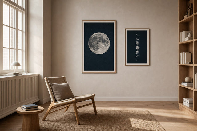
You do not need the original, and only MoMA has it anyway. What you need are expressive, painterly designs with visible brush texture, a deep blue ground and small concentrated bursts of light: moons, stars, lit windows, reflections on water. Among Posterlefi's 8,000+ posters and art prints there is a wide seam of exactly this kind of motif, and the fastest route in is by colour, through the blue wall art collection. From there, build the palette around the print:
- Prussian blue + golden yellow: the classic Starry Night pairing. Keep yellow to roughly a tenth of the scheme, a cushion, a brass frame edge, a lamp glow, so it sparks against the blue instead of competing with it.
- Midnight blue + cream and oak: the softest, most Scandinavian version. Cream walls and pale wood let a dark print feel cosy rather than heavy.
- Deep teal + rust or terracotta: a warmer autumn take that nods to the orange moon in the painting. Works beautifully with leather and wool.
- Navy + black frame on a white wall: the graphic, gallery-like option. Crisp, modern and hard to get wrong.
- Layered blues: hang two or three blue works of different intensity, ink, cobalt, dusty blue, together so the wall itself gets depth, like a sky moving from dusk to full night.
Sizes, frames and paper that do a sky justice
Swirling, painterly motifs need room to move; at postcard scale the drama collapses. Scale up more confidently than feels natural and follow a few concrete rules:
- 70×100 cm above a sofa or bed is the statement move. Hang it with the centre of the print about 145-150 cm from the floor, and leave 20-30 cm of air between furniture and frame.
- 50×70 cm suits hallways, home offices and reading corners, big enough for the swirls to breathe, small enough to live on a narrower wall.
- 30×40 cm works as a satellite piece: a small moon study or star motif flanking a larger work in a group.
- Frame warm or frame sharp. Oak and walnut tones soften a dark motif for bedrooms; a black frame sharpens it for living rooms. Posterlefi's wooden frames come in 14 colours and 13 sizes, so matching frame to motif and room is straightforward.
- Choose paper for depth. Both the 200 gsm and the heavier 230 gsm premium poster papers carry dense, dark colour fields well, and a saturated night blue is exactly where that quality shows.
If you want the motif to feel even more like a painting, a canvas print adds physical surface texture that suits impasto-style artwork particularly well.
Building a night-sky gallery wall
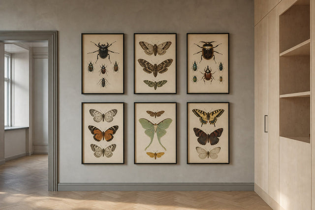
One dramatic sky can anchor an entire wall. The trick is contrast: let the night-sky piece be the loudest voice and surround it with quieter ones, a pale botanical silhouette, a black and white photograph, a small abstract in a single colour. Keep spacing consistent at 5-8 cm between frames, align the group around one strong horizontal or vertical line, and place the darkest, largest piece slightly off-centre rather than dead middle, which keeps the arrangement alive.
Before you put a single nail in the wall, plan the layout digitally. The free Gallery Wall Builder lets you arrange exact print sizes on a virtual wall, test spacing and swap motifs until the balance is right. It turns the most error-prone part of decorating into a ten-minute experiment, and since every order comes with 100-day returns, even the final decision is a low-stakes one.
Frequently asked questions about The Starry Night
Where is The Starry Night now? The original has been in the collection of the Museum of Modern Art in New York since 1941. Everything else, from posters to coffee cups, is a reproduction or an homage.
What is the meaning of van Gogh's The Starry Night? Van Gogh never spelled it out, but the painting is widely read as an inner state made visible: a turbulent, living sky over a calm, sleeping village, with the cypress bridging earth and heavens. Hope and unrest share the same canvas, which is much of its power.
What art style is The Starry Night? It is a landmark of post-impressionism, the movement that pushed beyond impressionism's fleeting light toward emotion, symbolism and expressive technique. Its thick impasto, rhythmic brushwork and heightened colour became a foundation for expressionism in the century that followed.
Is the sky in The Starry Night real? Partly. Venus really was blazing in the pre-dawn sky over Saint-Rémy in June 1889, and the moon and stars are grounded in what van Gogh observed from his window. The village is largely imagined, and the whole scene was composed from memory in his studio.
What colours go with starry night style wall art? Deep blues pair naturally with golden yellow and brass for classic contrast, with cream and oak for a soft Scandinavian look, or with rust and terracotta for autumn warmth. Treat the blue as your anchor and add the warm tones in small doses.
The Starry Night endures because it treats the dark as something rich rather than something to switch off. You can borrow that idea tonight: one expressive, deep-blue sky on the right wall changes how a whole room feels after sunset. Explore the painterly designs in the paintings collection and find the night sky that belongs in your home.
Build your wall virtually before you spend a penny
Arrange sizes and layout on a virtual wall — free, before you buy.

Start with these
See the whole collection →


Related inspiration

100-day returns