


Hygge Decorating: Candlelight, Warmth and Wall Art
Candlelight and warm 2700K bulbs make gold and warm tones glow while cool blues quietly recede. Here is how to use that to your advantage and build a complete hygge corner around two well-chosen prints.
By late October, most of home life happens after dark. In Denmark, where the word was coined, hygge is less a decorating trend than a seasonal survival strategy: when daylight disappears in the middle of the afternoon, you build your own light out of lamps, flames and warm surfaces. That is why the smartest hygge decor decisions are really lighting decisions. The candles on the side table, the low lamp beside the armchair, the pool of gold in the corner of the room — they do not just set a mood. They physically change the colours of everything hanging on your walls.
This guide takes that fact seriously. First we will look at what actually happens to art under warm light — why gold and ochre seem to switch on at 2700K while cool blues quietly step back — and then we will use it to build a complete hygge corner from scratch: one good chair, one warm lamp, two well-chosen prints hung a little lower than usual, and candles kept at a respectful distance from the paper.
What warm light actually does to your art
Light is described by colour temperature, measured in kelvin. Midday daylight sits around 5,500K and carries a full, blue-rich spectrum. A standard warm white bulb runs at 2,700K, with far more red, orange and yellow in the mix. A candle flame drops all the way to roughly 1,800K — almost pure amber. The lower the number, the warmer and more golden the light.
Here is the part that matters for your walls: a pigment can only reflect wavelengths that reach it. A gold or ochre passage in a print is asking for red, orange and yellow light, and at 2,700K it receives plenty — so it appears saturated, luminous, almost lit from within. A cool blue passage is asking for blue light, and warm sources deliver very little of it. Starved of its own wavelength, the blue reads muted, greyer and visually recessive. The same print genuinely changes character between noon and nine in the evening.
None of this is a flaw to correct. Scandinavian interiors have leaned on it for generations: you choose art that is flattered by the light you actually live in during the darkest months, not by the light of a summer showroom.
Colours that glow after dark — and colours that recede
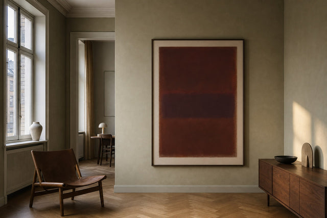
The winners under lamplight and candlelight are consistent: gold, brass and amber; ochre and mustard; terracotta and rust; burgundy and warm brown; cream, sand and sepia. Prints built on these tones gain intensity every time the sun goes down. A gold-toned abstract can behave almost like a light fixture in its own right, bouncing warmth back into the room.
The receding tones are ice blue, mint, lavender and cool grey, and crisp white backgrounds shift toward soft cream. That does not disqualify them — a recessive tone can be a deliberately calm backdrop — but in a room used mainly in the evening, it makes sense to let warm tones lead and cool tones support. Warm neutrals are the safest bridge between the two: the sand and greige tones in beige wall art sit comfortably beside nearly any palette and never fight the flame.
The anatomy of a hygge corner
A hygge corner is a small, deliberate destination inside a room — the place your feet carry you at eight in the evening without being asked. It needs surprisingly few parts, but each one earns its place. If you are furnishing the wider room around it, the calm, pale-wood logic of a Scandinavian living room is the natural frame for everything that follows.
- The chair: an armchair angled 30 to 45 degrees away from the wall so it faces into the room, deep enough to pull your legs up into.
- The lamp: a floor or table lamp with a fabric or opal glass shade and a dimmable 2,700K bulb, positioned so its pool of light overlaps the lower half of the art.
- The art: a pair of prints in a warm palette — typically one 50×70 cm anchor and one 30×40 cm companion — hung as a single unit.
- The table: a small side table within arm's reach for a book, a cup and a candle, kept at least 50 cm out from the wall the art hangs on.
- The textiles: a wool throw and one cushion that repeat a single colour from the prints, tying wall and chair together.
Hang the prints lower than you think
The standard gallery rule puts the centre of an artwork at about 145 cm from the floor — average standing eye height. A hygge corner breaks that rule on purpose, because nobody stands in it. Seated eye height is closer to 110 to 120 cm, so drop the centre of your pair to roughly 125 to 135 cm instead.
In practice, for a vertical 50×70 cm print that means the bottom edge lands around 90 to 100 cm from the floor. If the pair hangs directly above the chair, leave 15 to 25 cm between the chair back and the lower frame edge — close enough to read as one composition, far enough that heads never meet frames. The test is simple: sit down. If the art meets your gaze without you lifting your chin, it is hung correctly, even if it looks slightly low when you stand.
Two-print pairings that work by lamplight
Two prints are the sweet spot for a corner: enough to make a composition, not so much that the wall gets busy. A few pairings that hold up beautifully in warm light:
- Gold abstract + botanical line art: a 50×70 cm gold-toned abstract beside a 30×40 cm line-drawn botanical, hung 7 cm apart with centres aligned — the abstract glows while the line art keeps things quiet.
- Sepia city + cream typography: a vintage-toned 40×50 cm cityscape above a 30×40 cm minimalist text print, stacked vertically with an 8 cm gap, perfect for the narrow wall slice beside a chair.
- Matched warm pair: two 40×50 cm abstracts in ochre and terracotta, side by side at equal height — the calmest, most symmetrical option.
- Terracotta shapes + sand landscape: a 50×70 cm terracotta shape study next to a 50×70 cm dune or desert scene, reading as one wide warm band above a low chair back.
If you want to see any of these before hammering a nail, the free Gallery Wall Builder lets you drag the exact print sizes around a virtual wall and check spacing and balance in minutes.
Layer the light: lamp, bulb and flame
Hygge lighting works in three layers, and the art benefits from all of them. Ambient light stays low: ceiling fixtures dimmed well down or switched off entirely. The middle layer is the corner lamp, and this is where bulb choice matters most. Look for 2,700K or even 2,200K amber filament, a colour rendering index (CRI) of 90 or above so pigments render true rather than muddy, and a dimmer so you can take the room down gradually as the evening deepens.
Placement decides whether the lamp flatters the art or fights it. A lamp roughly level with the artwork, set off to one side, grazes the surface with warmth; a bright source straight in front of framed glass bounces a hotspot back at the chair. The final layer is flame: one to three candles for movement, because flicker adds a kind of life to a wall that no bulb can copy.
Candles and paper art: a safe distance
The one place candlelight and wall art genuinely conflict is proximity. A burning candle sends up a plume of heat and fine soot, and over the weeks that plume will deposit a grey film on anything directly above it — glass, frame and wall alike. A few working rules keep the romance without the residue: never place a burning candle on a shelf or table directly beneath a print; keep at least 50 cm of horizontal offset and a full metre of vertical clearance below the artwork; trim wicks to about 5 mm, since long wicks smoke far more; and keep every flame away from curtains and out of walkways. Framed prints behind glass are well protected from splashes and handling, but glass still dulls under soot, so distance is the real protection. If you love the look of a flame directly beneath the art, battery LED candles have become convincingly warm and flicker without producing a plume.
Frames, paper and surfaces that love low light
Small material choices multiply the effect of warm light. Wooden frames in oak and other warm natural tones carry the lamp's glow right up to the edge of the image, while a black frame gives crisper contrast if the pair needs an anchor. Posterlefi's wooden frames come in 14 colours and 13 sizes, so matching frame tone to print palette is straightforward. The paper matters too: prints come on premium poster paper in 200 gsm and 230 gsm weights, and the heavier 230 gsm stock hangs flatter and feels more substantial inside a frame. And if flame reflections on glass bother you, canvas prints solve the problem outright — no glass, no glare, just surface.
Hygge decor questions, answered
What colour light is best for hygge?
Warm white at 2,700K or lower is the sweet spot, and 2,200K amber filament bulbs get you closest to candle tone. Choose dimmable bulbs with a CRI of 90 or above so your art's pigments stay true. Cooler bulbs above 3,500K read as office light and flatten the mood instantly.
What kind of wall art looks best in candlelight?
Warm-toned art: gold, ochre, terracotta, rust, sepia and cream, because flame light is rich in exactly the wavelengths those pigments reflect. Cool blues and greys mute noticeably after dark, so use them as supporting pieces rather than the star. Metallic and gold-toned prints respond most dramatically of all.
How high should I hang art above an armchair?
Leave 15 to 25 cm between the top of the chair back and the bottom of the frame. In a seated corner, aim for the centre of the artwork at 125 to 135 cm from the floor rather than the standing-height standard of 145 cm. Sit in the chair and check that the art meets your natural eye line.
Are candles safe near posters and framed prints?
Yes, at a distance. Never burn a candle directly beneath artwork — the heat and soot plume rises straight up and will film the glass and wall over time. Keep at least 50 cm of sideways offset and about a metre of clearance below the print, or use battery LED candles where you want flame-light close to the wall.
Does warm lamplight damage posters over time?
Modern LED bulbs emit negligible UV and very little heat, so a warm lamp near your prints is safe for the long term. The real risks to paper art are direct sunlight, which fades pigments, and candle heat and soot at close range. Keep flames at a sensible distance and framed prints will look the same for years.
The fastest way to start is with the print that will do the glowing. Browse the gold collection for pieces built to catch warm light, pick a quieter companion in a warm neutral, and let the October evenings do the rest.
Build your wall virtually before you spend a penny
Arrange sizes and layout on a virtual wall — free, before you buy.

Start with these
See the whole collection →


Related inspiration
100-day returns