


Monet and Impressionism: How to Get the Look at Home
A plain-English look at Monet, impressionism and why the soft painterly style suits modern homes, with practical advice on colors, frames, sizes and layouts for watercolor and painterly prints.
Few painters own a color palette the way Claude Monet does. Search for Monet style art and you already know what you will find: shimmering water, blurred gardens, skies broken into a thousand soft strokes. More than 150 years after the first impressionist exhibition, the look still feels like a long exhale. It is calm without being empty, colorful without being loud, and it sits surprisingly well in modern homes, including pared-back Scandinavian ones.
This guide does two things. First, it explains what impressionism actually is, in plain terms and without the art-history jargon. Then it gets practical: how to bring that soft, painterly look home with watercolor posters and soft brushstroke prints, which colors and frames flatter them, and how to size and hang everything so the result feels considered rather than sentimental.
What impressionism actually is
Impressionism began in 1870s Paris as a quiet rebellion. The official Salon rewarded polished, almost photographic painting: historical scenes, dark backgrounds, brushwork so smooth it disappeared. Monet, Renoir, Pissarro, Morisot and their circle wanted the opposite. They set out to paint what the eye actually experiences in a single moment, before the brain tidies it up into outlines and labels.
That one ambition explains nearly everything about the style. Light matters more than detail, so edges dissolve and shadows turn blue and violet instead of brown. Brushstrokes stay visible because the painters worked fast, often outdoors, chasing a sun that would not hold still. Subjects became ordinary on purpose: a garden, a river bank, a train station, people at lunch. Even the name started as an insult, borrowed by a mocking critic from Monet's 1872 painting Impression, Sunrise. The group kept it, and the joke aged badly for the critic.
For decorating purposes, you can reduce impressionism to three ingredients: loose, visible brushwork; a light-filled palette; and everyday subjects treated with real affection. Any print carrying those three qualities will read as impressionist on a wall, whether it was made in 1874 or last year.
Why gardens and water still work on modern walls
Monet spent the last three decades of his life painting the garden he built at Giverny: water lilies, a Japanese footbridge, willows leaning over a pond. He painted the same motifs dozens of times at different hours, because his real subject was never the pond. It was the light changing on it.
That is exactly why this kind of imagery behaves so well in a home. A soft garden or water scene has no insistent story demanding attention every time you walk past, so it never grows tiring the way a bold graphic statement can. The blurred focus creates depth and quiet at the same time, which makes rooms feel both larger and calmer. And nature motifs connect effortlessly with the materials most Nordic interiors are already built from: pale wood, linen, wool, ceramics and living plants.
An honest note before you start shopping
Let us be clear about one thing: Posterlefi does not sell Monet's paintings, and this is not a reproduction catalog. The originals hang in museums, and photographic copies of century-old canvases often disappoint on a wall, with muddied color and lost texture. What Posterlefi offers instead is original, AI-designed art created in the same spirit: soft brushwork, luminous washes of color, gardens, water and sky. Think of this piece as a get-the-look guide. You are not buying a slice of art history; you are borrowing the qualities that made it beloved — light, softness and atmosphere — in artwork designed for modern rooms and printed on premium 200 gsm or 230 gsm poster paper.
How to recognize a good soft brushstroke print
Once you start looking, painterly prints range from genuinely lovely to vaguely mushy. The difference usually comes down to a few concrete traits you can check before buying:
- Visible, confident strokes or washes. The mark-making should look deliberate: wet-on-wet watercolor blooms, dry-brush texture, dabs of layered color. If it merely looks out of focus, keep scrolling.
- A restrained palette. Most convincing impressionist-leaning prints use three to five closely related tones plus one gentle accent. Twenty competing colors reads as noise, not light.
- Dissolved edges. Look for shapes that melt into their background: a shoreline fading into mist, petals losing their outline. Hard, vector-crisp edges break the illusion instantly.
- Everyday natural subjects. Gardens, meadows, water, fruit, skies, quiet interiors. The modest subject is a feature of the style, not a weakness.
- Breathing room. Prints with generous pale or empty areas hang more calmly and pair more easily with other art.
You will find these qualities throughout Posterlefi's painterly art prints, and in their most romantic form among the floral prints, where soft petals do exactly what Monet's wisteria did: dissolve into color.
Pastel palettes for gray Nordic light
Here is a seasonal argument for the style. From October to March, northern daylight turns flat and gray, and strict black-and-white walls can start to feel cold rather than crisp. Pastel-toned painterly prints do the opposite: they hold onto warmth and color even in weak light, like a window onto a milder season.
A few pairings that consistently work. Powder blue and warm white prints against pale oak furniture keep a room airy while softening it. Sage and eucalyptus greens with cream walls and a brass lamp feel gently botanical without a single houseplant. Blush pink and lilac washes warm up a cool gray sofa better than almost any other accent, especially with walnut or darker wood nearby. As a rule of thumb, let the print carry the color and keep roughly two thirds of the surrounding room neutral, so the pastels glow instead of competing.
Frames: thin oak, white, and the case for a passepartout
Heavy, ornate gold frames belong to the museum version of impressionism. At home, the soft look asks for the opposite: a thin, quiet frame that lets the brushwork stay the main event. Thin oak is the safest choice in Nordic rooms because it repeats the wood tones already present in floors and furniture. A slim white frame on a white wall almost disappears, which makes the colors of the print appear to float. Black works too, but reserve it for painterly prints with deeper tones; around delicate pastels it can feel like a hard outline drawn around a soft thing.
Then there is the passepartout, the mat border between print and frame, and it earns its keep with painterly art more than with any other style. Loose brushwork benefits from a zone of calm around it; a border of roughly 5 to 8 cm gives the strokes room to end before the frame begins, and instantly makes a print look more considered. Posterlefi's wooden frames come in 14 colors and 13 sizes, so matching a frame to both print and room is straightforward, and if you want something closer to the feel of an actual canvas on the wall, canvas prints are available as well.
Sizes and layouts that flatter the painterly look
Soft art loses its presence when it is hung too small and too high, which is the most common mistake people make with it. A few reliable patterns, with real numbers:
- One statement piece: a 70x100 cm print above a sofa or bed, covering roughly two thirds of the furniture's width, with the lower edge 15 to 25 cm above the backrest or headboard.
- A calm pair: two 50x70 cm prints side by side with a 5 to 8 cm gap, ideally from the same palette, like two views of the same pond at different hours. Monet would approve of the repetition.
- A hallway rhythm: three 30x40 cm prints in a row at eye level, around 145 to 150 cm from the floor to the center, spaced 7 to 10 cm apart.
- A soft salon wall: one 50x70 cm anchor surrounded by a mix of 21x30, 30x40 and 40x50 cm pieces, with consistent gaps so the loose artwork still reads as one composition.
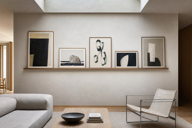
- Small moments: a 21x30 cm watercolor leaned on a shelf, a desk or a windowsill, where soft color rewards a close viewing distance.
Plan the wall before you touch a hammer
Painterly prints forgive many things, but not a chaotic arrangement, because the art itself is already loose; the hanging has to supply the order. The easiest way to get it right is to plan digitally first. With Posterlefi's free Gallery Wall Builder you can arrange prints on a virtual wall, check whether the pastel tones balance across the composition, compare thin oak against white frames, and adjust sizes before a single nail goes into the plaster. Ten minutes there routinely saves an afternoon of re-hanging, and Posterlefi's 100-day returns cover any second thoughts that survive the planning.
Frequently asked questions about Monet style art
Is Monet style art the same thing as impressionism? Nearly. Impressionism is the broader movement that emerged in 1870s France, with painters like Renoir, Pissarro, Degas and Morisot. Monet was its most famous and most consistent member, so his name has become everyday shorthand for the whole look: soft light, visible strokes, gardens and water.
Does Posterlefi sell real Monet posters? No, and that is deliberate. Posterlefi sells original art prints designed in-house, including watercolor and painterly styles inspired by the same love of light and loose brushwork. You get the atmosphere of the movement in artwork made for modern printing and modern rooms, rather than a photographed copy of a century-old canvas.
What colors go with impressionist wall art? Keep the surroundings quiet and natural: warm white, cream, greige and pale oak let pastel prints do the talking. For accents, pick one tone out of the print itself, perhaps a sage cushion or a powder blue throw, and repeat it once or twice in the room. Avoid placing pastels next to large blocks of strong, saturated color, which flattens them.
What size should a painterly print be above a sofa? Go bigger than instinct suggests. For a standard three-seat sofa, a 70x100 cm print or a pair of 50x70 cm prints covers the ideal two thirds of the sofa's width. Hang the artwork so its lower edge sits 15 to 25 cm above the backrest, which keeps print and furniture connected as one group.
Do watercolor posters suit a minimalist Scandinavian home? Very well, precisely because they are quiet. A soft watercolor adds color and warmth without adding visual clutter, which is the whole minimalist bargain. Choose one large piece instead of many small ones, frame it in thin oak or white, and give it an empty stretch of wall to breathe on.
When you are ready to bring the light home, start with Posterlefi's watercolor paintings collection, where soft washes and loose strokes do what Monet taught the world to love: let the light in, and leave the details to the imagination.
Build your wall virtually before you spend a penny
Arrange sizes and layout on a virtual wall — free, before you buy.

Start with these
See the whole collection →


Related inspiration


100-day returns