


Orange Posters: Using Autumn's Accent Color Right
A practical guide to autumn's accent color: the orange shade ladder from apricot to amber, a simple dosing rule per room, and the cream, walnut, and charcoal pairings that make orange glow instead of shout.
Every September, orange makes its annual return — on the trees, in the shop windows, and across every interior feed you follow. Yet there is a real difference between a room that glows and a room that shouts, and it almost always comes down to dose. Orange wall art is the most precise way to get that dose right: you bring in the season's signature color at exactly the strength your room can carry, hang it in an afternoon, and take it down the day you want something new. No repainting, no regret.
This guide walks the full orange shade ladder — soft apricot, terracotta, burnt orange, amber — and shows which rung belongs in which room. You will get a simple dosing rule you can apply to any space, the cream, walnut, and charcoal pairings that let orange work quietly instead of dominating, and a plan for building a complete autumn color palette around it. Think of it as the season's accent color, used deliberately.
The Orange Shade Ladder, from Apricot to Amber
Orange is not one color; it is a ladder, and the rung you choose changes everything about how a room feels. At the softest end sits apricot — pale, slightly pink, closer to a blush than a pumpkin. It reads as a warm neutral in most light and is the easiest orange to live with day after day. One rung down is terracotta, the baked-clay shade with a brown undertone that grounds it. Terracotta is the diplomat of the family: warm enough to register as orange, earthy enough to behave like a neutral.
Burnt orange is where the color gains real weight. Red-leaning and deep, it is the shade of the 1970s revival, of turned oak leaves and worn leather, and it has enough pigment to anchor a large wall on its own. Finally there is amber — golden, yellow-leaning, the color of honey held up to a window. Amber is the brightest, most optimistic rung of the ladder, and in a room it behaves more like captured light than like paint.
The working rule: choose one rung as your lead and borrow a neighboring rung as support. Apricot with terracotta, terracotta with burnt orange, burnt orange with amber — adjacent shades deepen each other. Skipping rungs, or using all four at once, is where rooms stop looking like homes and start looking like seasonal shop displays.
Why Orange Answers the Gray September Light
There is a practical reason orange keeps returning to Scandinavian homes each autumn, and it has little to do with fashion. From September onward, daylight in Denmark turns flat and gray-blue — beautiful in its own restrained way, but cool, and merciless to rooms decorated entirely in whites and grays. Orange sits directly opposite blue on the color wheel, which makes it the natural counterweight: a burnt orange print does not fight the gray light coming through the window, it completes it.
This is also why orange art often looks better in October than it did in July. Summer light is already warm, so an orange wall can tip into too much of a good thing. Under a low gray sky, the same print reads as necessary — a small, steady source of warmth the weather refuses to provide. North-facing rooms, which receive the coolest light of all, benefit the most from a warm print on the wall.
The Dosing Rule: One Statement or Two Supporters
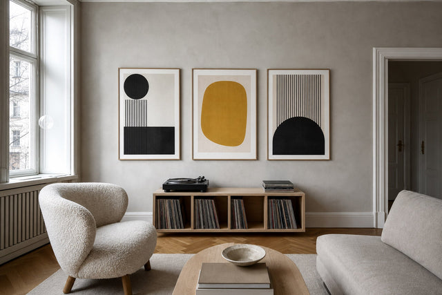
Orange is a high-chroma color that advances visually — it always appears closer and larger than it really is. That is exactly what makes it powerful as an accent, and exactly why it needs a ceiling. The dosing rule is simple: one 50x70 cm orange print, or two 30x40 cm prints, per room. That is enough for the color to register from anywhere in the space without ever becoming the only thing you see.
Scale the rule to the room rather than to your enthusiasm:
- Small rooms under about 12 square meters (bedrooms, entries, home offices): a single 30x40 cm or 40x50 cm print is plenty. Orange gains apparent intensity in tight quarters.
- Standard living rooms: one 50x70 cm print as the statement, or a pair of 30x40 cm prints hung side by side with 5-7 cm between the frames.
- Large or open-plan rooms: one 70x100 cm print can carry the entire space — just keep every other orange element in the room small and incidental.
- Gallery walls: limit orange to roughly one print in four, and let cream, brown, and off-white fill the rest so the orange reads as punctuation rather than paragraph.
If in doubt, under-dose. A single orange print with room to breathe glows; three orange prints in one sightline cancel each other out and simply read as loud.
Room by Room: Apricot Sleeps, Burnt Orange Hosts, Amber Cooks
Each rung of the ladder has a room where it naturally belongs. Apricot belongs in the bedroom. It is the least stimulating orange — soft enough to look at last thing at night and first thing in the morning. Hang a 40x50 or 50x70 cm apricot abstract or botanical above the headboard and pair it with washed linen in oatmeal or white; the print will catch morning light beautifully.
Burnt orange belongs in the living room. This is the social shade — deep, warm, and at its best in the evening under lamplight, which flatters red undertones the way daylight flatters yellow ones. Above a charcoal or gray sofa, a 50x70 cm print becomes the anchor of the whole scheme of burnt orange decor, doing what a fireplace does: giving the room a warm center. Amber belongs in the kitchen. Golden amber tones sit naturally in an interior of oak cabinets, brass hardware, and morning coffee; a 30x40 cm amber print propped on open shelving or hung beside the window keeps things casual.
And terracotta? It is the connector — happiest in hallways and dining rooms, and in any space that links other rooms, because its brown undertone shakes hands with almost every material you already own.
The Supporting Cast: Cream, Walnut, and Charcoal
Orange rarely fails on its own; it fails because of what surrounds it. Against bright, cold white walls, a strong orange can look like a warning sign. The fix is to surround it with colors that absorb some of its energy:
- Cream, not white: a warm off-white wall softens the boundary around an orange print, so the color settles into the room instead of vibrating against it. This single swap does more than anything else on this list.
- Walnut and dark oak: mid-to-dark warm woods share orange's undertone at a fraction of the intensity. A walnut frame around a terracotta print is the classic pairing for a reason.
- Charcoal, not black: deep gray gives burnt orange something serious to push against — the combination reads as considered, almost tailored. Pure black can make a bright orange feel like signage; charcoal never does.
- A muted blue-gray accent: optional, but a dusty blue cushion or vase across the room sharpens every orange in it, because complementary colors intensify each other in small doses.
Motifs That Carry Orange Well
The motif decides how literal the color feels. Abstract color-field prints are the purest delivery method — broad planes of terracotta or amber with soft edges, letting the shade itself be the subject. Botanical prints — dried grasses, seed heads, autumn leaves — bring orange in through nature, which is why they rarely feel like a decorating decision at all. Vintage and exhibition-style posters often carry burnt orange in their typography and borders, giving you the color plus a graphic backbone. And photographic prints — desert landscapes, dunes at golden hour — deliver amber with depth already built in.
A useful test while browsing: squint at the print until the subject disappears. What remains is the color impression your room will actually live with. If the blur is a warm, even glow, the print will work almost anywhere. If it is a hard block of saturated orange, apply the dosing rule strictly and give it a large, calm wall.
Frames, Paper, and Placement
Frame choice can move a print half a rung up or down the ladder. An oak or walnut frame warms the print further and suits terracotta and amber; a black frame sharpens burnt orange into something more graphic; a white or cream frame lightens apricot until it almost floats. With 14 frame colors and 13 sizes available, matching the frame to the wood tones already in your room — rather than to the print itself — is usually the smarter move, because it stitches the art into the space.
On placement, the standard rules serve orange especially well, because the color draws the eye so strongly. Center a single print at 145-150 cm from the floor to its midpoint. Above a sofa, leave 15-25 cm between the backrest and the lower edge of the frame, and keep the print — or the pair — at roughly two-thirds of the sofa's width. For large, saturated prints, the heavier 230 gsm paper is worth choosing over 200 gsm: the extra stiffness keeps a big field of color looking perfectly flat and gallery-crisp.
Building the Full Earth Palette
Orange is the accent, not the whole story. The rooms that wear it best follow a rough 60-30-10 split: about 60 percent quiet base tones (cream, off-white, oatmeal), 30 percent mid-depth earth tones (wood, tan, soft brown), and 10 percent orange as the spark. In practice, that means letting beige and warm neutral prints handle the background, adding depth with brown tones like chestnut and umber, and reserving orange for the one or two pieces that carry the season.
If you are planning a gallery wall around this palette, lay it out digitally before you pick up a hammer. The free Gallery Wall Builder lets you arrange sizes and test exactly how much orange the composition can take — it is far easier to delete a print on screen than to live with one hole too many in the plaster. And because every order comes with 100-day returns, even the print you were unsure about gets a proper audition on your actual wall, in your actual light.
FAQ: Orange Wall Art, Answered
What colors go best with orange wall art? Cream, walnut brown, and charcoal gray are the most reliable partners — they absorb some of orange's energy so the print glows instead of shouting. A small dose of muted blue-gray across the room sharpens the effect further. Avoid pairing strong orange with bright, cold white, which exaggerates its intensity.
Is orange wall art too bold for a small room? Not if you dose it correctly. In rooms under about 12 square meters, choose a single 30x40 or 40x50 cm print and lean toward the softer rungs of the ladder — apricot or terracotta rather than burnt orange. One well-placed warm print makes a small room feel cozier, not smaller.
What size orange poster should I hang above the sofa? A 50x70 cm print suits most standard sofas, hung 15-25 cm above the backrest with its center around 145-150 cm from the floor. For a wider sofa, use two 30x40 cm prints side by side with 5-7 cm between frames. Aim for the art to span roughly two-thirds of the sofa's width.
What is the difference between terracotta and burnt orange? Terracotta has a brown, baked-clay undertone that makes it behave almost like a neutral, while burnt orange leans red and carries noticeably more pigment and drama. Terracotta suits connecting spaces and calmer schemes; burnt orange is the statement shade for living rooms and evening light.
Does orange wall art work outside autumn? Yes — the earthier rungs, apricot and terracotta, read as year-round warm neutrals rather than seasonal color. Orange only feels strictly autumnal when it is paired with overtly seasonal motifs like leaves and harvest scenes. Choose an abstract or botanical print, and it will earn its wall in April just as well as in September.
Ready to put the season's warmest color to work? Browse the full range of orange posters and wall art — from the palest apricot to the deepest amber — and find the one print your gray September light has been waiting for.
Build your wall virtually before you spend a penny
Arrange sizes and layout on a virtual wall — free, before you buy.

Start with these
See the whole collection →


Related inspiration

100-day returns