


Japanese Posters: The Japandi Aesthetic Explained
A practical style guide that untangles ukiyo-e, wabi-sabi and Japandi, then walks you through a four-step Japandi wall formula: one nature motif, a muted earth palette, an oak frame and generous empty space.
Type "japanese poster" into a search bar and you are really asking about three different things at once. Some people want the look of traditional woodblock prints — the great wave frozen mid-crash, a crane lifting off a marsh, the silhouette of a mountain at dusk. Others are drawn to wabi-sabi, the quiet philosophy of imperfection that has drifted out of the tea ceremony and into interior design. And a growing number are actually looking for Japandi: the Japanese-Scandinavian hybrid that has become the calmest room formula in Nordic homes.
These threads get tangled constantly, and the result is a lot of walls that almost work — a busy wave print shouting in a pastel bedroom, or a stark black frame fighting rustic texture. This guide untangles them: what each tradition stands for, which motifs and colours belong to which, and a Japandi wall formula you can hang this weekend — one nature motif, a muted earth palette, an oak frame, and generous empty wall around it.
Three Aesthetics Hiding Behind One Search
Here is the short map. Ukiyo-e is a historical Japanese printmaking tradition with a specific visual grammar: flat planes of colour, confident outlines, and nature motifs like waves, cranes and Mount Fuji. Wabi-sabi is not a style at all but a worldview — an appreciation of impermanence, asymmetry and imperfection that shapes how you choose and arrange things. Japandi is the newest of the three: a deliberate fusion of Japanese restraint and Scandinavian functionality.
Why does it matter? Each thread answers a different question. Ukiyo-e tells you which motifs carry the mood. Wabi-sabi tells you how much to hang and how perfect it should look (less than you think, on both counts). Japandi tells you how to frame it and what colours surround it. Working together, the wall feels inevitable; blindly mixed, it feels like a souvenir shop.
Ukiyo-e: The Woodblock Tradition Behind the Wave
Ukiyo-e — usually translated as "pictures of the floating world" — flourished in Japan during the Edo period, roughly the 17th to 19th centuries. These were woodblock prints, produced in editions and sold affordably — a spiritual ancestor of the modern poster. Artists like Hokusai and Hiroshige turned landscapes and weather into images so strong that a single cresting wave still reads instantly two centuries later.
The visual grammar is what you are really borrowing when you hang a Japanese-style print today: flat, layered fields of colour instead of Western shading; bold, calligraphic outlines; daring crops where a branch enters from outside the frame; and gradient skies fading from indigo to pale peach. The classic motifs — the wave, the crane, koi, cherry blossom, the lone mountain — are not random. Each carried meaning: longevity, perseverance, the brevity of beauty. That symbolic weight is why these images feel serious rather than merely decorative.
One honest note before you shop: Posterlefi's Japanese-inspired designs are original, AI-designed interpretations of this aesthetic — new artwork in the spirit of the tradition, not museum reprints of historical works. If you want a woodblock-style wave with colours tuned to a modern Nordic palette, that is exactly what these interpretations are for.
Wabi-Sabi: Why Imperfection Reads as Calm
Wabi-sabi is the hardest to pin down because it resists definition on purpose. At its core it accepts — even celebrates — three facts: nothing lasts, nothing is finished, nothing is perfect. In objects, that means a preference for the weathered over the polished, the asymmetric over the centred, the muted over the saturated. A cracked glaze, a faded pigment, an uneven edge: features, not flaws.
In wall art, wabi sabi decor shows up as ink-wash softness, visible brush texture, off-centre compositions and colours that look like they have already lived a little — bone, ash, clay, moss. It is emphatically not shabby-chic clutter. Wabi-sabi is spare: one imperfect thing, given room to breathe, is the whole point. When choosing between two prints, favour the quieter, slightly unbalanced one with texture rather than gloss — and hang one piece where you were tempted to hang three.
Japandi: The Japanese-Scandinavian Hybrid
Japandi works because the two parent traditions were already cousins. Both prize craftsmanship, natural materials, light wood and the discipline of leaving things out. The Japanese side contributes depth and gravity: darker accents, asymmetry, a comfort with shadow. The Scandinavian side contributes lightness and warmth: pale oak, white and greige walls, wool and linen textures.
On the wall, Japandi art is recognisable at a glance: nature motifs reduced to essentials, single-line figures, ink-inspired abstracts, muted botanicals and mountain silhouettes. Nothing neon, nothing glossy, nothing that shouts. For a fast shortlist to react to, browse a minimalist art collection and pull out everything with an earth-toned, nature-leaning mood — that gets you 80 percent of the way there.
The crucial difference from pure Scandinavian minimalism is warmth of tone. Scandi minimalism often runs cool — white, grey, black — while Japandi shifts the palette toward clay, sand, umber and moss, and swaps hard symmetry for gentle imbalance. That shift is why a Japandi wall feels serene rather than sterile.
The Japandi Wall Formula: Four Decisions
Strip away the theory and building a Japandi wall comes down to four decisions. Make them in this order and it is very hard to go wrong:
- One nature motif per wall zone. A mountain line, a single branch, a crane, an abstracted wave — pick one clear subject and let it own the wall. Any second piece should be quieter, never a competing hero.
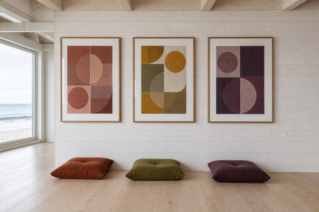
- A palette of three muted earth tones, maximum. Think sand, clay, moss green, charcoal ink, bone white, faded indigo. Choose tones that appear both in the artwork and somewhere else in the room — a cushion, a vase, a throw — so the wall converses with the space.
- An oak or light-wood frame. Warm wood bridges the print and your furniture. Posterlefi's wooden frames come in 14 colours and 13 sizes; for this look plain oak is the safest choice, with black oak as a deliberate accent if the room needs an anchor.
- Generous empty wall around the piece. Leave at least 30–50 cm of bare wall on each side of the frame. In Japanese aesthetics this negative space has a name — ma — and it is treated as part of the composition, not leftover area.
That last point is the one Western habits fight hardest. We treat empty wall as a problem to solve; in a Japandi room the emptiness is doing active work, framing the artwork the way silence frames a note of music. If a wall feels unfinished after one well-chosen 50×70 cm print, wait two weeks before adding anything. Most people stop noticing the "gap" and start noticing the calm.
Colours, Sizes and Frames That Keep It Calm
Scale matters as much as subject. Japanese-inspired art loses its poise when it is too small for the wall — a lone 21×30 cm print floating on a three-metre wall reads as an afterthought, not restraint. Err one size larger than your instinct, then protect the empty space around it. Both of Posterlefi's paper weights suit the style; the heavier 230 gsm stock is worth choosing for large statement pieces, where its substance and flatter lie in the frame show.
- Above a sofa: one 70×100 cm statement print, hung so its lower edge sits 15–25 cm above the backrest, or a pair of 50×70 cm prints with a wide 12–15 cm gap between them.
- Over a sideboard or console: a single 50×70 cm piece hung slightly off-centre — a quiet wabi-sabi move that de-formalises the arrangement.
- In a hallway: a vertical 30×40 cm or 40×50 cm print echoes the tall, slim proportions of traditional hanging scrolls.
- Colour pairings that work: greige walls with clay and rust artwork; warm white walls with indigo-and-bone ink motifs; green-grey walls with moss and sand botanicals; and — for drama — a charcoal feature wall behind a pale, minimal line piece in an oak frame.
- Hanging height: keep the centre of the artwork 145–155 cm from the floor; higher starts to feel accidental in a style built on groundedness.
Planning a Japanese-Inspired Gallery Wall
Can a gallery wall be Japandi at all? Yes — but it follows different rules than salon-style clusters. Keep it to two or three pieces, not nine. Use wide, even gaps of 10–15 cm rather than the tight 5 cm spacing of a classic grid. Align the frames along a single shared edge — usually the bottom — so the group reads as one horizon line. And vary the voices: one ukiyo-e-inspired motif as the anchor, one tonal abstract, and perhaps one botanical sketch from a line art series for a hand-drawn, wabi-sabi note.
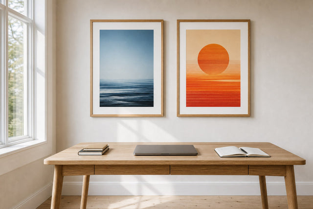
An asymmetric pair is the most foolproof pattern: one large piece (say 50×70 cm) with a smaller companion (30×40 cm) offset low to the side, connected by a shared colour. The imbalance creates the gentle tension that makes the arrangement feel considered rather than catalogue-perfect. To test spacing, sizes and combinations before you commit a single nail hole, the free Gallery Wall Builder lets you arrange everything on a virtual wall first and see the negative space as clearly as the prints.
Mistakes That Break the Aesthetic
A few recurring missteps undo more Japandi walls than bad art ever does. The first is motif inflation: a wave, a crane, a torii gate and a blossom branch all in one room — each lovely, together a theme park. Choose one hero motif per room. The second is chromatic drift — a cherry red or cobalt blue punctures the muted register the whole look depends on. If a print you love runs hot, keep every other element in the room strictly neutral.
The third is glossy hardware: shiny plastic frames, chrome details, mirrored accents. The style is built on matte, tactile surfaces, which is why a matte print in a real wooden frame does so much of the heavy lifting. Finally, resist the urge to fill. Decide which one wall carries the art and let at least one other stay completely bare. That bare wall is not wasted — it is the ma that makes the rest legible.
Frequently Asked Questions
What is the difference between Japandi and wabi-sabi?
Wabi-sabi is a philosophy — an appreciation of imperfection, impermanence and asymmetry that guides how you choose and arrange things. Japandi is a concrete interior style blending Japanese restraint with Scandinavian warmth: light wood, muted earth tones, functional simplicity. Wabi-sabi is an ingredient inside Japandi, not a rival style.
What size should a Japanese poster be above a sofa?
Aim for artwork roughly two-thirds the width of the sofa — for most sofas, a single 70×100 cm print or a pair of 50×70 cm prints with a wide gap. Hang it so the lower edge sits 15–25 cm above the backrest, so sofa and art read as one unit.
What colours go with Japandi wall art?
Stay inside a muted earth register: sand, clay, moss green, bone white, charcoal and faded indigo. Pick at most three tones and repeat one elsewhere in the room, in a textile or ceramic. Avoid saturated brights, which break the calm the style depends on.
Are Posterlefi's Japanese posters original woodblock prints?
No — they are original, AI-designed interpretations of the Japanese art style, created for modern interiors rather than reproduced from museum collections. They are printed on premium 200 gsm or 230 gsm poster paper, with matching wooden frames in 14 colours, and covered by 100-day returns.
Does Japandi work in a small apartment?
It arguably works best there. Because the style is built on few pieces, pale surfaces and deliberate empty space, it makes compact rooms feel larger and quieter rather than fuller. One well-scaled nature motif in an oak frame will do more for a small living room than more decor ever could.
When you are ready to choose your one nature motif — a wave, a branch, a mountain holding up an empty sky — start with the illustration art collection and shortlist the three pieces that make you exhale. One of them is your wall.
Build your wall virtually before you spend a penny
Arrange sizes and layout on a virtual wall — free, before you buy.

Start with these
See the whole collection →


Related inspiration

100-day returns