


Autumn Colours at Home: Rust, Ochre and Moss on the Wall
A practical colour guide that translates the autumn palette of rust, ochre, moss and plum into wall art, with three ready-made combinations and one simple styling rule built around your textiles.
There is a reason the autumn colour palette never really goes out of style. Rust, ochre, moss and plum are the colours of the season itself — turned leaves, late afternoon light, damp woodland, the last dark fruit on the branch — and when you bring them indoors they do exactly what they do outside: they make everything feel warmer, softer and more grounded. On the wall, this palette is one of the fastest ways to shift the mood of a room without repainting a single surface.
The trick is knowing which role each colour plays. Rust and ochre are your warm anchors, moss green is the calm counterweight, and plum is the statement accent you use sparingly. In this guide we translate the classic autumn colour palette into wall art: three ready-made combinations you can copy directly, one simple styling rule built around the textiles you already own, and practical advice on sizes, frames and layouts. Whether you are refreshing a single shelf or planning a full gallery wall, you will leave with a concrete plan.
Why Rust, Ochre, Moss and Plum Work So Well Together
These four colours sit close to each other in nature, and that is precisely why they behave so well in an interior. Rust and ochre are neighbours on the warm side of the colour wheel, so they blend rather than compete. Moss green carries enough yellow to feel related to ochre while still offering the coolness a warm room needs to breathe. Plum adds depth and shadow — the visual equivalent of an early autumn evening.
Just as important, all four are muted. None of them is a pure, saturated primary; each has a little grey or brown mixed in, the way pigments in nature always do. That low saturation is what makes an autumn colour palette interior feel calm instead of loud, and it is why these tones flatter almost every wall colour, from bright white to warm greige to deep charcoal.
Rust and Ochre: The Warm Anchors
Rust is the workhorse of the palette. Somewhere between terracotta and burnt orange, it is warm enough to make a room feel inviting yet earthy enough to avoid tipping into brightness. Ochre — a mustard-leaning yellow with brown undertones — plays a similar role one step lighter, catching the light where rust absorbs it. Together they set the temperature of the whole wall.
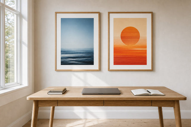
In wall art, look for these tones in abstract compositions with soft organic shapes, vintage-style travel prints, line drawings on toned paper, and dried-flower botanicals. A rust abstract above a beige sofa is one of the most reliable pairings in interior styling: enough contrast to register, enough warmth to relax. If you are new to rust decor, start with one medium-sized print — 50x70 cm is the classic — and let it earn its place before you add more. Anchors work best when they clearly lead, so aim for warm tones in roughly two thirds of the art on the wall and let the remaining pieces cool things down.
Moss Green: The Calm Counterweight
Every warm palette needs a counterweight, and moss green is the gentlest one autumn offers. Deeper than sage but softer than forest green, moss reads almost as a neutral in a room built on rust and ochre. It slows the eye, brings a sense of the outdoors inside and keeps the wall from feeling like one long sunset.
Botanical prints are the natural home of this colour: eucalyptus branches, ferns, oversized leaf studies and misty forest photography all deliver moss tones with very little effort. You will find plenty of candidates among the botanical and landscape prints in the green collection. Pair moss art with oak frames rather than black ones — warm wood keeps green from turning cold — and repeat the tone somewhere at floor level, in a plant or a cushion, so the wall does not feel cut off from the rest of the room.
Plum: The Statement Accent
Plum is where the palette gets its character. A deep, slightly greyed purple is unexpected in most Scandinavian-leaning homes, which is exactly what makes a small dose of it so effective. Think of plum as the palette's punctuation mark: one or two pieces, never the whole sentence.
Moody floral prints, dusk photography and abstracts with wine and aubergine tones all carry plum well. Because the colour is so deep, it needs breathing room — hang plum art against a light wall, or place it in a wider gallery wall where paler pieces surround it. And resist the urge to match it exactly across the room. Plum works precisely because it is scarce; when it appears in one throw and one print and nowhere else, it looks deliberate.
Three Ready-Made Autumn Palettes for Your Walls
If you would rather skip the theory, these three combinations are ready to copy. Each balances a warm anchor, a supporting neutral and a grounding accent, and each behaves a little differently in a room.
- Rust + beige + black: the boldest of the three. Rust abstracts and ochre-toned prints over a beige wall or sofa, framed in black for graphic edge. Add one black-and-white photograph so the palette has a resting point. Best in living rooms with decent daylight, where rust can glow rather than darken.
- Moss + oak + cream: the calmest. Green botanicals and soft landscape prints in oak frames against cream walls. This combination suits bedrooms and reading corners, and it is the easiest to live with year-round because it leans on nature rather than season. Warm it up with a single rust cushion if it starts to feel too quiet.
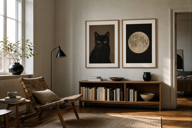
- Plum + grey: the most dramatic. Deep plum art, soft grey tones and generous white space around every frame. It rewards restraint — two or three well-chosen prints beat six — and works beautifully in dining rooms and hallways, spaces you pass through rather than linger in.
All three palettes lean on earthy mid-tones, so if you are hunting for pieces to bridge the stronger colours, the caramel, walnut and taupe prints in the brown collection are quietly useful connectors.
The Two-Colour Rule: Start With Your Textiles
Here is the single most useful styling rule in this guide: pick two colours from your throws and cushions and repeat them in the art. Not three, not the whole palette — two. Textiles are where most of us already express seasonal colour, which means your sofa is probably wearing rust or moss right now. The wall simply needs to agree with it.
The rule works because repetition is what makes a room read as designed rather than accumulated. When the ochre in a cushion reappears in a print a metre above it, the eye draws a line between the two and the space snaps together. In practice:
- Lay your throws and cushions on the sofa and identify the two strongest colours.
- Choose art in which both colours appear — they do not need to dominate the print, just be clearly present.
- Keep the remaining art in neutrals: cream, beige, soft grey or black and white.
- When you change textiles in spring, swap one or two prints rather than rebuilding the whole wall.
Sizes, Frames and Layouts That Suit Autumn Art
Deep, warm colours carry more visual weight than pale ones, so sizing matters. A small plum print disappears; a lone small rust print can look like an afterthought. Scale up slightly compared with what you would choose in a lighter palette, and give dark pieces more empty wall around them.
- 50x70 cm is the workhorse for a single rust or ochre statement above a sideboard, desk or armchair.
- 70x100 cm suits a bold anchor above the sofa — hang it so the centre of the print sits at eye level, roughly 145 cm from the floor.
- Pairs of 30x40 cm work well for moss botanicals, hung side by side with a 5-7 cm gap.
- 21x30 cm pieces are ideal for leaning on shelves, where a small plum accent can live without dominating the room.
For frames, warm wood flatters this palette best: oak and walnut deepen rust and ochre, while black sharpens a plum-and-grey scheme. Posterlefi's wooden frames come in 14 colours and 13 sizes, so every combination above can be framed consistently, and prints are produced on premium 200 gsm or 230 gsm poster paper — the heavier weight gives dense autumn colours a satisfying, flat solidity. If you are planning a larger arrangement, sketch it first in the free Gallery Wall Builder, which lets you test combinations, sizes and spacing on screen before you put a single nail in the wall.
How to Keep an Autumn Palette From Feeling Like a Theme
The difference between a warm, layered room and a seasonal display comes down to motif. Pumpkins, maple leaves and harvest scenes tie the palette to a date; abstract shapes, portraits, architecture and botanicals in autumn tones do not. Choose fall decorating colours, not fall imagery, and the room will still make sense in February.
It also helps to keep at least a quarter of the wall in true neutrals — black-and-white photography, cream line art, plain toned paper — so the palette reads as a temperature rather than a costume. The room should feel as though the light through the window changed, not the calendar. This is also why muted versions of the four colours age better than saturated ones: burnt orange over bright, olive-leaning green over grassy, greyed plum over violet.
Frequently Asked Questions
What colours go with rust in a living room?
Beige, cream, warm white, moss green, walnut brown and black all pair naturally with rust. For wall art, the safest formula is rust plus one neutral plus one cooler tone — moss or soft grey — so the room keeps its balance. Avoid pairing rust with bright, icy blues, which tend to make both colours look off.
Is an autumn colour palette too dark for a small room?
Not if you control the proportions. Keep the walls light, put the autumn colours in the art and textiles rather than on large surfaces, and favour ochre and rust — which radiate warmth — over large expanses of plum. A single 50x70 cm warm print in a small room adds cosiness without visually shrinking it.
How do I decorate with autumn colours without repainting?
Wall art and textiles will do almost all of the work. Swap in two or three prints in rust, ochre, moss or plum, echo the same tones in cushions and a throw, and the room reads as autumnal even against plain white walls. It is also completely reversible when the season — or your taste — changes.
What wall art goes with moss green walls or furniture?
Moss pairs beautifully with ochre and rust prints, cream-toned line art and black-and-white photography. Keep frames in oak or walnut so the green stays warm. If the moss in your room is dark, choose art with lighter backgrounds to preserve contrast on the wall.
Can I mix plum and rust in the same room?
Yes, as long as one of them clearly leads. Let rust dominate the art and textiles and confine plum to a single print or cushion, or do the reverse. Separating the two deep tones with neutrals — a grey frame, a beige wall, cream art — stops them competing for attention.
However you weight the four colours, start with the anchor. A single warm print has a way of reorganising everything around it, and the rest of the palette tends to follow naturally. Explore rust, terracotta and ochre wall art in the orange collection and see which piece your room has been waiting for — with 100-day returns, you have a whole season to be sure it belongs.
Build your wall virtually before you spend a penny
Arrange sizes and layout on a virtual wall — free, before you buy.

Start with these
See the whole collection →


Related inspiration

100-day returns