


Home Office Wall Art: Give Your Workspace New Energy
A dark-season guide to home office wall art: which motifs support focus versus energy, how to style the wall behind you for video calls, and a two-poster micro-setup for small desk corners.
By mid-October, the honest version of working from home looks like this: you sit down at eight in half-darkness, and by the time you close the laptop, the streetlights are on. The room you work in has to carry more of the load than it did in June, and the wall you stare at between tasks matters more than most of us admit. The right home office wall art will not answer your emails, but it changes how the room feels to sit in for eight hours — and how it reads to every colleague who sees it behind you on camera.
This guide is a practical dark-season refresh for the wall around your desk: the quiet psychology of motifs — why calm line art supports deep focus while a bold quote print works more like espresso — plus how to style the wall that appears in your video calls, a compact two-poster setup for small desk corners, exact sizes in centimetres, and the warm light that keeps it all visible on a grey November afternoon.
Focus or energy: what the dark season asks of your wall
In summer, the window does most of the decorating. From October the equation flips: the window turns into a dark mirror by late afternoon, and your field of vision narrows to desk, screen and the wall behind it. Every time you look up to think — dozens of times a day — your eyes land on that wall. It is also the cheapest meaningful upgrade in the room: two well-chosen posters cost a fraction of a new chair and change what colleagues see in every call between now and spring.
So before browsing a single motif, decide what job the wall has. Calm, ordered visuals — few lines, muted colour, generous empty space — lower the visual noise in a room and make it easier to hold a thought: right for writing, coding and any work measured in unbroken stretches. High-contrast, typographic or saturated visuals raise activation instead, which is useful before a sales call or the last hour of a deadline, but tiring to stare at all day.
Neither is better; they are tools for different moments. The trick is to zone the room: the calm piece in the sightline you face while working, the energetic piece on a side wall or by the door, where you catch it when you stand up or walk in. You get both effects without them competing for the same glance.
Calm choices: line art and structured minimalism
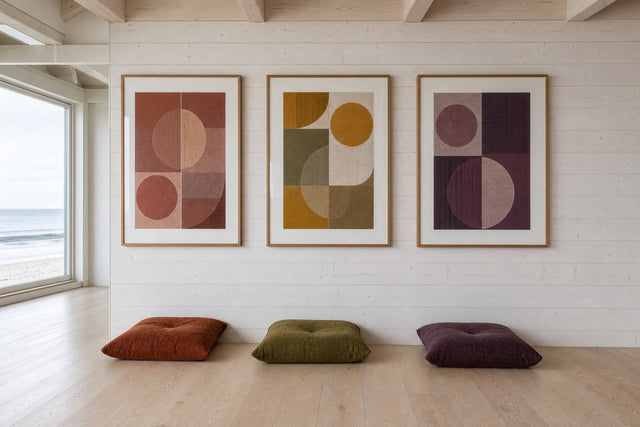
If your work depends on long stretches of concentration, start with line art prints and structured minimalist compositions. A single-line figure, a botanical outline, a quiet arrangement of arcs and rectangles: these give the eye a path to follow without interrupting a thought — the visual equivalent of instrumental music.
Palette discipline does most of the work here. Keep the wall to two or three muted hues: sand and chalk white, sage green and soft grey, or the timeless charcoal on off-white. If you hang more than one print, let them share a palette even when the motifs differ — that shared thread is what makes a wall feel composed. Printed on premium 200 or 230 gsm poster paper, subtle compositions like these hold their depth in flat winter light instead of washing out.
Energisers: when a bold quote print earns its place
Motivational office prints have a mixed reputation, mostly earned through overuse. But a single, well-set quote poster, treated as typography rather than a slogan, is a different thing entirely: strong letterforms in black and white, or one saturated accent colour, work as graphic art first and message second. Three rules keep it on the right side of the line — one quote per room, the shorter the phrase the better, and the typography should be beautiful enough to hang even if you disagreed with the words.
Placement matters as much as the print. Hang an energiser where you glance, not where you stare: the wall beside the door works brilliantly, because you catch it on the way in with your coffee and it never nags at the edge of your vision during deep work. Put the same print above your monitor and you will stop seeing it within a week.
The wall on camera: your video-call backdrop
From October to March, more colleagues will see your office wall than your actual home. The camera frames the wall behind you, so style it for the lens, not just the room: a considered backdrop reads as calm competence, a bare wall as unfinished, an overloaded shelf as chaos. What reliably works on screen:
- Height: hang the print so its centre sits roughly 20–30 cm above your seated head height. On camera it should appear beside or just above your shoulder — never sprouting out of your head.
- Size: 30×40 cm or 50×70 cm reads clearly in a small video tile. A 21×30 cm print disappears at that distance, while 70×100 cm can dominate the frame in a small room.
- Position: off-centre, over one shoulder — the rule of thirds applies to your video tile too.
- Motif: calm, medium-contrast imagery; very fine, dense patterns can shimmer on compressed video.
- Colour: two or three tones that flatter skin on camera — warm sand, sage, terracotta or muted blue all outperform anything neon.
- Test: open your camera preview and hold the print against the wall before you commit to nail holes.
Matte poster paper is an ally here, since glass in a frame can catch your ring light or window and blow out on camera; if you do frame the piece, angle it a few degrees away from your main light source.
The two-poster and shelf micro-setup for small corners
Not every home office is a room. If your workspace is a corner of the bedroom or a 120 cm desk in the hallway, a full gallery wall is the wrong tool; what consistently works is one small shelf plus two prints in different sizes — depth and personality within a footprint under a metre wide.
The recipe: mount a 60–80 cm shelf about 50–60 cm above the desktop. Hang a 30×40 cm print just above and to one side of it, then lean a framed 21×30 cm print on the shelf so it slightly overlaps the hung piece — the overlap is what makes it feel styled rather than arranged. Finish with one small plant and a warm lamp, and stop there. Because the smaller print just leans, you can swap it monthly to keep a tiny workspace from going stale by February.
Sizes, heights and frames that work at a desk
The standard advice — centre the art at 145 cm, average standing eye level — needs adjusting in an office, because you sit all day and your eye line is lower. Reliable starting points:
- Above the desk you face: one 50×70 cm print centred over the desk, bottom edge 25–35 cm above the desktop — big enough to anchor the wall, low enough to feel connected to the workspace.
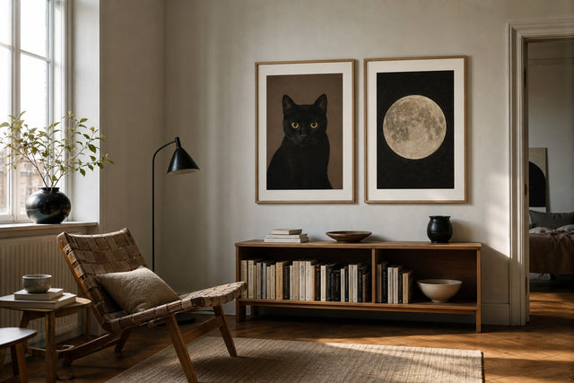
- Wider desks (140 cm and up): a pair of 30×40 cm prints side by side with a 5–7 cm gap, centres aligned, in the same palette and frame.
- A narrow slice of wall: stack two 21×30 cm prints vertically with 7–10 cm between them — perfect beside a window or bookcase.
- The camera wall behind you: one confident 50×70 cm or 70×100 cm piece beats a cluster of small frames, which read as clutter on video.
- Frames: matching wooden frames come in 14 colours and 13 sizes, so you can echo your desk timber for a calm, tonal look — or set a dark frame against a pale wall for graphic contrast.
If you prefer a softer, frameless look for the larger statement piece, a canvas print does the same anchoring job with more texture and no glare at all.
Warm light keeps art alive on dark afternoons
Here is the detail most dark-season refreshes miss: by half past three in November, unlit wall art simply disappears into dusk. If the only light in the room is your screen and a cool ceiling fixture, even the best print turns into a grey rectangle. Give the wall its own light — a picture light, a wall washer or a desk lamp angled toward the art — in warm white around 2700 to 3000 kelvin, positioned 30–40 cm out from the wall so it grazes the print rather than bouncing straight off it.
Avoid mixing that warm pool with a cold 4000 K+ overhead, which makes every colour on the wall look slightly wrong, and put the lamp on a dimmer if you can: full brightness for the working afternoon, low and warm for the last hour. As a bonus, a warm lamp near the wall behind you is exactly the flattering fill light video calls reward.
Plan the wall before you make holes
Once you know the wall's job, its palette and its sizes, resist the urge to start hammering. Test the layout first with the free Gallery Wall Builder, where you can arrange prints and sizes on a virtual wall until the spacing feels right — or tape paper templates up for a day and watch how they sit in the light. With more than 8,000 posters and art prints spanning Scandinavian, botanical, abstract and black-and-white styles, the hard part is not finding options; it is committing to the job you gave the wall. And with 100-day returns, a motif that fights the room's light in December is a solved problem, not a sunk cost.
Home office wall art: frequently asked questions
What is the best wall art for a home office? It depends on the work you do at the desk. For concentration-heavy work, calm line art and structured minimalist prints in two or three muted colours are the safest choice for the wall you face. If you want a jolt of energy, add one typographic quote print on a side wall where you glance rather than stare.
What should I put on the wall behind me for video calls? One calm, medium-contrast print between 30×40 and 50×70 cm, hung so its centre sits 20–30 cm above your seated head and placed off-centre over one shoulder. Avoid dense fine patterns, which shimmer on compressed video. Always check the result in your camera preview before making holes.
How big should wall art be above a desk? For a standard 120–160 cm desk, a single 50×70 cm print centred over the desk is the most reliable anchor, with its bottom edge 25–35 cm above the desktop. On wider desks, a pair of 30×40 cm prints with a 5–7 cm gap fills the wall without one oversized piece.
Do motivational posters actually help productivity? As a quick activation cue, yes — a strong phrase you catch on the way into the room can set a tone for the day. They work best in strict moderation: one per room, typography-led, and placed where you glance occasionally rather than in your constant sightline.
How do I keep wall art visible during dark winter afternoons? Give it dedicated warm light — a picture light or angled desk lamp at 2700–3000 K, positioned 30–40 cm from the wall so the light grazes the surface. Avoid mixing in cool 4000 K+ overhead light, and use a dimmer so the wall can shift from working light to evening warmth.
If your workspace is overdue for its dark-season reset, start with the wall you look at most. Browse the minimalist art collection for calm, focus-friendly prints that will carry your home office — on camera and off — all the way to spring.
Build your wall virtually before you spend a penny
Arrange sizes and layout on a virtual wall — free, before you buy.

Start with these
See the whole collection →


Related inspiration

100-day returns