


Gallery Wall Inspiration: 10 Ideas for Your Wall
A lookbook of ten named gallery wall looks, from strict grid minimalism to salon-style maximalism, each with a one-line formula, concrete sizes in cm, and a poster pairing you can copy at home.
Most people go hunting for gallery wall inspiration with one specific wall already in mind: the blank stretch above the sofa, the landing at the top of the stairs, the bedroom wall that has been waiting for something since the day you moved in. What the search usually turns up is a flood of beautiful but vague images — walls you admire without quite knowing why they work, or how to translate them into your own home with your own ceiling height and your own furniture.
This article takes a different approach. It is a lookbook of ten named looks, arranged roughly from the most disciplined to the most free-form. Each one comes with a one-line formula — the number of pieces, the sizes, and the frames that make it work — plus a poster pairing to match. Treat it as a menu of gallery wall ideas rather than a step-by-step manual: find the look that suits your room and your temperament, then fill in your own taste.
How This Lookbook Works
Every look below follows the same logic: a formula you can copy, and a pairing that suits it. The formula covers three decisions — how many pieces, which sizes, and which frames — because those three choices, far more than any individual artwork, decide whether a wall reads as intentional or accidental. Posterlefi's catalog of more than 8,000 posters spans Scandinavian, botanical, minimalist, abstract, vintage, city, and black-and-white styles, and matching wooden frames come in 14 colors and 13 sizes, so every formula here can be assembled in one place. If you would rather skip the composing altogether, the curated ready-made gallery walls let you shop a complete, pre-balanced look in one go.
Four sizes appear again and again in these formulas, so it helps to know them by name:
- 21×30 cm — the small filler that makes a cluster feel collected over time rather than bought in one afternoon.
- 30×40 cm — the workhorse; most grids and trios are built on it.
- 50×70 cm — the mid-size anchor that gives a mixed wall its backbone.
- 70×100 cm — the statement format; one per wall is almost always enough.
Two Orderly Looks: The Strict Grid and the Black-and-White Editorial
1. The Strict Grid. The formula: identical frames + identical sizes + one visual theme, hung in ruler-straight rows. The classic version is six 30×40 cm posters in black frames, two rows of three, with an even 5 cm gap on every side. Because the structure is doing all the work, the art should belong to a clear family — a botanical study series, monochrome photography, or graphic prints in a single palette. This is the look for people who feel calmer when things line up, and it thrives in hallways and home offices where symmetry reads as polish rather than stiffness.
2. The Black-and-White Editorial. The formula: high-contrast black-and-white art + slim black frames + generous breathing room between pieces. Looser than the grid, this look mixes sizes from 30×40 cm up to 50×70 cm, aligned along an invisible horizontal center line so the wall feels composed without being rigid. Pair black-and-white photography with a typographic print or one stark abstract for punctuation. The effect is confident and slightly urban — a magazine editor's office rather than a gallery — and it suits living rooms that lean modern.
Two Calm Looks: Tonal Beige and the Line-Art Trio
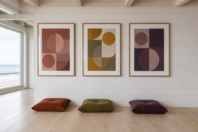
3. Tonal Beige. The formula: layered warm neutrals + oak or beige frames + mixed sizes in a loose cluster. Build around sand, oat, clay, and soft terracotta: abstract shapes, dune photography, muted botanicals. Because the palette does the harmonizing, the shapes and subjects are free to vary — that is the whole trick. Start with a 50×70 cm anchor, then gather 30×40 cm and 21×30 cm pieces around it with slightly irregular spacing. This is a bedroom favorite for good reason: it adds interest without adding noise.
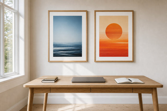
4. The Line-Art Trio. The formula: three line-art prints + three identical frames + one straight row at eye height. The simplest look in this entire lookbook: three 30×40 cm or 40×50 cm prints, spaced 7–8 cm apart, centered above a bed, console, or sofa. Single-line faces, figure studies, or botanical line drawings all work, as long as the line weight feels consistent across the trio. It can be planned, ordered, and hung inside a week, and it is very hard to get wrong.
Two Fresh Looks: The Botanical Cluster and the Kids' Color Pop
5. The Botanical Cluster. The formula: four to six plant-themed prints + light wooden frames + an organic, slightly irregular arrangement. Mix vintage-style botanical illustrations with modern leaf photography so the wall reads as curated rather than greenhouse catalog. Vary the gaps between 4 and 8 cm — a botanical wall that is too tidy loses the natural feel that makes it charming. Kitchens and dining rooms love this look, especially near a window where real plants can echo the printed ones.
6. The Kids' Color Pop. The formula: three to five bright illustrated prints + white frames + a lower hanging height. The detail most people miss: hang the arrangement so the child can actually see it, centering it around 130–140 cm from the floor instead of the adult-standard 145–150 cm. Friendly animals, alphabet prints, and cheerful shapes are the natural pairing, and in a kids' room a few bigger prints beat many small ones — stay at 30×40 cm or larger so the wall reads clearly from across the room.
Two Collected Looks: The Vintage Salon and the Photo-and-Illustration Mix
7. The Vintage Salon. The formula: floor-to-ceiling abundance + deliberately mixed frame colors + old-meets-new subjects. This is salon-style maximalism: exhibition posters, vintage illustrations, and classical-feeling artworks shoulder to shoulder with modern abstracts. The one rule holding the glorious chaos together is consistent spacing — keep roughly 5 cm between every frame even though nothing else matches. A salon wall is never finished, which is its charm; start with eight to ten pieces and let it grow. Staircases and dining rooms give it the vertical room it craves.
8. The Photo-and-Illustration Mix. The formula: alternating photography and illustration + one shared accent color + varied sizes. This is the most personal-looking wall in the lookbook: a city photograph beside an abstract beside a delicate line drawing, each piece carrying the same accent tone — rust, deep blue, sage green, whatever runs through your room already. The repeated color is the glue; without it, the mix collapses into clutter. Choose it when your taste is too varied for any single-style look, because that variety becomes the point.
Two Flexible Looks: Statement-plus-Satellites and the Shelf-Leaning Wall
9. Statement-plus-Satellites. The formula: one oversized anchor + three or four small orbiters, hung off-center. A single 70×100 cm poster carries the wall, while 21×30 cm and 30×40 cm pieces cluster to one side of it like moons. The built-in asymmetry makes this the best answer for walls where the furniture is not centered — above a sideboard, a desk, or an offset bed. Let the anchor be bold, a large abstract or a dramatic landscape photograph, and keep the satellites quieter so the hierarchy stays clear.
10. The Shelf-Leaning Wall. The formula: one or two picture ledges + framed prints leaning and overlapping + zero fixed positions. This is the most commitment-free look here — no measuring, no filler holes, and a new arrangement whenever the mood strikes. Layer larger 50×70 cm frames at the back and 21×30 cm or 30×40 cm pieces in front with slight overlaps, which add depth a flat-hung wall cannot match. It is the renter's best friend and the natural home for seasonal rotation, so pair it with whatever you love this month.
Choosing the Right Look for Your Room
If two or three looks are calling to you at once, let the room cast the deciding vote. A few honest matches drawn from how these walls behave in real homes:
- Living room: Black-and-White Editorial or Statement-plus-Satellites — both hold their own above a sofa without competing with it.
- Bedroom: Tonal Beige or the Line-Art Trio, where calm matters more than drama.
- Hallway or staircase: the Strict Grid for order, or the Vintage Salon if you want guests to slow down on the way up.
- Kitchen or dining room: the Botanical Cluster, ideally near daylight.
- Rented home: the Shelf-Leaning Wall — every look survives a move, but this one moves the easiest.
Whichever direction you choose, arrange before you hammer. The free Gallery Wall Builder lets you place your chosen posters and frame colors on a virtual wall and shuffle them until the composition clicks — far kinder to your walls than testing layouts with nails. And since every print ships with 100-day returns, a piece that feels wrong once it is up can simply go back.
Gallery Wall Inspiration: FAQ
How many posters do I need for a gallery wall? Three is enough for a trio, and six to eight is the sweet spot for most clustered looks. A statement-plus-satellites wall works with four or five pieces, while a salon-style wall starts around ten and grows from there. Begin with fewer than you think you need — adding later is easy, subtracting means filling holes.
Should all the frames on a gallery wall match? It depends entirely on which look you are building. Grids, trios, and editorial walls rely on identical frames for their sense of order, while tonal and salon walls welcome a mix — as long as something else stays constant, whether that is the color palette, the spacing, or the wood tone. Matching frames is the safe default; mixed frames are a deliberate choice, not an accident.
What poster sizes work best together on a picture wall? A reliable recipe is one anchor at 50×70 cm or 70×100 cm, two or three mid-size pieces at 30×40 cm, and a couple of 21×30 cm fillers. The size contrast creates hierarchy, which is what separates a composed wall from a scattered one. Walls built from many identical small prints tend to read as busy unless they are hung in a strict grid.
How do I plan a wall collage before buying anything? Use a planning tool first: Posterlefi's Gallery Wall Builder lets you test posters, sizes, and frame colors on screen before a single order is placed. Old-school paper templates taped to the wall work too, and the two methods combine well — plan the composition digitally, then confirm the scale on the actual wall. Ten minutes of planning prevents the most common regret, which is buying art one size too small.
Do all the posters on a gallery wall need to share a theme? No — they need to share a thread, which is a looser requirement. That thread can be a color that repeats across every piece, a consistent frame, or a shared mood like calm neutrals or high-contrast black and white. The Photo-and-Illustration Mix above is proof that wildly different art hangs together happily when one accent color runs through it all.
Ready to start collecting? A well-loved print is the easiest first anchor for any of these ten looks — browse Posterlefi's bestselling posters and see which one your wall has been waiting for.
Build your wall virtually before you spend a penny
Arrange sizes and layout on a virtual wall — free, before you buy.

Start with these
See the whole collection →


Related inspiration

100-day returns