


Wine Posters: Art for the Dining Corner and Home Bar
How to style wine posters in the dining corner and home bar: the right sizes in cm, frame pairings for dark designs, and a small food wall that outlasts any bottle you could bring to dinner.
A wine poster is one of those small decorating decisions that quietly changes how a room feels. Hang one above the bar cart or beside the dining table, and that corner suddenly has a point of view: this is where the good glasses come out, where dinner runs long, where someone always suggests one more small pour. Most homes decorate the living room first and the dining corner last — which is exactly why one well-chosen wine print makes such a difference there.
This guide covers the practical side of getting it right: which motifs actually work (graphic glasses, bottle silhouettes, typographic designs), which sizes suit a bar cart versus a dining nook, how to frame dark artwork so it reads as a proper bar rather than a dim hallway, and how to grow a small food-and-wine wall over time. Everything is measured in real centimeters and real placements, so you can go from idea to hung print in a single weekend.
Why the dining corner deserves its own art
Dining corners host weeknight dinners, homework, long Saturday lunches and the occasional dinner party, yet most are furnished with a table, chairs and nothing on the walls — a room that functions but never quite lands. Dining room wall art is what tells people — including you — that this is a destination in the home, not a pass-through.
A wine motif is the natural theme here because it belongs to the rituals that already happen at the table. Unlike a generic abstract, wine wall art is anchored to eating and drinking together, so it never feels arbitrary. And because most wine graphics are built from a handful of strong shapes — the curve of a glass, the shoulder of a bottle, a few well-set words — they hold up at a distance, across the room, which is how dining art is almost always seen.
Glasses, bottles and letters: choosing your wine motif
Wine art falls into a few recognizable families, and knowing them makes choosing much faster:
- Line-drawn glasses: minimal, often a single continuous stroke on a cream or white ground. The safest choice for Scandinavian and modern dining rooms because it adds theme without adding visual noise.
- Bottle silhouettes and still lifes: more body and color; these suit classic or eclectic rooms and look their best in a 50x70 cm format, where the shapes have room to breathe.
- Typographic prints: a single word or short phrase set in confident type. These are the backbone of the home bar look — graphic, self-assured and legible from across the room.
- Vintage-inspired illustration: muted palettes and softer drawing for rooms with older furniture, rattan or warm wood tones.
If you are torn between motifs, decide by background color instead: light grounds calm a room, dark grounds concentrate it. That one decision does more for the final result than the subject of the print ever will.
The home bar wall: dark backgrounds, black frames
Bar carts photograph so well because of contrast — glass, metal and bottle labels standing against a defined backdrop. You can create that backdrop with home bar prints. Choose designs with dark grounds — charcoal, deep bottle green, oxblood, near-black — and frame them in black, so print and frame read as one deep block. A matte black frame around a dark typographic print is the fastest route to that hotel-bar feeling at home.
The classic arrangement is a pair of 30x40 cm prints hung side by side above the cart, sharing a background color but differing in subject: one glass motif, one typographic, for instance. If your bar lives on a sideboard or a shelf instead, a single 50x70 cm dark print behind it does the same job with one nail. For more designs in this register, browse posters built around deep black backgrounds — many slot straight into a bar wall even without a wine motif.
Sizes and placement, in real numbers
Most disappointing walls are a size problem, not a taste problem. Use these numbers as your starting point:
- Above a bar cart (typically 60–80 cm wide): a pair of 30x40 cm prints, 3–5 cm apart, bottom edges 20–25 cm above the top of the cart.
- The dining nook: one 50x70 cm print on the wall beside or behind the table, hung so its center sits around 145–150 cm from the floor — slightly lower if you mostly see it while seated.
- A large open dining wall: one 70x100 cm statement print, or a tight grid of four 30x40 cm prints with even 5 cm gaps.
- Narrow slices of wall between windows or beside a doorway: a single vertical 21x30 or 30x40 cm print.
- Shelf or sideboard styling: a 21x30 cm print leaned rather than hung, layered slightly behind glassware or a decanter.
Posterlefi prints come on premium poster paper in 200 gsm and 230 gsm weights, and the matching wooden frames are made in 13 sizes — so pairing print and frame is a matter of choosing the same size twice, not hunting for a fit.
Color pairings that flatter wine art
Wine motifs bring their own palette — burgundy, bottle green, cream, near-black — and the wall works best when frame and paint play along. A few combinations that consistently succeed:
- Burgundy print, oak frame, warm white wall: the classic dining-room pairing; the pale wood tempers the red.
- Charcoal or black print, black frame: the bar look; add one brass or glass object nearby and the corner is done.
- Olive or bottle green print, walnut frame: quietly expensive-looking, especially against beige or greige walls.
- Black and white line art, any frame color: the flexible option — with 14 frame colors available, you can match the chairs, the table legs or the cart itself.
- Terracotta and dusty pink accents: suits a natural-wine sensibility and rooms with linen, clay pots and pale wood.
One caution: avoid hanging a red-heavy print on a red or deep pink wall — give strong colors a neutral ground and they will do the work themselves.
A small food wall: wine plus a recipe print
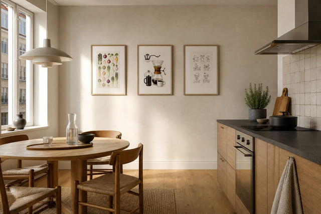
Here is an idea borrowed from good café walls: pair one wine motif with one recipe print to make a small food wall. The wine print sets the mood; the recipe print — a classic dish, an illustrated ingredient chart — adds a bit of wit and something to read while the pasta water boils. Hung in the zone between kitchen and table, the pair connects the two spaces and makes an open-plan room feel deliberate. It is also the natural home for wine kitchen posters that would feel too casual in a formal dining room.
Keep the pairing simple: two 30x40 cm prints side by side in matching frames, or a 30x40 above a 21x30 for a looser, stacked look. Choose prints that share one color — cream grounds in both, or a burgundy accent that repeats — so they read as a set rather than a coincidence. You will find natural partners among the recipe posters, many of which are drawn in the same graphic style as wine art. Best of all, this wall grows well: add a third print after the next memorable dinner, then a fourth, and within a year the wall has actual history in it.
Plan the wall before you drill
A wine wall involves few prints, which paradoxically makes planning more important — with only one or two pieces, a size mistake is obvious. Before you buy or drill, mock the corner up in the free Gallery Wall Builder: set your wall dimensions, then try the space with a single 50x70 cm print and again with a pair of 30x40s. The better option is usually obvious within a minute.
Two further safety nets: the matching wooden frames come in 14 colors, so you can settle framing at the same time as the print, and every order carries 100-day returns, so if that burgundy still life turns out to argue with your curtains, you can exchange it without drama. If you would rather avoid glass near the table altogether, many designs are also available as canvas prints.
The host gift that outlasts the bottle
Every frequent dinner guest knows the arithmetic: another invitation, another bottle, opened and forgotten by Tuesday. A framed wine print is the alternative that stays. A 30x40 cm print in a black or oak frame is generous without being presumptuous — small enough that the host can find a wall for it, distinctive enough that they will remember which dinner it arrived at. Choose the motif to fit the host: a sharp typographic print for the friend with the serious glassware, a loose line-drawn glass for the one whose parties always end in the kitchen.
A practical note: Posterlefi ships worldwide, with free shipping on orders over 399 kr in Denmark and over 49 EUR in the EU, and the 100-day return window means the recipient can swap the motif if your reading of their taste was off. That is more grace than any bottle offers.
Wine poster FAQ
What size wine poster is best for a dining room? For most dining nooks, one 50x70 cm print is the sweet spot — large enough to register across the table, small enough for a corner wall. On a big open wall behind the table, go up to 70x100 cm. Above sideboards and bar carts, a pair of 30x40 cm prints usually beats one larger piece.
How do I decorate a home bar wall with prints? Choose one or two designs with dark backgrounds — charcoal, deep green or near-black — and frame them in black so the art reads as a single deep block behind the bottles. Hang a pair of 30x40 cm prints with bottom edges 20–25 cm above the cart, and keep the surrounding wall empty; the visual density of a bar needs calm around it.
Do wine posters work in a kitchen? Yes, especially in the zone between kitchen and dining table, where a food theme feels natural. Pair a wine motif with a recipe print for a small food wall, and keep artwork out of the direct splash and steam zone by the hob and sink. Framed prints behind glass wipe clean easily, which suits kitchen-adjacent walls.
What color frame goes with wine wall art? Black is the default for dark-background prints and the bar look; oak and walnut warm up burgundy and cream motifs in dining rooms. With 14 frame colors to choose from, the most reliable trick is to match the frame to something fixed in the room — the table legs, the floor tone or the cart.
Can I mix wine posters with other art styles? Absolutely. Wine motifs pair naturally with botanical prints, black and white photography and simple typographic pieces. Keep the frames consistent and repeat one color across the wall, and the mix reads as a curated whole rather than a theme wall.
The dining corner earns art the way few walls do — it is where the evenings you actually remember take place. Start with one motif that matches the way you host, check the size against the numbers above, and let the wall grow from there. When you are ready to look, the coffee and wine poster collection gathers glasses, bottles and typographic designs in one place, ready to hang before the next dinner.
Build your wall virtually before you spend a penny
Arrange sizes and layout on a virtual wall — free, before you buy.

Start with these
See the whole collection →


Related inspiration
100-day returns