


Vintage Posters: Retro Charm in Modern Homes
Vintage posters give characterless new builds and rentals instant history. This guide covers three era looks — art deco travel posters, mid-century minimalism and 70s earth tones — plus the one-statement rule that keeps retro prints looking curated.
There is a particular kind of room almost everyone has lived in at some point: freshly painted white walls, smooth plaster, sensible grey flooring, and no history whatsoever. New builds and rental apartments are practical, but they rarely have a story to tell. Vintage posters are one of the fastest ways to change that. A single art deco travel print or a sun-warmed 70s graphic brings decades of atmosphere to a wall that was bare drywall a week ago — no renovation, no built-in shelving, and nothing your landlord needs to approve beyond a hook or two.
This guide walks through the three era looks that work hardest in modern interiors — art deco travel posters, mid-century graphic minimalism, and 70s earth-tone curves — and the one styling rule that keeps retro prints looking curated rather than cluttered. Along the way you will get concrete sizes in centimetres, colour pairings that actually work, and layout patterns you can copy straight onto your own wall.
Why vintage wall art works so well in modern homes
Modern architecture is deliberately neutral. Developers build for the widest possible audience, which means white walls, straight lines, and finishes chosen to offend no one. The result is a blank canvas — and blank canvases feel unfinished until something with character arrives.
Vintage wall art supplies that character instantly because it carries visual time depth. A poster in the manner of a 1930s railway advertisement or a 1970s exhibition graphic implies that a room has been collected over years, even when everything in it was delivered last month. Interior stylists use this trick constantly: one aged-looking element makes new furnishings feel intentional rather than showroom-fresh.
For renters the appeal is even more practical. Posters ask nothing of the building itself. You can lean a large framed print against the wall on a sideboard, hang it from a single picture hook, and take the entire look with you when the lease ends. In a home you cannot remodel, the art does the heavy lifting.
Era one: art deco travel posters
The art deco travel poster is the most glamorous of the three looks. Born in the 1920s and 30s, when railways, ocean liners and early airlines competed for passengers, the art deco poster style is built on bold geometric shapes, flat planes of colour, dramatic perspective, and stylised landscapes that make a coastline or a mountain range look like a stage set.
The palette is the giveaway: sunset colours. Think burnt orange, dusty pink, deep teal, sand and gold, often arranged along a strong diagonal — a ski slope, a ship's bow, a beam of evening light. These tones are warm without being loud, which is exactly why they flatter cool, neutral modern rooms.
Art deco prints thrive in hallways, above sideboards and in dining areas — places where a touch of theatre feels welcome. Pair them with brass or gold-toned accents, dark wood and deep green or navy textiles, and the corner starts to feel like a small grand hotel. One large print at 50 × 70 cm or 70 × 100 cm carries more of that glamour than several small ones ever will.
Era two: mid-century graphic minimalism
If art deco is a grand hotel, mid-century design is a bright Copenhagen apartment in 1958. The look draws on 1950s and 60s exhibition posters and advertising: radically simplified forms, generous off-white space, matte primaries, and typography treated as part of the picture rather than a caption underneath it.
This is the easiest vintage style to live with, because it shares DNA with the pale woods and clean lines so many modern homes already lean toward. A mid-century graphic above a teak sideboard or a pale oak table looks like it was always meant to be there, and the style slots naturally into a Scandinavian living room without any restyling at all.
Colour pairing is simple: pick one saturated accent from the print — mustard, brick red, petrol blue — and repeat it exactly once in the room, in a cushion or a throw. That single echo is enough to make the poster feel connected to the space instead of merely decorative.
Era three: 70s earth tones and soft curves
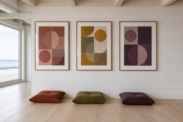
The third look swaps geometry for warmth. Seventies-style prints are all arches, suns, waves and rounded abstract forms, drawn in terracotta, ochre, olive, rust, chocolate and cream. Where art deco is vertical and dramatic, the 70s look is horizontal and relaxed — it lowers the visual temperature of a room rather than raising it.
This era is the natural partner for the textures that dominate current interiors: bouclé chairs, rattan pendants, linen curtains, jute rugs. If your room already contains warm neutrals, a 70s earth-tone print will deepen the scheme without fighting it. It is also the most forgiving style for bedrooms, where soft curves read as calm rather than busy.
A quietly effective trick: hang a pair of 30 × 40 cm earth-tone prints side by side with 5-7 cm between the frames. The repetition feels considered, and the muted palette keeps the pair from competing with the bed or sofa below it.
The one-statement rule
Here is the styling rule that separates curated from cluttered: one vintage statement per wall. Vintage imagery is dense — it carries colour, typography, nostalgia and often a suggestion of place, all at once. Give a wall two or three competing vintage pieces and the room starts to resemble a flea-market stall. Give it one, surrounded by quieter modern pieces, and that single print becomes the story of the wall.
In practice, this means letting the vintage print be the loudest thing in its zone and dialling everything around it down:
- Anchor with one hero. One 50 × 70 cm or 70 × 100 cm vintage print per wall. Every other frame on that wall should be smaller and visually calmer.
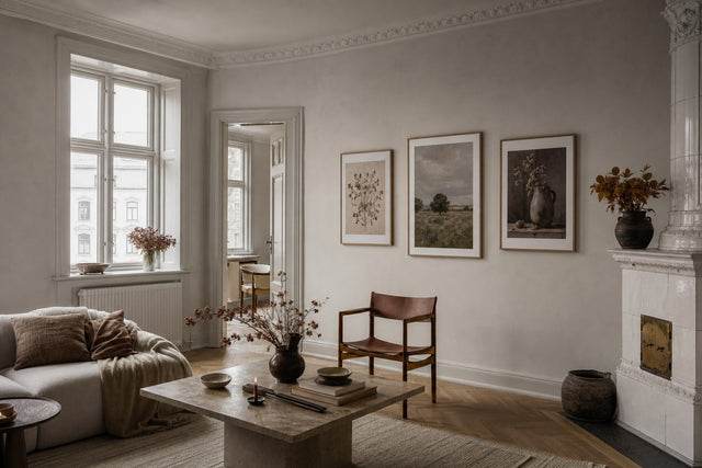
- Surround with modern minimalism. Line drawings, black and white photography, or abstracts in two or three muted tones make ideal neighbours — they frame the statement instead of shouting over it.
- Repeat one colour, not the whole palette. Pull a single tone from the vintage print into the surrounding pieces or textiles: burnt orange from an art deco sky, ochre from a 70s sun.
- Separate eras by wall, not by room. Enjoy art deco in the hallway and 70s curves in the bedroom — just avoid stacking two eras in the same arrangement.
- Leave breathing room. A statement needs 20-30 cm of empty wall around it to register as deliberate rather than accidental.
Sizes, frames and placement that make retro prints feel intentional
Scale is where most walls go wrong, and vintage imagery is unforgiving of timid sizing — a small dramatic print reads as an apology. Use these numbers as a starting point:
- 21 × 30 cm: shelf and picture-ledge territory. Good for propping a retro print against the wall in a kitchen or a home office.
- 30 × 40 cm: the pairing size. Two or three in a row work above a desk, a console or bedside tables.
- 50 × 70 cm: the workhorse statement — big enough to anchor the wall over a sideboard or in an entrance hall.
- 70 × 100 cm: the full statement, right for the wall above a sofa or bed. As a rule of thumb, art above a sofa should span roughly two-thirds of the sofa's width.
- Hanging height: aim for the centre of the print at 145-150 cm from the floor, and slightly lower above seating.
Frames finish the argument. A slim black frame sharpens art deco graphics; natural oak flatters mid-century prints; walnut and darker woods deepen 70s earth palettes. Posterlefi's wooden frames come in 14 colours and 13 sizes, so matching frame to era is straightforward — and every print ships on premium 200 gsm or 230 gsm poster paper, which matters because heavy stock sits flat and looks substantial, the way vintage lithographs once did.
Building a wall around one vintage anchor
Once the statement piece is chosen, the quieter pieces around it need arranging. Three layout patterns work reliably: the off-centre grid (a 70 × 100 cm anchor on the left, a two-by-two grid of 30 × 40 cm prints on the right, aligned to the anchor's top edge); the symmetrical trio (a 50 × 70 cm anchor centred, one 30 × 40 cm print on either side, all three centres on one horizontal line); and the ledge mix (the anchor hung on the wall, smaller prints leaned and slightly overlapping on a picture ledge below).
If you would rather see the result before hammering a single nail, the free Gallery Wall Builder lets you arrange prints and frames on a virtual wall first — particularly useful in a rental, where every hole should count.
Black and white photography deserves special mention as a neighbour for vintage prints. Monochrome city scenes and documentary-style shots are visually quiet but atmospherically rich, so they extend that collected-over-time feeling without adding more colour. A browse through the iconic photo prints will turn up plenty of pieces that sit comfortably beside any of the three eras.
Original designs with a vintage soul
One thing worth knowing before you shop: the vintage-style posters at Posterlefi are original designs created in the spirit of these eras — contemporary, AI-designed artworks that borrow the palettes, shapes and typographic manners of art deco, mid-century and 70s graphics, rather than scans of aged paper. In practice that means crisp printing, faithful colour, and compositions built to work at today's standard frame sizes, while still delivering all the retro character you came for. And with 100-day returns, trying a bolder era than usual is a low-stakes experiment.
FAQ: vintage posters in modern homes
Do vintage posters work in a modern minimalist home? They work precisely because of the contrast. One retro print against clean modern furnishings reads as a deliberate curatorial choice, and the minimalism keeps the nostalgia from tipping into theme decor. Follow the one-statement rule — a single vintage piece per wall — and the two styles flatter each other.
What size vintage poster should I hang above a sofa? Aim for roughly two-thirds of the sofa's width. For a standard two-to-three-seat sofa that usually means a 70 × 100 cm print, or a 50 × 70 cm print flanked by two smaller pieces. Hang it so the bottom edge sits about 20-25 cm above the backrest.
How do I hang posters in a rental without damaging the walls? Large framed prints can lean on a sideboard, a mantel or the floor, and a picture ledge needs only two screws to hold a whole rotating display. Adhesive hooks rated for the frame's weight handle mid-sized prints on smooth walls. Planning the arrangement digitally first keeps the number of holes to an absolute minimum.
Can I mix art deco, mid-century and 70s prints in one home? Yes, and the mix can look wonderful — just separate the eras by wall or by room rather than combining them in a single arrangement. Each era keeps its own zone with one statement per wall, and a shared accent colour, like ochre or teal, can quietly tie the rooms together.
What frame colour looks best with retro prints? Match the frame to the era: slim black for art deco drama, natural oak for mid-century warmth, walnut or darker wood for 70s earth tones. If you are framing several eras across one home, choosing a single consistent frame colour — black or oak — will unify them into one collection.
However characterless the walls you started with, the right print gives them a past. Browse the full range of vintage posters and retro prints and find the one statement your wall has been waiting for.
Build your wall virtually before you spend a penny
Arrange sizes and layout on a virtual wall — free, before you buy.

Start with these
See the whole collection →


Related inspiration

100-day returns