


Art Nouveau Posters: Nature's Flowing Lines Explained
A plain-terms guide to art nouveau — whiplash lines, stylised botany, and how it differs from art deco — plus a simple one-wall recipe for getting the look at home.
Of all the historic styles finding their way back onto modern walls, art nouveau may be the most quietly wearable. Art nouveau posters bring something rare into a room: movement. Where most wall art sits still, the flowing stems, curling vines, and long, graceful lines of this 1890s style seem to grow across the paper. If you have ever admired a print without quite knowing why it felt alive, there is a fair chance art nouveau was behind it.
This guide explains the movement in plain terms — where it came from, what its signature lines and stylised flowers actually are, and how it differs from the harder geometry of art deco. Then it gets practical: a simple get-the-look recipe you can hang on one wall this weekend, plus two modern routes into the style if a full period look feels like too much.
The 1890s Movement, Explained in Plain Terms
Art nouveau — literally "new art" — swept through Europe between roughly 1890 and 1910. It was a deliberate break from two things at once: the stiff, formal art of the academies, and the cold repetition of industrial mass production. Its designers believed everyday objects deserved beauty, and that beauty should come from nature rather than from classical columns or machine parts. The result was a style that touched everything — architecture in Brussels, metro entrances in Paris, jewellery in Vienna, furniture in Glasgow — but found its widest audience on paper.
Posters were the movement's mass medium. Advances in colour lithography meant theatres, cafés, and even biscuit makers could cover city walls with large, vivid advertisements, and art nouveau designers turned those advertisements into art. That is why the style still feels so at home in poster format today: it was born there. More than a century later, the vocabulary those designers invented — flowing lines, flattened flowers, ornamental borders — remains one of the most graceful looks you can hang in a hallway or above a sofa.
The Whiplash Line: Why the Style Feels Alive
If art nouveau has one signature, it is the whiplash curve: a long, tapering line that swells, bends, and snaps back on itself like the crack of a whip or a plant stem bowed by wind. Nothing in the style sits at a right angle if it can help it. Stems arc across the page, hair streams into ornament, smoke curls into borders, and the eye is pulled along the whole journey from corner to corner.
This is organic line art in its purest historical form. The line is not just an outline around a subject; it is the subject. In many classic compositions the drawing does almost all the work — shading is minimal, colour is applied in flat fields, and everything depends on the confidence of that single flowing contour. It is also why the style pairs so naturally with modern minimalist interiors: strip away the ornament and the underlying grammar is remarkably clean.
Stylised Botany: Flowers as Ornament, Not Illustration
Art nouveau loved plants, but never botanical-textbook plants. Irises, lilies, poppies, thistles, and water plants were flattened, elongated, and simplified until they became ornament — half flower, half pattern. Petals stretch impossibly long, leaves twist to fill a corner, and a single stem might run the entire height of a composition. This is what separates art nouveau botany from classic botanical illustration posters, which aim for scientific accuracy. Nouveau aims for rhythm.
The movement's other recurring motifs follow the same logic. Graceful figures — often women in profile with rivers of flowing hair — merge into the plants and borders around them until figure and ornament become one continuous line. Dragonflies, peacocks, and swans appear because their bodies naturally curve. And nearly everything is contained within a decorative frame drawn as part of the artwork itself: arched borders, circular halos, mosaic bands. The picture carries its own architecture.
Art Nouveau vs. Art Deco: Curves Against Geometry
The two styles are separated by only a couple of decades but read completely differently on a wall. Art deco, which took over in the 1920s, is the machine-age sibling: hard geometry, symmetry, sunbursts, stepped forms, metallic gold and strong black. Art nouveau, from the 1890s, is the garden-grown one: asymmetry, tendrils, muted natural colour, and hardly a straight edge in sight.
A quick test if you are unsure which you are looking at, or which one suits your room:
- Lines: deco is ruler-and-compass; nouveau is freehand and flowing. If the composition could be drawn without lifting the pen, it leans nouveau.
- Palette: deco favours high contrast — black, gold, jewel tones. Nouveau favours soft, earthy colour — sage green, ochre, dusty rose, cream, muted teal.
- Mood: deco says glamour and speed; nouveau says growth and calm. In a bedroom or reading corner, nouveau is almost always the gentler choice.
- Subject: deco celebrates cities, machines, and skylines; nouveau celebrates gardens, seasons, and figures woven into both.
Neither is better; they simply do different jobs. Deco energises a space, nouveau softens it. If your room already carries plenty of hard lines — a boxy sofa, rectilinear shelving, large windows — a flowing nouveau print provides exactly the counterpoint the space is missing.
A Note on the Old Masters of the Style
Art nouveau is inseparable from names like Alphonse Mucha, whose theatre posters defined the look of 1890s Paris. Studying their visual grammar — the haloed figures, the ornamental borders, the lettering woven into the image — is the fastest way to train your eye for the style. To be clear about what you will find at Posterlefi: our catalogue consists of original designs created in the art nouveau spirit, not reproductions of period artists. You get the whiplash lines, the stylised botany, and the soft palette drawn fresh — which also means the colours and formats are made for modern rooms rather than nineteenth-century advertising columns.
Get the Look: A One-Wall Art Nouveau Recipe
You do not need to redecorate to bring the art nouveau style home. This is the simplest reliable formula, and it works in living rooms, bedrooms, and hallways alike:
- The print: one organic botanical design at 50x70 cm — large enough for the flowing lines to actually flow. Look for a single dominant stem or figure rather than a busy repeating pattern.
- The frame: slim and black. A thin black frame sharpens the curves the way ink sharpens a drawing, and keeps the look modern rather than museum-like. Oak is the softer alternative if black feels heavy in your room.
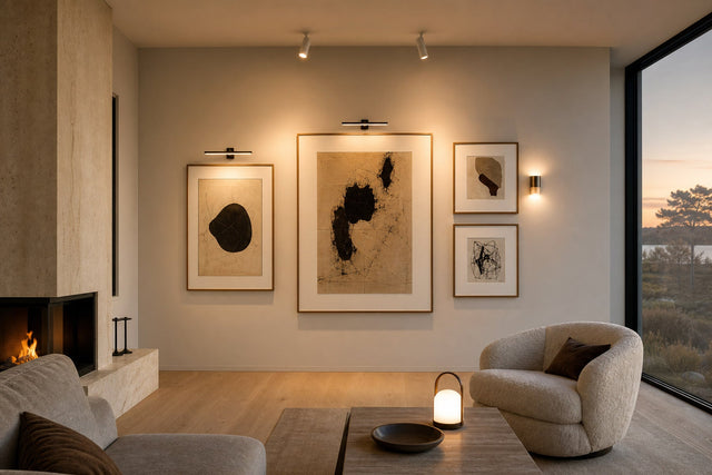
- The wall: warm white or soft cream. Nouveau's muted palette goes flat against a stark, cool white and disappears on busy wallpaper. A warm neutral background lets the line work read from across the room.
- The echoes: repeat the language twice elsewhere in the room — a curved vase on a sideboard and one brass detail (a candlestick, a lamp base, a picture light) are enough. The room starts referencing the print without turning into a theme.
- The restraint: stop there. One strong print with two supporting echoes reads as taste; five nouveau pieces in one room reads as costume.
Hang the print with its centre about 145-150 cm from the floor, or 15-25 cm above a sofa or sideboard, and give it breathing room on both sides. The style's built-in asymmetry does the visual work — you do not need to crowd it.
Two Modern Routes into the Style
Not everyone wants the full period look, ornamental borders and all. The good news is that art nouveau's DNA survives in two contemporary categories, and either one can carry the feeling with a lighter touch.
The first route is botanical. Modern botanical prints with elongated stems, flat colour fields, and a little deliberate stylisation are direct descendants of nouveau's flower ornament — minus the density. A pair of stylised botanicals in 30x40 cm makes an easy bedroom duo where a full nouveau composition might feel too rich.
The second route is line art. Contemporary line art posters — single-contour figures, flowing abstract curves, one confident stroke describing a face or a plant — are essentially the whiplash line with the ornament removed. If your home is firmly minimalist or Scandinavian, this is the route that will feel most native: all of the movement, none of the decoration.
And if you want the genuine turn-of-the-century flavour — ornamental borders, muted lithograph colour, that unmistakable vintage poster style — the vintage category is where the fullest expressions of the look live.
Sizes, Paper, and Frames That Suit the Style
Because art nouveau depends so heavily on line quality, print size matters more here than with most styles. Too small, and the curves lose their sweep. As a rule of thumb: 50x70 cm is the sweet spot for a statement piece above furniture, 70x100 cm suits a large empty wall where the lines can really travel, and 30x40 cm works best for supporting pieces and pairs. Posterlefi prints on premium poster paper in 200 gsm and 230 gsm weights — the heavier stock has a substance that suits the vintage character — and matching wooden frames come in 14 colours and 13 sizes, so the slim black or oak frame the style asks for is easy to match exactly. Canvas is available too, though for this particular style, paper behind glass stays truest to its poster-art origins.
Planning an Art Nouveau Gallery Wall
One statement print is the classic move, but the style also rewards a small, disciplined grouping. Because nouveau compositions are individually busy, the arrangement itself should be calm: matched frames, generous spacing of 7-8 cm between pieces, and a limited palette across all the prints. Three patterns work reliably. A vertical column of three 30x40 cm prints suits a hallway, since the stacked format echoes the style's tall, narrow proportions. A symmetrical pair of 50x70 cm prints can flank a mirror or a bed. Or let one 50x70 cm nouveau anchor sit among two or three quieter line-art pieces that borrow its curves without competing. If you want to test spacing and sizes before hammering a single nail, the free Gallery Wall Builder lets you arrange the whole wall on screen first — particularly useful here, because balance is everything when the prints themselves are ornate.
Frequently Asked Questions
What is the difference between art nouveau and art deco posters? Art nouveau (roughly 1890-1910) is organic and asymmetrical — flowing whiplash lines, stylised flowers, soft earthy colour. Art deco (1920s-30s) is geometric and symmetrical — sunbursts, stepped forms, bold black and gold. The quickest test: nouveau curves, deco angles.
What colours go with art nouveau posters? Warm neutrals make the safest backdrop: warm white, cream, soft beige. For accents, pull from the style's own palette — sage green, ochre, dusty rose, muted teal — and add brass or aged gold in small doses. Avoid stark cool whites and neon brights, which fight the style's softness.
What size should an art nouveau poster be? Go larger than you think. Choose 50x70 cm as a single statement above a sofa or sideboard, 70x100 cm on a big open wall, and 30x40 cm only for pairs and supporting pieces. The flowing lines are the whole point, and they need room to travel.
Does art nouveau work in a modern or Scandinavian home? Yes — surprisingly well. Its foundation is clean, confident line work, which shares DNA with Scandinavian minimalism. Choose a restrained composition, frame it in slim black or oak, and keep it to one statement piece; it will read as a warm counterpoint rather than a period costume.
How should I frame an art nouveau poster? A slim black wooden frame is the modern classic: it sharpens the line work and keeps the ornament from feeling antique. Oak or walnut warms the look for rooms with wooden furniture. Skip wide, ornate gold frames — the print already carries its own decoration, and doubling up tips the whole thing into pastiche.
Ready to bring a little 1890s movement onto your walls? Explore the full range of vintage posters at Posterlefi and find the flowing lines that suit your room — every print ships with 100-day returns, so the only hard decision is which stem to follow.
Build your wall virtually before you spend a penny
Arrange sizes and layout on a virtual wall — free, before you buy.

Start with these
See the whole collection →


Related inspiration

100-day returns