


Abstract Art at Home: How to Choose the Right Piece
A practical style guide to choosing abstract art you'll keep loving: how to read colour mood, movement and texture, match a piece's energy to the room, and why abstracts reward XXL sizing like 70x100 cm.
Abstract art is the genre people hesitate over the longest. A botanical print is easy to judge — you either like eucalyptus or you don't — but an abstract poster asks you to trust a feeling you can't quite name. There is no motif to anchor you, no landscape to recognize, no face to read. So plenty of people scroll past hundreds of genuinely beautiful pieces and buy nothing, quietly worried they'll pick something they're tired of by spring.
Here is the reassuring truth: choosing abstract art you'll still love in five years doesn't require an art-history education. It requires learning to read three simple things — colour mood, movement, and texture — and then matching the energy of the piece to the job of the room it hangs in. This guide gives you that vocabulary, introduces the two big families of abstraction, and explains why abstract wall art tolerates dramatic sizing better than any other genre you can put on a wall.
Why abstract art is easier to choose than you think
The anxiety around abstract art rests on a misunderstanding: that there is a correct interpretation you might miss. There isn't. An abstract piece is not a puzzle with an answer — it's closer to a piece of instrumental music. Nobody asks what a cello suite is "of," and nobody should ask that of a field of layered ochre either. The only question that matters is whether the piece makes the room feel the way you want the room to feel.
This is also why abstracts age so gracefully on your walls. A figurative print commits you to a subject, and subjects drift in and out of fashion. An abstract commits you to a palette and a mood, which is a far more durable contract. When people say they "got tired" of a piece, it is almost always because the energy of the artwork clashed with the energy of the room — a loud, high-contrast composition in a bedroom, or a whisper-quiet tonal piece lost in a busy hallway. The three reading tools below exist precisely to prevent that mismatch.
Tool one: read the colour mood
Colour does most of the emotional work in an abstract, so start there. Squint at the piece until the shapes blur away and only the overall temperature remains. Does it read warm or cool? Saturated or muted? High contrast or tonal? That squint impression — not the details — is what you'll actually live with, because most of the time you'll see the piece from across the room, out of the corner of your eye.
A few reliable colour moods and where they belong:
- Terracotta, rust, and ochre on warm white — grounded and enveloping. Beautiful with oak floors, linen, and cane furniture; the natural pick for living rooms and reading corners.
- Dusty blue, slate, and sage on cool grey — calm and slightly formal. Works in bedrooms and home offices where you want the temperature turned down.
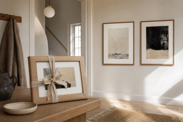
- Black and white with one accent colour — graphic and confident. Ideal for hallways and entryways, where a piece gets seen in passing and needs to land fast.
- Blush, sand, and cream — soft and low contrast. These near-tonal abstracts are the gentlest option for bedrooms and pair naturally with pale wood.
- Deep green and navy with warm neutrals — moody and enveloping. Suited to dining rooms and darker-painted walls, where the piece can glow rather than shout.
A practical shortcut: pick up two colours that already exist in the room — a rug, a throw, the sofa — and let the artwork introduce one new accent. Two echoes plus one surprise is the ratio that makes a piece look chosen rather than matched.
Tool two: follow the movement
Every abstract composition moves, and the direction of that movement sets its energy level. This is the tool most buyers have never been handed, and it explains more purchase regret than anything else.
Horizontal compositions — layered bands, soft washes, horizon-like divisions — are calm. Your eye glides side to side the way it does across a landscape, and the piece reads as restful even in strong colours. Vertical compositions lift a room: tall strokes and rising forms draw the eye upward, which makes them useful in rooms with lower ceilings or above narrow furniture. Diagonals are the energizers. A composition built on slashes, sweeping arcs, or tilted geometry creates visible momentum — wonderful in an entryway or above a desk, exhausting above a bed. And circular or centered compositions contain their own energy; they feel resolved and self-sufficient, which makes them the easiest to place almost anywhere.
Test it the same way you tested colour: look at the piece and notice where your eye enters and where it travels. If it settles, the piece is calm. If it keeps circulating, the piece is active. Neither is better — but one of them belongs in your bedroom and the other in your hallway.
Tool three: look for texture
Texture is the quietest of the three signals, and the one that separates a flat decorative graphic from a piece with presence. In abstract work, texture means visible brushstrokes, granular pigment, paper grain, scraped layers, or the soft bleed of ink into fiber. A textured abstract keeps rewarding you at close range — from the sofa it's a colour mood, but from a meter away it's a surface with history.
Painterly abstracts carry the most texture, and if that hand-made quality is what draws you, browse pieces with visible brushwork in the painting-style prints collection, where the strokes and layering do exactly this work. Print quality matters more here than in any other genre: texture only survives reproduction on decent paper. Posterlefi prints on premium 200 gsm and 230 gsm poster paper, and the heavier 230 gsm stock has a substance that suits painterly, layered compositions particularly well. For very large statement pieces, canvas is also an option and adds a physical weave of its own.
Organic or geometric: the two families of abstract art
Nearly every abstract you'll ever consider belongs to one of two families, and knowing which one you're drawn to cuts your search time in half.
Organic abstraction uses forms borrowed from nature without depicting it: soft edges, flowing lines, blots, washes, arcs that feel grown rather than drawn. Organic pieces are forgiving and warm; they suit rooms with natural materials — wood, wool, linen, stone — and they layer easily with other art because their soft edges don't compete.
Geometric abstraction is built from the ruler and the compass: grids, circles, hard-edged blocks of colour, Bauhaus-descended balance. Geometric pieces bring order and intention to a wall. They flatter modern interiors, and they're a natural companion to the pared-back compositions in the minimalist art collection — many of the best minimalist prints are, strictly speaking, geometric abstracts wearing fewer colours.
You can mix the families, and confident walls often do — but give one of them the majority. A predominantly organic gallery wall with a single geometric piece reads as curated; a fifty-fifty split reads as undecided.
Match the energy of the piece to the job of the room
This is the rule that ties the three tools together: the artwork's energy should match the room's function, not fight it. Rooms where you wind down want calm pieces; rooms you pass through can take bold ones. Concretely:
- Bedroom — low contrast, horizontal movement, muted or tonal colour. A 50x70 cm piece above a dresser, or a single 70x100 cm above the bed, hung so the lower edge sits 15–25 cm above the headboard.
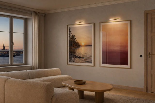
- Living room — this is where your boldest keeper belongs. One anchor piece at 70x100 cm over the sofa, or a pair of 50x70 cm prints hung 5–8 cm apart.
- Hallway and entryway — the highest-energy zone in the home. Diagonal movement and strong contrast work here because viewers are literally in motion; try a rhythmic row of three 30x40 cm prints, or one confident 50x70 cm facing the door.
- Home office — vertical or centered compositions in mid-energy colours: enough life to keep the room from going flat, not so much that it pulls focus from the screen.
- Dining room — moody, saturated palettes earn their keep where people linger in the evening; deep greens, navys, and rusts at 50x70 cm or larger.
If a piece you love seems "wrong" somewhere, it usually isn't wrong — it's misplaced. The energetic diagonal that overwhelmed the bedroom will look superb in the hall.
Go bigger than you think: abstract art loves XXL
Here is the genre's structural advantage: abstract art tolerates — and rewards — extra-large sizing better than anything else you can hang. A photograph enlarged to 100x140 cm can tip into billboard territory, and an enlarged text print just gets shouty. An abstract, by contrast, simply becomes more immersive. With no subject to over-enlarge, scale turns into atmosphere.
So when you're deciding between two sizes of an abstract, take the larger one. Above a standard three-seat sofa, 70x100 cm should be your default, not your daring option — a 50x70 cm print floating alone above two meters of sofa is the single most common sizing mistake in living rooms. Aim for artwork (or a grouping) about two-thirds the width of the furniture beneath it.
Two practical supports make going big less nerve-racking. First, plan before you hang: the free Gallery Wall Builder lets you arrange sizes and combinations on a virtual wall, so you can see whether that 70x100 truly anchors the sofa wall before a single nail goes in. Second, a large abstract deserves a proper frame — wooden frames come in 14 colours and 13 sizes, and on big formats a slim oak or black frame gives the piece the finished edge that makes XXL look intentional rather than accidental. And with 100-day returns, the bold size choice is not a leap of faith.
The seasonal pick: warm organic abstracts for autumn
If you're choosing right now, lean warm and organic. As the light turns amber and interiors fill with wool throws and candlelight, abstracts in terracotta, rust, ochre, caramel, and burnt sienna do something remarkable: they hold the glow of the season on the wall. Organic compositions — soft arcs, layered washes, forms that feel like riverbeds and dunes — amplify that comfort in a way hard geometry doesn't.
The practical beauty of the warm organic family is that it isn't only seasonal. Those earth tones sit comfortably against summer's bare floors and open windows too, which makes this the rare "autumn buy" you won't want to swap out in April. Pair a warm organic abstract with an oak frame and neutral textiles, and the piece will quietly re-tune itself to every season that passes through the room.
Frequently asked questions about abstract art
How do I choose abstract art for my living room?
Start with colour mood: pick up two colours already present in the room and let the artwork add one new accent. Then check the movement — a living room can handle an energetic composition, since it's a social space rather than a sleeping one. Size generously: 70x100 cm over a sofa, or a grouping roughly two-thirds the sofa's width.
What size should an abstract poster be above a sofa?
For a standard three-seat sofa, 70x100 cm is the reliable default, hung with its lower edge 15–25 cm above the backrest. Larger sofas and open walls can carry 100x140 cm, or a pair of 50x70 cm prints hung close together. Abstracts scale up better than any other genre, so when in doubt, choose the bigger size.
Do abstract prints go out of style?
Far more slowly than figurative art, because an abstract commits you to a palette and mood rather than a trend motif. The pieces people tire of are usually energy mismatches — a loud piece in a calm room — rather than dated designs. Choose by colour mood and room function, and an abstract will comfortably outlast several rounds of cushion changes.
Can I mix abstract art with other styles on a gallery wall?
Yes, and abstracts are the best mixers on the market: with no subject of their own, they never compete with photographs, botanicals, or typography. Use abstracts as the connective tissue that repeats your wall's key colours. Keep one family — organic or geometric — in the majority so the wall reads as curated.
What is the difference between organic and geometric abstract art?
Organic abstraction uses soft, nature-derived forms — washes, arcs, blots — and feels warm and forgiving, especially alongside wood and textiles. Geometric abstraction is built from grids, circles, and hard edges, bringing order and a modern sensibility to a wall. Most people are instinctively drawn to one family; identifying yours cuts your search time in half.
Ready to put the three tools to work? Browse the full range of abstract art posters — from whisper-quiet tonal washes to full-volume geometry — and find the piece whose energy fits your room exactly.
Build your wall virtually before you spend a penny
Arrange sizes and layout on a virtual wall — free, before you buy.

Start with these
See the whole collection →


Related inspiration
100-day returns