


Wabi-Sabi Interiors: The Beauty of Imperfection
A practical masterclass in wabi-sabi interiors: what imperfection, impermanence and incompleteness mean for your walls, with concrete palettes, print sizes and placement patterns.
Somewhere between the crisp white walls of Nordic minimalism and the packed gallery walls of recent years sits a quieter idea. A wabi sabi interior does not ask your home to be perfect — it asks it to be honest. Rooted in Japanese aesthetics, wabi-sabi finds beauty in the worn, the muted and the unfinished: linen that creases, a glaze that pools unevenly, a single print hung slightly off-center on an otherwise bare wall. As September pulls us back indoors and toward earth tones, it may be the most seasonally right way to decorate there is.
This guide is a practical masterclass, not a philosophy lecture. We will unpack the three ideas behind wabi-sabi, then translate them into concrete decisions about wall art — sizes in centimeters, an exact palette, frame choices, placement patterns — and compare the style honestly with japandi and Nordic minimalism, so you can tell which of the three calm styles is actually yours. By the end, you will know what to hang, where to hang it, and what to deliberately leave empty.
What Wabi-Sabi Actually Means: Three Ideas, Not a Look
Wabi-sabi grew out of the Japanese tea ceremony, where a rough, irregular bowl was prized above flawless porcelain because it carried the trace of a human hand. Strip away centuries of nuance and three ideas remain. The first is imperfection: an object does not need to be flawless to be beautiful, and often the flaw is the beauty — think of kintsugi, the practice of repairing broken ceramics with gold so the crack becomes the most valuable line in the piece.
The second is impermanence. Everything ages, fades and weathers, and wabi-sabi treats that patina as a gain rather than a loss. A brass handle that darkens, a wooden tabletop that slowly silvers — these are records of a life lived in the room. The third is incompleteness: a space is allowed to feel unfinished, open, still becoming. A wall with one print and a generous stretch of nothing is not waiting for more art. It is already done.
Notice what is missing from that list: a color code, a furniture brand, a shopping list. Wabi-sabi is a way of judging, not a catalogue. That is exactly why it translates so well to walls — every decision below is those three ideas applied.
From Philosophy to Walls: What Changes When You Hang Art the Wabi-Sabi Way
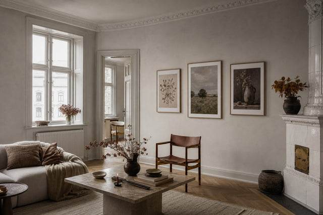
Most wall-styling advice pushes toward control: matched pairs, aligned edges, symmetrical arrangements around a sofa's center line. Wabi-sabi quietly reverses almost all of it. Instead of two identical 50x70 cm prints flanking a mirror, you hang one 50x70, shifted toward a third of the wall, and let the remaining space breathe. Instead of a motif with crisp vector edges, you choose a watercolor where the pigment blooms unevenly at the borders. Instead of a lacquered frame, you pick raw oak with visible grain.
The practical shift comes down to four habits:
- One strong piece over matched pairs. A single asymmetrically placed 50x70 cm or 70x100 cm print carries a wall better than a symmetrical duo. Symmetry reads as polish; wabi-sabi wants presence.
- Soft edges over sharp ones. Watercolor washes, ink paintings and textured abstracts in beige and brown suit the style; high-contrast graphic prints and neon tones fight it.
- Material honesty. Choose frames that look like what they are — oak, pine, dark wood — rather than glossy finishes that hide the material. Canvas prints, with their visible weave, are also naturally at home here.
- Empty wall as a design element. Plan the blank space with the same care as the print. If a wall is 300 cm wide, art might occupy only the leftmost 100 cm — on purpose.
The Wabi-Sabi Palette: Clay, Unbleached Linen and Moss
September is the month Scandinavian homes turn toward earth tones anyway, which makes this the easiest season to start. The wabi-sabi palette meets that autumn shift halfway: it is warm but never loud, and every color in it looks like it came from the ground, a plant or a kiln.
Build your wall art and surrounding textiles from these combinations:
- Clay + unbleached linen: a warm terracotta-brown against soft off-white. Pair a clay-toned abstract print with an oat or sand wall and a natural linen sofa throw.
- Moss + warm grey: muted botanical green with stone grey. Works beautifully as a 50x70 cm botanical study over a grey daybed, framed in raw oak.
- Mushroom + off-black: greige tones grounded by a charcoal accent — an ink-wash motif in a slim dark wooden frame gives the room one quiet anchor.
- Sand + rust: the September pairing. A textured beige-brown watercolor with a thread of rust echoes turning leaves without a single literal autumn motif.
The discipline is in what you exclude. Pure brilliant white, primary colors and cool chrome tones all signal newness — the opposite of patina. If you want a broad base to build from, beige is the natural starting point: nearly everything in that tonal family already speaks the wabi-sabi language.
Motifs That Carry Imperfection Well
Not every calm motif is a wabi-sabi motif. The test is simple: does the image show the trace of a hand or a process? A watercolor wash where two pigments bleed into each other passes. A geometric grid rendered in perfect vectors does not, however muted its colors.
Look for these families of imagery. Soft watercolor paintings are the most direct route — the medium is inherently imperfect, with blooms, granulation and uneven edges no printer of flawless gradients can fake. Ink and sumi-e style brush paintings bring the Japanese lineage in directly, with a single confident stroke and a great deal of empty paper. Textured abstracts in beige, brown and stone read like plaster, raw canvas or eroded stone walls. And quiet botanical studies — dried grasses, seed heads, a single bending stem — carry impermanence literally, since they show plants past their prime and beautiful for it.
Photography can work too, if you choose it carefully: weathered facades, fog, worn stone, sun-faded landscapes. What you are avoiding is gloss — high saturation, hard flash lighting and anything that looks retouched to perfection.
Frames and Paper: Where Patina Meets Practicality
In a style built on material honesty, the frame is not an accessory — it is half the object. Raw and light woods are the classic choice: oak-toned and natural wood frames show grain, knots and variation, which is precisely the point. A dark wooden frame works as the off-black anchor in a mushroom-and-charcoal scheme. What to skip is anything high-shine: polished metallics and glossy lacquers read as showroom, not tea house. Posterlefi's wooden frames come in 14 colors and 13 sizes, so matching a natural finish to each print size — from a small 21x30 cm study to a statement 70x100 cm — is straightforward.
Paper weight matters more than people expect. A heavier 230 gsm paper has a more substantial, matte-leaning presence on the wall, while 200 gsm is a fine standard for smaller formats. For the textured abstracts and canvas-like motifs the style favors, the sturdier paper flatters the artwork. And if you want texture you can actually see from across the room, a canvas print adds a woven surface that suits wabi-sabi better than almost any other decorating style.
One more quietly radical option: no glass-fronted formality at all. A print in a simple wooden frame, or a canvas hung bare, keeps the object soft and touchable rather than sealed away.
Empty Space Is Part of the Composition
In Japanese aesthetics there is a name for meaningful emptiness — ma — and it is the hardest part of wabi-sabi for Western decorators to trust. The instinct says a bare wall is a to-do list. The style says the bare wall is doing something: it gives the one piece you did hang its silence.
Concrete placement patterns that work:
- The off-center solo: one 50x70 cm print placed a third of the way along the wall rather than centered, with its middle at roughly 145-150 cm from the floor. Above a sideboard, align it loosely with one end of the furniture, not the midpoint.
- The uneven pair: a 30x40 cm and a 50x70 cm hung together with staggered top edges and an 8-10 cm gap. The size difference is the point — do not equalize them.
- The loose drift: three small 21x30 cm prints stepping diagonally down a wall instead of forming a straight row or column. Keep spacing irregular but related — say 7, 9 and 12 cm.
- The lone statement: a 70x100 cm print alone on a wall of 3 meters or more, with nothing else competing. This is the most confident wabi-sabi move there is.
Asymmetry is easy to endorse and surprisingly hard to eyeball, because our hands drift back toward symmetry the moment we hold a hammer. This is where planning digitally first pays off: the free Gallery Wall Builder lets you arrange prints on a virtual wall, test an off-center placement against a centered one, and see how much emptiness feels intentional rather than accidental — before a single nail goes in.
Japandi vs Wabi-Sabi vs Nordic Minimalism: Which Calm Is Yours?
These three styles get blended into one beige blur online, but they answer to different instincts, and knowing yours saves a lot of second-guessing at checkout.
Nordic minimalism seeks light and order. It loves white and pale grey walls, blond wood, clean-lined black and white prints, and symmetry that makes small rooms feel larger and brighter. If clutter genuinely stresses you and you crave brightness through a long winter, this is your home style, and a foundation of minimalist art will serve you for years.
Japandi is the meeting point: Japanese restraint fused with Scandinavian function. It keeps the clean lines and order of the Nordic school but warms the palette toward tan, walnut and black, and allows more natural texture. Japandi is still controlled — edges align, sets match. It suits people who want warmth without giving up precision.
Wabi-sabi is the loosest and most forgiving of the three. It alone celebrates wear, welcomes visible age, and treats asymmetry as a feature rather than a compromise. Choose it if a slightly crumpled linen bed looks better to you than a pressed one, and if your favorite objects are the ones with a history. In practice, many Scandinavian homes land on japandi bones with wabi-sabi walls — ordered furniture, imperfect art. There is no rule against mixing; there is only knowing which instinct leads.
Wabi-Sabi Questions, Answered
What is wabi sabi interior style in simple terms? It is a Japanese-rooted approach to decorating that finds beauty in imperfection, age and simplicity. Instead of polished, matching, brand-new surfaces, it favors natural materials, muted earth tones, handmade irregularity and generous empty space. The goal is a home that feels honest and lived-in rather than staged.
What colors are used in wabi sabi decor? Muted, earthy tones drawn from nature: clay and terracotta, unbleached linen and oat, moss green, mushroom greige, stone grey and soft off-black. Brilliant white, primary colors and shiny metallics are avoided because they signal newness and polish, which is the opposite of the patina the style celebrates.
What is the difference between japandi and wabi sabi? Japandi is a hybrid of Japanese and Scandinavian design that stays controlled — clean lines, aligned edges, a warm but disciplined palette. Wabi-sabi is a philosophy rather than a hybrid, and it goes further: it actively embraces asymmetry, visible wear and unfinished-looking surfaces. Japandi rooms look curated; wabi-sabi rooms look inhabited.
What kind of wall art fits a wabi-sabi home? Motifs that show a hand or a process: soft watercolors with bleeding edges, ink and brush paintings, textured beige-brown abstracts, and quiet studies of dried botanicals. Hang them in raw or natural wooden frames, favor one asymmetrically placed piece over symmetrical pairs, and leave deliberate empty wall around the art.
Is wabi-sabi the same as minimalism? No, though they share restraint. Minimalism reduces toward order and visual silence, often with cool tones and strict geometry. Wabi-sabi reduces toward warmth and meaning — fewer things, but imperfect, aged and textured ones. A minimalist wall is empty and exact; a wabi-sabi wall is mostly empty and slightly, deliberately off.
If the style has been quietly making sense as you read, start where the palette starts: browse the beige wall art collection, choose one imperfect motif that holds your eye, and give it a wall — and the silence — of its own.
Build your wall virtually before you spend a penny
Arrange sizes and layout on a virtual wall — free, before you buy.

Start with these
See the whole collection →


Related inspiration

100-day returns