


Watercolor Art Explained: Soft Style for Your Walls
What makes watercolor art feel so calm? A practical style guide to transparent washes and soft edges — plus the rooms, motifs, frames and palettes that suit soft wall art best.
There is a reason watercolor art keeps appearing in the calmest rooms of a home. Where graphic posters announce themselves with hard edges, saturated color blocks and maximum contrast, watercolor does the opposite: it suggests rather than states. A wash of dusty blue becomes a distant hill. Three loose strokes of rose become a peony. Your eye completes the picture, and that small act of participation is exactly what makes the style feel gentle instead of loud.
This guide explains what actually makes watercolor read as watercolor — the transparent layers, the softly bleeding edges, the visible texture of the paper — and then gets practical: the motifs the style does best, the rooms where soft wall art genuinely earns its place, the frames that preserve its airiness, and how to build a whole wall of watercolor prints without the result turning vague. A quick note on spelling: watercolour posters and watercolor posters are the same thing — British and American English simply disagree.
What Makes Watercolor Read as Watercolor
Watercolor is defined by one physical fact: the pigment is transparent. Oil and acrylic sit on top of the surface in opaque layers, but watercolor is pigment suspended in water that sinks into the paper itself. Light passes through the thin veil of color, bounces off the white paper underneath, and returns to your eye. That is where the famous luminosity comes from — the glow is not painted on, it is the paper shining through.
From that single fact follow the visual signatures your brain checks, instantly and unconsciously, when deciding whether something reads as watercolor:
- Transparent layers. Depth is built by laying one thin wash over another, so earlier layers ghost through later ones. Where two washes overlap, a third, deeper tone appears — that soft stacking is unmistakable.
- Bleeding edges. When wet pigment meets wet paper it spreads on its own, leaving feathered borders and the occasional bloom where water pushed color outward. Ruler-straight lines are rare; drifting boundaries are everywhere.
- Visible paper texture. Watercolor paper has tooth — a fine grain that catches pigment unevenly. In a good print you can still see that grain inside the washes, which keeps even large fields of color alive.
- Reserved white space. Classical watercolor uses no white paint; the brightest areas are simply untouched paper. That is why the style always keeps some air in it.
Together these signals produce something no other medium quite manages: color that behaves like weather rather than a statement pinned to the wall.
Why Soft Edges Calm a Room
The calming effect has a plain perceptual explanation. Your eye is wired to seek contrast — hard edges and saturated boundaries are precisely what the visual system flags for attention. A bold graphic poster re-attracts your gaze every time you cross the room: a gift in a hallway, a tax beside your bed.
Watercolor operates at the other end of the scale. Gradients instead of edges, muted mixtures instead of pure pigment, and generous pale areas mean the art registers as ambience rather than signal. You see it when you choose to look and forget it when you do not — exactly the behavior you want from art in rooms devoted to winding down. It is also why soft wall art can go larger than you might dare with graphic prints: a 70×100 cm wash above a bed adds real presence without adding any noise.
The Three Motif Families of Watercolor
Nearly everything in the style falls into three broad families. Knowing which one you respond to makes choosing far easier.
Loose florals. Peonies in three confident strokes, drifting eucalyptus stems, wildflowers that are more gesture than botany. Because the blooms are suggested rather than described petal by petal, they sidestep the sweetness photographic florals sometimes carry. Browse our flower posters and you will notice the watercolor pieces read as the quietest of the group — that softness is the medium doing its work.
Misty landscapes. Mountains dissolving into fog, pale coastlines, a horizon reduced to two overlapping washes. Watercolor may be the best medium ever devised for haze, which is why landscape posters in this style feel closer to a memory of a place than a photograph of one. They are natural candidates for bedrooms, where you want depth without drama.
Abstract washes. Color fields, slow gradients, ink blooms caught mid-spread. This is the most versatile family because there is no motif to agree or disagree with — only a palette. If your home leans modern and figurative art feels out of place, an abstract wash delivers all of watercolor's softness with none of its sentimentality.
Room by Room: Where Soft Wall Art Belongs
Watercolor can hang anywhere, but it repays some rooms more than others. The pattern is simple: the more a room is about slowing down, the harder the style works.
- The bedroom. The style's natural habitat. Hang a single 70×100 cm piece centered above the headboard, or a pair of 50×70 cm prints with 5–8 cm between them, lower edge roughly 20–25 cm above the headboard. Choose muted palettes — dusty blue, sage, blush — over anything saturated.
- The nursery. Low-contrast art suits a room designed for sleep, and watercolor animals or botanicals grow with the child instead of dating in two years. A trio of 30×40 cm prints in matching frames is a classic, flexible start.
- The reading corner. One 50×70 cm print beside the armchair, hung slightly lower than usual — around 120–130 cm to the center — so it sits comfortably in view when you are seated.
- The home office. Choose an abstract wash rather than florals if you want calm without decoration. A soft gradient in your peripheral vision is easier to live with through a long workday than anything with a subject.
- Where to think twice. Rooms that thrive on energy — a lively kitchen, a teenager's room — often want punchier art; watercolor will whisper into a space that is shouting.
Framing: White, Oak and a Generous Passepartout
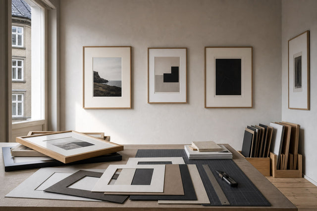
Framing decides whether the airiness survives the journey to your wall. A white frame is the safest choice because it reads as an extension of the reserved paper — the wash seems to float. Oak and lighter wood tones add warmth and are the natural pairing in Scandinavian and Japandi rooms, where the grain of the frame echoes the grain of the paper. A thin black frame can sharpen an abstract wash in a modern space, but heavy, dark moulding around a delicate floral flattens everything the medium does well.
The single biggest upgrade, though, is a generous passepartout. A wide mat gives the washes room to breathe and mimics the white margin painters traditionally leave around a watercolor. Practically, that means framing up: put a 30×40 cm print in a 50×70 cm frame with a mat, and the piece instantly gains gallery weight. At Posterlefi the matching wooden frames come in 14 colors and 13 sizes, so pairing any print with a white or oak frame one size up is straightforward — and if you prefer a softer, frameless look, canvas prints are available too.
Palettes That Pair With Watercolor Prints
Watercolor's muted mixtures make it one of the easiest styles to coordinate. A few proven pairings:
- Dusty blue washes + warm white walls + oak furniture. The Scandinavian default, and hard to get wrong. Add a striped cushion in the same blue and the room clicks together.
- Blush and rose florals + sage green textiles. Rose and green are complements, so the pairing has quiet tension without harsh contrast. Lovely in bedrooms.
- Grey mist landscapes + charcoal accents. Tone-on-tone and very calm. Add one black-and-white piece nearby for structure so the greys do not drift into fog.
- Terracotta and sand abstracts + cream, linen and rattan. The warmest expression of the style, suited to south-facing rooms and boho-leaning interiors.
One counterintuitive tip: watercolor is stunning on dark walls — against deep blue-grey or forest green, the pale reserved paper glows like a window.
Building a Soft Gallery Wall Without Going Vague
The one real risk with watercolor is an all-soft wall that blurs into mush — five gentle pieces that, together, say nothing. The fix is structure, not louder art. Anchor the arrangement with one clearly larger piece, such as a 50×70 cm wash, and let two or three smaller prints in 30×40 cm and 21×30 cm orbit it. Vary the scale, not the mood. Repeat one color across at least two pieces so the group reads as a family, and give the wall a spine by including a single structured piece — a fine line drawing or a black-and-white photograph. That one firm element makes everything soft around it look intentional.
Keep frames consistent — all white or all oak — when the art itself is this loose. And before you put a single nail in the wall, test the layout in our free Gallery Wall Builder: you can arrange real prints in their real sizes on a virtual wall and see whether the composition holds together before anything is on the wall.
A Note on Originality
The watercolor designs at Posterlefi are original AI-designed artworks created for our catalogue — not scans or reproductions of museum pieces. In practice that matters: palettes are tuned for interiors, and motifs exist in cohesive series, so finding three pieces that genuinely belong together takes minutes rather than weeks. Every design is printed on premium poster paper in 200 gsm or 230 gsm, and 100-day returns mean you can live with a print in the actual room before deciding.
Frequently Asked Questions About Watercolor Art
What makes watercolor art different from other painting styles? Transparency. Watercolor pigment lets light pass through to the white paper beneath, creating a glow that opaque media cannot copy. The practical signatures are layered translucent washes, soft bleeding edges, visible paper grain and untouched white areas doing the work of highlights.
Which rooms suit watercolor prints best? Bedrooms, nurseries and reading corners — anywhere you go to slow down. The style's low contrast means it registers as atmosphere rather than a focal point demanding attention, which is exactly what art near sleep and rest should do. High-energy spaces often suit bolder graphic art better.
What frame color looks best with watercolour posters? White or oak. White extends the paper so the wash appears to float; oak adds warmth and suits Scandinavian interiors. Whichever you choose, a generous passepartout — for example a 30×40 cm print matted in a 50×70 cm frame — flatters the style more than any frame color decision.
What size watercolor print should I hang above a bed? For a standard double bed, one 70×100 cm print or a pair of 50×70 cm prints works best, hung with the lower edge 20–25 cm above the headboard. Because watercolor is visually quiet, err on the larger side — a big soft piece never overwhelms the way a big graphic piece can.
Is watercolor too soft for a living room? Not if you give it structure. Choose a large-format abstract wash rather than a small floral, frame it with intention, and pair it with one or two firmer pieces such as a line drawing or a black-and-white photograph. The contrast lets the softness read as a choice rather than a default.
If this sounds like the temperature your rooms have been missing, start where the washes live: explore the full watercolor paintings collection and find the piece your quietest wall has been waiting for.
Build your wall virtually before you spend a penny
Arrange sizes and layout on a virtual wall — free, before you buy.

Start with these
See the whole collection →


Related inspiration


100-day returns