


Wall Art Ideas, Wall by Wall: 12 Placements That Lift the Whole Home
A wall-by-wall guide to twelve wall art ideas — from vertical hallway pairs and ascending staircase grids to a six-piece grid for the big empty wall — with exact sizes, spacing and hanging heights.
An empty wall has a strange way of dominating a room. You stop noticing the sofa you chose so carefully or the sideboard you saved for; your eye goes straight to the blank plaster above them. Here is the reassuring part: most good wall art ideas are not really about taste. They are about placement. Once you know what a narrow hallway wants versus what a three-metre living room wall wants, choosing the actual posters becomes the easy — and genuinely enjoyable — part of the job.
That is why this guide is organised by wall, not by style. Below are twelve ideas covering the walls almost every home has: the tight hallway, the staircase, the stretch above the sideboard, the sofa wall, the bedroom, and that big empty wall that has quietly bothered you for months. Each idea comes with concrete sizes and spacing in centimetres, so you can measure tonight and hang this weekend.
Two rules that make every wall work
Before the ideas, two measurements are worth memorising. Galleries hang art so the centre of the piece sits at about 145 cm from the floor — average eye height. The rule works just as well at home, and it instantly fixes the most common mistake: hanging everything too high. The second rule concerns width: art hung above furniture should span roughly two-thirds of the furniture's width. A 180 cm sideboard wants about 120 cm of art above it; a lone 30x40 print up there will look like a postage stamp.
Keep these in your back pocket as you read the twelve ideas:
- The 145 cm rule: the centre of a single piece — or the centre of a whole group — sits 145 cm above the floor.
- The two-thirds rule: art above a sofa, bed or sideboard should span about two-thirds of the furniture's width.
- Spacing: leave 5–8 cm between frames in any group; tighter reads as one deliberate shape, wider starts to look scattered.
- Furniture clearance: the bottom edge of the art should sit 20–25 cm above a sofa back or headboard, and 25–30 cm above a sideboard.
- Treat groups as one piece: measure the outer edges of the full arrangement and centre that whole shape on the wall, not each frame individually.
Ideas 1–2: the narrow hallway loves vertical pairs
Hallways are corridors of glances — nobody stands still in them — so the wall decor ideas that work here are simple, rhythmic and vertical. Idea 1: hang a row of portrait-format 30x40 prints in identical frames, spaced 7–8 cm apart, with their centres on the 145 cm line. A useful rule of thumb is one 30x40 for every 50–60 cm of wall, so a 2.5-metre hallway wall takes four prints comfortably. Because people view hallway art from half a metre away, detailed motifs earn their place here; black and white photography prints are a classic hallway choice because they stay legible even in the low light most hallways get.
Idea 2: if your hallway ends in a flat wall, treat that end wall as the focal point instead. One tall vertical piece — a 50x70, or a 61x91 if the wall can carry it — hung at eye height pulls the gaze down the corridor and makes a narrow space feel intentional rather than merely functional. Keep the side walls bare or nearly bare so the end piece does the talking.
Idea 3: the staircase grid that climbs with you
Staircase walls intimidate people, but the whole trick is one imaginary line. Picture a line running parallel to the handrail, 145 cm vertically above the treads. The centre of each frame sits on that line, so the arrangement ascends exactly as you do. Idea 3: use identical frames in a single size — 30x40 or 40x50 both work — stepping each frame upward as the stairs rise. Keep the horizontal gaps even at around 8 cm and let the vertical offset follow the pitch of the stairs. The repetition is what makes it feel calm instead of busy; a staircase is the one wall where mixing frame colours rarely pays off.
A staircase is hard to picture in your head, so plan it digitally first and spare the plaster. The free Gallery Wall Builder lets you arrange sizes, spacing and motifs on screen before you commit a single nail.
Ideas 4–5: above the sideboard, hang some and lean some
The sideboard wall is the most forgiving surface in the house, because the furniture gives you both an anchor and a shelf. Idea 4: the composed version. Hang a symmetrical pair of 50x70 prints side by side, 6–8 cm apart, with their combined width landing near two-thirds of the sideboard and their bottom edges 25–30 cm above the top. This is the arrangement that makes a dining room look finished with the least effort.
Idea 5: the relaxed version — layering. Lean one larger piece, a 50x70 or 61x91, directly on the sideboard against the wall. Then overlap a smaller 30x40 in front of one of its corners, and hang a third small print on the wall just above. The mix of hung and leaning frames reads as collected over time rather than bought in an afternoon, and it leaves natural gaps for a lamp or a vase to join the composition. One quiet discipline holds it together: keep the frames in the same colour family. Posterlefi's wooden frames come in 14 colours, so matching a trio is straightforward.
Ideas 6–7: the big empty wall — one statement or a six-piece grid
The three-metre-plus wall is where most people freeze, and it is also where small art goes to disappear. You have two honest options, and both involve committing. Idea 6: one properly large piece. A 70x100 print in a wide frame can hold a big wall entirely on its own, especially with generous empty space left around it. Large wall art earns its keep precisely because it does not have to share; abstract and painterly motifs suit this scale best, since fine detail is wasted at a viewing distance of three metres.
Idea 7: the six-piece grid. Three columns by two rows of 50x70 prints with 7 cm gaps gives you a block roughly 164 cm wide and 147 cm tall — enough presence for almost any wall. Grids are the most architectural of all picture arrangements: identical frames, identical spacing, and the discipline itself becomes the design. Hang the centre of the whole block at 145 cm and check your gaps with a spacer cut from cardboard.
Proven layout patterns for art for empty walls at this scale:
- 3 x 2 grid of 50x70: about 164 x 147 cm overall — the classic answer for walls over three metres.
- 2 x 2 grid of 50x70: about 107 x 147 cm — for generous but not enormous walls.
- Single 70x100: maximum calm; centre it on the wall, or over furniture, with the centre at 145 cm.
- Triptych of 40x50: three related motifs in a row, 8 cm apart, about 136 cm wide — ideal above long, low furniture.
- Organic salon wall: eight to twelve mixed sizes from 21x30 up to 50x70, growing outward from one anchor piece — plan it on screen before you hammer.
Idea 8: the sofa wall, where two-thirds does the maths for you
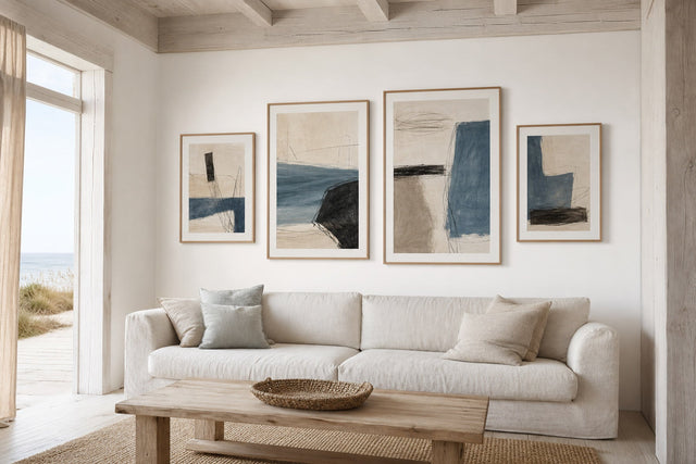
Above the sofa, the two-thirds rule stops being theory and becomes arithmetic. A standard 220 cm three-seater wants roughly 145–150 cm of art width above it. That translates neatly into a three-piece row of 50x70 prints at about 164 cm wide, or a pair of 61x91 prints at about 129 cm — both sit comfortably in the right zone, where a single small print would float awkwardly. Hang the bottom edges 20–25 cm above the backrest so the art and the sofa read as one unit rather than two strangers. In a pale, wood-and-wool Nordic scheme, muted abstracts and soft landscape tones keep the wall restful; there is a whole approach to this in the Scandinavian living room collection if that is your home's language.
Ideas 9–10: bedroom and home office want quieter arrangements
Some walls should lower your pulse, not raise it. Idea 9: above the bed, hang a matched pair of 40x50 or 50x70 prints, centred over the headboard with bottom edges just 20–25 cm above it — noticeably lower than you would hang elsewhere, because the bed is viewed while sitting and lying down. Muted botanicals, line art and hazy photography all behave well in a bedroom; high-contrast graphics tend to fight the point of the room.
Idea 10: in the home office, think in columns. A vertical stack of three 30x40 prints beside the desk fills the narrow wall segment that most desks sit against. If the art hangs above the desk where you see it while seated, drop the centre line to about 125–130 cm — eye height changes when you sit down, and the art should follow.
Ideas 11–12: the leftover walls — nooks, slivers and in-betweens
Every home has walls that no furniture claims: the strip between two windows, the nook beside the kitchen shelves, the half-wall behind a door. These are the most personal spots in the house precisely because nothing about them is prescribed. Idea 11: in a kitchen or breakfast nook, hang a casual cluster of three to five small prints — 21x30 and 30x40 mixed — with looser spacing than you would use in a formal grid. Food motifs, vintage prints and cheerful graphics suit the setting, and small formats are easy to swap when the season or your mood changes.
Idea 12: for a narrow sliver of wall, use a vertical column: two or three 21x30 prints stacked with 7 cm gaps, centred on the sliver. A column turns an awkward leftover into a deliberate detail, and it is often the arrangement guests notice first.
Wall art questions people actually ask
What height should I hang wall art? Hang single pieces so their centre sits about 145 cm above the floor, which matches average eye height. For a group, treat the whole arrangement as one shape and put the centre of that shape at 145 cm. In rooms where people mostly sit — dining rooms, offices, bedrooms — you can drop the line 10–20 cm lower.
How big should wall art be above a sofa? Aim for a total width of about two-thirds of the sofa. For a 220 cm sofa that means roughly 145–150 cm of art, which a triptych of 50x70 prints or a pair of 61x91 prints delivers. Keep the bottom edge 20–25 cm above the backrest.
How do I arrange pictures on a staircase wall? Follow an imaginary line parallel to the handrail, 145 cm above the treads, and place the centre of each frame on it. Use identical frames in one size and keep horizontal gaps even, around 8 cm. The stepped repetition does all the visual work.
What do I put on a large empty wall? Scale up rather than scatter: either one 70x100 statement piece with breathing room around it, or a disciplined grid such as three-by-two 50x70 prints with 7 cm gaps. Several small unrelated pieces spread across a big wall almost always read as clutter.
How far apart should frames hang in a group? Keep 5–8 cm between frames, and keep that gap consistent through the whole arrangement. Consistent spacing is what makes a group of separate prints read as one intentional composition rather than an accumulation.
Every wall in this guide can be solved with a tape measure and one good decision. If you need the raw material, Posterlefi's catalogue of more than 8,000 posters and art prints covers Scandinavian, botanical, abstract, photographic and vintage styles, printed on premium 200 or 230 gsm paper — and with 100-day returns, there is room to change your mind once a print meets your actual wall. Start with the newest arrivals and give your emptiest wall first pick of this season's prints.
Build your wall virtually before you spend a penny
Arrange sizes and layout on a virtual wall — free, before you buy.

Start with these
See the whole collection →


Related inspiration


100-day returns