


The Psychology of Blue: Mastering Calm and Focus in Interior Design
Discover how the strategic use of blue wall art can transform your home into a sanctuary of calm and focus. This guide explores the color psychology behind blue bedroom decor and productivity-boosting office aesthetics, offering expert styling tips for integrating Posterlefi's Scandinavian prints into your living space.
The Psychology of Blue: Mastering Calm and Focus in Interior Design
The Direct Answer: In the realm of interior design and color psychology, blue is unequivocally recognized as the premier color for inducing physiological calm and mental clarity. Studies indicate that viewing shades of blue can lower blood pressure, reduce heart rate, and slow respiration, making it the ideal choice for spaces dedicated to rest (bedrooms) and deep focus (home offices). By mimicking the natural tranquility of the ocean and the sky, blue wall art acts as a visual anchor that reduces cognitive load and promotes a state of serenity.
The Science of Serenity: Why Blue Works
Before we dive into styling, it is crucial to understand the why behind the aesthetic. Our brains are hardwired to associate blue with non-threatening, constant elements of nature: a clear midday sky or a calm sea. This association triggers the parasympathetic nervous system, signaling the body to relax. Unlike red, which signals alarm or passion, or yellow, which screams energy, blue sits on the cool end of the spectrum, physically receding from the eye to make spaces feel larger and more open.
For the modern homeowner, specifically those who adore the functional beauty of Scandinavian design, integrating blue is not just a stylistic choice—it is a wellness strategy. Whether you are looking to curate a gallery wall that quiets the mind or a singular statement piece that anchors a room, the specific shade of blue matters. At Posterlefi, we have found that incorporating blue art prints into high-stress zones effectively neutralizes visual noise.
Blue in the Bedroom: Designing for Deep Sleep
The bedroom is your sanctuary, yet it is often cluttered with visual stimuli that hinder the transition into sleep. To combat insomnia and restlessness, interior decorators recommend a palette dominated by soft, cool tones. This does not mean painting every wall navy; rather, it involves the strategic placement of art that draws the eye into a state of meditation.
We recommend starting with landscape art or serene nature photography that features misty mornings, calm lakes, or twilight horizons. These images serve as "windows" to the outside world, expanding the perceived boundaries of a small bedroom. If you prefer a more artistic touch, watercolor paintings in shades of indigo and azure offer a softness that rigid geometric shapes cannot achieve. The fluidity of watercolor mimics water itself, enhancing the calming effect.
Posterlefi Design Tip: Pair a large-scale blue nature print with crisp white bedding and warm wood textures. The contrast between the cool art and the warm wood creates a balanced, "hygge" atmosphere essential for Scandinavian bedrooms.
The Blue Office: Cultivating Focus and Flow
While blue calms the body, it simultaneously sharpens the mind. This unique duality makes it the gold standard for home offices. "Intellectual Blue" stimulates clear thought and communication. If your workspace feels chaotic, introducing structure through abstract art featuring blue tones can help organize your thoughts.
For a workspace that demands creativity without distraction, consider minimalist art. A single blue line drawing or a color-block print provides a focal point for your eyes to rest on during screen breaks, reducing eye strain and mental fatigue. Alternatively, if your work is high-pressure, cities photography featuring blue "golden hour" skylines can inspire ambition while maintaining a cool, professional palette.
The Scandinavian Approach: Pairing Blue with Neutrals
Scandinavian design is defined by light, functionality, and a connection to nature. Blue is the perfect accent color to break up the monotony of a monochrome palette without disrupting the harmony. The key is in the pairing.
1. Blue and Beige
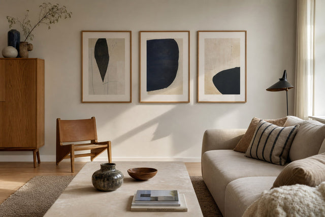
Warm earth tones ground the coolness of blue. When you place a deep navy print against a wall painted in beige, you create a sophisticated contrast that feels organic. This combination is trending in 2026 living rooms.
2. Blue and White
The classic maritime combination. Crisp white walls allow blue artwork to pop vividly. This is ideal for nature prints involving botanical elements or sky imagery.
3. Blue and Grey
For an ultra-modern, masculine look, layer different shades of blue against gray backgrounds. This works exceptionally well with black framed photography or monochrome Scandinavian prints.
Curating Your Blue Gallery Wall: The Posterlefi Method
Creating a gallery wall requires more than just hanging pictures; it requires a narrative. Here is a step-by-step guide to building a "Blue for Calm" gallery wall:
- Anchor the Look: Start with a large, central piece. A dramatic piece from our iconic photos collection or a sweeping landscape sets the tone.
- Mix Media: Don't stick to one style. Combine a realistic photo with a piece of illustration art. This adds texture and visual interest.
- Incorporate Organic Shapes: Break up rigid squares with prints featuring leaves & plants. The green-blue hues of eucalyptus or ferns bridge the gap between pure blue and nature.
- Add a Quote: A calming mantra from our quote posters collection, framed in blue or white, reinforces the intention of the space.
Data Comparison: Which Shade of Blue is Right for You?
| Shade | Psychological Effect | Best Room Application | Recommended Collection |
|---|---|---|---|
| Navy / Indigo | Authority, Depth, Meditation | Home Office, Reading Nook | Abstract Art |
| Sky Blue / Cyan | Openness, Freedom, Optimism | Small Bedrooms, Bathrooms | Summer prints |
| Teal / Turquoise | Balance, Emotional Healing | Living Room, Creative Studio | Scandinavian |
| Slate / Grey-Blue | Neutrality, Sophistication | Dining Room, Hallways | Photography |
Seasonal Swaps: keeping the Calm Year-Round
One of the benefits of Posterlefi art prints is the ability to swap them with the seasons. In the colder months, deep blues evoke a cozy winter evening. Explore our winter prints for snowy landscapes that utilize blue shadows. Conversely, in the warmer months, lighter, breezier blues found in summer prints or even insects & butterflies prints can make a room feel airier and cooler.
Frequently Asked Questions (FAQ)
Can blue wall art make a room feel cold?
It can if not balanced properly. To avoid a "cold" feeling, ensure you mix your blue art prints with warm lighting, wood furniture, and textiles in beige or cream. The contrast creates coziness.
What is the best frame color for blue art?
It depends on the shade. For deep navy art, a gold frame adds luxury and warmth. For light sky blues, a white or light oak frame maintains the airy, Scandinavian aesthetic. For high-contrast modernism, use black frames.
Does blue art work in the kitchen?
Absolutely. Blue is known to suppress appetite slightly (which can be a diet aid!) but also creates a clean, hygienic look. We recommend botanical prints or line art for kitchen spaces to keep the vibe fresh and uncluttered.
Conclusion
Integrating blue into your home decor is more than a trend; it is a commitment to a more peaceful, focused lifestyle. By selecting the right blue wall art, you leverage the power of color psychology to improve your well-being. Whether you choose the deep focus of an indigo abstract or the breezy calm of a coastal photograph, Posterlefi has the curated collection to transform your walls into a source of serenity. Start building your sanctuary today.
Build your wall virtually before you spend a penny
Arrange sizes and layout on a virtual wall — free, before you buy.

Start with these
See the whole collection →


Related inspiration
100-day returns