


The Matisse Look Explained: Organic Shapes for Your Home
A practical guide to the Matisse cut-out look: what defines the style, and how to recreate it at home with original line art, restrained color pairings, and oak frames.
There is a reason matisse style art keeps appearing on the most confident walls in Scandinavian homes: it is very hard to get wrong. Loose organic shapes, a single unbroken line describing a figure, two or three colors that know how to behave — the look reads as effortless precisely because the rules behind it are strict. Henri Matisse spent the last decade of his life refining this visual language with scissors and painted paper, and the results still feel more modern than most things designed last year.
This guide explains what actually defines the cut-out era — the shapes, the line work, the restraint — and then gets practical: which colors to pair, what sizes work above a sofa or a sideboard, why oak frames flatter the style so reliably, and how to plan an entire wall before you drive a single nail. One thing to be clear about up front: this is a get-the-look guide built around original designs, not a catalog of Matisse reproductions. You will learn to recognize the style, then recreate its mood with art made today.
Where the Cut-Out Look Comes From
In the 1940s, after surgery left Matisse largely unable to work at an easel, he changed his method entirely. Assistants painted sheets of paper in flat gouache, and he cut shapes directly from them — leaves, fronds, coral, stars, dancing bodies — then arranged the pieces into compositions on his studio walls. He famously called the technique "painting with scissors." What began as a workaround became the boldest work of his career: enormous, joyful arrangements of pure shape and color that museums now treat as the summit of his output.
Two things make this era so useful for interiors. First, the works are flat by nature — no brushwork, no illusion of depth — so they translate beautifully to printed posters. Second, the compositions were designed to live on walls, at room scale, as part of an environment. Matisse was, in a very real sense, decorating. That is why the cut-out art style slips into a living room more naturally than almost any other movement of the twentieth century.
What Defines the Style: Shapes, Lines, and Color
Strip the look down and you find three ingredients, and the discipline lies in never adding a fourth. The first is the organic shape: irregular, hand-cut silhouettes drawn from nature. Think seaweed swaying, a leaf with slightly uneven lobes, the curve of a hip or a shoulder. Nothing is geometric, nothing is symmetrical, and the small wobble of the scissors is the point — it is what keeps an organic shapes poster feeling human rather than manufactured.
The second ingredient is the confident single line. Alongside the cut-outs, Matisse drew faces and figures in one continuous, unhesitating contour — no shading, no correction, no second attempt visible. This economy is the direct ancestor of the line drawing prints that dominate modern Scandinavian interiors: a whole figure conjured from one dark stroke on pale paper.
The third is restrained color used in flat blocks. A classic cut-out composition rarely holds more than two or three saturated hues plus the white of the paper. Cobalt blue, coral red, leaf green, sunflower yellow — each sits in its own unbroken field, never blended, never gradiented. Add the final habit of generous negative space, and you have the complete grammar. When you shop for matisse inspired art, these are the tells to look for: organic silhouettes, one-line figures, flat color, and plenty of air around every element.
Get the Look with Original Art
An honest note before the styling advice. Matisse's actual cut-outs hang in museums — the Museum of Modern Art in New York, Tate Modern in London, the Centre Pompidou in Paris — and his estate licenses official reproductions through other channels. Posterlefi does not sell Matisse's works. What we offer instead is original, digitally created art designed for Posterlefi: a catalog of more than 8,000 posters that includes a deep bench of continuous-line figures and organic abstract compositions in exactly this spirit. Our line art collection is the natural starting point — single-stroke faces, botanical contours, and loose organic forms that carry the same calm confidence without pretending to be something they are not.
There is a practical upside to going original rather than reproduction. The style was always about a visual language, not a specific image, and original designs let you tune that language to your room — a warmer terracotta instead of a museum-piece red, a composition proportioned for a 50x70 cm frame rather than a gallery wall in Paris. You are buying the grammar, applied freshly.
Color Pairings That Keep It Calm
The fastest way to ruin the look is to use too many colors at once. Matisse could balance six hues because he controlled the entire composition; on a domestic wall shared with furniture, textiles, and daylight, fewer is safer. Pick one of these proven pairings and hold the line:
- Cobalt blue on warm white — the Blue Nudes mood. One saturated blue, nothing else. Works especially well as a pair of prints over a light oak sideboard.
- Burnt orange and deep navy on cream — warm and grounded. Echo the orange in a cushion or throw so the wall talks to the sofa.
- Sage green, terracotta, and off-white — the gentlest version, ideal for bedrooms where saturated primaries would feel loud.
- Black line work with a single coral accent — mostly monochrome line drawing prints, with one organic shape in color to lift the group.
- Mustard, dusty pink, and charcoal — a mid-century-leaning trio that flatters walnut and darker wood furniture.
Whichever pairing you choose, repeat at least one hue somewhere else in the room — a vase, a blanket, the spine of a book stack. That single echo is what makes a wall look styled rather than shipped.
Why Beige and White Walls Do the Heavy Lifting
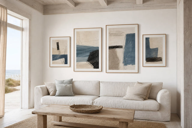
Flat color blocks need a quiet ground to land on, which is why this style is at its best on white and beige walls. On a clean white wall, the prints read almost like a gallery hang: the paper edge nearly disappears, the shapes float, and the saturated hues do all the talking. If your walls are a cool, bright white, lean toward cooler print palettes — blues, greens, black line work — so nothing clashes at the temperature level.
Beige and greige walls behave differently, and better than most people expect. The warmth of the wall flatters terracotta, ochre, sage, and blush palettes, and it softens the contrast so the overall effect is cozier and less museum-like. One detail worth checking: on a beige wall, choose designs with an off-white or cream background rather than stark paper-white. A bright white print background against a warm beige wall can look mismatched, like a cool rectangle punched into a warm surface. Cream-grounded designs blend in as though they were commissioned for the room.
Oak Frames and Paper: Finishing the Look
If the style has an official frame, it is pale oak. The light, warm grain echoes the wood tones already present in most Scandinavian rooms — floors, table legs, shelving — and its softness keeps the focus on the shapes rather than the border. Oak next to terracotta and sage is a particularly reliable pairing; oak around cobalt blue on white gives you warmth and clarity at once. Posterlefi's wooden frames come in 14 colors and 13 sizes, so matching frame to palette is straightforward: oak for warm and earthy schemes, black for graphic black-and-white line work that wants a crisp edge, and white frames when you want prints on a white wall to melt into the surface and let color alone define the composition.
Paper matters more than most buyers realize with flat-color art, because large unbroken fields show quality instantly. Posterlefi prints on premium poster paper in two weights, 200 gsm and 230 gsm — both substantial enough to sit perfectly flat in the frame, which is exactly what fields of solid color demand. For larger statement sizes, the heavier 230 gsm stock is a sensible choice.
Sizes and Layout Patterns That Work
Because the style thrives on negative space, the hanging plan matters as much as the prints. These layouts are proven with this kind of art:
- One 70x100 cm statement above the sofa — hang it so the center sits about 145 cm from the floor, with 20–30 cm between the sofa back and the frame's lower edge.
- A pair of 50x70 cm prints side by side — leave a 5–8 cm gap between frames and treat the pair as one block when centering. Ideal for two related one-line figures.
- A trio of 30x40 cm prints in a row — perfect above a sideboard or bed. Keep gaps identical and palettes shared across all three.
- An asymmetric cluster — one 50x70 cm anchor with two 30x40 cm satellites, aligned along the anchor's top or bottom edge. This mimics the loose balance of a cut-out composition itself.
- One oversized print alone on a beige wall — the bravest and often best option. A single 70x100 cm organic composition with a meter of empty wall around it is pure Matisse logic: the emptiness is part of the work.
Resist the urge to fill leftover wall. In this style, blank space is not unused space — it is the frame around the whole idea.
Plan the Whole Wall Before You Buy
The cut-out look mixes beautifully within its own family: a one-line face beside an organic botanical shape beside a small abstract color study reads as a curated set, because everything shares the same underlying grammar. The trick is to vary scale while repeating palette — let one large anchor print set the colors, then pick smaller companions that borrow at least one hue from it. Figure studies are the classic companion piece; our female figure prints sit naturally next to organic shapes, exactly as line-drawn bodies sat beside cut leaves in Matisse's own studio arrangements.
Before ordering, test the whole arrangement digitally. The free Gallery Wall Builder lets you drag your chosen prints into position, try the pair-versus-trio question, and check spacing at true proportions — far cheaper than living with extra nail holes. And if a print looks different in your room than it did on screen, Posterlefi's 100-day return window means the experiment carries very little risk.
Frequently Asked Questions
What is Matisse's cut-out style actually called?
The technique is known in French as gouaches découpées — literally cut gouaches — and the period from roughly 1943 to 1954 is usually called his cut-out era. Matisse cut shapes from paper hand-painted in flat gouache and composed them into large works. When people search for the cut-out art style today, this is the body of work they mean.
Is Matisse style art the same as line art?
They overlap but are not identical. Line art refers to any drawing built from clean contour lines, while the Matisse look combines two strands: continuous one-line figure drawing and flat organic cut-out shapes. Most modern line drawing prints descend directly from his single-stroke figure studies, so the two categories share a wall very comfortably.
What colors go best with Matisse inspired art?
Start from a warm neutral base — white, cream, or beige walls — and limit the art itself to two or three saturated hues. Cobalt blue with warm white, burnt orange with navy, and sage with terracotta are the most dependable pairings. Repeat one of the print colors in a textile elsewhere in the room to tie the scheme together.
What size should a Matisse style poster be above a sofa?
A single 70x100 cm print is the safest statement size, hung with its center about 145 cm from the floor. As a rule of thumb, the art — whether one frame or a group — should span roughly two-thirds of the sofa's width. Two 50x70 cm prints with a small gap achieve the same presence with more flexibility.
Does Posterlefi sell original Matisse prints?
No, and no honest poster shop this side of a museum store should claim to. Posterlefi sells original designs created for our own catalog — over 8,000 posters, including extensive line art, figure, and organic abstract ranges inspired by the broader modernist tradition. You get the visual language of the era, printed on 200 or 230 gsm paper, with a 100-day return policy behind it.
Ready to bring the look home? Start with a palette, pick an anchor print, and keep the rest of the wall quiet. Browse our full collection of line art posters to find the organic shapes and one-line figures that fit your room.
Build your wall virtually before you spend a penny
Arrange sizes and layout on a virtual wall — free, before you buy.

Start with these
See the whole collection →


Related inspiration


100-day returns