


The Frame Guide: Oak, Black, or Metal? Choosing the Perfect Border for Your Art
Choosing the right frame depends on the artwork's visual weight and your room's color palette. Oak frames introduce warmth and texture, making them ideal for nature prints and Scandinavian interiors. Black wood frames create a boundary and high contrast, perfect for monochrome photography and modern line art. Metal frames (Gold, Silver, or Copper) offer a sleek, elegant profile that elevates fashion illustrations and abstract pieces without overpowering them.
The Definitive Guide to Framing: Oak, Black, or Metal?
The Direct Answer: Choosing the right frame depends entirely on the artwork's visual weight and your room's existing color palette. Oak frames introduce organic warmth and texture, making them the superior choice for nature prints and Scandinavian interiors. Black wood frames create a distinct visual boundary and high contrast, serving as the perfect anchor for monochrome photography and modern line art. Metal frames (Gold, Silver, or Copper) offer a sleek, elegant profile that elevates fashion illustrations and abstract pieces without overpowering them. The frame is the outfit for your art; it should complement, not distract.
Understanding the Role of the Frame in Interior Design
At Posterlefi, we believe that the frame is just as important as the print itself. A frame does more than protect the paper; it dictates how the art communicates with the rest of the room. A Scandinavian art print can feel rustic in oak but clinically modern in black. As Scandinavian design lovers and interior decorators know, the interplay between the wall color, the print, and the frame material is where the magic happens. In this comprehensive guide, we will dissect the three titans of the framing world: Oak, Black Wood, and Metal.
1. The Oak Frame: Warmth, Texture, and Hygge
Oak is the quintessential choice for those seeking to bring the outdoors in. In the world of Nordic design, wood is not just a material; it is a philosophy. Oak frames possess a natural grain that softens the transition between the artwork and the wall.
- Best For: Nature-inspired imagery. If you are hanging nature photography or soft botanical prints, oak reinforces the organic subject matter. The golden undertones of oak harmonize beautifully with greens and earth tones.
- The Vibe: Relaxed, authentic, and soft. It screams "home."
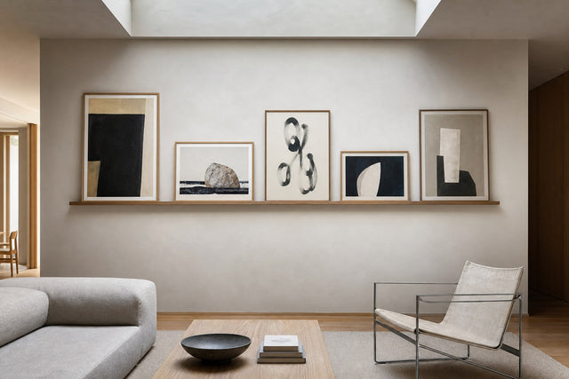
- Posterlefi Strategy: We highly recommend pairing our oak frames with beige art prints or lighter palettes. The low contrast between a beige print and an oak frame creates a serene, tone-on-tone look that is incredibly trendy in 2026.
When decorating a room with white walls, oak adds a necessary element of warmth, preventing the space from feeling too sterile. It is the natural companion to leaves and plants posters, bridging the gap between living greenery in your room and the art on your walls.
2. The Black Wood Frame: Contrast, Definition, and Drama
While oak blends, black defines. A black wood frame acts as a bold container for the image. It draws the eye inward and creates a sharp boundary that separates the art from the reality of the wall. This is the go-to choice for industrial lofts, modern apartments, and gallery walls that need structure.
- Best For: High-contrast imagery. Black art prints, monochrome sketches, and especially quote posters thrive in black frames. The text needs to pop, and a black frame ensures the viewer's focus remains on the message.
- The Vibe: Sophisticated, graphic, and intentional.
- Posterlefi Strategy: Use black frames for cities and architecture photography. The stark lines of a cityscape are mirrored by the straight, dark lines of the frame. Additionally, if you are curating a collection of iconic photos in black and white, a black frame is the industry standard for a museum-quality look.
Do not fear using black frames on dark walls. A black frame on a dark grey or navy wall can create a moody, immersive "dark academia" aesthetic that is perfect for vintage prints.
3. The Metal Frame: Elegance, Luxury, and Minimalism
Metal frames—specifically aluminum with finishes in Gold, Silver, copper, or Matte Black—offer a thinner profile than their wood counterparts. This thin bezel is crucial when you want a minimalist look where the frame feels almost invisible yet undeniably premium.
- Gold Frames: These are the jewel of the gallery wall. Gold adds a layer of luxury and pairs exceptionally well with fashion illustrations or female figure art. The metallic sheen catches the light, drawing attention to the art. We find that pink art prints and warm sunset hues look radiant inside a gold border.
- Silver/Copper Frames: Silver is cooler and tech-forward, often suiting abstract art or cool-toned blue prints.
- The Vibe: Chic, expensive, and light.
- Posterlefi Strategy: Use metal frames for wedding gifts or formal areas like the dining room. A large watercolor painting in a thin gold frame looks effortlessly expensive.
4. The White Wood Frame: The Invisible Lift
Although the debate is often Oak vs. Black, we cannot ignore the White frame. White frames are the secret weapon for making small rooms feel larger. When placed on a white wall, the frame disappears, leaving the artwork to float. This is the ideal choice for colorful graphic illustrations where you want the colors to explode without a heavy border containing them. It is also a staple for summer prints and breezy coastal themes.
Strategic Pairing: Matching Frame to Art Category
To demonstrate our "Topical Authority" on interior styling, we have analyzed our catalog to provide specific pairing recommendations based on our Bestsellers.
For The Minimalist
If you love minimalist art and line art, stick to Black Wood or Black Metal. The stark contrast emphasizes the simplicity of the lines. However, if the minimalist art is texture-based (like a beige plaster look), switch to Oak to maintain the softness.
For The Nature Lover
For nature prints and landscapes, avoid heavy black frames unless the photo is dark and moody. Oak is the default winner here. It complements the greens of flower posters and the browns of autumn landscapes.
For The Retro Soul
If you are exploring our music posters or vintage collections, consider a Dark Wood (walnut) or Black frame to mimic the aesthetics of vinyl record displays or old-school photography darkrooms.
The Posterlefi Gallery Wall Method: Mixing Materials
A common question we receive is: "Can I mix frame colors?" The answer is a resounding Yes, but with intent. This is what we call the Posterlefi Gallery Wall Method.
To successfully mix frames, follow the 60-30-10 rule:
- 60% Primary Frame: Choose one dominant material (e.g., Black) to hold the gallery together.
- 30% Secondary Frame: Use a complementary material (e.g., Oak) to add warmth.
- 10% Accent Frame: Use a metallic frame (e.g., Gold) for your specific statement pieces, perhaps for gold-accented prints or typography.
This method works exceptionally well when mixing different genres, such as combining recipe posters in the kitchen with botanical illustrations. The variety in frames suggests a collection built over time, rather than bought in a single day.
Comparison: Wood vs. Metal Frames
| Feature | Wood (Oak/Black/White) | Metal (Gold/Silver/Black) |
|---|---|---|
| Profile Thickness | Thicker (approx. 15-20mm). Adds substance. | Thinner (approx. 8-10mm). Minimalist. |
| Durability | Sturdy, but can chip if dropped. Organic feel. | Extremely durable, scratch-resistant. sleek feel. |
| Weight | Heavier visual weight. Grounds the art. | Lighter visual weight. Lets art breathe. |
| Best Art Match | Nature Photography, Scandinavian, Animals | Fashion, Abstract, Illustration |
| Room Feel | Warm, cozy, traditional to modern. | Cool, sharp, industrial to luxe. |
Frequently Asked Questions (FAQ)
What is the best frame for a busy, colorful poster?
For busy prints, such as those in our insects & butterflies collection, we recommend a simple White or light Oak frame. A heavy black frame can make a complex image feel cluttered, while white provides a "breathing room" border that organizes the chaos.
Does the frame need to match the furniture?
Not necessarily. While matching your oak frame to your oak floor is a safe bet, contrasting is trendier. If you have dark velvet furniture, gold frames create a stunning luxe contrast. If you have white furniture, Black frames provide necessary anchor points in the room.
Which frame style suits seasonal decor?
If you change your art frequently—swapping spring prints for winter prints—Black metal frames are the most versatile neutral. They work with the pastels of spring and the deep reds and greens of holiday posters equally well.
Conclusion: Trust Your Eye
Whether you choose the organic warmth of Oak, the decisive boundary of Black, or the jewelry-like finish of Metal, remember that the frame is there to serve the art. At Posterlefi, our goal is to help you create a home that feels uniquely yours. Browse our New In collection today to test your new framing knowledge, or check out our Deals to start building your gallery wall for less.
Build your wall virtually before you spend a penny
Arrange sizes and layout on a virtual wall — free, before you buy.

Start with these
See the whole collection →


Related inspiration


100-day returns