


Scandinavian Interiors: Choosing Wall Art for the Nordic Look
A practical guide to Scandinavian interior style: the three pillars of Nordic wall art — pale palettes, nature motifs, and generous negative space — with exact sizes, frame pairings, and layouts for every room.
Scandinavian interior style is one of the few design languages that never seems to date. Born out of long, dark Nordic winters and a deep respect for daylight, it favors pale walls, honest materials, and rooms that feel calm rather than staged. Yet one element decides whether a Scandinavian room feels finished or merely empty, and it is the one most people leave until last: the walls. The right art pulls the whole look together. The wrong art — too loud, too gilded, too crowded — quietly undoes everything else you got right.
This guide breaks Scandinavian wall art down into three working pillars — pale palettes, nature motifs, and generous negative space — then applies them room by room with concrete sizes, pairings, and layout patterns, so you come away knowing exactly what to hang, how large, and where.
The Three Pillars of Scandinavian Wall Art
Nordic interior style grew out of early twentieth-century functionalism: homes should serve daily life, and beauty should come from light, proportion, and material rather than ornament. In countries where the sun barely clears the horizon in January, every design decision protects daylight. Walls stay pale so they bounce light around the room. Furniture stays low and light-legged so sightlines remain open. And wall art follows three consistent rules.
First, it stays within a pale, muted palette so it never fights the room for attention. Second, it leans on nature — the forests, coastlines, and plant life that Scandinavians build their weekends around. Third, it uses negative space generously, both inside the artwork and on the wall around it. Master these three pillars and you can browse a catalogue of 8,000+ designs and know within seconds whether a print belongs in a Nordic home.
Pillar One: Pale, Muted Palettes
The Scandinavian palette starts with white — but rarely a stark, blue-toned white. Think warm chalk, oat, and eggshell, layered with soft greys and the tones of natural wood. Onto that base, Scandinavians add color the way a good cook adds salt: deliberately and sparingly. Dusty blue, sage green, muted terracotta, and ochre are the classic accents because they all exist in the Nordic landscape itself.
For wall art, this means choosing prints where the palette is desaturated rather than vivid. A landscape photograph works when its tones are misty and grey-blue; the same scene in saturated postcard colors will look like it wandered in from a different house. A useful test: hold the print (or your phone screen) at arm's length and squint. If any single color jumps forward aggressively, it will do the same on your wall every day. The strongest Scandinavian walls usually commit to one or two accent tones and repeat them — a sage botanical pair echoing a green throw, or a terracotta abstract picking up a clay vase across the room.
Pillar Two: Nature Motifs
Ask a Dane or a Swede what they hang above the sofa and the answer is overwhelmingly drawn from nature. Botanical studies, birch and pine forests, misty lakes, coastal horizons, pressed-flower illustrations, and line drawings of leaves and branches dominate Nordic walls. It is a philosophy: when winter keeps you indoors for five months, you bring the outdoors in.
Nature in Scandinavian wall art comes in three broad registers. Literal: soft-focus landscape photography and botanical illustration. Abstracted: organic shapes, arcs, and curves that echo dunes, stones, and low sun without depicting them. And linear: single-stroke line art of plants, figures, and natural forms, which delivers a motif with almost no visual weight at all. A room can mix all three registers happily, as long as the palette stays consistent — a photographic misty forest, a sand-toned abstract arc, and a one-line botanical can share a wall because they share a temperature.
Pillar Three: Generous Negative Space
Negative space is the pillar people miss, and it operates on two levels. Inside the artwork: Scandinavian prints breathe. A single branch on an off-white field, a horizon line placed low with a vast pale sky above it, a figure drawn in one unbroken stroke — the empty area is not wasted space, it is the point.
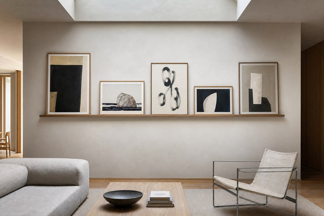
On the wall itself, the same rule applies. Scandinavian rooms hang fewer, larger pieces rather than covering every surface. One 50x70 cm print centered over a sideboard, with clear wall around it, has more presence than six small frames scattered across the same area. When you do build a gallery wall, keep spacing consistent — 5 to 7 cm between frames — and leave the surrounding wall clearly empty, so the grouping reads as one deliberate object. Hang art so its center sits about 145 cm from the floor, and slightly lower over sofas and beds.
Room by Room: Sizes and Layouts That Work
Principles are useful; measurements are better. Here is how the three pillars translate onto specific walls, using standard poster sizes:
- Living room: a pair of muted 50x70 cm landscapes hung side by side over the sofa, 5-7 cm apart, centers at eye level. Two related prints — not identical, but sharing a palette — give the wall rhythm without clutter. For a larger statement wall, step up to 61x91 cm or add a third piece. The Scandinavian living room collection is built around exactly these pairings.
- Bedroom: one calm piece over the bed, nothing more. A single 50x70 cm or 61x91 cm line art print — a sleeping figure, a single stem, an abstract face — keeps the room serene. Hang it low enough to connect with the headboard, roughly 20-25 cm above it.
- Hallway: a 30x40 cm botanical trio in an evenly spaced row. Hallways are seen in motion, so a repeating rhythm works better than one large piece you never stand back from.
- Dining room: one large horizontal piece (70x100 cm) on the long wall, its center aligned with the midline of the table. Muted abstracts work especially well here.
- Home office: two 30x40 cm prints stacked vertically beside the desk — graphic, linear motifs that give your eyes somewhere restful to land between screens.
If you are unsure how a layout will look, sketch it digitally before you commit. The free Gallery Wall Builder lets you arrange prints and sizes on a virtual wall, so you can test a 50x70 pair against a three-piece grid in seconds — before anything is printed and before a single nail goes into the wall.
Scandi Decor Rules: The Do and Don't List
Every style has its guardrails. These are the scandi decor rules that keep a wall looking Nordic rather than generic:
- Do limit each room to a maximum of two accent colors, and let your art repeat them.
- Do choose oak, light wood, white, or black frames — slim profiles, clean edges.
- Do keep at least one large wall in the room completely bare. Emptiness is part of the composition.
- Do mix motifs — photography, abstract, line art — while keeping the palette temperature consistent.
- Don't use heavy gold frames or ornate mouldings; they belong to a different design language entirely.
- Don't hang art too high. Center at about 145 cm; when in doubt, go lower.
- Don't mix more than two frame colors on a single wall.
- Don't fill every wall. If a room already has three decorated surfaces, let the fourth one rest.
Japandi vs Scandi: What Is the Difference?
The japandi vs scandi question comes up constantly, and the answer is simpler than the internet makes it. Japandi is a hybrid: Scandinavian functionalism merged with Japanese wabi-sabi, the appreciation of imperfection and impermanence. The two traditions already share a love of natural materials, craftsmanship, and restraint, which is why the blend feels so seamless.
The practical differences show up in tone and temperature. Japandi runs darker and earthier: walnut and stained oak rather than pale birch, charcoal and clay tones rather than white and grey, lower furniture, and a stronger taste for asymmetry. For wall art, japandi favors ink-wash abstracts, brushstroke motifs, and earthy, textural pieces, while classic Scandinavian art stays lighter and airier. If your room has pale floors and white walls, lean scandi; if it has darker woods and warm plaster tones, japandi-leaning art will sit more naturally. Many Nordic homes now live comfortably in between — a pale scandi base with one or two darker, textural prints for depth.
Frames, Paper, and the Finishing Touches
In a style this restrained, the physical details carry real weight. A slim oak frame reads as warm and natural; a slim white frame all but disappears into a pale wall, leaving only the motif; black adds graphic punch to line art. Posterlefi's wooden frames come in 14 colors and 13 sizes, so matching a frame to both the print and the room is straightforward — as a rule, echo the dominant wood tone already in the room.
Paper matters, too. Posters printed on 200 gsm or 230 gsm premium paper hang flat and frame cleanly, with the heavier 230 gsm stock giving large formats a satisfying rigidity. For a softer, more textural look — one that suits japandi-leaning rooms — canvas prints trade the crisp poster surface for woven depth. And because judging art from a screen is hard, Posterlefi's 100-day returns give you time to live with a print through changing light and honest second thoughts.
Frequently Asked Questions
What is Scandinavian interior style in simple terms?
It is a design approach from the Nordic countries built on light, function, and natural materials. Rooms use pale colors, wood, and simple forms, keep clutter to a minimum, and aim for a calm, livable atmosphere rather than showroom drama. Wall art follows the same logic: muted, nature-inspired, and given room to breathe.
What kind of wall art goes with Scandinavian decor?
Botanical illustrations, muted landscape photography, abstract prints in soft earth tones, and minimalist line art are the core categories. The unifying rules are a desaturated palette, a nature-adjacent motif, and plenty of negative space within the composition. Anything loud, glossy, or heavily ornamented will fight the room instead of finishing it.
How many colours should a Scandinavian room have?
Keep it to a pale base — white, grey, and wood tones — plus a maximum of two accent colors. Your wall art should draw from those same two accents rather than introducing new ones. It is the fastest fix for a room that feels vaguely chaotic.
What is the difference between japandi and scandi?
Both prize simplicity and natural materials. Scandi is lighter — pale woods, white walls, airy prints — while japandi blends in Japanese wabi-sabi: darker woods, earthier tones, deliberate asymmetry, and more textural, ink-inspired art. Think of japandi as scandi with the lights dimmed and the contrast turned up.
What size posters should I use in a Scandinavian living room?
Over a standard three-seat sofa, a pair of 50x70 cm prints hung 5-7 cm apart is the classic solution. For a large open wall, one 70x100 cm piece or a 61x91 cm pair holds the space better. Whatever the size, hang the artwork so its center sits around 145 cm from the floor.
Scandinavian interior style rewards patience: a few well-chosen pieces, hung with care, in a palette that lets the room stay quiet. When you are ready to find yours, explore the full Scandinavian wall art collection — thousands of pale, nature-led designs made for exactly the walls this guide describes.
Build your wall virtually before you spend a penny
Arrange sizes and layout on a virtual wall — free, before you buy.

Start with these
See the whole collection →


Related inspiration


100-day returns