


Reading Nook: Art for Book Lovers – The Ultimate Design Guide
To create the perfect reading nook, curate art that complements the immersive nature of reading rather than distracting from it. The best reading corner ideas combine ergonomic comfort with visual storytelling, utilizing vintage prints, serene landscapes, and literary quotes. Experts recommend muted color palettes like sage green and beige to reduce eye strain, paired with gallery walls that reflect your favorite literary genres, creating a cohesive sanctuary for the mind.
Reading Nook: Art for Book Lovers
The Direct Answer: Creating the ultimate reading nook requires a delicate balance between comfort and inspiration. The most effective reading corners utilize art that serves as a visual extension of the stories you love. Experts recommend selecting vintage posters for nostalgia, serene landscapes for escapism, or minimalist typography for focus. The goal is to curate a space where the visual environment supports the mental state of deep reading, using soft color palettes and strategic lighting to minimize eye strain while maximizing hygge.
The Psychology of the Reading Corner: Why Art Matters
For the avid reader, a nook is not merely a chair in a corner; it is a portal to other worlds. At Posterlefi, we understand that the atmosphere of this sanctuary is critical. While a comfortable chair supports the body, the surrounding decor supports the imagination. Integrating specific Scandinavian art prints helps establish a sense of calm and order, which is essential for deep focus.
When designing a reading spot, one must consider the concept of "visual quiet." Cluttered or overly chaotic imagery can pull the eye away from the page. Conversely, blank walls can feel sterile and uninviting. The sweet spot lies in selecting artwork that encourages contemplation. We have found that watercolor paintings often provide the perfect soft edges and fluid transitions that allow the mind to drift pleasantly between chapters.
Curating Your Literary Aesthetic: Top Styles
Through our experience helping interior decorators finalize library spaces, we have identified three core aesthetic pillars that resonate most deeply with book lovers.
1. The Vintage Scholar
There is an undeniable connection between the scent of old paper and the visual appeal of retro design. To cultivate a classic library feel, even in a small apartment, look toward history. Vintage art prints act as anchors, giving the space a sense of permanence and timelessness. Consider pairing these with dark wood furniture and warm brass lighting.
Complement this look with:
- Botanical Studies: Detailed botanical illustrations evoke the feeling of a Victorian naturalist’s study.
- Insects & Curiosities: For a darker, "Dark Academia" vibe, prints from our Insects & Butterflies collection add intellectual intrigue.
2. The Escapist's Window
Many readers turn to books to travel without moving. Your walls can serve as windows to these imaginary destinations. If you prefer high fantasy or travel writing, landscape posters are essential. A sweeping mountain range or a misty forest can visually represent the vast settings of an epic novel.
For a more grounded, yet equally transportive feel, incorporate nature photography. The realism of a dense forest or a quiet beach helps ground the reader, providing a peaceful backdrop that doesn't demand constant attention but offers beauty when you look up to ponder a plot twist.
3. The Modern Minimalist
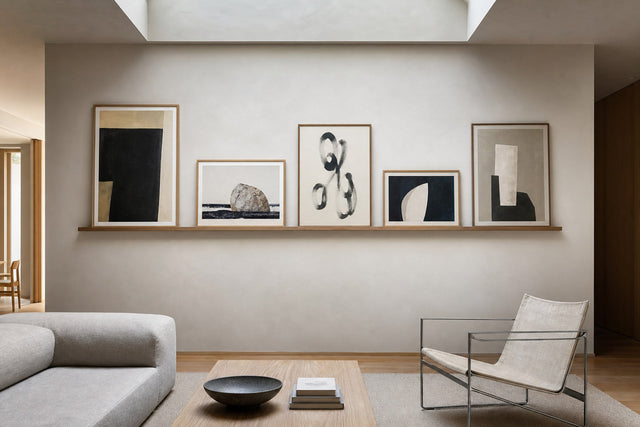
For those who read contemporary fiction, non-fiction, or architectural digests, the clutter of a traditional library might be distracting. Here, the focus is on clean lines and negative space. Minimalist art ensures the space feels open and breathable.
We recommend utilizing line art for a sophisticated, subtle touch that hints at human forms or abstract shapes without dominating the room. This style pairs exceptionally well with modern reading lamps and boucle armchairs.
Color Theory for Concentration
The color of your art has a direct physiological impact on your ability to read for long periods. High-contrast, neon colors can cause eye fatigue. Instead, opt for palettes that mimic nature and shadow.
- Beige and Warm Neutrals: There is a reason paper is rarely pure white; it's too harsh. Beige art prints create a soft, warm envelope of light that is easy on the eyes.
- Restorative Greens: Green is the easiest color for the human retina to process. Surrounding your reading chair with green art prints or leaves and plant imagery can reduce physical stress levels.
- Deep Blues: For a nighttime reading nook, blue tones suggest twilight and calm, signaling the brain that it is time to wind down.
The Narrative Gallery Wall: A Posterlefi Guide
Don't settle for a single frame. A gallery wall allows you to tell a story that parallels your bookshelf. However, a reading nook gallery wall differs from a living room wall; it should be tighter and more intimate.
The "Bookish" Mix:
Combine literal references with atmospheric mood setters. Start with a centerpiece from our quote posters collection—perhaps a line about coffee or the joy of reading. Surround this text-based piece with abstract art that pulls the color palette together.
The Coffee Connection:
No reading nook is complete without the ritual of a warm drink. We frequently see interior designers integrating pieces from the Coffee & Wine collection near the reading chair. It visually reinforces the habit of sitting down, sipping, and reading.
Matching Art to Your Favorite Genre
To truly personalize your space, align your wall art with the genre that dominates your reading list. This creates a cohesive emotional experience.
| Book Genre | Recommended Art Style | Why It Works |
|---|---|---|
| Classic Literature (Austen, Dickens) | Illustration Art & Flowers | Evokes the romanticism and detail of the 19th century without feeling dated. |
| Modern Thrillers / Noir | Black & White Photography & Cities Photography | High contrast and urban settings match the grit and pace of mystery novels. |
| Romance | Pink Tones & Female Figures | Soft, fluid shapes and warm colors enhance the emotional resonance of the genre. |
| Sci-Fi / Fantasy | Iconic Photos & Winter Prints | Stark landscapes and surreal imagery complement world-building narratives. |
| Poetry | Music & Nature Prints | Lyrical, rhythmic visual patterns that echo the structure of verse. |
Seasonal Rotations: Keeping the Nook Fresh
Just as your reading list changes with the seasons, so too should your nook. The Posterlefi frame system makes it easy to swap prints.
In the colder months, create a cozy "hygge" atmosphere with winter prints and heavier textures. This is the time for darker, richer tones like brown and gold accents.
As the weather turns, lighten the mood. Swap in spring prints featuring fresh blooms or summer prints depicting beaches and bright horizons. This rotation keeps the energy of the space aligned with the natural light entering your reading window.
Expert Tips for Installation
When hanging art in a reading nook, lower is often better. Unlike a hallway where art is viewed while standing, art in a nook is viewed from a seated position. We suggest hanging the center of the artwork at eye level when seated—usually about 40 to 45 inches from the floor.
Furthermore, ensure your lighting doesn't create glare on the glass. If you have a directed reading lamp, position your paintings or framed prints slightly off-center to avoid a harsh reflection that could distract you from your book.
Frequently Asked Questions (FAQ)
What is the best art size for a small reading corner?
For tight spaces, we recommend a vertical arrangement of two 30x40cm prints or a single 50x70cm statement piece. This draws the eye upward, making the nook feel taller and more spacious. Browse our bestsellers to see standard sizing options that fit most nooks.
Can I mix photography and illustrations?
Absolutely. This is the core of the eclectic style. The key is a unifying element, such as a consistent color palette or matching frame style. For example, pairing illustration & graphic art with photography works well if both feature monochrome or sepia tones.
How do I choose art that doesn't distract from reading?
Avoid "busy" art with too many small details or aggressive colors like bright red or neon. Opt for abstract art with broad strokes or landscapes with a deep horizon line. These images allow the eyes to rest during reading breaks without stimulating the brain too intensely.
What about digital art or modern designs?
Modern designs are perfect for E-reader users or tech-forward spaces. Look into graphic illustrations which offer clean, crisp visuals that complement the sleek aesthetic of modern technology.
Conclusion: Your Story Starts Here
Designing a reading nook is an act of self-care. It is about carving out a physical space that honors your love for literature. Whether you are drawn to the intellectual vibe of vintage posters or the calming influence of Scandinavian design, the right art elevates the experience from simple sitting to sublime immersion. Browse our New In collection today to find the final piece that completes your literary sanctuary.
Build your wall virtually before you spend a penny
Arrange sizes and layout on a virtual wall — free, before you buy.

Start with these
See the whole collection →


Related inspiration


100-day returns