


Poster Frames: How to Choose the Right One
A practical decision guide to poster frames: when black, oak and white each work best, how to match the frame to your room instead of the poster, and the one-colour rule that keeps gallery walls calm.
Choosing poster frames should be the easy part. You have already found the print you love — now it just needs a border. Yet frame the same poster in black, in oak and in white, and you will see three noticeably different pictures. The frame decides whether a motif reads as sharp or soft, formal or relaxed, and whether it belongs in your room or looks like it wandered in from someone else's home. That is why poster frames deserve a real decision, not a quick afterthought at checkout.
The good news is that you do not need a design degree to get it right. A handful of dependable rules — black for graphic motifs, oak for warmth, white for bright Scandinavian walls, and one frame colour per gallery wall — will carry you through almost every room. This guide walks through each rule, when you can break it, and how to match frame colour to the room you actually live in.
Why the frame changes the picture
A frame is the visual boundary that tells your eye where the art stops and the wall begins. A dark border pulls the edges of the motif inward and increases contrast, which makes graphic art look crisper. A light wooden border does the opposite: it softens the transition, so the artwork feels like a natural part of the wall rather than an object placed on it. A white frame on a white wall almost dissolves, leaving the print floating on its own.
A frame is also furniture as much as it is art: you study a poster now and then, but the frame sits in your peripheral vision every day, next to your sofa and your floor. That is why the most reliable framing decisions start with the room, not the print. Quality matters for the same reason — a poster printed on sturdy 200 gsm or 230 gsm paper lies flat behind the frame, without the ripples that make thin prints look tired within months.
Black frames: sharpness for graphic and monochrome art
Black is the most decisive frame colour you can choose, and it rewards art that is decisive too. A black frame sharpens black and white photography, line art, typography posters, city maps and high-contrast abstract prints. Because the frame repeats the darkest tone in the motif, edges look cleaner, whites look brighter, and the artwork gains a gallery-like seriousness.
Black frames also anchor art on pale walls: on white or light grey paint, a black border gives the eye a firm place to land in rooms that might otherwise feel unanchored. They sit naturally alongside black window frames, steel lamps and dark shelving.
Two cautions. Black can overpower very soft motifs — a pale pink botanical may look trapped inside a heavy dark border. And in a small room with little daylight, many black frames together can make the walls close in. One or two are grounding; eight can be gloomy.
Oak frames: warmth for botanicals and earth tones
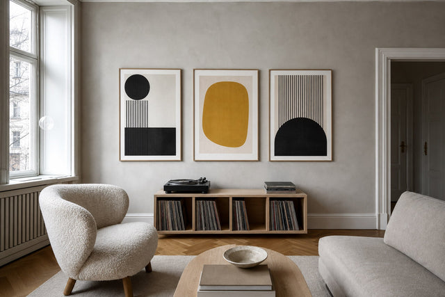
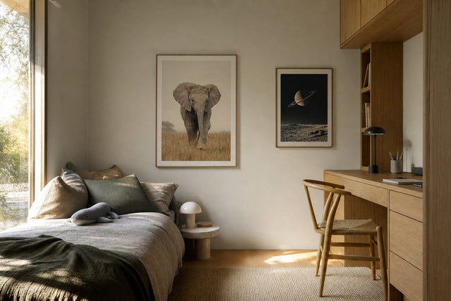
If black is the sharp choice, oak is the warm one. The visible grain and honey tone of an oak frame add a natural, tactile quality that suits botanical prints, beige and terracotta palettes, vintage illustrations, muted landscapes and line drawings on off-white paper. Where a black frame says “look at this”, an oak frame says “this has always been here” — a quieter, more lived-in effect.
Oak is also the easiest frame to pair with the materials most Scandinavian homes are already full of: light wooden floors, linen curtains, rattan, wool and pale furniture. If your room leans Japandi or soft-minimalist, oak frames will almost always feel more coherent than black. And because oak is a mid-tone rather than an extreme, it flatters light and mid-toned motifs alike.
When people ask whether to pick a black frame or oak frame, the fastest tiebreaker is the mood of the motif: high contrast and urban leans black; organic, warm and hand-drawn leans oak. If the poster could go either way, let the room decide — more on that below.
White frames: the quiet choice for bright walls
White frames are the most misunderstood of the three. On a bright white or off-white wall, they practically disappear — and that is precisely their strength: nothing competes with the art. Colourful abstracts, bold children's room prints and vivid photographic motifs speak at full volume because the border adds no colour of its own.
This makes white the default choice for the airy, light-flooded look that defines a classic Scandinavian living room: white walls, pale floors, and art that floats rather than hangs.
On a dark green, navy or charcoal wall, though, a white frame becomes a high-contrast border that competes with the artwork. That can be a striking, deliberate look — but it is a statement, not a neutral choice.
Match the frame to the room, not the poster
The most common framing mistake is trying to match the frame to a colour inside the artwork. It sounds logical, but it ties every decision to a different print, and the one-off results never add up to a whole. Professional interiors do the opposite: they match frames to the fixed elements of the room — floor, large furniture, window frames and metal finishes — so the frames repeat something the eye already knows.
- Oak or light ash floors: oak frames are the natural echo; the wall and floor start speaking the same language.
- Black window frames, steel or matte-black lamps: black frames repeat the detail and make it look intentional.
- White walls with pale floors and light textiles: white or oak frames keep the airy feel; black adds deliberate punctuation.
- Walnut or dark-stained furniture: black or dark brown frames harmonise; pale frames can look disconnected.
- Brass or warm metal details: warm-toned wooden frames flatter them; cool greys fight them.
- Dark or saturated feature walls: black frames sink in elegantly, oak glows against the depth, white becomes a graphic statement.
Notice that the poster barely appears in that list. A good motif survives any of the three main frame colours; a frame that clashes with your floor will bother you forever.
Getting frame sizes right
Colour gets the attention, but frame sizes decide whether a wall feels balanced or busy. Matching standard formats make life simple — our wooden frames come in 13 sizes and fit the standard 30x40 cm, 50x70 cm and 70x100 cm formats directly, with no custom ordering involved.
- 30x40 cm: the supporting player. Ideal on narrow wall strips, in pairs above a sideboard, on picture ledges, or as the small connective pieces in a gallery wall.
- 50x70 cm: the workhorse. Big enough to carry a wall above a desk, dresser or reading chair on its own, and the classic choice for a pair or trio above a sofa.
- 70x100 cm: the statement. One framed 70x100 above a sofa or bed does what five small prints struggle to do — it gives the room a single, confident focal point.
Three placement rules keep sizes honest. Art above furniture should span roughly two-thirds of the furniture's width — above a 210 cm sofa, that means about 140 cm of framed art, as one large piece or a group. Hang single pieces with the centre of the motif around 145 cm from the floor, average eye height. And leave 15-25 cm of air between furniture and frame, so the two read as connected rather than stacked.
One frame colour per gallery wall
A gallery wall already contains plenty of variety: different motifs, sizes, orientations and colours. If the frames vary too, the eye has nothing stable to hold onto and the wall tips from lively into chaotic. The most effective rule for a calm gallery wall is simple: one frame colour for the entire arrangement. All black turns a mixed wall into a graphic grid; all oak makes it warm and collected; all white lets a colourful cluster breathe.
If you genuinely want variation, limit yourself to two frame colours at most — say oak as the base with two or three black frames — and distribute the second colour diagonally across the arrangement rather than clumping it. Keep spacing consistent at 5-8 cm, and the wall will still read as one composition.
The easiest way to test all of this before hammering a nail is the free Gallery Wall Builder, where you can arrange posters, compare frame colours and try layouts on a virtual wall until the combination clicks.
Beyond black, oak and white
Black, oak and white will cover ninety percent of homes, but they are not the whole palette — our frames come in 14 colours. A coloured frame works best as a deliberate accent: pick up one hue that already exists in the room, such as a dusty blue from the curtains or a deep green from an armchair, and use it on one or two prints while keeping the surrounding frames neutral. Darker brown tones give classic and vintage motifs a more traditional, library-like character than pure black.
And if a motif calls for no frame at all, canvas prints offer a border-free alternative with a soft, painterly presence — useful for large-format art in relaxed rooms. Whichever direction you take, you have 100 days to live with the result and return it if it does not work in your light — which takes the risk out of experimenting.
FAQ: poster frames
Should I choose a black frame or oak frame? Let the motif make the first call: black sharpens graphic, high-contrast and black and white art, while oak warms botanicals, earth tones and vintage illustrations. If the poster could go either way, match the room instead — black echoes dark window frames and modern details, oak echoes wooden floors and natural textiles.
What size frame do I need for a 50x70 poster? A 50x70 cm frame — poster and frame sizes are quoted identically, so a standard-format poster drops straight into the matching standard frame. Our frames fit the common 30x40, 50x70 and 70x100 cm formats directly, with no trimming or custom work needed.
Do all the frames on a gallery wall have to match? They do not have to, but one frame colour is the most reliable route to a calm, cohesive wall. If you want variation, use two colours at most and spread the second colour evenly across the arrangement instead of grouping it.
Should the frame match the poster or the room? The room. Frames live next to your floor, furniture and window frames every day, so matching those fixed elements makes every future poster easier to place. A frame chosen to match one specific print often stops working the moment you swap the art.
What colour frame goes with white walls? All three classics work, with different effects: white frames disappear and let the art float, oak adds warmth and texture, and black creates crisp definition. Choose based on the mood you want — airy, natural or graphic — and on the other materials in the room.
Once you know your frame colour and format, the rest is pleasure rather than homework. Start with our bestselling posters to see which motifs people frame again and again, or browse the full range of 8,000+ posters and art prints and find the piece your wall has been waiting for.
Build your wall virtually before you spend a penny
Arrange sizes and layout on a virtual wall — free, before you buy.

Start with these
See the whole collection →


Related inspiration

100-day returns