


Kitchen posters: artwork that adds warmth and personality
A practical guide to choosing and placing kitchen posters with measured sight lines, a clear palette and six real PosterLeFi artworks.
The short answer
Choose kitchen posters by starting with the wall, not the motif. Measure the clear area away from steam, direct splashes and heat, decide whether the art should calm or energise the room, and repeat one or two colours already present in the kitchen. Test exact paper templates at normal standing and sitting sight lines before choosing sizes. A deliberate pair or compact group usually gives more personality than many unrelated pictures.
Kitchen art works best when it is planned as part of the room rather than added to the last empty surface. Cabinets, handles, worktops, tiles and appliances already create many lines and reflections, so the poster arrangement needs a clear role. It may soften a functional room, connect the dining area to the kitchen, or introduce colour without changing fixed finishes. Begin by standing at the doorway and identifying the wall that remains visible while you cook, eat and move through the room. That view is more useful than choosing a favourite motif first and then searching for somewhere to squeeze it in.
Use the wider poster collection for discovery, compare established combinations on the gallery-wall inspiration page, and save possible products before deciding. If you want a quick view of proven customer choices, the bestselling selection is another useful starting point. Keep discovery broad but make the final shortlist strict. Every selected work should contribute colour, rhythm, subject or calm. Two posters with distinct jobs can feel richer than six pictures competing for the same attention.
Find a safe and visible wall field
Measure only the uninterrupted wall, excluding doors, switches, shelves and areas needed for cabinet movement. In a kitchen, location matters as much as size. Avoid the direct splash zone behind a sink, the immediate area above a hob and positions where rising steam repeatedly reaches the surface. A dining nook, a wall beside the table or the clear end of a cabinet run often gives art more distance from daily cooking. Check the chosen field in morning and evening light; reflections and strong light can change how the motif and frame read.
Mark the proposed outer boundary with removable tape. Look at it from the doorway, the main preparation position and every regular seat at the table. These three views reveal whether the composition blocks a sight line, feels too high or appears detached from the furniture below. Do not select frame sizes until the boundary feels correct. Paper templates cut to the exact outer dimensions let you test proportions without drilling. Write the product title, size and orientation on each template so the plan remains clear when several options are moved.
Choose colour from what is already in the room
A kitchen normally contains more colour than it first appears to: timber, metal, grout, crockery, textiles and food packaging all influence the view. Choose one stable room colour and one optional accent. The stable colour might be black from handles, warm wood from a table or a pale neutral from cabinet fronts. The accent can come from a motif and return in a towel, bowl or chair cushion. This method avoids buying art that only works in isolation against a white website background.
Contrast should match the room’s visual activity. A kitchen with patterned tiles and open shelves may benefit from quieter art with generous space around its forms. A simple room with flat cabinet fronts can carry stronger graphics. If several posters are used, let one be the anchor and give it the strongest contrast. The supporting works can repeat a line, shape or small colour detail. Empty wall between frames is not wasted space; it separates the art from the many practical objects already present.
Six works to compare without forcing one style
The selected works provide a concrete comparison rather than a prescribed set. Jlr Whiskysour Pink Copy Poster by Jenny Liz Rome and Fabric Pattern Collage No.7 Poster by The Miuus Studio can be assessed as possible colour-led anchors. Rainbow Plus Shapes Blue Mustard9 Poster by Ana Rut Bre offers another graphic direction, while Potterypoemno02 Poster by Treechild can be considered when you want the arrangement to relate to tableware and everyday objects.
Floral Baby Portrait #1 (2021) Poster by Dianne Nicole Fernando and Abstract Brush Strokes 65X Poster by Mareike Böhmer extend the comparison with figurative and abstract options. Treat the six product links as samples for judging scale, palette and atmosphere. Their artist names and product titles are taken from the verified shop data; the guide does not assume biographical details or promise how any work will look in a kitchen different from the photographed room.
A practical kitchen-wall method
- Photograph the clear wall straight on and record its width and height.
- Remove the zones affected by doors, steam, direct heat or regular splashes.
- Choose one purpose: calm backdrop, colour link or conversational focus.
- Select one anchor motif and no more than two supporting colour connections.
- Cut exact frame-size paper templates and label every one.
- Place the templates at normal standing and seated sight lines.
- Leave the arrangement overnight and inspect it in different light.
- Confirm the chosen product sizes and frame options on their current product pages.
- Mark fixing points only after the complete group has passed all views.
This sequence separates visual decisions from purchase decisions. It also stops a common chain reaction: buying one poster, discovering that its size does not fit the available wall, and adding more pieces in an attempt to make the first choice look intentional. The templates reveal whether the wall needs a single large image, a balanced pair or a compact gallery group. Take photographs of each promising layout from the same position. Side-by-side images make small differences in height and spacing easier to judge.
Choose between a single, pair or compact group
A single poster gives the calmest result and works well where cabinet lines already create structure. A pair introduces rhythm without becoming complicated; align either the outer edges or the visual centres and keep one repeated gap. A compact group suits a dining zone that should feel more personal, but it needs one clear outer boundary. Mixed orientations can work when the overall silhouette remains stable. Avoid scattering small frames across every narrow strip of wall, because the room then loses a place for the eye to rest.
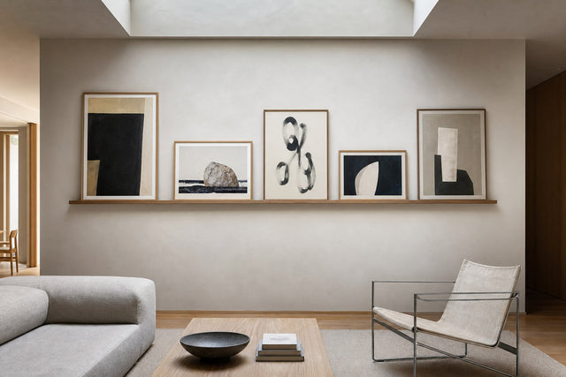
Relate the arrangement to the furniture below it. Above a bench or dining table, the group should feel connected to that zone rather than floating towards the ceiling. Check it while seated, because the kitchen is experienced at several eye levels. If the upper frame feels crowded by a ceiling line or cabinet, lower the entire template group rather than compressing only the top gap. If the group feels weak, bring the frames closer before adding another product.
Frames, surfaces and everyday use
Frame choice changes the visual weight of the art. One repeated finish immediately unifies different motifs; mixed finishes need another consistent element such as spacing or palette. Compare the available frame presentation on the current product page and judge it against the actual kitchen materials. A frame shown in a clean mock-up may feel different beside steel appliances, timber fronts or coloured tiles. The final choice should support the motif without turning every frame edge into another competing cabinet line.
Plan for cleaning and movement. Keep the art where it can be reached without climbing over a worktop, and make sure chairs, doors and hanging lamps do not collide with it. Use appropriate fixings for the wall and the weight of the chosen frame. The guide cannot assess an individual wall construction, so check the fixing manufacturer’s instructions where needed. After hanging the first anchor, step back and verify it before continuing; a small initial error becomes more visible across a multi-frame arrangement.
Final checklist before ordering
- The wall field is clear of direct steam, heat and splash zones.
- The exact outer frame dimensions fit the measured boundary.
- The composition works from doorway, work position and dining seat.
- One motif is the anchor and the remaining works have defined supporting roles.
- Colours connect to permanent room elements rather than temporary clutter.
- All selected sizes, product details and current options have been checked on the product pages.
- The paper-template layout has been viewed in more than one light condition.
When these checks are complete, the posters are doing more than filling a blank wall. They give the kitchen a deliberate visual centre and connect practical surfaces to the personal part of the home. Keep the area below the new arrangement simple for the first few days. Then return objects one by one. A bowl, lamp or textile should strengthen the selected palette rather than obscure the art. That final editing step is often what makes a kitchen display feel settled rather than newly installed.
Artworks used in this guide

Jlr Whiskysour Pink Copy Poster
Jenny Liz Rome
View artwork →
Fabric Pattern Collage No.7 Poster
The Miuus Studio
View artwork →
Rainbow Plus Shapes Blue Mustard9 Poster
Ana Rut Bre
View artwork →
Potterypoemno02 Poster
Treechild
View artwork →
Floral Baby Portrait #1 (2021) Poster
Dianne Nicole Fernando
View artwork →
Abstract Brush Strokes 65X Poster
Mareike Böhmer
View artwork →Frequently asked questions
Where should posters hang in a kitchen?
Choose a visible wall away from direct splashes, rising steam and immediate heat. Dining nooks and clear side walls are often easier to assess and maintain than active preparation zones.
Should kitchen posters match the cabinet colour?
They do not need to match. Use one existing room colour as a stable connection and let a second colour act as an accent so the art belongs without becoming uniform.
Is one large poster better than several small ones?
It depends on the wall and the room’s existing lines. Test exact paper templates: one image is calmest, a pair adds rhythm, and a compact group offers more personality when it has a clear boundary.
Build your wall virtually before you spend a penny
Arrange sizes and layout on a virtual wall — free, before you buy.

Start with these
See the whole collection →


Related inspiration


100-day returns