


Music Posters: Instant Personality for a New Room
Music posters are the fastest way to make a new room feel like yours. Three complete looks — a black-and-gold jazz corner, a color-pop teen wall and a single statement print above the desk — plus concrete sizes, color pairings and hanging tips.
Every August, thousands of students carry boxes into rooms that look exactly alike: white walls, a narrow bed, a desk, a lamp that came with the place. What separates a room you merely sleep in from a room that feels like yours is what goes on those walls — and few themes do the job faster than music posters. Music is identity shorthand. Before a new friend has scanned a single shelf, a waveform print or a line-drawn saxophone has already told them something true about the person who lives there.
This guide is about decorating with original music-themed art — instrument illustrations, waveform graphics, bold typographic prints — not band merchandise or album covers. The distinction matters more than it sounds. Original designs age better, mix more easily with the furniture you actually own, and say music matters to me without pinning you to one act or one summer. Below you will find three complete looks you can copy directly, concrete sizes in centimeters, and straight answers to the questions people ask before they put a single hole in the wall.
Why music is the strongest identity motif for a new room
Teens and students decorate in a different order than homeowners do. Identity comes first; color schemes come second. The poster wall in a dorm or a freshly repainted teen bedroom is a public statement of taste, which is why generic landscape art rarely survives there. Music works so well as that statement because it is universal and specific at the same time. Everyone loves music; nobody loves it the same way. A moody double-bass sketch, a neon-bright equalizer graphic and a delicate sheet-music illustration all say music — but they describe three very different people.
Music art is also unusually flexible as decor. It thrives in a strict black-and-white minimalist room, in a warm vintage setup and in a loud full-color wall alike, because instruments and sound graphics exist in every visual style. That flexibility is exactly what you want at study start, when your taste may evolve faster than the semester passes. Swap two prints in a music wall and the whole room changes mood; the theme itself never goes out of date.
Original music art, not band merch: what to look for
To be clear about terms: everything in this guide is built from original music-themed designs, never album covers or tour merchandise. Four categories carry almost every successful music wall:
- Instrument line art — a trumpet, cello or electric guitar drawn in a single continuous line. It reads as sophisticated drawing first and music reference second.
- Waveform and equalizer graphics — sound made visible. These lean modern and geometric, and they sit comfortably next to abstract art.
- Music typography — bold poster-style lettering built around short words with attitude. Typography adds energy without adding visual clutter.
- Vintage-style music illustration — gramophones, concert-hall interiors, classic radios. Warm, nostalgic and remarkably easy to live with for years.
Because these are designs rather than memorabilia, they cooperate with everything else on your wall. A waveform print can hang beside a botanical poster; a line-drawn violin can share a frame color with a city map. Posterlefi's catalog spans more than 8,000 posters and art prints across exactly these styles — Scandinavian, graphic, vintage, black and white — so a music theme never forces you into a corner visually.
Look one: the black-and-gold jazz corner
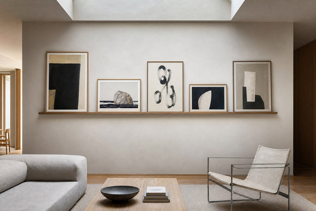
This is the grown-up option — right for a student apartment or an older teen who wants the room to feel more late-night club than classroom. Build it from a strict palette of black, warm gold and cream: a saxophone or trumpet drawn in fine gold-toned line on a near-black background, a vintage-style jazz illustration, and one black-and-white typographic print to break the pattern. Hang them as a level row of three 30x40 cm prints above a sideboard or low bookcase, or as one 40x50 cm anchor flanked by two 21x30 cm companions with 6 cm gaps.
Frames finish this look more than any other. Black wooden frames keep the corner sharp and gallery-like; oak softens it toward Scandinavian warmth. Since matching wooden frames come in 14 colors and 13 sizes, it is easy to keep all three frames identical — and identical frames are what make a small trio read as one intentional piece instead of three separate purchases. Add one tactile element below the wall, such as a dark green throw or a brass lamp, and the corner stops being decoration and becomes atmosphere.
Look two: a color-pop graphic wall for a teen room
A teen room can handle — and usually wants — far more color than the rest of the home. Build this wall from bold graphic illustration: flat color fields, thick outlines, stylized instruments, playful lettering. The trick that keeps it energetic instead of chaotic is a repeated color logic. Choose two loud colors and one neutral, then make sure every print on the wall contains at least one of them:
- Electric blue + tangerine + off-white — fresh and unisex, flattering next to pale wood furniture.
- Hot pink + deep red + black — a deliberately fashionable clash that black frames instantly pull together.
- Lime + violet + soft gray — the boldest of the three; it pops against a white wall and calms down against a gray one.
For the layout, go salon-style: a cluster of five to seven prints in mixed sizes. Place one 50x70 cm anchor just off center, support it with two 30x40 cm prints, and fill the edges with three or four small 21x30 and 13x18 cm pieces, keeping consistent 5-7 cm gaps throughout. Mixed sizes with even spacing look curated; even sizes with random spacing look accidental. If the graphic route is the one that fits, start browsing in the illustration and graphic art collection and pull the music motifs from there.
Look three: one statement print above the desk
Not every room wants a full wall, and a study zone often works better without one. The quietest, fastest version of a music wall is a single 50x70 cm instrument print centered above the desk — a continuous-line guitar, a minimalist piano sketch, a single elegant waveform. Center it on the desk, not the wall, and hang it so the bottom edge of the frame sits 25-30 cm above the desk surface; that keeps it clear of your lamp and monitor while still anchoring the whole workspace.
Then add exactly one companion: a 30x40 cm quote poster hung to the side, its top edge aligned with the top of the big frame. A short, well-set phrase about work, focus or playing it louder gives the corner a voice without turning it busy — the quote poster collection is full of candidates. The pairing works because the instrument print carries the identity while the quote carries the energy, and two frames still count as a calm wall when you are trying to study under them.
Sizes, frames and hanging heights that actually work
Most first poster walls fail on scale, not taste — nearly always because the prints are too small for the wall. Use these numbers and you will skip the most common mistakes:
- 13x18 and 21x30 cm — filler sizes for clusters. Never hang one alone on a large wall; it will look lost.
- 30x40 cm — the workhorse. Right for pairs, rows of three and the middle weight of any gallery wall.
- 40x50 cm — a compact anchor above a dresser or narrow desk.
- 50x70 cm — the classic statement size, and the one to choose if you are buying a single print for above a bed or desk.
- Hanging height — aim for the center of the print, or of the whole cluster, at 145-155 cm from the floor. Above furniture, leave 15-25 cm between the furniture top and the frame's bottom edge.
- Coverage rule — art above a piece of furniture should span roughly two-thirds of that furniture's width.
On materials: posters printed on premium paper in 200 gsm and 230 gsm both hang flat and true, and the heavier 230 gsm stock brings extra stiffness that suits large statement formats. If you would rather skip glass and frames entirely in a bedroom, canvas prints give the same motifs a softer, frameless presence.
Plan the wall before you make a single hole
The difference between a wall that looks curated and a wall that looks improvised is usually ten minutes of planning. The free Gallery Wall Builder lets you arrange your chosen prints and sizes on a virtual wall first, so you can test the jazz trio against the seven-piece color cluster before committing to either. Once the layout is set, cut paper templates in the real sizes, tape them up with painter's tape and live with them for a day — it is remarkable how often the perfect on-screen arrangement wants to move 10 cm in real life.
In dorms and rentals, check the house rules before drilling; adhesive picture strips handle lighter frames on smooth walls if nails are off the table. And if a print feels wrong once it is finally up, that is not a crisis: with 100-day returns there is room to change your mind long after the semester has started.
Music poster FAQ
What size music poster should I get for a bedroom?
For a single print above a bed or desk, 50x70 cm is the safest choice — big enough to anchor the wall on its own. For groups, build around 30x40 cm with smaller 21x30 cm fillers. As a rule of thumb, the art should span about two-thirds of the width of the furniture below it.
How do I hang posters in a dorm without damaging the walls?
Use adhesive picture strips rated above the weight of your frame, press them firmly for about thirty seconds, and remove them by stretching the tab flat against the wall rather than pulling outward. They work best on smooth, painted surfaces. Always check your housing rules first — some dorms allow small nails, which hold better for frames from 40x50 cm up.
What is the difference between music posters and band posters?
Band posters are merchandise: album covers, tour prints and artist photos tied to a specific act. Music posters, as used in this guide, are original designs about music itself — instruments, waveforms, typography, vintage illustration. They work as standalone art, mix with other decor styles, and do not date the way merch does.
What colors go with music wall art?
Match the palette to the style. Jazz-inspired and vintage prints love black, gold and cream; graphic music art wants two bright colors grounded by one neutral; minimalist line art works best in a single color that already exists somewhere in the room, such as the bed textiles or the desk lamp.
Can I mix music posters with other art styles on the same wall?
Yes, and the wall is usually better for it. Keep one shared color across all prints, or keep every frame identical, and the mix will read as intentional. One botanical or photographic print inside a music cluster softens the theme nicely — test the combination in the Gallery Wall Builder before you buy.
A new room does not need much to stop feeling anonymous: one honest theme, a few well-judged sizes and frames that agree with each other. Start with the prints that sound like you in the music poster collection — and give the blank wall above the desk something to say from the first week of the semester.
Build your wall virtually before you spend a penny
Arrange sizes and layout on a virtual wall — free, before you buy.

Start with these
See the whole collection →


Related inspiration


100-day returns