


Love Matisse Posters? Get the Look with Modern Art
A practical style guide to Matisse's visual language — paper cut-outs, organic shapes and one-line figures — and how to get the look at home with original modern art prints in the same spirit.
If you have ever saved a coral-coloured cut-out shape or a face drawn in one unbroken line to a moodboard, you already understand the pull of Matisse posters. Few visual languages have aged this gracefully: the organic shapes, the flat and confident colour, the figure described in a single fluid stroke all feel as current in a modern apartment as they did when Henri Matisse first picked up his scissors in the 1940s. The look is playful without being childish, minimal without being cold, and it settles into a Scandinavian interior as if the two were made for each other.
This article is a style guide, not a catalogue of reproductions. We will decode what actually defines Matisse’s visual language — the paper cut-outs, the leaf and coral forms, the reclining figures, the famous one-line drawings — and then map each element to modern art prints created in the same spirit. One thing should be clear from the start: Posterlefi sells original designs inspired by this design language, never Matisse’s own works. Think of what follows as a lesson in the grammar of the style, so you can speak it fluently on your own walls.
Why the Matisse look never seems to date
Henri Matisse (1869–1954) spent half a century pushing colour further than most of his contemporaries dared. As a young painter he led the Fauves — the “wild beasts” — who let colour off the leash of realism: a face could be green and a shadow could be violet, as long as the feeling was right. That instinct, colour as emotion rather than description, runs through everything he made afterwards.
The reason his language still works in modern homes is structural, not nostalgic. Matisse reduced images to their essentials — shape, colour, line — so nothing in the work depends on fine detail or period styling. A Matisse-style print reads instantly from across the room and never competes with the furniture. In interiors built around pale wood, linen and calm wall colours, that clarity is exactly what the room is asking for: art that is simple at first glance and considered the longer you look.
The cut-outs: painting with scissors
In his final decade, when illness kept him from standing at an easel, Matisse invented a new medium. Assistants painted sheets of paper with gouache; he cut shapes from them freehand and arranged the pieces into large compositions, often pinned directly to his studio walls. He called it “painting with scissors”, and the method produced some of the most recognisable images of the twentieth century — cobalt-blue seated figures, spiralling blocks of pure colour, floating forms that read as seaweed, coral and birds.
Three principles define the cut-out look. First, the silhouette does all the work: every shape is a flat field of colour with no shading, no outline and no texture. Second, the shapes are organic — leaves, fronds, coral, dancing bodies — cut with a living wobble rather than geometric precision. Third, the negative space is active: the cream or white ground between the shapes is composed just as carefully as the shapes themselves. When you evaluate cut-out style prints today, look for those same three qualities. Flat colour, hand-drawn irregularity and generous breathing room are what separate a convincing design from a stiff imitation.
The one-line figure: drawing without lifting the pen
Long before the cut-outs, Matisse was celebrated for his line. His contour drawings describe a face, a hand or a whole reclining body in a handful of unbroken strokes — sometimes literally one. There is no hatching, no shading and no visible correction; the confidence of the line is the artwork. He was said to practise a subject over and over so that the final version could look effortless.
This is the branch of his language that modern line drawing art descends from. A single-line face or figure gives a wall human presence without the formality of a portrait, and because the image is mostly empty paper, it calms a room rather than filling it. Line art is also the easiest entry point into the whole style: black ink on cream pairs with any palette you already own, from warm beige to charcoal grey, and it never argues with the rest of your walls.
Colour the Matisse way
Matisse’s palette is instantly nameable: deep ultramarine blue, coral red, mustard yellow, leaf green, black and warm cream. Just as important is his restraint — he rarely used more than three or four strong colours in a single composition, and he anchored them against a neutral ground so each hue could ring clearly. You can borrow that discipline directly when choosing art for a room.
Pairings that reliably work at home:
- Ultramarine and warm cream — one saturated blue print on an off-white wall feels bold but never loud; an oak frame warms the pairing up.
- Coral and soft pink — tonal and lively, and far easier to live with in a bedroom than pure red.
- Mustard and olive green — the earthiest combination in the palette, ideal next to walnut furniture and linen textiles.
- Black and cream — the line-drawing palette, foolproof in every room and the safest base for a gallery wall you plan to extend later.
- Leaf green and terracotta — pulls a botanical interior together; let one colour dominate and use the other as an accent.
One practical rule borrowed from the master himself: limit each wall to three strong colours plus a neutral. Add more and the shapes stop reading as one composition and start competing for attention.
Get the look: mapping each element to modern prints
Here is where the style lesson becomes a practical strategy. You will not find Matisse reproductions at Posterlefi — what you will find are original designs by contemporary artists who work in the same visual grammar. Match the element you love to the type of print that carries it.
Drawn to the one-line figures? Start with the line art collection, where single-stroke faces, hands and bodies carry the same economy of line that made Matisse’s drawings famous. Choose designs with visible confidence — long, fluid strokes rather than fussy detail.
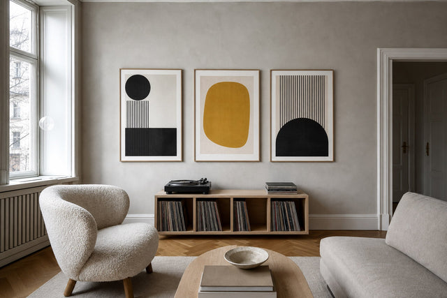
Drawn to the organic cut-out shapes? Look through the abstract art collection for flat colour fields, leaf and coral silhouettes, and compositions where the background does half the work. The closer a design comes to looking cut rather than painted, the stronger the echo.
Drawn to the reclining figures? The female figures collection gathers original prints in that tradition — seated and reclining forms reduced to their essential curves, rendered both in line and in blocked colour.
Because all three families share one grammar, they mix effortlessly. A blocked-colour abstract, a black-line figure and a muted botanical shape will hang together like chapters of the same book.
Sizes, frames and placement that suit the style
Matisse-style imagery is bold and simple, which means it scales beautifully — but scale still needs to be deliberate. Posterlefi prints on premium 200 gsm and 230 gsm poster paper in 13 sizes, so you can match the format to the wall rather than forcing the wall to accept the format.
- Above a sofa: one 70×100 cm statement print, or a pair of 50×70 cm prints hung 5–8 cm apart. Aim for a total width of roughly two-thirds of the sofa, with the bottom edge 15–20 cm above the backrest.
- Over the bed: two 50×70 cm line drawings side by side read as a calm, symmetrical pair that will not loom over you.
- In a hallway: a vertical trio of 30×40 cm prints turns a narrow wall into a rhythm instead of an afterthought.
- On a shelf or sideboard: 21×30 cm and 30×40 cm prints, leaned rather than hung, let you rotate the display whenever the mood shifts.
Framing follows the same logic as colour. Oak and lighter wood tones warm up blues and greens and feel the most Scandinavian; black sharpens line art into something graphic; a white frame disappears entirely and lets a cut-out style print supply all the colour. With matching wooden frames available in 14 colours and 13 sizes, you can vary the motifs across a wall while keeping the framing consistent — the quickest way to make mixed prints look intentional.
Building a Matisse-inspired gallery wall
The cut-out aesthetic was literally born as a gallery wall: Matisse composed his late works by pinning painted shapes across his studio walls and moving them until the balance felt right. You can honour that process at home. Start with one anchor — a large organic-shape print in 50×70 cm or 70×100 cm — then arrange three to five smaller line drawings and colour studies around it, keeping the gaps a consistent 5–8 cm so the group reads as a single composition.
Keep the palette disciplined with the three-colours-plus-a-neutral rule, and vary the motifs rather than the style: a figure, a botanical shape, a colour study. If you want to move shapes around the way Matisse did — without the pinholes — Posterlefi’s free online Gallery Wall Builder lets you test exact print sizes and spacing on a virtual wall before anything is ordered.
And remember the practical safety nets: worldwide delivery, free shipping in Denmark on orders over 399 kr and in the EU on orders over 49 EUR, and a 100-day return window — long enough to live with a wall through several weeks of changing light before you commit to it fully.
Matisse posters and the look: your questions answered
Are Matisse posters still in style? Yes — the look has moved from trend to staple. Organic shapes, warm minimal palettes and one-line figures are now fixtures of Scandinavian and Japandi interiors, and because the language is reduced to shape, colour and line, it carries no date stamp. It reads as modern rather than as a moment.
Does Posterlefi sell original Matisse prints? No. Posterlefi sells original designs by contemporary artists working in the spirit of the style — cut-out shapes, fluid line figures and flat colour compositions. If what you want is the visual language rather than a museum reproduction, that is exactly what these collections are for.
What size should a Matisse-style poster be above a sofa? A single 70×100 cm print is the classic statement; a pair of 50×70 cm prints works when you prefer symmetry. In both cases aim for roughly two-thirds of the sofa’s width and hang the art so its bottom edge sits 15–20 cm above the backrest.
What colours go with Matisse style art? Warm cream, off-white and pale grey walls give the strong colours room to ring. Within the art itself, stick to Matisse’s own discipline: no more than three saturated colours — say ultramarine, coral and mustard — plus a neutral, across the whole wall.
How do I start a Matisse-inspired wall without buying everything at once? Begin with one anchor print and two smaller line drawings; that trio already establishes the grammar. Add pieces gradually, keep the palette rule intact, and use the 100-day returns to make sure every new print earns its place.
Ready to put the theory on your wall? Start where Matisse’s hand is most visible — the single, confident line. Browse original line art prints at Posterlefi and find a design that speaks the language you have just learned to read.
Build your wall virtually before you spend a penny
Arrange sizes and layout on a virtual wall — free, before you buy.

Start with these
See the whole collection →


Related inspiration


100-day returns