


Living Room Posters: Choosing Art for Bright Spaces
Discover how strong Danish summer daylight changes the way art reads in your living room. This guide covers formats, palettes, and hanging techniques that hold up in sun-flooded spaces, ensuring your living room posters always look their best.
When the Scandinavian summer sun finally graces us with its long, bright days, our living rooms transform. What might look perfectly balanced and subtle on a grey winter afternoon can feel washed out or overly reflective when flooded with strong daylight. This guide is all about understanding how that beautiful, intense summer light interacts with your living room posters, and how to choose and display your art to truly shine in bright spaces.
The unique quality of Danish summer light – bright, high, and often direct – demands a thoughtful approach to interior design, especially when it comes to your living room wall art. We'll explore practical considerations, from sizing and placement to colour palettes and finishes, ensuring your curated collection not only withstands the summer glare but thrives in it, creating an inviting and visually compelling space.
Understanding Summer Light and Its Impact on Art
The intensity and angle of summer light are significantly different from the softer, lower light of other seasons. This strong daylight can alter how colours appear, diminish contrast, and even create unwanted glare, making some art feel less impactful. For those of us in sun-drenched homes, particularly in living rooms with large windows or south-facing aspects, selecting the right posters for bright rooms becomes a crucial design decision. The goal is to choose pieces that maintain their vibrancy and detail even when bathed in intense light, rather than fading into the background or becoming difficult to view.
Consider how different art styles react. Highly detailed pieces might lose their intricate elements in strong light, while bold, graphic designs often hold up better. Similarly, the finish of your prints and frames plays a significant role, as reflective surfaces can become problematic. Thinking about your living room's orientation and how light moves through it during the day will be your first step in making informed choices about your wall art.
Sizing Your Art: The Two-Thirds Rule for Art Above the Sofa
One of the most common and impactful placements for art in a living room is above the sofa. Getting the scale right here is paramount. A piece that's too small will look lost, while something too large can feel overwhelming. A widely accepted guideline is the two-thirds rule: your art or gallery wall should occupy approximately two-thirds of the sofa's width.
- For a standard 2-3 seater sofa (approx. 180-220 cm wide):
- A single large poster around 70x100 cm is often ideal, providing a strong focal point without dwarfing the sofa.
- Alternatively, a pair of 50x70 cm posters hung side-by-side with a small gap between them works beautifully, creating visual balance and allowing for thematic pairing.
- For a larger sofa or sectional:
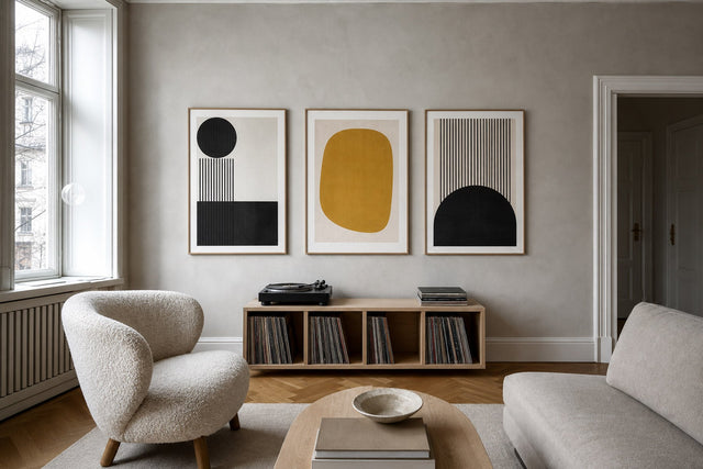
- Consider a triptych of 50x70 cm or even 70x100 cm posters.
- A dynamic living room gallery wall composed of various sizes (e.g., 50x70, 30x40, 21x30 cm) can fill the space effectively while adding visual interest. Use our online Gallery Wall Builder tool to plan your layout.
Remember, this rule is a starting point, not a strict law. The height of your ceilings and the overall scale of your room will also influence your final decision. The key is to create a harmonious relationship between the furniture and the art above it, making the entire arrangement feel cohesive and intentional.
The Perfect Height: Hanging Your Art at 145 cm Centre
Beyond width, hanging height is another critical factor in ensuring your living room wall art is viewed comfortably and effectively. The standard recommendation, particularly for art in a seated viewing area like a living room, is to hang the centre of your artwork at eye level. For most people, this translates to approximately 145 cm (about 57 inches) from the floor to the centre of the poster.
This height ensures that the art is neither too high, forcing viewers to strain their necks, nor too low, where it might be obscured by furniture or blend into the background. When creating a living room gallery wall, aim for the central piece or the visual centre of the entire arrangement to be at this 145 cm mark. This creates a cohesive look and ensures that all elements of your display are easily appreciated. Always measure twice and mark lightly before making any holes!
Palettes That Pop: Cool Blues vs. Warm Sand Tones in Summer Light
The colour palette of your posters plays a huge role in how they read in a sun-flooded living room. Strong daylight can wash out muted colours, but it can also make certain hues sing. When choosing posters for bright rooms, consider two main approaches:
- Cool Blues and Greens: These colours are incredibly refreshing and can enhance the feeling of spaciousness and calm in a bright room. Think deep ocean blues, soft sky tones, and tranquil forest greens. In strong summer light, these colours often maintain their saturation and can even appear more vibrant, offering a cool counterpoint to the warmth outside. They evoke a sense of Scandinavian serenity and work beautifully with natural wood tones and minimalist décor.
- Warm Sand Tones and Earthy Neutrals: While you might think warm colours would be too much in summer, carefully chosen sand, beige, and soft terracotta tones can create a sophisticated, inviting atmosphere. The trick is to opt for shades with a good depth of pigment that won't disappear in the light. These colours bring a natural, grounded feel, reminiscent of sun-baked beaches and earthy landscapes. Paired with natural textures and light woods, they create a warm, yet airy, ambiance that feels perfectly at home in a bright summer living room.
Avoid overly pastel or desaturated colours if your room receives intense direct sunlight, as they are most prone to looking washed out. Instead, lean into colours with clear pigment and good contrast.
The Glare Factor: Matte Surfaces and Strategic Placement
One of the biggest challenges with posters in bright, sun-facing rooms is glare. Reflections from windows or direct sunlight can obscure the image, making your beautiful art difficult to appreciate. This is where the choice of surface and strategic placement become crucial.
At Posterlefi, our posters are printed on premium poster paper (200 gsm and 230 gsm), which inherently has a beautiful matte or semi-matte finish. This is a significant advantage in bright rooms, as matte surfaces absorb light rather than reflecting it. When choosing frames, consider options with anti-reflective glass if possible, or opt for our high-quality wooden frames that complement the matte print without adding excessive shine. We offer 14 colours and 13 sizes of frames to match any aesthetic.
Beyond the print itself, consider the wall where your art will hang. If a wall receives direct, intense sunlight for several hours a day, it might be better to place your most valued pieces on an adjacent wall that receives indirect light, or choose pieces with very bold, high-contrast designs that can withstand some glare. For walls that are consistently sun-drenched, a gallery wall with smaller, varied pieces might also be more forgiving than a single large, highly detailed piece, as the eye can shift focus between elements.
Creating a Cohesive Look: Living Room Gallery Wall Ideas
A living room gallery wall is an excellent way to express personality and add depth to your space, especially in a bright room. It allows for a mix of styles, sizes, and colours, creating a dynamic visual narrative. When designing a gallery wall for a sun-drenched living room, consider these principles:
- Theme and Colour Harmony: Even with varied pieces, a unifying theme or a consistent colour palette will prevent the wall from looking chaotic. For summer light, consider themes around nature, abstract forms with strong lines, or black and white photography that maintains impact regardless of light intensity.
- Varying Textures and Finishes: Incorporate different frame styles or even a few canvas prints alongside your framed posters to add visual interest and break up potential glare. Our canvas prints are another great option for a matte, non-reflective finish.
- Strategic Spacing: Give your art room to breathe. Don't overcrowd the wall. Consistent spacing (e.g., 5-10 cm between frames) creates a polished, intentional look. Our online Gallery Wall Builder is an invaluable tool for experimenting with layouts before you commit.
- Mix of Orientations: Combine portrait and landscape posters to create a more organic and engaging arrangement. For example, a central 70x100 cm portrait poster flanked by two 50x70 cm landscape pieces.
Remember, a gallery wall is an evolving piece of art itself. Don't be afraid to experiment and rearrange until it feels just right for your bright living room.
FAQ: Your Questions About Living Room Posters Answered
What size poster should I put above my sofa?
A good rule of thumb is for your art to be approximately two-thirds the width of your sofa. For example, above a 200 cm sofa, aim for a piece or collection that spans about 130-140 cm. This could be a single 70x100 cm poster or a pair of 50x70 cm prints.
How high should I hang my living room wall art?
Generally, the centre of your artwork should be hung at eye level, which is typically around 145 cm (57 inches) from the floor. This ensures comfortable viewing whether you are standing or seated in your living room.
What kind of art works best in a bright, sunny room?
Art with bold colours, strong contrasts, and clear imagery tends to hold up best in bright rooms. Matte finishes are preferable to avoid glare. Consider cool blues, vibrant greens, or rich sand tones, and avoid overly pale or desaturated colours that can appear washed out.
How do I prevent glare on my posters in a sun-filled living room?
Choose posters with matte finishes and frames with anti-reflective glass if possible. Strategically place art on walls that receive indirect rather than direct, intense sunlight. If direct sun is unavoidable, opt for bolder, less intricate designs that can still be appreciated even with some glare.
Embrace the beautiful, strong light of summer in your living room. With these tips, you can select and display living room posters that not only complement your space but truly come alive in the sunshine. Explore our curated selection of Scandinavian living room posters to find the perfect pieces for your bright, beautiful home.
Build your wall virtually before you spend a penny
Arrange sizes and layout on a virtual wall — free, before you buy.

Start with these
See the whole collection →


Related inspiration


100-day returns