


Line Art Posters: One Line, Maximum Impact
A practical style guide to line art posters: what defines the one-line drawing, why it suits small rooms and rentals, and exactly how to frame, pair and hang it — down to the centimetre.
There is a reason line art posters keep turning up in the calmest rooms you know. A single continuous line traces a face, a reclining figure or a stem of eucalyptus, and everything the line does not touch stays open, quiet and light. No colour blocking, no busy pattern — just gesture and paper. If your walls are small, rented or already carrying enough visual weight, that restraint is exactly the point.
This guide covers what actually defines line art, why it works so hard in compact rooms and rentals, and how to choose between face and figure motifs and botanical drawings. You will also get the classic frame-and-wall pairing, a recipe for a three-poster row above a desk or bed — measured in centimetres, not vibes — and ways to give a gallery wall breathing room.
What actually counts as line art
Line art is drawing reduced to its most essential ingredient: the line itself. No shading, no filled shapes, no gradients — the entire image is carried by the path of the stroke. The purest form is the one line drawing, where the artist completes the whole motif without lifting the pen.
The second defining ingredient is what is not drawn. Negative space — the empty paper around and inside the line — does half the work in minimalist line art. Your eye completes the curves the artist only suggests — which is why a one-stroke face can feel more alive than a detailed portrait, and why the style stays easy to live with.
Why one continuous line suits small rooms
Every object in a small room competes for attention, and walls are no exception. A large, saturated print in a 12-square-metre bedroom behaves like an extra piece of furniture, making the walls feel closer than they are. Line art does the opposite: because most of the sheet remains open paper, the wall keeps reading as wall — bright, continuous and calm — while the drawing adds character at almost no visual cost.
A 50×70 cm one line drawing above a small desk adds presence without pressure, where a dense photographic print the same size would overwhelm the corner. If you have hesitated to hang anything large in a compact room, a piece from a minimalist art collection built on line and negative space is the safest way to go bigger.
Why renters keep choosing line art
Rentals mean walls you cannot repaint, layouts you did not choose, and the knowledge that everything you hang will one day come down again. Line art works unusually well within those limits. Landlord white and off-white — colours that fight bold, colour-heavy art — are the native habitat of a black line on paper; the plainer the wall, the better the line reads.
Line art also looks coherent when collected one piece at a time: start with a single 30×40 cm print in a student room or first apartment and grow the arrangement as the next space allows. If you are setting up a study corner before a new semester, one well-chosen line drawing above the desk does more than a wall of scattered clippings — and it moves with you when the lease ends.
Faces and figures: the human side of the line
Face and figure motifs are the heart of the genre. A single-line face reads as a personality on the wall — thoughtful, wry, serene, depending on the tilt of the stroke — without being a portrait of anyone in particular. That abstraction is why figure line art works in living rooms and entryways where a photographic portrait would feel too intimate.
Faces and figures carry more graphic weight than botanicals — denser line, more assertive curves — making them natural anchors: the statement piece above a sideboard, or the centre print in a row of three. Hang several figures together with a shared direction — profiles facing into the room, not off the edge of the wall — and the group feels composed rather than crowded.
Botanical line art: quieter, softer, easier to place
Botanical line drawings — a eucalyptus stem, a wildflower, an arching branch — sit at the gentle end of the style, with finer, more open lines. Where a figure asks to be looked at, a botanical print is content to be glanced at — the better choice for rooms meant for winding down: bedrooms, bathrooms, reading corners.
Botanicals also bridge between line art and the materials around it: a line-drawn stem in an oak frame picks up the warmth of a wooden headboard or a rattan chair. If your room leans natural — linen, wool, light wood — start botanical; if it leans graphic — black steel, monochrome textiles — start with a figure. Many of the best line art walls use both: figures for the anchor, botanicals for the breathing room between them.
The classic pairing: black frame, beige wall
If line art has a uniform, it is this: a fine black line on off-white paper, a slim black wooden frame, and a warm beige wall behind it. The frame repeats the weight and colour of the drawn line, so the piece reads as one crisp graphic object, while the beige wall makes the paper look luminous and warms a style that can otherwise skew cool.
That is the default, not the only option. Reliable pairings to steal:
- Black frame + warm beige or greige wall — the classic. Maximum contrast for the line, warmth from the wall. Works with both figures and botanicals.
- Oak frame + white wall — the soft Scandinavian version. Gentler contrast, ideal for bedrooms and botanical motifs.
- White frame + sage or dusty green wall — lets a botanical line drawing echo the wall colour; the frame almost disappears and the line floats.
- Dark walnut frame + cream wall — warmer and more traditional; suits figure drawings alongside vintage or mid-century furniture.
- One frame colour per wall — whatever you choose, repeat it; mixed frame colours add exactly the noise the style is meant to remove.
Posterlefi's wooden frames come in 14 colours and 13 sizes, so matching every print in a set is straightforward.
The three-poster row above a desk or bed
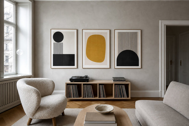
The single most useful line art layout is the horizontal row of three: three prints, same size, same frame, evenly spaced above a desk, bed or sideboard. It reads as one calm composition rather than three separate decisions, and the measurements below make it hard to get wrong.
- Choose one size for all three. 30×40 cm suits a desk of 120–140 cm; 40×50 cm suits a wider desk or a double bed; 50×70 cm suits a king-size bed or a long sideboard.
- Keep gaps of 5–7 cm between frames. Three 40×50 cm prints with 6 cm gaps span about 132 cm — a near-perfect fit above a 140–160 cm bed or desk.
- Aim for roughly two-thirds of the furniture width. A row much wider than the desk or bed below looks top-heavy; much narrower looks stranded.
- Above a desk: hang the row so the bottom edge of the frames sits 20–25 cm above the desktop — high enough to clear a monitor, low enough to stay connected to the workspace.
- Above a bed: bottom edge 25–30 cm above the headboard.
- Compose the trio deliberately: three botanicals, three figures, or botanical–figure–botanical with the strongest motif in the centre. Match line weight across all three so no single print shouts.
Hang the centre print first, level it, then measure outward — ten minutes with a pencil and spirit level separates a considered row from three posters that merely share a wall.
Gallery walls that can breathe
Line art also has a second job: it is the best rest note a gallery wall can have. A wall of dense prints — photography, saturated abstracts, vintage posters — tires the eye because there is nowhere to pause. Slot line art prints between the heavy pieces and the whole arrangement relaxes.
An all-line-art gallery wall works too — one of the few that stays calm at nine or eleven frames, because every piece is mostly negative space. Vary the sizes — a 50×70 cm figure as anchor, 30×40 cm and 21×30 cm pieces around it — but keep the frame colour constant and the gaps even at 5–7 cm.
Either way, plan before you hammer. The free Gallery Wall Builder lets you arrange the actual prints and sizes on a virtual wall first — worth doing in any home and close to essential in a rental, where every test hole must eventually be filled.
Paper, frames and the practical details
Because line art depends on crisp edges and clean paper, print quality is not a place to gamble. Posterlefi prints on premium poster paper in two weights — 200 gsm and 230 gsm — both substantial enough to lie flat in the frame, so the line stays sharp and the negative space stays even. Canvas prints are available for a frameless look, though classic line art is usually best served by a slim frame around all that open space.
Posterlefi's 8,000+ posters span the whole minimalist family, so pieces mix across styles without clashing. Shipping is free over 399 kr in Denmark and 49 EUR in the EU, with worldwide delivery — and the 100-day return window means a print that does not work in your room's real light is a solved problem, not a sunk cost.
FAQ: line art posters
What is a line art poster?
A line art poster reproduces a drawing made entirely of lines — most often a single continuous stroke — with no shading or filled colour. The motif is usually a face, figure or botanical subject, and the empty paper is a deliberate part of the composition, not leftover space.
Do line art posters work in small rooms?
Exceptionally well. Because most of the print is open paper, line art adds character without adding visual weight. In a small room you can even size up — a 50×70 cm line drawing often sits more lightly than a dense 30×40 cm photographic print.
What frame colour goes best with line art prints?
A slim black frame is the classic choice, because it repeats the weight of the drawn line — especially against a warm beige wall. Oak suits softer botanical line art on white walls, and white frames let the line float almost frameless. Keep the choice consistent across the wall.
What size line art poster should I hang above a bed or desk?
For a single print, 50×70 cm suits most double beds and desks; 40×50 cm suits narrower spots. For a row of three, use three 40×50 cm prints with 5–7 cm gaps above a 140–160 cm bed or desk, keeping the total width around two-thirds of the furniture below.
Can I mix line art with other poster styles?
Yes — it is one of the easiest styles to mix, and it improves busy arrangements. Use line art prints as quiet counterpoints between photography or colourful abstracts on a gallery wall, and keep frames consistent so the contrast comes from the art, not the hardware.
If a calmer wall is the goal, one confident line is a very good place to start. Browse the full range of line art posters at Posterlefi and find the stroke that suits your room.
Build your wall virtually before you spend a penny
Arrange sizes and layout on a virtual wall — free, before you buy.

Start with these
See the whole collection →


Related inspiration


100-day returns