


Halloween Posters: Stylish Spooky-Season Art in Three Mood Levels
A no-gore guide to Halloween wall art: ravens, moths, dark botanicals and full moons arranged in three mood levels, from subtle autumn dark to a full haunted library, with print sizes and palettes that keep working long after October.
Halloween wall art has a reputation problem. Say the words and most people picture cardboard skeletons, plastic cobwebs and a wall of orange — fine for one party, less fine on November 1 when it all has to come down. But there is another way to dress a home for spooky season, one that borrows from the moodier corners of art history rather than the costume aisle: ravens perched on bare branches, moths mounted like specimens from an old natural history plate, dark botanicals, misty pine forests and a heavy full moon hanging over black water.
This guide takes that kind of stylish, no-gore spooky season decor seriously. We will start with the palette that makes dark art feel elegant instead of gloomy, then build three mood levels — from a whisper of autumn dark to a full haunted library — each with a concrete print recipe, sizes in centimeters included. And because none of it depends on a carved pumpkin or fake blood, every piece keeps earning its place deep into November and beyond.
Why Stylish Beats Scary
Traditional Halloween decorating is designed for a single evening. Gore and gags are punchlines, and punchlines wear out fast — especially ones you walk past forty times a day. Atmosphere never gets old: a black and white photograph of fog rolling through spruce trees is quietly unsettling on October 31 and simply beautiful on a gray Tuesday in January.
There is also the matter of how a room reads. A moody print in a proper wooden frame looks considered; a vinyl wall decal of a witch does not. If you want guests to walk in and instinctively lower their voices, the answer is not more decorations — it is darker, better art.
The Spooky-Season Palette: Black, Bone, Amber and Moss
Before choosing motifs, settle the palette. What separates elegant dark decor from a room that just feels dim is contrast and warmth: black needs something pale to push against and something warm to glow beside. Four pairings do most of the work:
- Black + bone white + raw oak — the Scandinavian take on spooky. High-contrast black and white prints in light oak frames stay crisp and airy even when the imagery is dark.
- Charcoal + amber — soft blacks and deep grays warmed by cognac leather, brass candlesticks and low lamplight. This is the pairing that makes a room feel candlelit even at noon.
- Moss green + black + brass — dark botanical prints against deep green textiles read as an old conservatory after sunset. Sophisticated, slightly overgrown, very October.
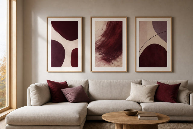
- Ink + oxblood — one deep-red accent (a cushion, a single vintage print with a red seal or bloom) gives a monochrome wall a pulse without a drop of actual gore.
Whichever pairing you choose, keep it consistent across the wall; a disciplined palette is what makes a dark gallery look curated rather than cluttered.
Mood Level One: Subtle Autumn Dark
This is the entry point — for renters, minimalists, or anyone who wants the season to whisper rather than howl. Shift an existing light, neutral room a few degrees darker with two or three pieces, so the change feels like weather moving in rather than a themed takeover.
- One anchor print, 50 × 70 cm: a black and white landscape — mist over a lake, a lone pine in fog, a mountain under low cloud. Hang it where you sit most evenings.
- Two supporting prints, 30 × 40 cm: dark botanicals work perfectly here — a black-ground study of thistles, ferns or seed heads. Hang them as a pair with 5–7 cm between frames.
- Frame choice: light oak or white frames keep this level feeling Scandinavian and calm; the darkness stays inside the artwork, not around it.
Add a couple of amber-toned candles and the room acknowledges the season without ever saying the word Halloween — which is exactly why it can stay up until spring.
Mood Level Two: The Moody Gallery Wall
Level two commits: a dedicated gallery wall of five to six dark prints, the visual equivalent of turning the lights down and putting a record on. Mixing motifs makes this level sing — pair a raven study with a full moon photograph, a dark botanical with a vintage moth plate, and one deep charcoal abstract to give the eye somewhere quiet to rest.
A layout that reliably works on a sofa or bed wall of about 200 cm:
- One 50 × 70 cm anchor slightly left of center — your strongest, darkest image.
- Two 40 × 50 cm prints flanking it, one hung a little higher, one a little lower.
- Two 30 × 40 cm prints filling the outer edges.
- One 21 × 30 cm print tucked into a gap — ideally the moth or beetle plate, since small specimen prints beg for close viewing.
- Keep 5–8 cm spacing between all frames and treat the cluster as one rectangle, its center at about 150 cm from the floor.
Dark gallery walls are less forgiving of guesswork than light ones, because every frame edge stands out. Plan before you pick up a hammer — the free Gallery Wall Builder lets you arrange your chosen prints on a virtual wall and test spacing until the cluster locks into place.
Mood Level Three: The Full Haunted Library
Level three is for the committed: a wall — or a whole room — that feels like the private study of a Victorian naturalist who never throws anything away. The look leans heavily on vintage prints: anatomical botanicals, celestial charts, antique maps, engraved birds and hand-colored moths, hung close together in a dense salon-style arrangement that climbs toward the ceiling.
The recipe changes character here. Instead of a balanced cluster, you are building an accumulation:
- Eight to twelve prints in mixed sizes from 21 × 30 cm up to 50 × 70 cm, hung with tight 4–5 cm spacing so the wall reads as a single collection.
- Mismatched-on-purpose frames: mostly black and walnut, with one or two brass-toned or dark green frames slipped in. Uniform frames make a salon hang look like a catalog; slight variation makes it look inherited.
- At least three “specimen” pieces: moths, beetles, seed pods, poppy heads or a celestial chart. These tip the wall from “dark gallery” into “haunted library.”
- One oversize moment: a 61 × 91 cm or 70 × 100 cm moon or raven print gives the accumulation a gravitational center.
Style the surrounding shelves with stacked books, a brass lamp and one unapologetic candelabra, and the room will do the haunting for you — no cobwebs required.
The Motifs That Do the Heavy Lifting
Not all dark imagery earns its keep past October, so choose motifs with a life outside the season. Ravens and crows are the aristocrats of spooky art — Poe made them permanently literary, and a single corvid in profile has the graphic punch of a logo. Moths are the insider’s choice: where butterflies read as summer, moths read as midnight, and vintage-style plates of them belong to natural history as much as to Halloween. Browse a dedicated insect and butterfly print collection and you will find the moodier specimens sitting right beside their daylight cousins.
Dark botanicals — pale flowers on near-black grounds, inky ferns, dried seed heads — are the most versatile motif of all, equally at home in a spooky-season scheme and a year-round moody bedroom. Full moons and night skies supply atmosphere without any narrative at all, and misty forests are the cheapest special effect in decorating: fog does to a photograph what a dimmer does to a room.
Frames, Paper and Hanging Dark Art Well
Dark art asks more of its presentation. A black frame around a black-ground print creates a seamless, dramatic edge; oak or white creates a visible border that keeps the wall light and Scandinavian. Walnut sits between the two and is the natural pick for the haunted library. With wooden frames in 14 colors and 13 sizes, it is easy to keep a palette consistent across a cluster — or deliberately, carefully inconsistent for the salon hang.
Paper matters more with dark prints too, because large areas of deep ink show off surface quality. A heavier 230 gsm paper has a substantial, gallery-like feel that flatters full-bleed black imagery, while 200 gsm is a premium everyday choice for smaller supporting prints. Hang the center of any single print — or of a whole cluster — at roughly 145–155 cm, and light the wall with warm bulbs; dark art under cold light turns flat, while under warm light it glows like varnish.
The November Test: Why This Look Outlives the Season
Here is the quiet advantage of the no-gore approach: on November 1, you change almost nothing. A raven is a raven all winter. Dark botanicals shift from “spooky” to “wintry” the moment the pumpkins leave the porch. The misty forest that felt haunted in October feels hygge-adjacent by December, once fairy lights arrive.
To consciously de-Halloween the wall, work by swap rather than teardown: remove the most on-the-nose piece, slide a snowy landscape or pale abstract into its frame, and exchange amber accessories for silver or evergreen. The structure of the wall — sizes, spacing, frames — stays put. That is the difference between decorating for a date on the calendar and building a wall with a mood you actually want to live in.
Frequently Asked Questions
How do I decorate for Halloween without it looking tacky?
Skip anything designed to be scary and choose art that is simply dark and atmospheric: ravens, moths, dark botanicals, full moons, misty landscapes. Keep a disciplined palette — black, bone white, amber, moss green — and hang everything in real wooden frames. If it would look at home in an old library, it will look right for Halloween.
What size posters work best for moody wall art?
Use a 50 × 70 cm print as your anchor and build around it with 40 × 50 cm and 30 × 40 cm supporting pieces, keeping 5–8 cm between frames. For a statement wall, one 70 × 100 cm moon or forest print can carry a room alone. Small 21 × 30 cm specimen prints work best at eye level, where they invite close inspection.
What colors go with black wall art?
Bone white and raw oak keep black art crisp and Scandinavian; amber, cognac and brass warm it into candlelight territory; moss green turns it botanical and slightly gothic. Pick one pairing and repeat it across frames, textiles and accessories so the darkness reads as a scheme, not a shadow.
Can I leave Halloween wall art up after October?
If you chose the no-gore route, yes — that is the whole point. Ravens, dark botanicals, moons and misty forests are seasonless motifs that read as moody rather than themed. Most people find the look actually improves in November and December, when early darkness and warm lighting flatter deep-toned prints.
Do dark posters make a room feel smaller?
Not if you manage contrast. Keep the wall behind the art light, choose prints with pale elements — fog, moonlight, white blooms — that give the eye an exit, and use lighter frames if the room is small. A few well-placed dark prints add depth to a pale room; it is painting every surface dark that shrinks a space.
Ready to build your own version — a whisper of autumn dark or the full haunted library? Start at the deepest end of the palette with the black wall art collection, and let the ravens and moths find their way in from there.
Build your wall virtually before you spend a penny
Arrange sizes and layout on a virtual wall — free, before you buy.

Start with these
See the whole collection →


Related inspiration


100-day returns