


Gallery Wall Templates: 7 Layouts You Can Copy
Seven named gallery wall layouts you can copy measurement for measurement - from a symmetric grid of 30x40s to a staircase diagonal - with exact cm spacing and the 145 cm height rule.
Most gallery walls that go wrong don't fail because of the art. They fail because the hanging was improvised: one frame goes up, the next gets eyeballed against it, and twenty minutes later the whole wall is drifting gently downhill. A good gallery wall layout works in the opposite order. You decide the pattern, the sizes, and the spacing before you pick up the drill, and suddenly even a first attempt looks like it was hung by someone who does this for a living.
Below are seven named layouts you can copy measurement for measurement, with sizes in centimeters, exact spacing, and the one height rule that quietly makes professional arrangements look right. None of them needs more than a tape measure, a pencil, a level, and an unhurried hour. And if you would rather rehearse before committing to holes in the plaster, every template here can be rebuilt digitally first, frame by frame, in the free Gallery Wall Builder.
Three numbers to memorize before you hang anything
Every layout in this guide leans on the same three measurements. Get these right and the rest is mostly patience.
- 145 cm to center. The visual center of the whole arrangement, not of each individual frame, should sit about 145 cm above the floor. That is average eye height, and it is the rule galleries and museums actually follow.
- 5-7 cm between frames. Consistent gaps are what make mixed sizes read as one composition instead of scattered pictures. Tighter than 5 cm feels cramped once the frames are up; wider than 8 cm and the group visually falls apart.
- 15-25 cm above furniture. Where the wall sits above a sofa, bed, or sideboard, the bottom edge of the lowest frame should hover 15-25 cm above it so furniture and art read as one scene. When the two rules conflict, the furniture clearance wins.
One more habit worth stealing from professional picture hangers: treat the entire group as a single shape. Work out the total width and height of the finished arrangement first, find that rectangle's center, place the center at 145 cm, and only then position individual frames working outward. Each template below gives you the group dimensions so you can skip the math.
Template 1: The symmetric grid
The most reliable gallery wall layout in existence: six identical 30x40 cm frames in three columns and two rows, with 6 cm gaps throughout. The group measures 102 cm wide by 86 cm tall. Center it at 145 cm and the top edge lands at 188 cm, the bottom at 102 cm, which clears the back of most sofas and sideboards comfortably.
A grid lives or dies on discipline, so use six identical frames in one color and fill them with art from a single family: a botanical series, six line drawings, or six black and white photographs. Mixing loud, unrelated motifs inside a strict grid creates visual noise the geometry cannot fix. The grid is also the easiest layout to rotate for narrow spaces. Turn it into two columns by three rows and you get a 66 cm wide, 132 cm tall arrangement that suits the strip of wall between two windows or at the end of a hallway.
Template 2: The pair
Two 50x70 cm prints hung side by side with a 6 cm gap. The group is 106 cm wide and 70 cm tall, which makes it the fastest route to a finished look above a bed or a two-seat sofa. Hang both frames so the shared center point sits at 145 cm, or, above furniture, so the bottom edges float about 20 cm over the headboard or sofa back.
The pair works because it behaves like a diptych: two motifs that share a palette and a mood, read as one wide image. Choose two abstracts in the same tones, two halves of a landscape, or a matched set of muted Scandinavian living room prints. Keep the frames identical, and check the gap with a spare piece of 6 cm card as you hang, because at this scale even a 1 cm difference is visible from across the room.
Template 3: The centerline row
Three to five frames in a horizontal row, every frame centered on the same invisible line at 145 cm. The classic version uses 40x50, 30x40, and 40x50 cm frames with 6 cm gaps, for a total width of 122 cm. Want it longer? Add a 30x40 at each end and the row grows to 194 cm, ideal above a long sideboard or along a hallway.
The detail that separates this layout from an ordinary row is the alignment: you center the frames on a horizontal midline rather than lining up their top edges. Mixed heights hanging from a shared centerline look intentional and calm; mixed heights with aligned tops look like a shelf that lost its shelf. Measure 145 cm up from the floor at several points, connect the marks with a light pencil line or painter's tape, and hang every frame so its vertical middle sits exactly on that line.
Template 4: The anchor layout
One 70x100 cm statement print plus two 30x40 cm satellites. Place the anchor's center at 145 cm, then stack the two smaller frames in a column 6 cm to its right, with a 6 cm gap between them. The stacked column measures 86 cm tall, so align its center with the anchor's center and the whole group, 106 cm wide, reads as balanced despite being asymmetric.
This is the layout to choose when you own one print you genuinely love and want everything else to support it. The anchor carries the color and the drama; the satellites echo it quietly, in the same frame color, with simpler motifs. If the wall is wide, add a third 30x40 to the column or a second column, but resist the urge to promote a satellite to a second large frame. Two anchors compete, and the layout collapses back into an uneasy pair.
Template 5: The organic salon hang
The salon hang mixes seven to twelve pieces in sizes from 13x18 up to 50x70 cm into one dense, collected-over-time cluster. It looks improvised. It absolutely is not. The arrangements that work all follow the same quiet rules:
- Keep every gap between 5 and 7 cm, even as the frame sizes vary. Consistent spacing is what holds the chaos together.
- Place the largest piece just off-center at roughly 145 cm, and build outward from it in all directions.
- Limit yourself to two or three frame colors and repeat each one at least twice. Matching wooden frames come in 14 colors; restraint reads as taste.
- Mix orientations deliberately, portrait next to landscape, so no row or column forms by accident.
- Keep an invisible outer boundary, a rough rectangle or soft oval, so the cluster has a shape instead of a sprawl.
Lay the whole arrangement out on the floor first, photograph it, and hang from the middle outward. If you would rather begin from combinations that are already proven, the curated ready-made gallery walls pair motifs, sizes, and frames that are known to work together.
Template 6: The staircase diagonal
Along a staircase, the 145 cm rule bends: each frame's center should sit about 145 cm above the tread directly below it, measured vertically. Connect those points and you get a diagonal line parallel to the pitch of the stairs. Hang alternating 30x40 and 40x50 cm frames with their centers on that line, spaced 40-45 cm apart horizontally, and each frame will step upward by roughly the rise of one stair, typically 17-18 cm.
Mark the diagonal with painter's tape before you drill, because a staircase punishes freehand hanging more than any flat wall; a frame that is 3 cm off the line is visible from both the top and bottom of the stairs. Keep the motifs light and sequential, a city series, botanical studies, or family photographs in matching frames, since people view them one at a time in passing rather than all at once.
Template 7: The ledge wall
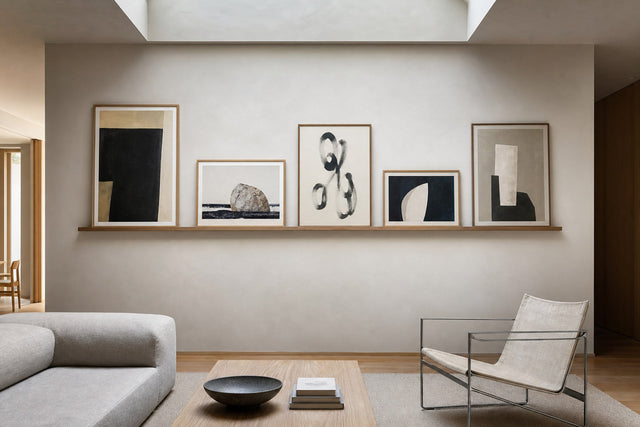
The only layout with no measuring between frames at all. Mount one or two picture ledges, then lean and layer the art: 50x70 cm frames at the back, 30x40 and 21x30 in front, edges overlapping by a few centimeters. With a single ledge, mount it at about 120 cm so the leaning art's midpoint lands near eye height. With two, hang the second 40-45 cm above the first so tall frames on the lower ledge slide behind it.
The ledge wall is the renter's template, two screws per ledge instead of a dozen holes, and the restless decorator's template too, because you can reshuffle the entire wall in five minutes without tools. It is also the arrangement most tolerant of experiments. Posters printed on sturdy 200 gsm or 230 gsm paper sit flat and stay put in their frames, and swapping a motif seasonally costs nothing but the moment it takes to lean a new one in front.
Gallery wall layout FAQ
How high should I hang a gallery wall?
Aim for the center of the entire arrangement to sit about 145 cm above the floor, which matches average eye height. Above a sofa, bed, or sideboard, let furniture clearance take priority instead: keep the lowest frame 15-25 cm above the furniture, even if that pushes the group's center slightly higher than 145 cm.
How much space should be between frames on a gallery wall?
Use 5-7 cm between frames and keep the gap consistent across the whole arrangement. Consistency matters more than the exact number: a wall hung entirely with 6 cm gaps looks composed, while a wall that varies between 4 and 10 cm looks accidental even if every frame is level.
What size posters work best for a gallery wall layout?
Build around 30x40 cm as the workhorse size, use 50x70 or 70x100 cm as anchors, and fill gaps with 21x30 and 13x18 cm pieces. A practical starting mix for a salon hang is one large anchor, three or four mid-sized prints, and two or three small fillers.
How do I plan a gallery wall without putting holes in the wall?
Two ways. The analog method: trace each frame onto paper, cut the templates out, and tape them to the wall with the correct gaps until the arrangement works. The faster method: rebuild the template digitally in the free Gallery Wall Builder, where you can test sizes, spacing, and motifs on screen before a single hole is drilled. If you want no holes at all, choose the ledge wall.
Do all the frames in a gallery wall have to match?
For the grid, the pair, and the centerline row, yes, matching frames are what make those layouts read as deliberate. For the salon hang, mixed frames are part of the charm, but limit the palette: with wooden frames available in 14 colors and 13 sizes, pick two or three colors and repeat them so the variety looks curated rather than random.
Pick the template that fits your wall, measure twice, and take your time. When you are ready to fill the frames, browse the Scandinavian poster collection for calm, cohesive motifs that suit every layout here, and with 100-day returns you have ample time to live with the arrangement and swap anything that doesn't earn its place.
Build your wall virtually before you spend a penny
Arrange sizes and layout on a virtual wall — free, before you buy.

Start with these
See the whole collection →


Related inspiration


100-day returns