


Decorating with Beige: Warm Minimalist Wall Art
A serious color guide to beige: how to tell warm sand from cool greige, match undertones to your room's light, and layer a tone-on-tone gallery wall that feels calm, not flat.
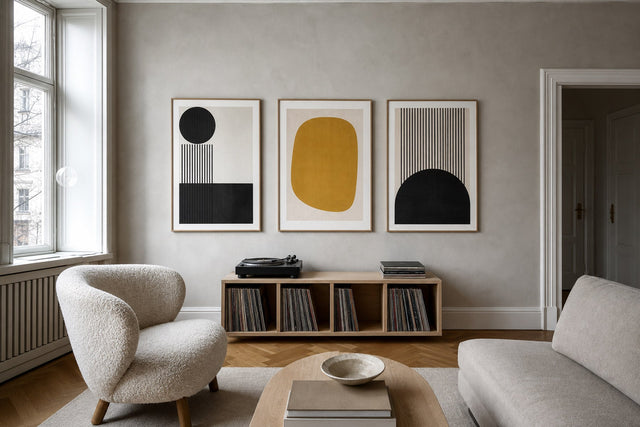
Beige spent years as shorthand for playing it safe. Then warm minimalism took over — linen sofas, limewashed walls, pale oak floors — and the quietest color in the paint deck became the one holding entire rooms together. Good beige wall art works the same way: it does not compete for attention, it sets a temperature. A sand-toned abstract above the sofa makes a white room feel sun-washed instead of sterile, and a pair of greige line-art prints can calm a busy hallway without introducing a single new color.
Beige is also the easiest color to get slightly wrong. Hang a pink-leaning print on a green-leaning wall and both suddenly look muddy, even if nobody can say exactly why. So this guide takes the color seriously: undertones — warm sand versus cool greige — matching them to your room's light, the pairings with white, oak and black that keep a neutral scheme from going flat, and a concrete weekend project — a tone-on-tone layered gallery wall built from a single beige color palette.
What beige actually is (and why it reads as calm)
Beige is not one color; it is a family. The spectrum runs from cream and ivory through oat, sand and camel down to taupe and greige, and the members share two traits: low saturation and a touch of warmth relative to pure gray. Our eyes associate desaturated, warm tones with natural materials — linen, paper, raw wood, dry grass — which is why a room wrapped in beige borrows the calm of those materials without needing to contain them all.
This is also the engine behind warm minimalism. The style keeps minimalism's discipline — few objects, clean lines, generous empty space — but swaps the cold white-and-slate palette for tones the body reads as sunlight and textile. On the wall, that translates into neutral wall art with visible softness: paper grain, loose brushstrokes and plant silhouettes rather than glossy, saturated graphics.
Warm sand vs. cool greige: learn to read the undertone
Every beige leans somewhere. The warm sand family carries yellow, peach or a whisper of red beneath the surface — think dry sand, straw and terracotta dust. The cool greige family carries gray or green — think stone, driftwood and unbleached linen that has been washed a hundred times. Neither is better — but they do not enjoy sharing a wall.
Two quick tests reveal an undertone. Hold the print against a sheet of pure white printer paper: the hidden yellow or gray appears once the eye has a true neutral for comparison. Or line up candidate prints side by side on the floor — clashing undertones make one another look dirty within seconds, which is far cheaper to discover on the floor than on the wall.
The working rule: choose one undertone family per wall. Across a larger room you can transition gradually — warm sand around the seating area, drifting toward greige near a stone fireplace — but on a single wall, mixed undertones read as a mistake even to people who could never name the problem.
Match the undertone to your room's light
Light decides how any beige performs, so check it before style, motif or size. North-facing rooms receive cool, bluish daylight that flattens greige into something close to concrete; a warm sand print counteracts that chill and restores the sun-washed effect. South-facing rooms are drenched in warm light most of the day, so both families work, but cool greige is often the smarter pick: it stays crisp where a very yellow beige can turn syrupy.
East- and west-facing rooms change character across the day, so judge the art at the hour you actually use the room: morning for a breakfast corner, evening for a living room. And do not forget artificial light. A warm 2700 K bulb pushes every beige toward orange after dark, so a print that looked balanced at noon can glow apricot at night. Prop the print against the wall for a full day before you commit to nail holes — Posterlefi's 100-day returns give you time to judge it in every light a season can offer.
The pairings that keep beige alive: white, oak and a little black
A tone-on-tone room fails when everything sits in the same narrow band of tone and texture. Beige needs partners — not loud ones, just contrast in the right doses. The classic trio is white for air, oak for kinship and black for punctuation — the same trio that forms the backbone of Scandinavian wall art and interiors: pale wood, quiet color, one dark accent.
- Sand + warm white + oak frame: the sunniest combination. Choose a soft chalk white rather than a blue-toned brilliant white, which fights the warmth.
- Greige + cool white + black frame: the most architectural. A thin black outline sharpens a soft print the way glasses sharpen a face.
- Beige + muted terracotta: terracotta is essentially beige with the volume turned up, so it deepens the scheme without breaking it.
- Greige + olive or eucalyptus green: greige's gray-green undertone makes these near neighbors; the pairing feels calm and quietly botanical.
- Beige + one black-and-white print: a single monochrome piece among beige artworks acts like a full stop in a long sentence — use exactly one.
Keep black to roughly ten percent of the wall story: a frame, a drawn line, one small print. The moment black becomes a co-star, warm minimalism tips into graphic modernism — a fine style, but a different article.
Motifs that carry a beige palette: line art, arches and dried botanicals
Because beige gives up the drama of color, the motif has to carry structure. Three families do this exceptionally well and layer beautifully with one another.
Line art — a face, a figure or a hand drawn in one unbroken stroke on an oat or cream ground — supplies the human element a neutral wall otherwise lacks, and it is the natural entry point into minimalist art prints. Arch-shaped abstracts — soft arcs, half-suns and stacked domes in sand and rust — give the wall geometry and a subtle nod to desert modernism. Dried botanicals — pampas grass, bunny tails and eucalyptus rendered in sepia tones — bring the texture that keeps tone-on-tone schemes from flattening out.
Beyond the big three, look at hazy textured abstracts that resemble raw plaster, dune and desert photography, and beige aesthetic prints built around simple shapes or restrained typography. Within a catalog of more than 8,000 posters and art prints you can afford to be picky: hold every candidate to the undertone test before it earns a place on your shortlist.
The project: a tone-on-tone layered gallery wall
Here is the concrete weekend version of everything above — a six-print gallery wall in one undertone family, layered from light to dark so the eye drifts across it like a landscape. It fits comfortably above a standard three-seat sofa.
- Sizes: one 50×70 cm anchor print, two 40×50 cm supporting prints, three 30×40 cm small pieces. The finished cluster lands around 180–200 cm wide — about two-thirds of a 220 cm sofa, the classic proportion.
- Spacing: keep every gap consistent at 5–8 cm. Even spacing is what separates a composed wall from a random one.
- Height: place the visual midpoint of the cluster 145–150 cm from the floor; above a sofa, keep the lowest frame 20–25 cm above the backrest.
- Tonal flow: arrange from lightest (cream, top left) to deepest (taupe, bottom right) so the wall has a quiet diagonal direction instead of a checkerboard of tones.
- Motif mix: two line-art prints, two arch abstracts, two botanicals — enough variety to reward a second look, not enough to feel busy.
- Frames: stick to one or two frame colors at most, for example oak on four prints and warm white on two.
Before you touch a hammer, build the arrangement digitally. Posterlefi's free Gallery Wall Builder lets you drag actual prints in their actual sizes into a layout, swap candidates in and out, and test the light-to-dark flow — so the only holes in your wall are the six you meant to make.
Frames, paper and texture: the finishing layer
In a scheme this quiet, finishing choices carry unusual weight. Frame color first: oak deepens the warmth and connects the wall to wooden furniture; white lets prints float on a pale wall; a slim black frame provides the ten-percent punctuation discussed above. Posterlefi's wooden frames come in 14 colors and 13 sizes, so matching both the undertone and the exact print size is straightforward.
Paper matters more in beige than in bolder palettes, because subtle tonal steps are the entire point. Posterlefi prints on premium poster paper in 200 gsm and 230 gsm weights, and the heavier stock lies beautifully flat behind glass. Position frames away from direct window glare, since reflections erase exactly the soft tone differences you chose beige for. For one large statement piece, consider a canvas print — the woven surface adds a physical texture that suits warm minimalism especially well.
Five beige mistakes (and their one-line fixes)
Most disappointing beige walls fail in one of five ways, all fixable. Matching the art exactly to the wall color makes it vanish — keep two to three visible tonal steps between wall and artwork. Mixed undertones look faintly dirty — recheck each print against white paper. Only smooth, flat motifs drain the wall — add one botanical or textured abstract. Too-small prints float in space — treat 50×70 cm as the minimum anchor above furniture. And judging only in daylight hides the evening orange shift — look again under your actual bulbs before hanging.
Frequently asked questions about beige wall art
What colors go best with beige wall art? White, oak and black are the reliable core: white adds air, wood tones are beige's closest relatives, and small black details add definition. For one step more color, muted terracotta suits warm sand while olive green flatters cool greige. Avoid bright saturated shades on the same wall — they make beige read as dull rather than calm.
Is beige wall art still in style in 2026? Yes — beige has moved from trend to staple as warm minimalism has matured. The current direction favors layered, tone-on-tone schemes with visible texture over single flat beige accents. Because the palette is anchored in natural materials rather than a fashion moment, it ages slowly and restyles easily.
What is the difference between beige and greige? Greige is beige with gray mixed in, which cools it down and mutes the yellow undertone. Classic beige leans warm — toward sand, straw and camel — while greige sits closer to stone and driftwood. In practice, greige tolerates cool light and gray furniture better, while classic beige glows more under warm light.
What size should beige wall art be above a sofa? Aim for a print or cluster about two-thirds of the sofa's width — roughly 140–160 cm above a standard 220 cm three-seater. A single framed 70×100 cm print works, and so does the six-print layout described above. Keep the lower edge 20–25 cm above the backrest so the art visually connects to the furniture.
Can I mix beige and gray in the same room? Yes, if you bridge them with greige, which contains both. Let one family dominate and use the other in supporting doses, repeating each at least twice so the mix looks deliberate. A greige print hung between a beige sofa and gray curtains ties the two families together neatly.
Beige rewards the decorator who slows down: read the undertone, watch your light, and let texture do the talking. When you are ready to start pinning down favorites, browse the beige wall art collection at Posterlefi — with 100 days to see how every print settles into your room's light before you commit.
Build your wall virtually before you spend a penny
Arrange sizes and layout on a virtual wall — free, before you buy.

Start with these
See the whole collection →


Related inspiration


100-day returns