


Color Psychology: What Wall Colors Do to Your Mood
Green balances, blue calms, amber energizes. A room-by-room guide to using color psychology at home, changing the mood with art instead of repainting.
Most color psychology interior advice ends the same way: pick a hue, buy the paint, and commit an entire wall to it. That is a big ask. Repainting is slow, messy, and hard to undo, which is why so many rooms stay white long after their owners have stopped loving them. Here is the part the paint charts leave out: the mood of a room does not live in the walls alone. It lives just as much in what hangs on them.
Art carries color into a room at a fraction of the commitment. One large print can shift the emotional temperature of a bedroom as decisively as a painted accent wall, and if the effect is not what you hoped for, you take it down and try something else the same afternoon. This guide covers what the main color families actually do to mood, why saturation matters as much as hue, and how to apply it all room by room with prints instead of paint.
What color actually does to a room
The core associations in color psychology are more consistent than you might expect. Green reads as balance and renewal, almost certainly because it is the color of living things; research on views of nature and recovery points in the same direction. Blue reads as calm and distance, borrowing from sky and open water, and tends to lower the perceived temperature of a room. Orange and yellow read as energy, appetite, and sociability, the colors of fire, sun, and ripe fruit. Earth tones, from sand through terracotta to deep clay, read as stability and groundedness, the palette of soil, wood, and stone.
Two honest caveats before you rearrange the whole apartment. First, these effects are directional, not magical. A green print will nudge a bedroom toward calm; it will not fix a mattress you hate. Second, personal and cultural associations can override the general rule. If yellow was the color of the kitchen you grew up happy in, yellow may calm you more than any textbook blue. Treat the associations as sensible defaults, then trust your own reaction.
The third factor, and the one most guides skip, is saturation. Hue sets the direction of the mood; saturation sets the volume. A muted sage green whispers balance, while a saturated lime shouts for attention and can be as stimulating as any red. A powder blue calms; a vivid cobalt wakes the room up. Lightness plays the same game: pale tones recede and make a space feel open, while deep tones pull the walls closer and make a room feel gathered and intimate. When a color feels wrong in a room, the fix is usually not a different hue but a quieter or bolder version of the same one.
Why art is the smartest way to test a color
A paint swatch the size of a postcard tells you almost nothing about how a color behaves at scale, but a full repaint is an expensive way to find out. Art sits exactly in that gap: big enough to genuinely change how the room feels, small enough to move, swap, or return.
Think of print sizes as doses. A 30x40 cm print is a dose: it introduces a color without dominating the room, perfect for finding out whether you and burnt orange are going to get along. A 50x70 cm print has real presence, enough to read from across the room and set the mood of a corner. A 70x100 cm print is a mood-setter, functionally an accent wall you can hang in ten minutes. With more than 8,000 posters and art prints to choose from, you can run this experiment in any color family and any style, from botanical to abstract.
- Start small and mobile. Hang or prop a 30x40 cm print in the room and live with it for a week before judging.
- Test in the room's real light. Look at the color in bright morning light, gray afternoon light, and under warm evening bulbs; a green that soothes at noon can turn muddy at night.
- Scale up only what earns it. If the color still pleases you after a week, move up to a 50x70 or 70x100 cm version and let it lead the room.
- Keep the frame neutral while testing. An oak, white, or black frame keeps your judgment on the color itself rather than the border around it.
- Use the return window as a trial period. With 100 days to return a print, you can evaluate a color across a real stretch of daily life instead of a single enthusiastic afternoon.
The bedroom: a calming green pair
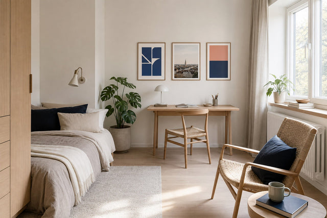
Green is the safest bet in the house for a bedroom, because it calms without turning cold the way some blues can. For a worked example, take the classic pair: two 50x70 cm prints hung side by side above the headboard, about 15 to 20 cm apart and centered on the bed. Choose two motifs in the same muted register, say a sage botanical and a soft eucalyptus-toned abstract, so they read as one calm gesture rather than two competing images. Oak or white frames keep the arrangement light. Pair them with bedding in white, sand, or soft gray and let green be the only real color in the room. The result is a bedroom that signals wind-down the moment you walk in, with no painter involved.
The kitchen: an energizing dose of amber
Kitchens and dining spaces are where the energizing end of the spectrum earns its keep. Warm yellows, ambers, and oranges are consistently linked with appetite, energy, and sociability, which is exactly what you want in the room where people cook, eat, and talk over coffee. But the kitchen is already the busiest visual landscape in the home, so keep the dose small: a single 30x40 cm print by the coffee corner, or a 21x30 cm pair on an open shelf, adds warmth without adding noise. An amber abstract in a black frame against white tile is a reliable pairing; so is burnt orange against pale wood. Browse orange and amber wall art for the warm end of the spectrum, and resist the urge to go bigger here. In hardworking rooms, energizing colors do their best work as an accent, not a wall.
The living room: grounded in earth tones
The living room has more jobs than any other room: host guests, absorb slow Sundays, survive weeknight chaos. That is why earth tones are its natural base. Terracotta, sand, ochre, and clay ground a space without pushing it toward either sleepy or buzzy, and they flatter almost every material you already own, from oak floors to wool throws to ceramic lamps. The worked example here is the anchor piece: one 70x100 cm earth-toned print above the sofa, its center around 145 to 150 cm from the floor, in a frame that echoes the wood tones in the room. If one large piece feels heavy, a trio of 50x70 cm prints in sand, rust, and off-white does the same grounding work with more rhythm. A collection like beige and sand art prints is a natural starting point, and earth tones carry a quiet bonus: they bridge warm and cool, so a green bedroom and an amber kitchen both feel related to the living room between them.
A room-by-room color map
Here is the short version, room by room, with sizes that suit a standard ceiling height of around 2.4 meters.
- Bedroom: muted green or dusty blue-gray; a pair of 50x70 cm prints above the bed; keep saturation low, because the goal is wind-down.
- Home office: green for steadiness with one small note of yellow for lift; a 50x70 cm print at eye level in your line of sight, not behind you.
- Kitchen and dining: amber, warm yellow, or terracotta in small formats, 21x30 to 30x40 cm; energy works best in doses here.
- Living room: an earth-tone base with one deeper accent such as forest green or rust; a 70x100 cm anchor above the sofa.
- Hallway: the one place a loud, energizing color almost always works, since nobody lingers; a vertical run of three 30x40 cm prints keeps the eye moving.
- Bathroom: aqua, seafoam, and pale green echo water and read as spa-like; small framed formats suit the limited wall space.
Making the palette hang together
The last step is making the colors feel intentional across the whole home rather than a series of separate experiments. Two rules do most of the work. First, limit the leading cast: two or three color families repeated at different volumes will always beat six colors used once each. Second, let the frames be the connecting thread. With wooden frames available in 14 colors, choosing one wood tone and one neutral and repeating them everywhere ties even very different prints into one story. And before you order anything, arrange your candidates in the free Gallery Wall Builder; seeing the greens, ambers, and earth tones side by side at true relative sizes will tell you within thirty seconds whether the palette holds.
Frequently asked questions
What is the most calming color for a bedroom?
Muted green and soft blue-gray are the two most reliable choices. Green calms without cooling the room, which suits bedrooms that already lean pale, while dusty blue settles rooms that run warm. In both cases saturation matters more than the exact hue, so keep it soft and grayed rather than vivid.
How do I add color to a room without painting?
Large-format art is the closest substitute for paint. A 70x100 cm print delivers roughly the visual weight of a small accent wall, hangs in minutes, and reverses instantly if you change your mind. Textiles such as cushions and throws can then repeat the color at smaller scale so it feels deliberate rather than accidental.
Do warm colors really give you more energy?
Directionally, yes. Warm hues like amber, orange, and sunny yellow are consistently experienced as more stimulating and sociable, which is why they suit kitchens, dining areas, and hallways. The effect scales with saturation: a muted apricot is gentle, while a vivid orange is genuinely loud. Save the strong versions for rooms where you want momentum rather than rest.
What size should an accent print be?
As a rule of thumb, 30x40 cm works as an accent on shelves, desks, and small walls, 50x70 cm reads clearly from across a room, and 70x100 cm sets the mood of the whole space. Above furniture, aim for art about two-thirds the width of the piece below it, whether that is one large print or a group.
Can I mix warm and cool colors in the same room?
Yes, and most good rooms do. Pick one temperature to lead, use the other as a supporting accent, and keep the saturation levels similar so neither side shouts. Earth tones such as sand and terracotta are the easiest bridge, because they sit near the middle and get along with both green and amber.
If you want the mood-changing effect of color with the lowest possible risk, start where the psychology is friendliest: green, the balancing all-rounder that earns its place in nearly every room. Explore the green art prints and posters collection, pick the size that matches your ambition, and let the walls do the repainting for you.
Build your wall virtually before you spend a penny
Arrange sizes and layout on a virtual wall — free, before you buy.

Start with these
See the whole collection →


Related inspiration


100-day returns