


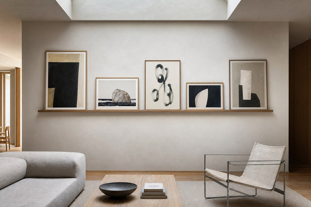
Gallery wall in the living room: create calm, rhythm and balance
A practical guide to planning a balanced living-room gallery wall with measured spacing, clear sight lines and six real PosterLeFi artworks.
The short answer
A calm gallery wall begins with one visual anchor, repeated spacing and a clear relationship to the furniture below it. Measure the available wall, mark the outer boundary, arrange paper templates before drilling, and let colour, shape or line connect the works. Keep enough empty wall around the composition so the group reads as one deliberate element rather than many separate pictures.
A successful gallery wall in the living room is not defined by how many pictures it contains, but by how clearly the pictures relate to one another and to the room. Start with the wall you actually have: the sofa, sideboard, doors, windows and main walking route determine the useful field. A composition that looks balanced on a blank screen may feel top-heavy when it hangs above low furniture. Before choosing frames, decide what the wall should do. It can create a calm focal point, bring several colours together or give a quiet room more energy. This purpose becomes the rule you use whenever two layout options seem equally attractive.
For inspiration, compare finished rooms on the gallery-wall page, test combinations in the gallery-wall builder, and browse the wider poster collection. These three steps separate discovery from decision-making. Save motifs that genuinely suit the room, then reduce the selection until every work contributes. A smaller, coherent set is usually easier to place and easier to live with than a group chosen only because every individual image is beautiful.
Measure the wall before choosing the layout
Measure the width of the furniture below the wall and the clear height between the furniture and ceiling. Use the furniture as the first reference line. In many rooms, a gallery wall feels settled when the complete group is visibly narrower than the sofa or sideboard, because the furniture then acts as a base. This is a visual method rather than a universal rule: a deliberately offset layout can work, but the offset should look intentional. Mark the proposed outer boundary with low-tack tape. Step back to the doorway and the usual sitting position; those two views reveal imbalance more reliably than standing directly in front of the wall.
Next, decide on a consistent gap. The exact number matters less than repetition. Small works normally tolerate a tighter gap, while large works need more air. Cut paper to the outer dimensions of every frame and tape the templates inside the boundary. Write the motif title and orientation on each sheet. The templates let you test height, rhythm and spacing without lifting frames repeatedly. Photograph each promising arrangement from the same spot. Comparing photographs makes subtle differences easier to see and prevents the layout from drifting while you move individual sheets.
Choose one anchor and build rhythm around it
An anchor is the work that the eye finds first. It may be the largest piece, the darkest motif or the design with the strongest contrast. Place it near the visual centre, but avoid treating the centre as a mathematical target. Furniture, lamps and windows shift the room's balance. The remaining works should support the anchor through repeated colour, line or shape. Repetition does not require identical art. A blue detail can answer another blue detail; a rounded pot can echo a curved abstract form; a strong black line can return in a smaller motif on the opposite side.
The six selected examples demonstrate different linking tools without inventing a single uniform style. Interconnected 01 Poster by cartissi offers a clear graphic structure. Black Plain Abstract Poster by Little Dean can provide contrast and visual weight. Cactus In a Green Pot Poster and Greek Vase Poster, both by David Galan, introduce recognisable forms that can bridge abstract works. A Suitcase Full of Memories Poster by Uma Gokhale adds a narrative object, while Tribal Abstract Poster by CATS AND DOTZ contributes another strong rhythm.
Use colour as a connection, not a strict theme
A gallery wall can feel calm even when the motifs differ. Choose two or three colours that already exist in the room and let them recur across the composition. They do not need to dominate every image. A small green area may connect to a plant, while warm neutrals can respond to oak, wool or linen. Black is useful as punctuation: repeated in two or three places, it helps the eye move across the group. If every work is equally colourful and equally high-contrast, the wall may become visually noisy. Give the strongest motif quieter neighbours and reserve empty wall as part of the palette.
Frame colour changes the reading of a motif as much as spacing does. Repeating one frame finish produces immediate unity. Mixing finishes can work when another element remains stable, such as identical gaps or a limited colour palette. Test the frame options digitally before ordering, then assess them against the real furniture rather than a white product-page background. Pale wood often connects gently to Nordic interiors, while darker frames define the perimeter more firmly. The best choice is the one that supports the artwork and the room without becoming the first thing noticed.
Set the correct height
People often hang a gallery wall too high because they judge the empty wall before the furniture is in view. Treat the group as one large artwork. Its visual centre should relate to eye level in the room, while its lower edge should maintain a comfortable conversation with the sofa or sideboard. Sit down and check whether the arrangement still feels connected to the furniture. Also check the highest corner from the doorway. If the group seems to float, lower the complete template arrangement rather than moving only the bottom row.
Allow for practical use. A table lamp needs clear space around its shade; a sofa cushion may rise above the backrest; cabinet doors and curtains need movement. Sunlight can create glare, so observe the wall in morning and evening light before fixing the final positions. None of these checks requires a perfect formula. Their purpose is to prevent the art from conflicting with everyday objects after the holes are drilled.
A reliable paper-template method
- Measure the clear wall field and mark a calm outer boundary with removable tape.
- Choose the anchor work and place its paper template first.
- Add the second-heaviest work on the opposite side to establish balance.
- Fill the remaining spaces by repeating one gap and alternating visual weight.
- Check the layout from the doorway, sofa and main walking route.
- Photograph the arrangement, wait a few hours and review it again.
- Mark hook positions directly on the templates and verify every measurement.
- Hang the anchor first, then work outward while checking level and spacing.
This sequence reduces the risk of making many small corrections that gradually distort the whole. It also makes the decision reversible until the final stage. If the composition feels dense, do not automatically remove the smallest picture. First increase the empty margin around the complete group or simplify the colour rhythm. If it feels weak, move the works closer before adding another. Density and scale are different problems, and recognising which one you have leads to a cleaner solution.
Final check before you hang
Confirm that every motif is available in a size that suits the planned frame, and verify orientation before ordering. Keep the final photograph of the paper layout on your phone while hanging. After the first two frames are up, step back; a few millimetres of error there can multiply across the wall. When the complete group is mounted, remove visual clutter from the furniture below for a day. This gives you a neutral reading of the new composition. Accessories can then return one by one, guided by the same rule as the art: each item should strengthen the rhythm, colour or calm of the whole.
Artworks used in this guide

Interconnected 01 Poster
cartissi
View artwork →
Black Plain Abstract Poster
Little Dean
View artwork →
Cactus In a Green Pot Poster
David Galan
View artwork →
A Suitcase Full of Memories Poster
Uma Gokhale
View artwork →
Greek Vase Poster
David Galan
View artwork →
Tribal Abstract Poster
CATS AND DOTZ
View artwork →Frequently asked questions
How much space should there be between pictures?
Use one repeated gap across the group. Tighter gaps suit smaller works, while larger works need more air; consistency is more important than one fixed number.
Should all frames have the same colour?
No. One finish creates instant unity, but mixed finishes can work when spacing, palette or another layout rule remains consistent.
How do I avoid hanging the gallery wall too high?
Treat the group as one artwork, relate its centre to eye level, and check it from the sofa and doorway while the paper templates are still movable.
Build your wall virtually before you spend a penny
Arrange sizes and layout on a virtual wall — free, before you buy.

Start with these
See the whole collection →


Related inspiration


100-day returns