


Beige posters: create a warm, neutral home
A practical guide to choosing beige posters, building tonal depth and using selected Tara Royle motifs as controlled accents in a warm neutral interior.
The short answer
Beige posters work best when the room contains several related neutral tones rather than one flat shade. Begin with the wall, floor and largest textiles, choose a warm or cool direction, and repeat that undertone in frames and smaller materials. Add one controlled accent colour or graphic motif so the space remains personal. Test the complete group in the actual light before deciding on sizes and placement.
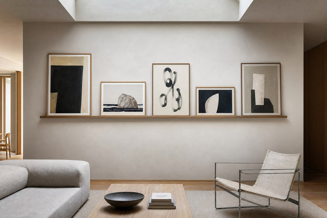
Beige posters can make a home feel warm and composed, but the result depends on more than selecting images with a pale background. Beige includes sand, oat, stone, mushroom, cream and greige, and each version leans slightly warm, cool, pink, yellow or grey. Read the room before choosing the art. Compare the wall colour with the floor, sofa, curtains and daylight. When those large surfaces share an undertone, the poster can connect them; when they pull in different directions, the artwork should bridge them rather than introduce a third unrelated neutral.
A simple test is to place white paper beside the wall and look again in daylight. The contrast makes the undertone easier to see. Warm beige often sits comfortably with oak, linen and terracotta, while cooler greige can answer stone, steel and blue-grey textiles. This is not a rigid rule. The useful point is consistency: repeat the chosen direction in two or three places so the room feels intentional. Browse abstract art, floral motifs and bestsellers as separate starting points, then compare only the works that suit the same tonal plan.
Start with the undertone
A neutral interior needs differences in value and texture. If wall, frame, textile and poster all have the same brightness, the composition can disappear. Create depth with a light, medium and darker neutral. A pale wall may support a mid-tone motif and a slightly darker frame; a mushroom wall may need a brighter passepartout and a stronger dark line. Natural materials help because oak, paper cord, wool, linen and unglazed ceramics reflect light differently even when their colours are close. The room remains calm, but it no longer feels flat.
Build depth without visual noise
Keep the palette disciplined by changing one variable at a time. First decide whether the main background is warm or cool. Next choose the contrast level. Only then introduce colour. A small blue, green or black detail can sharpen a beige scheme without taking it over. Repeat the accent once elsewhere, perhaps in a book cover or cushion seam, instead of matching every accessory. Empty wall is also part of the design. A generous margin around a poster group gives the neutral colours space to breathe and prevents the composition from becoming another block of visual clutter.
Use art as a controlled accent
The six selected Tara Royle works show how expressive motifs can live inside a neutral room without being labelled beige products. Cool it Cowboy Blue Poster, Cool it Cowboy Green Poster and Cool it Cowboy Black Poster offer three different accent directions. How Lucky Are We? Poster, Duck wearing Western Boots in green Poster and Duck wearing Western Boots Poster add playful graphic character. Their role in this guide is contrast: the calm material palette supports the exact artwork rather than changing it.
Choose size, frame and placement together
When several strong motifs share a wall, let the frames and spacing provide order. One natural-oak finish can link different colours immediately. Keep a repeated gap and choose one work as the visual anchor. Place the second-heaviest work across from it, then use smaller pieces to balance the outer edges. Test paper templates before drilling. View them from the doorway, the bed or sofa and the main walking line. A layout that appears balanced close up may lean to one side from the position in which it is most often seen.
Size should be chosen together with placement, not as a separate product decision. Measure the useful wall field and mark the complete outer boundary with removable tape. The group should have a clear relationship to the furniture below it, while leaving practical room for lamps, doors, curtains and cushions. Check morning and evening light for glare. If the art seems to float, lower the whole arrangement instead of moving only the bottom row. If it looks crowded, increase the outer margin before removing an individual work.
Frames influence temperature. Pale oak reinforces a soft Nordic feeling, while black creates a defined graphic edge. A white passepartout adds light between motif and wall; a warmer off-white can reduce contrast. Compare the frame against the real wall rather than a white screen. PosterLeFi product pages show the available choices for each product, and the final selection should always follow the options displayed for that particular size. The guide does not assume that every frame or format is available for every motif.
Before approving a neutral scheme, remove small decorative objects from the area and judge the art against the largest permanent surfaces. Accessories can disguise an imbalance because their colours create temporary links. Start with wall, floor, main furniture and daylight; then return objects one at a time. This order reveals whether the poster arrangement works by itself. It also prevents a common mistake: buying several new cushions or vases merely to rescue art that does not relate to the room. The artwork should lead, while accessories make quiet supporting connections.
A warm neutral home does not need perfect colour matching. In fact, identical beige across paint, fabric and paper can look artificial because each material responds differently to light. Aim for family resemblance rather than exact duplication. Put physical samples together and move them through the room during the day. A combination that feels soft in morning light may become yellow under an evening lamp. If one element changes too much, let it be a small accessory instead of the wall or largest artwork.
Finally, consider how the room is used. A guest room can carry a slightly more playful artwork group because it is seen in shorter intervals, while a workspace may benefit from more empty wall and fewer high-contrast motifs. The correct decision is the one that remains comfortable from the usual viewing distance. Keep a photograph of the final paper-template layout and the product links together. That makes installation more precise and gives you a reliable record if the arrangement later moves to another wall.
A practical neutral-room checklist
- Identify whether the wall reads warm, cool or balanced in daylight.
- Compare the floor and largest textile before selecting the poster palette.
- Choose one main neutral family and repeat it in at least two materials.
- Use light, medium and dark values so the room does not become flat.
- Reserve one accent colour and repeat it only once or twice.
- Treat empty wall around the art as part of the composition.
- Measure the complete group rather than estimating each frame separately.
- Mark the outer boundary with removable tape before ordering sizes.
- Test full-size paper templates before making holes.
- Keep one repeated gap between neighbouring frames.
- Choose one visual anchor and balance it from the opposite side.
- Check the layout from the doorway and the usual seated position.
- Leave practical clearance around lamps, curtains and cabinet doors.
- Observe the wall in both morning and evening light.
- Compare oak, black and pale frames against the actual wall colour.
- Use a passepartout when the motif needs breathing space.
- Confirm orientation and available sizes on each product page.
- Photograph two alternatives from the same viewpoint.
- Change only one variable between comparisons.
- Wait a few hours before approving the final arrangement.
Artworks used in this guide

Cool it Cowboy Blue Poster
Tara Royle
View artwork →
Cool it Cowboy Green Poster
Tara Royle
View artwork →
How Lucky Are We? Poster
Tara Royle
View artwork →
Duck wearing Western Boots in green Poster
Tara Royle
View artwork →
Duck wearing Western Boots Poster
Tara Royle
View artwork →
Cool it Cowboy Black Poster
Tara Royle
View artwork →Frequently asked questions
Do beige posters make a room look dull?
Not when the scheme includes varied values, textures and one controlled accent. Depth comes from contrast and materials, not from adding many colours.
Which frame colour suits beige art?
Pale oak creates a soft connection, while black adds definition. Compare both against the real wall and the motif before choosing.
Can colourful posters work in a beige interior?
Yes. A neutral room can act as a calm foundation for strong art when frames, spacing and the number of accent colours remain controlled.
Build your wall virtually before you spend a penny
Arrange sizes and layout on a virtual wall — free, before you buy.

Start with these
See the whole collection →


Related inspiration


100-day returns