


Bedroom Posters: Calm Art Above the Bed
A rest-first guide to bedroom wall art: the two formats that always work above a headboard, how high to hang them, and the calm motifs and color pairings that help a room wind down.
Of all the rooms in your home, the bedroom asks the least of its walls — and rewards restraint the most. Good bedroom wall art is not about making a statement; it is about setting a mood you can fall asleep under and wake up to, day after day. That changes the brief entirely. The bold abstract that energizes a hallway can read as pure noise in the one room built for rest.
This guide takes a rest-first approach to the wall above your bed and the walls around it. We will cover the two formats that reliably work above a headboard, exactly how high to hang them, a shortlist of genuinely calming motifs, and what to hang somewhere else. And if you live with long, bright summer nights, a soft, low-contrast palette earns its keep twice over — keeping the room settled even when the light outside refuses to switch off.
Why the Bedroom Needs a Different Visual Diet
Think about what bedroom walls actually do. They hold the last image you see before the light goes off and the first thing your eyes land on in the morning — art you live under for eight hours at a time, not something you pass on the way elsewhere. That is why the usual advice about statement pieces falls apart in here.
Restful rooms share a simple visual logic: fewer elements, softer contrast, and more breathing room between things. One large motif in muted tones reads as a single calm gesture. Six small, busy frames read as six separate demands on your attention. Neither is wrong in a hallway — but above a bed, it is the difference between a room that winds you down and one that quietly keeps you alert.
Above the Bed: Two Formats That Always Work
The wall above the headboard is the natural focal point of a bedroom, and when it comes to posters above the bed, two formats are close to impossible to get wrong.
One large poster, centered. A single 70x100 cm print hung centered over the bed gives the wall one clear anchor and nothing to compete with it. On a standard 140 or 160 cm double bed, 70x100 lands right in the proportional sweet spot: wide enough to feel intentional, narrow enough to leave quiet wall on either side. Center it on the bed, not on the wall — the bed is what the art belongs to.
A symmetric pair. Two 50x70 cm posters hung side by side with a 5-8 cm gap create a balanced composition roughly 105-108 cm wide. Symmetry is deeply restful: the eye takes in the arrangement in one glance and has nothing left to resolve. Pairs also let you split one theme across two prints — two line-art figures, or two botanical studies from the same family.
To size the arrangement to your bed, use these starting points:
- 90 cm single bed: one 50x70 cm poster, centered — a 70x100 would overwhelm the bed below it.
- 140 cm double: one 70x100 cm centered, or a pair of 40x50 cm prints with a 6 cm gap.
- 160 cm queen-size: one 70x100 cm, or the classic pair of 50x70 cm — both proportions work.
- 180 cm king-size: a pair of 50x70 cm, or one 70x100 cm if you enjoy generous margins of empty wall.
- Rule of thumb: the total width of the art should land between half and three-quarters of the bed's width.
How High to Hang Posters Above a Headboard
The most common mistake is hanging art too high, so it floats in the upper half of the wall, disconnected from the bed. The fix is one simple rule: leave 15-25 cm between the top of the headboard and the bottom edge of the frame.
Stay closer to 15 cm if you have a tall headboard or low ceilings — the tighter gap ties bed and art into a single unit. Go toward 25 cm with a low headboard, high ceilings, or a large 70x100 print that needs a little more air. No headboard at all? Measure roughly 25-35 cm above the top of your pillows instead.
Before you drill, do the sitting test: sit up in bed as if reading. If the back of your head brushes the frame, raise it a few centimeters — comfort beats formula every time.
A Calm Motif Shortlist: Line Art, Beige Abstracts, Muted Botanicals
Calm is not a single style; it is a set of qualities — soft contrast, simple composition, colors that sit close together. Three motif families deliver those qualities so consistently that they make a working shortlist of art for restful spaces.
Line art. A single continuous line describing a face, a figure, or a pair of hands leaves most of the paper empty, and that emptiness is exactly the point. Minimalist line art posters add a human, hand-drawn warmth without adding visual weight, making them one of the safest choices above a bed.
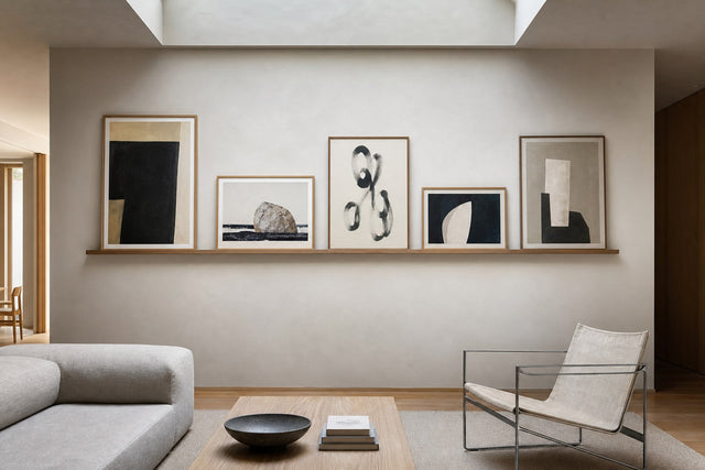
Soft beige abstracts. Tone-on-tone abstract shapes in sand, oat, and warm ivory give a wall gentle movement without any hard edges. Look for organic, rounded forms rather than sharp geometry — the beige art print collection is built around exactly this register of quiet, warm neutrals.
Muted botanicals. Dried grasses, a eucalyptus stem, a single leaf study in dusty green — botanical motifs carry an instinctive association with slowness and nature, as long as the palette stays muted. Save the saturated jungle greens for the living room.
Hazy landscapes and misty seascapes in pale tones belong on the same shortlist. What unites them all is restraint: each print gives your eye a place to rest rather than a puzzle to solve.
Color Pairings That Keep the Room Quiet
In a bedroom, contrast matters more than color. A pale blue print with strong black elements is more stimulating than a deep green print whose tones sit close together. When you are choosing calming bedroom art, squint at it: if hard darks and lights still jump out, the piece will keep pulling your attention at night.
These pairings are reliable starting points:
- Warm white + sand + soft clay: the classic Scandinavian bedroom palette; pair it with an oak frame for warmth.
- Oat + greige + a whisper of charcoal: ideal for line art, where the dark line stays thin and quiet.
- Sage green + cream: a natural fit for muted botanicals, especially in light wooden frames.
- Dusty blue + warm gray + white: cooler and airier — lovely in rooms that get strong morning light.
- Dusty terracotta + beige: warmth without loudness, beautiful against white or off-white walls.
One easy trick: echo a single tone from your bedding or curtains — not a full match, just one shared note that makes the room read as considered rather than coordinated.
This matters even more in high summer, when northern evenings barely darken and a bedroom has to create its own sense of dusk. Low-contrast art in warm, muted tones absorbs that lingering light rather than bouncing it back, helping the room feel restful hours before the sky does.
What to Avoid Above the Bed
Knowing what to leave out is half the job. Above a bed, skip:
- Busy, dense motifs: detailed maps, crowded collages, and intricate patterns invite your eyes to keep scanning — the opposite of winding down.
- Hard black-and-white contrast: stark photography with deep blacks carries daytime energy; hang it in a hallway or office instead.
- Saturated reds and neon brights: alerting colors that work against the room's whole purpose.
- Text-heavy prints: words ask to be read, and reading is engagement — typography posters do better where you are meant to be awake.
- Heavy, oversized pieces directly over the pillow line: whatever hangs above your head should be lightweight and securely mounted — one more argument for a framed paper poster.
A Bedroom Gallery Wall That Still Feels Restful
A bedroom gallery wall is entirely possible — it simply follows stricter rules than the free-form cluster you might build in a living room. The goal is order the eye can absorb in a single glance.
Keep it symmetric: a 2x2 or 2x3 grid of identical sizes (50x70 or 40x50 cm both work well) with even spacing of 5-8 cm between frames. Limit the palette to two or three closely related tones across all the prints, and use one frame color throughout. Consider placing the grid on the wall facing or beside the bed, keeping the headboard wall for a single calm anchor piece.
If you want to test arrangements before hammering a single nail, the free Gallery Wall Builder lets you lay out sizes, spacing, and motifs on screen until the composition feels right — far more relaxing than test holes in the plaster.
Frames, Paper, and the Practical Part
Presentation carries the calm as much as the motif does. Choose paper with some substance: posters printed on 200 gsm or 230 gsm premium paper hang flat and feel considered — details you notice at bedside distance. For frames, light oak and white read softest in restful rooms, while black adds a graphic edge that suits line art in a very pale room. With wooden frames in 14 colors and 13 sizes, the simplest route to serenity is repeating one frame finish on every piece in the room. A canvas print, with its matte, glare-free surface, is worth considering if your bedroom catches low evening sun that would reflect on glass.
If a print feels different above your bed than on screen, that is normal — art reads differently in every light. A 100-day return window means you can live with a piece through real mornings and evenings before you commit.
Frequently Asked Questions About Bedroom Wall Art
What size wall art should I hang above a queen bed? For a 160 cm queen bed, one 70x100 cm poster centered over the headboard, or a symmetric pair of 50x70 cm prints with a 5-8 cm gap, are the two most reliable formats. Aim for a total art width between half and three-quarters of the bed's width.
How high should posters hang above the bed? Leave 15-25 cm between the top of the headboard and the bottom of the frame — closer to 15 cm for tall headboards or low ceilings, closer to 25 cm for low headboards or tall rooms. Do the sitting test before drilling: if your head brushes the frame when you sit up, raise it.
What kind of art is most calming for a bedroom? Low-contrast motifs in muted, closely related tones: single-line drawings, soft beige abstracts, muted botanicals, and hazy landscapes. Squint at a print — if strong darks and lights still pop, it will read as stimulating at night.
Is it OK to put a gallery wall above the bed? Yes, if you keep it strictly ordered: a symmetric grid of identical sizes, even 5-8 cm spacing, one frame color, and a palette of two or three tones. If in doubt, hang the grid on a side wall and keep a single large piece above the headboard.
Should bedroom art match my bedding? Echo, don't match. Pick one tone from your bedding or curtains and let it reappear in the print. A perfect match looks staged; one shared note ties the room together while leaving it relaxed.
When you are ready to choose, browse slowly — the right piece for this room is rarely the loudest one. Our minimalist art collection gathers the line art, soft abstracts, and quiet compositions this guide is built on, ready to hang a calm 20 centimeters above the headboard.
Build your wall virtually before you spend a penny
Arrange sizes and layout on a virtual wall — free, before you buy.

Start with these
See the whole collection →


Related inspiration


100-day returns