


Autumn Posters: The Season's Most Beautiful Motifs
A motif-family guide to autumn posters: falling leaves and dried botanicals, misty forests, harvest still lifes and warm abstracts, each with a colour recipe, format tips in centimetres and an easy 50x70 swap-in strategy.
Somewhere around the first of September, summer prints start to feel slightly off. The light turns golden earlier in the day, evenings pull in, and the breezy coastal scenes and sun-washed pastels that carried a living room through June suddenly look like guests who have stayed a little too long. If that shift has already happened at your place, autumn posters are the easiest correction there is: motifs built on rust, moss, amber and chocolate that agree with what is happening outside the window instead of arguing with it.
The better news is that you do not need to redecorate. One or two well-chosen seasonal swaps can move an entire room from late summer into deep, comfortable autumn — and the rest of your walls can stay exactly as they are. This guide sorts the season's strongest motifs into four families: falling leaves and dried botanicals, misty forests, harvest still lifes, and warm abstract colour fields. Each family comes with a colour recipe you can borrow directly and a format tip in real centimetres, so you can choose quickly and hang with confidence.
Why the First of September Changes How Your Walls Feel
Wall art never reads in isolation. A print sits in the light of the room around it, and when that light changes, the print changes with it. The cool, bright light of a Scandinavian summer flatters airy motifs — pale blues, white space, thin lines. The lower, warmer light of September does the opposite: it makes those same motifs look thin and slightly cold, while it makes earthy tones glow. That is why a poster that felt perfect in July can feel wrong by the first week of September without you being able to say exactly why.
The practical answer is a rotation habit rather than a redesign. Keep your neutral anchors — black and white photography, line art, quiet typography — up all year, and reserve one or two visible spots for seasonal wall decor that changes three or four times a year. A single 50x70 above the sofa and a 30x40 in the hallway are usually enough to reset the mood of a whole home. The four motif families below are ordered roughly from most literal to most abstract, so you can decide how loudly you want the season to speak.
Falling Leaves and Dried Botanicals: The Gentle Entry Point
This is the most approachable family of autumn wall art, and the one to start with if you have never rotated art seasonally before. Think single-stem studies of oak or maple leaves, pressed-flower illustrations, dried grasses and seed heads, eucalyptus branches turning from green to copper. The motifs are quiet, botanical drawings age well, and they sit comfortably next to almost anything you already own. You will find hundreds of variations in this style among botanical posters and prints, from delicate line illustrations to full-bleed photographic studies.
The colour recipe here is rust + cream + oak: rust in the motif itself, cream in the background and mat, oak in the frame. The warmth stays gentle because cream does most of the work, which makes this family ideal for bedrooms and hallways where you want season without drama. Format tip: dried botanicals love repetition. A pair of 30x40 prints hung 5-7 cm apart reads as one calm composition, while a single stem study in 50x70 gives a narrow hallway wall a focal point without crowding it.
Misty Forests: Depth and Quiet
If botanicals are autumn at arm's length, misty forests are autumn you can walk into. This family covers photographic and painterly motifs of pine silhouettes in fog, birch trunks fading into white air, forest paths disappearing uphill. The mist matters more than the trees: it creates depth, and depth is what makes a flat wall feel like it opens up. These are the cosy autumn prints people mean when they talk about a room feeling like a cabin.
The recipe is moss + charcoal: deep green in the motif, charcoal in the frame, and very little else. Resist adding a third accent colour — the restraint is what keeps fog motifs calm instead of gloomy. Format tip: this family needs size. Mist reads as texture up close and as atmosphere from across the room, so go 50x70 at minimum and 70x100 if the print hangs above a sofa or bed. A small foggy forest print is a postage stamp of a view; a large one is a window.
Harvest Still Lifes: Warmth for Kitchens and Dining Rooms
The third family borrows from centuries of still-life tradition: pears on a linen cloth, wild mushrooms laid out on paper, vintage fruit-plate illustrations, pumpkins and gourds rendered with real painterly weight. These motifs carry an unapologetic warmth that can feel heavy in a pale summer room but becomes exactly right once the season turns. They belong near food — kitchens, dining corners, the wall behind an open shelf.
The recipe is amber + chocolate: golden amber tones in the motif, a deep brown frame around it. If you want the full vintage effect, hang harvest motifs in smaller formats — 21x30 or 30x40 — the way old kitchen prints were traditionally displayed, slightly below standard eye height so they connect with worktops and table surfaces. Posters that lean into warm brown tones are the natural backbone of this family, and they pair beautifully with wood, brass and ceramic objects you probably already have on the shelf beside them.
Warm Abstract Colour Fields: Autumn Without the Leaves
Not every home wants literal foliage on the wall, and this family is the answer. Abstract colour fields, soft arcs, mid-century shapes and painterly gradients in burnt orange, ochre, terracotta and clay deliver the temperature of the season with none of its clichés. In a minimalist or modern interior, an abstract in autumn tones often works better than any leaf motif, because it changes the mood of the room without changing its style.
The recipe here is terracotta + sand + charcoal: one saturated warm tone, one soft neutral, one dark anchor. Format tip: abstracts do their best work as a single large statement. One 70x100 colour field on an otherwise empty wall says more than three small prints, and because the motif is non-literal, it will still make sense in February — which makes this the family to choose if you want one purchase to stretch across two seasons.
The 50x70 Swap-In: The Fastest Room Refresh There Is
Across all four families, one format keeps earning its place: 50x70 cm. It is large enough to change the mood of a room on its own, small enough to move between rooms, and it is the size most motifs are designed to shine in. If you already own a 50x70 frame, an autumn refresh costs you one new sheet of paper and five minutes with the frame's back tabs. That is the entire project.
A few practical rules make the swap-in habit effortless:
- Keep the frame, swap the sheet. Leave the frame on its hook, open the back, exchange the print and close it again — no new nail holes, no measuring.
- Store off-season prints flat. A flat box or the original shipping packaging under a bed keeps summer prints ready for May. Never roll a print that arrived flat.
- Buy within one size ladder. If everything you own is 21x30, 30x40, 50x70 or 70x100, every print fits an existing frame and every frame accepts next season's print.
- Match paper weight to handling. Posters printed on 200 gsm paper are ideal for frequent seasonal rotation, while 230 gsm has a more substantial, gallery-like feel for prints that stay up year-round.
- Rotate two spots, not ten. One large print in the main room and one small print in an entry or hallway is enough — full seasonal overhauls are expensive, and they rarely look better than a focused swap.
With wooden frames available in 14 colours and 13 sizes, it is also worth owning one deliberately autumnal frame — oak or walnut-toned — that summer prints borrow for the rest of the year. Dark and warm frame colours flatter pale motifs more than most people expect.
Building a Small Autumn Gallery Wall
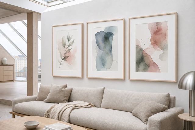
If one swap-in feels too subtle, a compact seasonal gallery wall is the next step up — three to five prints on one wall, unified by palette rather than by motif. This is where the four families start talking to each other: a misty forest photograph, a dried-botanical study and a terracotta abstract will hang together happily as long as they share the same warm undertone. The mistake to avoid is mixing warm and cool: one blue-grey print in an otherwise rust-and-amber cluster will always look like it wandered in from another season.
Three layouts that reliably work:
- The row of three: three 30x40 prints in identical frames, hung in a horizontal line with 5-7 cm between frames, centres at about 145 cm from the floor. Calm, symmetrical, ideal above a sideboard.
- The anchor and satellites: one 50x70 as the anchor with two 30x40 prints stacked beside it. Align the outer edges, keep gaps equal, and put your boldest motif in the anchor spot.
- The 2x2 grid: four 30x40 prints in a square grid — one from each motif family is a surprisingly good curation rule, since the shared palette holds them together while the subjects keep the wall interesting.
If you want to test a layout before committing to nail holes, the free Gallery Wall Builder lets you arrange sizes, frames and motifs on a virtual wall first — considerably cheaper than filling and repainting misplaced holes in October.
Frequently Asked Questions About Autumn Posters
When should I switch to autumn wall decor?
Early September is the natural moment in most northern homes — it is when the light changes enough for summer motifs to start feeling out of place. There is no rule, though: if you prefer a later shift, swapping in late September or early October still gives you a full two to three months of seasonal payoff before winter motifs take over.
What colours go best with autumn posters?
Work from the recipes: rust with cream and oak, moss with charcoal, amber with chocolate, terracotta with sand. The common thread is one saturated warm tone, one soft neutral and one dark anchor. Pull one of those colours into a cushion or throw nearby and the print will look intentional rather than decorative.
What size should an autumn poster be?
For a single statement print above a sofa or bed, 50x70 cm is the reliable workhorse, and 70x100 suits misty forest motifs that need room to breathe. For kitchens, hallways and gallery clusters, 21x30 and 30x40 are the practical sizes. When in doubt, size up — undersized art is the most common hanging mistake.
Can I mix fall posters with the art I already have up?
Yes, and you usually should. Keep your year-round anchors — black and white photography, line art, typography — and add one or two autumn motifs that share an undertone with the room. The only real conflict is temperature: cool blue-toned prints and warm rust-toned prints fight each other at close range, so give them separate walls.
Do autumn posters only work in living rooms?
Not at all. Harvest still lifes are strongest in kitchens and dining spaces, dried botanicals suit bedrooms and hallways, misty forests bring calm to bedrooms and home offices, and warm abstracts work almost anywhere. The living room is simply where a seasonal swap is most visible — it is the beginning, not the boundary.
However loudly or quietly you want the season on your walls, the swap itself is the easy part — with more than 8,000 posters and art prints to draw from, the four families above are a map, not a fence. Start with the one room where you spend your autumn evenings, and have a look at the newest designs in the collection to see what this season has brought in.
Build your wall virtually before you spend a penny
Arrange sizes and layout on a virtual wall — free, before you buy.

Start with these
See the whole collection →


Related inspiration


100-day returns