


Autumn Decorating 2026: Get Your Home Ready for Cozy Season
A 15-minute autumn refresh: swap three or four summer posters for warm earth-tone prints, echo the palette in textiles and lighting, and store the off-season art so it comes back flawless.
Somewhere in mid-September, the light changes. Evenings pull in, the garden fades, and the bright, airy rooms that felt perfect in July suddenly read a little thin. This is the moment most of us start thinking about autumn decor — and the moment many people talk themselves out of it, because redecorating sounds like paint swatches, furniture deliveries, and a lost weekend. It doesn't have to be any of that. The fastest full-season change a home can get is hanging different art on the walls you already own.
Rotating three or four posters — summer's ocean photograph out, a misty forest in — shifts the mood of a room in the time it takes to brew a pot of coffee. Add a throw that echoes the new palette and a warmer bulb in the reading lamp, and the whole space commits to the season. This guide lays that process out as a 15-minute checklist: what to take down, what to hang instead, which colors to reach for, and how to store the summer prints so they come back in perfect shape in May.
Swap, Don't Renovate: Why Art Rotation Works
Walls are the largest color surface in any room, which means the art on them does more to set a season's mood than nearly anything else you can change. A single 50x70 cm print in warm rust reads from across the room; a new cushion does not. That is the entire logic of seasonal art rotation: instead of adding more objects every season, you change the few large surfaces that actually register when someone walks in.
There is a practical bonus. If you keep your frames and swap only the prints inside them, the whole exercise needs no new hardware, no new nail holes, and no measuring. The frame stays on the wall; the print changes with the season. Most fall home decor advice starts with a shopping list of pumpkins and garlands that spend eleven months in a box. A rotation of prints, by contrast, earns its keep every single year, in both directions — the same swap that warms your rooms in September cools them again in May.
The 15-Minute Autumn Refresh, Minute by Minute
Set a timer if it helps. Once the autumn prints are in the house, this genuinely fits inside a quarter of an hour:
- Minutes 1–3: Walk through your main living areas and pick the three or four pieces that read most like summer — anything with bright blues, pastels, beach scenes, or white, high-noon light.
- Minutes 4–6: Take them down, open the frames, and dust the glass and inner edges while they are apart. This is the only maintenance your frames get all year, so it is worth the two minutes.
- Minutes 7–10: Slot the autumn prints into the same frames and rehang them on the existing hooks. Same sizes, same positions — the palette changes, the layout does not.
- Minutes 11–13: Pull one or two colors out of the new prints and repeat them in textiles: a rust throw over the sofa arm, an ochre cushion, a wool blanket by the reading chair.
- Minutes 14–15: Swap the brightest bulb in the room for a warm one (2700 K or lower) and move one light source down to seated height — a table or floor lamp doing the evening work instead of the ceiling fixture.
That is the whole method. Everything below is detail: which prints to choose, which colors work together, and what to do with the art that comes down.
The Summer-to-Autumn Swap List
The easiest way to choose replacements is to work in pairs: for every summer print that comes down, hang an autumn print with a similar subject but a warmer register. The room keeps its character; only the temperature changes. These trades are reliable:
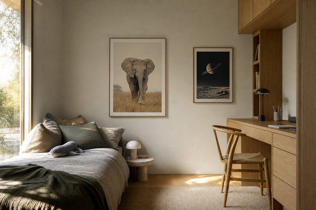
- Ocean or beach photography becomes a misty forest, fog over open fields, or a dark lake at dawn — still landscape, still calm, just quieter light.
- A pastel abstract becomes a rust, terracotta, or burnt-orange abstract with roughly the same composition, so the wall keeps its shape.
- Bright summer botanicals become dried grasses, seed heads, ferns, or mushroom studies in muted, papery tones.
- A white-sky city print becomes the same kind of scene in black and white, or a street photographed in low evening light.
- Citrus and fruit prints in the kitchen become vintage-style illustrations of pears, figs, plums, or chestnuts.
For the plant trades in particular, browse botanical posters with autumn eyes: skip the fresh greens and look for anything dried, faded, or drawn in ink and sepia. The same goes for landscapes — a good nature print full of mist, moor, or forest does most of the seasonal heavy lifting on its own.
Building an Autumn Palette That Suits Your Room
Autumn wall art does not have to mean orange everywhere. The strongest autumn palettes take one warm anchor color and pair it with something quieter, so the room feels seasonal rather than themed. Pairings that consistently work:
- Rust and cream — the classic, and friendly to almost any sofa color you already own.
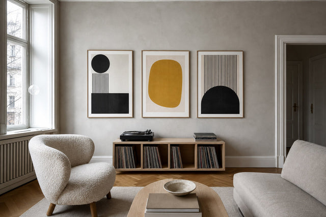
- Ochre and charcoal — a warmer take on the graphic black-and-white look.
- Olive and walnut brown — calm, botanical, and very Scandinavian.
- Burgundy and dusty pink — deeper and more formal, well suited to bedrooms.
- Warm brown and soft gray-blue — keeps a trace of summer's coolness, good for rooms that get strong afternoon sun.
If your room already leans cool — gray sofa, white walls, black frames — resist the urge to overcorrect with the loudest oranges you can find. Two or three prints in soft brown, caramel, and off-white will warm the space more convincingly than one pumpkin-colored statement piece, because they shift the average temperature of the whole room instead of fighting the rest of it.
Sizes, Frames, and Layouts That Keep the Swap Simple
The 15-minute promise depends on one decision made in advance: keep sizes consistent between seasons. If the summer print above your sofa is 70x100 cm, its autumn replacement should be 70x100 cm too, so it drops straight into the same frame on the same hook. Standard sizes — 30x40, 50x70, and 70x100 cm — make this easy, and Posterlefi's matching wooden frames come in 13 sizes and 14 colors, so replacing or adding a frame mid-rotation is straightforward.
A few layout rules of thumb hold in every season. Above a sofa, hang one 70x100 cm print centered, or a row of three 50x70 cm prints with 5–8 cm gaps between frames. In a hallway, pairs of 30x40 cm prints stacked or side by side keep a rhythm going without crowding. Whatever the arrangement, aim for the center of the print (or the center of the group) to sit around 145–150 cm from the floor — gallery height, comfortable for standing and seated viewers alike.
Frames can do quiet seasonal work of their own. Warm wood tones — oak, walnut, darker browns — flatter earth-toned prints and still look right in summer, which makes them the safest choice for a wall that changes twice a year. And if the swap has you rethinking an entire wall rather than a few frames, sketch it before you pick up a hammer: the free Gallery Wall Builder lets you arrange sizes and prints on a virtual wall first, turning a risky Saturday project into ten minutes of drag and drop.
Textiles and Lighting: The Five-Minute Finish
Art sets the palette; textiles and light make it feel inhabited. The hygge decor formula is less mysterious than it sounds: repeat the art's colors within arm's reach, and bring the light down low and warm. Take the two dominant colors from your new prints and repeat each of them at least once in fabric — a throw, a cushion cover, a table runner. A rust abstract above the sofa plus a rust throw on it reads as intentional; either one alone reads as accidental.
Lighting is the other half. Ceiling fixtures flatten a room; lamps at seated height carve it into warm pockets, which is precisely the autumn feeling everyone is chasing. Swap cool or bright bulbs for warm white (2700 K or below), switch the ceiling light off after dinner, and let two or three small lamps and a candle do the evening instead. The same earth-toned print looks noticeably richer under warm light — this five-minute step is what makes the art swap land.
How to Store Summer Prints for the Off-Season
A rotation only works if the prints survive it, and paper is more resilient than people fear — it is creases and damp that end a print's life, not handling. Give the outgoing summer pieces this treatment and they will come back flawless in May:
- Handle prints by the edges with clean, dry hands, and never fold or crease them — a fold is permanent, a gentle curl is not.
- Store flat if you can: in a large art folder or the original flat packaging, with a sheet of acid-free tissue between prints, slid under a bed or laid on top of a wardrobe.
- If you must roll, roll loosely — around 10 cm in diameter — and slide the roll into a tube rather than squeezing it in. Never put a rubber band directly around the paper.
- Choose a dry, room-temperature spot such as a closet shelf. Avoid attics and basements, where humidity swings warp paper over a season.
- Label the folder or tube with each print's name and size, so next spring's reverse swap takes 15 minutes too.
Posters printed on sturdy 200 gsm or 230 gsm paper stand up to this kind of twice-yearly rotation for many years — the weight that makes them hang flat on the wall is the same weight that keeps them safe in storage.
Autumn Decor FAQ
When should I start decorating for autumn?
When the evenings need lamps — for most homes, early to mid-September. There is no official date, and nothing about an art swap is irreversible anyway. A useful trigger: the first evening you close the curtains before dinner is the evening to schedule your 15 minutes.
How can I make my home feel cozy for fall without buying new furniture?
Change the walls and the light, not the furniture. Swapping three or four prints to warm earth tones, repeating those colors in a throw and a cushion, and moving to warm, low lighting will change the feel of a room more than any single furniture purchase. Large surfaces and light set a room's mood; furniture mostly just sits in it.
What colors work best for autumn decor?
Rust, terracotta, ochre, olive, walnut brown, burgundy, cream, and charcoal are the dependable core. Pick one warm anchor and one quiet partner — rust with cream, ochre with charcoal, olive with brown — rather than using every autumn color at once. Two colors repeated across art and textiles will always beat six colors used once each.
How do I store posters without damaging them?
Flat is best: an art folder or the original packaging with acid-free tissue between prints, kept somewhere dry at room temperature. If space forces you to roll, roll loosely into a wide tube and skip the rubber bands. Avoid attics, basements, and anywhere else with big humidity swings.
Do I need new frames for my autumn prints?
No — reusing your frames is the whole point of a seasonal rotation. Buy autumn prints in the same sizes as the summer ones and they drop straight in. If you are adding frames anyway, warm wood tones like oak and walnut suit every season, so the frames never need to rotate at all.
When the timer starts, the hardest part should already be done — three or four warm prints waiting by the door. Start with the browns: browse the brown wall art collection and pick the pieces your rooms will wear until spring.
Build your wall virtually before you spend a penny
Arrange sizes and layout on a virtual wall — free, before you buy.

Start with these
See the whole collection →


Related inspiration

100-day returns