


Abstract Art Demystified: How to Choose the Perfect Modern Prints
Choosing abstract art isn't about deciphering a hidden code; it's about emotional resonance and color harmony. Start by identifying the mood you want to create, match the artwork's palette to your room's accent colors, and balance complexity with your existing decor to create a cohesive interior design.
Abstract Art Demystified: How to Choose the Perfect Modern Prints
The Core Answer: Choosing the right abstract wall art is less about art history knowledge and more about intuition and interior harmony. To select the perfect piece, focus on three primary pillars: Emotional Connection (how does the piece make you feel?), Color Palette Integration (does it complement or contrast your existing scheme?), and Spatial Balance (does the scale and complexity of the art suit the room's energy?). Start with neutral tones if you are hesitant, and gradually introduce bolder forms as you become more comfortable with the abstract aesthetic.
The Intimidation Factor: Why We Fear the Abstract
At Posterlefi, we often hear customers say, "I don't understand abstract art." This is a common sentiment. Unlike a photograph of a cityscape or a botanical illustration, abstract art doesn't give you a clear subject to latch onto. There is no tree, no face, and no building. This lack of concrete subject matter can feel intimidating because our brains are wired to identify patterns and objects.
However, the beauty of abstract art prints lies precisely in that ambiguity. It is the visual poetry of interior design. It invites you to project your own emotions and interpretations onto the canvas. When curated correctly, abstract pieces become the soul of a room, offering a sophistication that literal imagery sometimes cannot achieve. Whether you are a seasoned interior decorator or a homeowner looking to refresh your space, understanding that you define the meaning is the first step to mastering this style.
The Psychology of Color: Your Guiding Compass
When the subject matter is removed, color becomes the protagonist. In the Posterlefi strategy for interior styling, we emphasize color psychology as the primary tool for selecting abstract works. The colors within the print dictate the mood of the room.
1. The Calming Sanctuary
For bedrooms and reading nooks, the goal is often relaxation. High-contrast, chaotic abstracts can be too stimulating here. Instead, look for works that utilize soft, cool tones. Integrating blue art prints into a bedroom induces feelings of serenity and stability. Similarly, green abstract compositions connect the indoors with the tranquility of nature, similar to the effect of nature prints but with a modern twist.
2. The Energy Hub
In living rooms or creative offices, you want to spark conversation and energy. This is where you can take risks. A splash of orange or gold art accents can act as a focal point, drawing the eye and invigorating the space. These warm tones in abstract forms mimic the dynamism of light and heat.
3. The Scandinavian Foundation
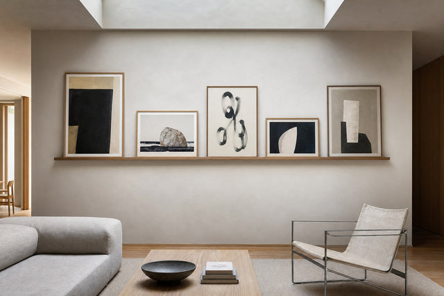
If you are a devotee of Scandinavian design, you know that the palette is often restrained. Here, texture and subtle tonal shifts are king. You don't need bright colors to make a statement. Beige wall art, white, and gray prints rely on form and composition rather than hue. These pieces add depth to a minimalist room without cluttering the visual field.
Form and Line: Decoding the Composition
Once you have settled on a color palette, consider the shapes. In the world of abstract art, shapes carry weight and meaning.
- Fluid Forms: Curves, swirls, and organic shapes suggest movement and softness. These are excellent for breaking up the rigid straight lines of modern furniture. Many of our watercolor paintings utilize these fluid dynamics to create a sense of flow.
- Geometric Rigidity: Squares, triangles, and sharp angles project strength, order, and modernity. These work exceptionally well in industrial or mid-century modern spaces.
- Minimalist Lines: Sometimes, less is more. Line art is a subset of abstract art that uses continuous lines to suggest form. It is incredibly versatile and pairs beautifully with quote posters for a balanced gallery wall.
The Posterlefi Guide to Mixing Abstract with Other Genres
One of the biggest misconceptions is that if you choose abstract art, your entire home must look like a modern art museum. This is false. In fact, eclectic mixing creates the most interesting homes. We call this "Transitional Styling."
Combining Abstract with Photography
Contrast is the key to visual interest. Pair a soft, nebulous abstract painting with the sharp, high-definition reality of photography prints. For example, a black-and-white abstract sketch looks stunning next to cities photography or architectural shots. The structure of the building in the photo grounds the ethereal nature of the abstract piece.
Nature Meets Modernity
Organic elements soften modern edges. Try placing a geometric abstract print alongside botanical illustrations or flower prints. The juxtaposition of man-made geometries with the natural chaos of leaves and plants creates a dynamic tension that is very pleasing to the eye.
Data Table: Abstract vs. Representational Art
| Feature | Abstract Art Prints | Representational (e.g., Landscape) |
|---|---|---|
| Primary Focus | Color, Shape, Emotion | Subject, Narrative, Realism |
| Interpretation | Subjective (Open to viewer) | Objective (Clear subject) |
| Best For | Creating mood, Modern interiors | Storytelling, Traditional interiors |
| Interior Match | Minimalist Art styles | Landscape or Country styles |
Creating the Perfect Gallery Wall
A gallery wall is a curated collection of art arranged together. Abstract art is the perfect "glue" for a gallery wall because it bridges the gap between different themes.
Step 1: Choose an Anchor Piece. Start with a large statement piece. Check our bestsellers to see what large-format abstracts are currently trending.
Step 2: Build Around a Palette. If your anchor piece is a pink abstract canvas, look for smaller pieces that contain hints of pink or complementary colors like grey or gold.
Step 3: Mix Mediums. Don't stick to just paintings. Mix a graphic illustration with a textural photo. You can even include music-themed prints if they fit the tonal aesthetic.
Step 4: Balance the 'Noise'. If you have a very busy, complex abstract piece, balance it with a white-space heavy print or a simple sketch. This gives the eye a place to rest.
Seasonal Updates: Rotating Your Abstracts
Because abstract art relies so heavily on color, it is the easiest type of art to swap out seasonally to refresh your home's vibe without changing furniture.
- Spring: Shift towards pastels and light airy forms. Browse our spring prints for inspiration that mixes abstracts with floral motifs.
- Summer: Go bold and bright. Summer prints often feature vibrant blues and yellows that mimic the sun and sea.
- Autumn/Winter: As the days get darker, bring in warmth. Switch to earthy browns and deep reds. Our winter prints and brown art collections offer deeper, cozier tones perfect for hygge evenings.
Trending: The Rise of 'Japandi' and Abstract Art
One of the most significant design trends recently is 'Japandi'—a hybrid of Japanese rustic minimalism and Scandinavian functionality. Abstract art is essential to this look. It calls for paintings that embrace imperfection, asymmetry, and neutral tones. Look for brushstroke art or ink-wash styles often found in our black and white collections. This style creates a grounded, Zen-like atmosphere.
Frequently Asked Questions (FAQ)
1. Can I mix abstract art with vintage decor?
Absolutely. In fact, modern abstract art creates a sophisticated contrast against vintage furniture. A sleek abstract print hanging above a mid-century sideboard is a classic designer move. You can also explore our vintage collection to find pieces that might share a color palette with your modern abstract prints.
2. How big should my abstract art be?
Size matters. A common mistake is choosing art that is too small for the wall. For a standalone abstract piece behind a sofa, the art should span roughly two-thirds the width of the sofa. If you are unsure, check our new arrivals for large-format options that make a bold statement.
3. Does abstract art have to be colorful?
Not at all. Monochrome abstract art is incredibly popular. Black and white abstracts focus entirely on texture, line, and contrast, making them timeless additions to any home.
4. Is abstract art suitable for a kitchen?
Yes, kitchens benefit greatly from art. Since kitchens are full of appliances and hard surfaces, art softens the space. Consider coffee & wine prints for a literal touch, or choose warm, appetizing colors in abstract forms to stimulate the appetite.
Conclusion: Trust Your Instincts
Demystifying abstract art ultimately comes down to trusting your own taste. There is no "right" or "wrong" interpretation. If a piece of art speaks to you, if the colors bring you joy, or if the shapes make your room feel complete, then it is the right choice for you.
Ready to find the perfect piece? Start exploring our curated Abstract Art Collection today or check out our current deals to start your collection.
Build your wall virtually before you spend a penny
Arrange sizes and layout on a virtual wall — free, before you buy.

Start with these
See the whole collection →


Related inspiration


100-day returns